The making of letters
in every form is for me the
purest and the greatest pleasure,
and at many stages of my life
it was to me what a song is
to the singer, a picture to the
painter, a shout to the elated, or
a sigh to the oppressed.
It was and is for me
the most happy and perfect
expression of my life.
Rudolph Koch
An exhilarating level of enthusiasm
overwhelmed participants at the fourth
biennial conference of the American
Typecasting Fellowship at Washington,
D. C., June 21-24, 1984.
A well-organized program coordinated
by Stan Nelson provided a most
stimulating atmosphere, yet the exchange
between participants equalled the formal
"structured" program.
In the truest sense of the word, the
"fellowship" of ATF came into full bloom
at this conference, and as never before,
information, techniques, and procedures
were exchanged among the 70-plus
participants from the United States,
England, Canada, Austria, and Germany.
Most exciting of all were the many
new faces present. Only 14 of the 35
persons who attended the first conference
six years ago, were present at the
Washington meeting. Best of all, the new
faces also were younger faces.
An informal poll taken by Harold
Berliner of Nevada City, Calif., revealed
that seven or eight persons had actually
put casting equipment into operation
since the Oxford conference in 1982.
Equally encouraging was the high
level of excellence exhibited by many
individuals at the conference. Having
equipment is one thing, but putting it to
good use is another and the latter is
definitely being done by many ATF members
judging from the keepsakes exchanged.
The cordial atmosphere presented by
Stan Nelson and Elizabeth Harris of the
Smithsonian Institution provided a
perfect backdrop for all which transpired.
Stan's excellent arrangements kept the
program on or ahead of schedule at all
times, and his selection of
accommodations and facilities was
excellent. From check-in Thursday afternoon
to a visit to Stan's Altier Press at his
home in Columbia, Md., on Sunday, all went
well.
Presentations included "In Praise of
Hot Metal" by Warren Chappell,
"Linecasting, An Ingenious Solution,"
by Stan Nelson, "Memories of Monotype" by
John Dreyfus, "The Private Typefoundry as
a Business," by Harold Berliner,
"Lettercutting at the Pie Tree Press" by
Jim Rimmer, "State of the Art" by Paul
Hayden Duensing, "The Bruce Foundry"
by Stephen 0. Saxe, "Wood Type
Trans-Atlantic" by Elizabeth Harris, and
"A Brief Look at the Typographic
Collections of the Museum of American
History" by Stan Nelson.
Some of these presentations were
made from written manuscripts and as
those are polished and forwarded, they
will be presented in the ATF Newsletter.
This issue includes text of a talk pre-
sented by Steve Saxe.
Another unexpected treat at the
conference was the bundle of keepsakes
presented by various persons attending.
The pieces included a 12-page hand-set
and hand-printed leaf done by the
gentlemen at Colonial Williamsburg,
various reproductions of early Monotype
literature, specimens of press work and
casting activity, patent drawings for
the Bruce typecaster, discussion of
current activities such as the
acquisition of 55 tons of type by Ian
Mortimer from the once-great Curwen
Press in London, to a 30-page book
Monotyped and printed by Harry Bollinger
of Alden, Mich. The packet itself creates
an excitement about the present state of
our fascinating hobby and if you get
opportunity to look over these keepsakes,
don't miss the chance.
3
Some Information on Back Issues for You and Bibliographers
Richard L. Hopkins
With apologies to bibliographers, the
following explanation of past ATF Newsletters
is offered both as an explanation and as a
matter of information to those frequent
requests for back issues of the publication.
All back issues listed as available are $3.00
postpaid in the U.S.
With this publication, ten issues have been
completed. About half the pressrun of issue
No. 9, printed in May, 1984, was improperly
labeled "Number 11." The comp explains that
to be wishful thinking, abruptly discovered
after half the run had been completed.
Number 1, published in August, 1978,
contained 8 pages 8¾x 11 inches. Six of
those pages were reproduced from the 1953
American Type Founders catalog which listed
all "unclassified faces" in the ATF vaults
at that time. About 8 copies remain.
Number 2, published January, 1979,
contained 6 pages 8¾xll inches. No copies
left.
Number 3, published July, 1979, contained
10 pages. It was the first to be sized 7x10
inches. This issue contains a listing of
matrices made by the Thompson Company before
it was absorbed by Lanston Monotype. No
copies left.
Number 4, published March, 1980, contained
8 pages 7x10 inches. Several copies left.
Number 5, published May, 1980, contained
4 7x10 pages and included an article on the
Unitype. Only 8 copies remain.
Number 6, published May, 1981, contained
20 7x10 pages and included an 8-page
supplement giving a photographic review of
our visit to American Type Founders Company.
Many copies remain.
Number 7, published February, 1982,
contained 20 pages 7x10 and included several
half-page forms contributed by members
explaining their own typecasting activities.
Only six left.
Number 8, published January, 1983, had 16
pages 7x10, including articles on the
Gujarati Type Foundry in India and the Paige
Typesetter. Fourteen copies remain.
Number 9, published June, 1984, contained
32 pages 7x10 inches. The issue includes a
photo supplement detailing a tour of the
Monotype International plant in England.
Several copies (improperly numbered "11")
available.
As with all other matters relating to this
Newsletter, address your letters to
Richard L. Hopkins, Box 263, Terra Alta,
W. Va. 26764. Back copies will be
distributed on a first come, first-served
basis.
3
In the last issue, we failed to mention David
W. Peat as co-owner of the Sterling Type
Foundry. Dingbats and numerous ornaments
are available. Write P. 0. Box 50234,
Indianapolis, Ind. 46250. The cutoff rule
above came from the new Sterling Type
Foundry.
3
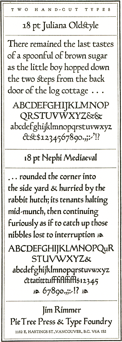
Complete Alphabet Showings of Two Original Metal Designs Are Revealed by Jim Rimmer
Richard L. Hopkins
Jim Rimmer's spirited presentation of how
he makes his own type designs in lead generated
great enthusiasm at the recent Washington
conference. The presentation followed on the
heels of his "how I do it" article in the last ATF
Newsletter, wherein he gave a partial showing of
his Juliana Oldstyle design.
As is obvious by the typeform accompany-
fog this article, Jim has kept himself quite busy,
having now completed both Juliana and a sec,
ond, fascinating face called Nephi Mediaeval.
"The conference itself, and the people who
attended were all so nice and generous," Jim
recounts. "Their enthusiasm has really put a
dent in my tinwork, I can tell you! In our
city-indeed in our country-there is not nearly as
much receptiveness to any kind of accomplish,
ment. In fact, in Vancouver, Gerald (Giampa)
and I can't even get our stuff accepted by the
local group of printers and academics to their
annual book show. I don't know what it takes
to achieve this, because I have been handling
type since I was 13, and Gerald has too.
"On another note: I have been so inspired
by the meeting in Washington, that I started
another typeface as soon as I had gotten my
breath enough to start work on it. This face is
named 'Fellowship'."
The letters here are samples of the first to be
cast. He also notes that his Juliana Oldstyle is
now complete in 18, 24, 36 and
48 pt.-breathtaking accomplishments indeed.
3
In November, the Hill & Dale was honored
by a brief visit by Corban Goble of Berea, Ky.
Corban had just gotten approval (at Indiana
University) on his disseration entitled
"Obituary of a Machine: The Rise and Fall of
the Linotype Machine for Newspaper Production."
He now is seeking a publisher and we wish
him success so that this valuable,
well-documented text will , receive the wide
audience it deserves. Congratulations,
Dr. Goble!3
This is the text of a presentation made at the 1984
ATF Conference in Washington, D. C.
The remarkable story of the Bruce type
foundry starts in Scotland where David Bruce
was born in 1770. As a boy he was a printer's
apprentice in Edinburgh, and emigrated to
America in 1793. In New York he found a job as
a newspaper pressman and then moved on to
Philadelphia. From there he sent for his younger
brother George, who was in danger of being
drafted into the British army. George arrived
in Philadelphia in 1795 at the age of 14, and
became friendly with two fellow Scots who
owned the only type foundry in the country,
Archibald Binny and James Ronaldson, and
the press maker Adam Ramage.
An outbreak of yellow fever forced them to
leave Philadelphia, and they worked as printers
for a while in Albany. Eventually they decided
on the greener pastures of New York, and they
made the trip on foot. In New York they con
tinued working as journeymen printers. I suppose
the term journeymen might be taken in a
literal sense here, because they shuttled back
and forth from New York to Philadelphia for a
while. But the urge to be their own masters was
strong, and before long, David set up an
inkmaking factory, but the enterprise failed for
lack of capital. Finally, in 1805, they set up a
printing office in rooms previously used by a
Tory printer named James Rivington, who is
believed to have been a spy in the employ of
George Washington. With a single rented
Ramage press and borrowed type, they began
work as D. & G. Bruce, Printers.
Their excellent work and competitive prices
brought them success. Within three years they
had nine presses from Adam Ramage working
in a larger office, and they were the biggest
printing firm in the city. Both men were
hardworking, persevering, and ingenious, but in
other ways they were totally different. David,
the elder, was impetuous and fiery-tempered,
while George was always cool and controlled.
In 1812, after news of the new process of
stereotyping reached America from England,
David Bruce set sail with letters of introduction
to the Earl of Stanhope, with the expectation
of learning the art. Stanhope refused to divulge
anything, but Bruce learned what he could
from other sources and returned to New York
to experiment on his own.
There was one great stumbling block to the
Bruces' efforts-the type of their day was badly
suited to stereotyping. The beard sloped at a
long angle into the body of the type, rather
than having squared shoulders as it does now.
Plaster casts made from the old type were
covered with long peaks of plaster which caused
great difficulty. In addition, spaces and quads
were too low.
When the Bruces approached the
typefounders-and there were not many they could
turn to at the time-the founders refused to
cast the special type for them, reasoning that
stereotyping would reduce the demand for the
type they manufactured.
With characteristic industry, the brothers
decided to cast their own. In 1813, with the
help of typefounder Edwin Starr and his two
brothers, they started typefounding as the
firm of Bruce & Starr. Thus they became the
third continuing foundry in the United States,
following Binny & Ronaldson in 1796 and
Elihu White in 1811 or 1812.
They were successful again in this new venture,
although differences with the Starr brothers
led to the dissolution of Bruce & Starr
after a year. In 1816 the Bruces sold off the
printing part of their business, and henceforth
devoted themselves exclusively to letter-founding
and stereotyping-two trades that often
were paired in the early 19th century.
The firm of D. & G. Bruce, Letter Founders,
began issuing specimen sheets in 1813, and
the first bound book was sent to customers in
1816. In 1818 the Bruces issued a type specimen
bound into Cornelius Van Winkle's Printers'
Guide, the first important printers' manual
published in this country. In the same year,
they moved into a large building of their own
at the crossroads of Centre and Chambers
streets, a short distance from City Hall. The
foundry remained there until the end of the
century.
By 1820 the Bruces were able to produce a
58-page specimen. It was printed on dampened
paper, of course, on one side of the sheet, and
probably on a wooden Ramage press. In this
book they uncharacteristically boasted of the
superiority of their type to that of the foundry
of their friends of their Philadelphia days,
Binny & Ronaldson. The specimen showed a
number of the latest display faces in large sizes.
These probably were cast in brass matrices.
David Bruce was afflicted with ill-health,
and in 1822 he retired to his farm in Bordentown,
New Jersey. George Bruce took full control
of the foundry, and soon afterward he
dropped the stereotyping part of the business.
He preferred to devote his energies to what for
him was as much a pleasure as a business-the
art of typefounding. Before this period he had
been a dashing widower in white-topped boots
and ruffled sleeves and shirt fronts, the owner
of a fast horse and a pleasure boat. Now he
devoted ·himself to minding his foundry's
business and designing and cutting new typefaces.
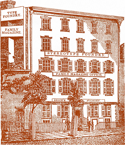
The Bruce Foundry was at the crossroads of Centre and Chambers streets
in New York until the end of the 19th century (1841 view).
In 1822 he became the first American to try
to make sense out of the progression of type
sizes. He devised a system of mathematical
progressions, with each size of type about 12 per
cent larger than the previous one and the sizes
doubling each seventh time. Although the
system was ingenious and logical, it did riot
catch on except for agate, a new type size Bruce
devised for it. Agate (5¼ points), of course, is
still with us as a measure of advertising space.
David Bruce Jr. now enters the picture. In
my estimation, he is certainly the most
interesting and productive figure in American
typefounding. He was a first-class type' designer
and punch cutter, the inventor of the first
successful casting machine, and the unofficial
historian of American typefounding, writing
anonymously for many years for the various
typographical trade periodicals. David Bruce Jr.
was born in 1802. As a young man he was apprenticed
to a printer-the traditional Bruce starting point.
His first work for the family type foundry was
cutting brass mats for large display letters
from 5 to 15 lines pica, in the days before
wood type was available.
The ornate designs of Victorian types were
causing difficulty in hand casting. The great
number of spidery lines and shadings made it
difficult to force the type metal into all
parts of the matrix. In 1834 David
Bruce Jr. first introduced the use of a
force-pump with the hand mold, and clearly the
next step would be a typecasting machine. Other
inventors, several at the rival foundry of
Elihu White in New York, had spent a great deal
of money over a long period of time trying to
develop a practical typecaster.
Although George Bruce adopted the force-pump,
he did not approve of his nephew's
experimenting around the foundry. David was
forced to leave the firm for two years,
abandoning his share of the profits, to work
on the machine in the seclusion of his father's
farm in New Jersey.
By 1838 he had succeeded in making a
machine which would cast type that was not too
porous for use-the main drawback of all the
previous machines. George Bruce bought the
patent for his foundry, and hired a former
locksmith, Lauritz Brandt, to build the machines.
By 1845 Brandt was off in Europe,
selling the machine as his own. As late as 1963
in the Printing and the Mind of Man Catalogue
the Bruce machine is mislabelled as the "Brandt
caster" instead of the Bruce caster.
If anyone doubts that Brandt was a villain,
he will have no doubts after the next scene. In
1843 David Bruce patented his improved
machine, No. 2. His uncle had the right of first
refusal, and George Bruce asked Brandt to
judge its usefulness.
Unknown to the inventor, Brandt told the uncle
that he saw nothing to warrant the purchase
of the new machine. My guess is that he
feared the new model would compete with his
sales of the original machine in Europe.
At any rate, after his uncle's rejection,
David Bruce Jr. turned to his friends at the
Boston Type Foundry. They worked with him
to give the new model a thorough testing. It
succeeded admirably, and the Boston Type
Foundry became the agency by which machine
typecasting spread throughout the United
States and Europe. The Bruce caster could
produce an average of 100 types a minute; a hand
caster could do no better than about 15.
The time was ripe for the casting machine
and its use spread rapidly. Miller & Richard
was the first British foundry to install the
machine, in 1849. Within 25 years of its
invention there were about 125 of them in use
in New York City alone-no doubt a large number
of these were in the Bruce foundry, which had
rejected the invention when it was offered.
Apart from his inventions, David Bruce Jr.
was the designer and cutter of several
typefaces including Madisonian and Hancock
scripts, Rimmed Shaded, and also music type,
borders and ornaments. He established type
foundries of his own in 1840 and in 1846 to
produce and sell type made on his casting
machines. Neither business lasted very long.
His articles about typefounders and typefounding
are source material now for those trying to
reconstruct the history of the industry. Bruce
wrote out his reminiscences in his History of
Typefounding in the United States, which was
edited by James Eckman and published by the
Typophiles in 1981.
The foundry's specimens grew from small
paper-bound booklets to large hard-bound
books. The first quarto book, about 9 by 11,
was issued in 1865. It cost over $20,000 to
print and bind, and the type shown represented
the use of over 100,000 punches and matrices.
For some time we have been aware of the
pirating of type designs that started after the
introduction of the electrotyped matrix in 1843
and the typecasting machine in 1845. As David
Bruce Jr. himself wrote in 1858: "An
indiscriminate plundering took place, commencing
among some of the minor foundries, upon the
older and more extensive establishments, the
conscientious proprietors of which, after
growling forth in vain their virtuous indignation
at such dishonorable conduct, boldly threw off
their coats, rolled up their sleeves, and made a
wholesale appropriation of whatever was worth
stealing in any direction from each other...."
However, in addition to this transatlantic
piracy, there was also a trade in matrices that is
not generally noticed today. In 1841 John
Binny, the son of the Bruce's old friend
Archibald Binny, offered the Bruce foundry the
drives (unfitted copper matrices) of whatever
faces he desired, at reasonable prices. And this
was not an isolated instance, because we know
that in 1861 George Bruce offered drives for 137
of his faces to European foundries, at prices
ranging from 45 cents each for text faces to
$1.25 each for scripts. This commerce in drives,
which had been a part of European printing
history since the earliest days, seems also to
have continued in this country long after the
introduction of the typecasting machine.
Meanwhile, following the Civil War, the
Bruce foundry was prospering. George Bruce
had long since become a rich man, acquiring
sawmills and other properties in New York and
New Jersey. He became president of the Mechanic's
Institute and an early member of the
New-York Historicai Society. But he was happiest
seated in his old red chair, cutting punches
for a new font of type. He became famous in
the trade for the quality of his work, and
especially for the Bruce Penman Copperplate
Script, which was considered the most elegant
made. His double small pica size of the script
received the first U. S. design patent in 1842,
the year the new patent law went on the books.
Specimen of Bruce's 60-point Penman No. 2,053
A specimen page of one of his scripts was
once set up and a proof brought to him for
approval. It read, "The plain Capitals for this
Cannon Copperplate Script, are unequaled in
elegance by any other font of writing type."
Bruce wrote on the bottom of the proof, "Oh!
Will Truth excuse such vanity?" and the compositor,
thinking it was an additional line, set
it and it was so printed and issued to the trade.
His last set of punches was a great primer
Copperplate Script cut at the age of 78, two
years before he died in 1866. The foundry was
then under the direction of his son, David
Wolfe Bruce. The name of the firm became
George Bruce's Son & Co.
The Bruce specimens were printed by Francis
Hart & Co., one of the finest printing firms
in New York. Since type founders always
wanted to show off their product to the best
advantage, these olc;l specimens often were
examples of the best printing available, from
the best type. A member of the Hart firm was
Theodore Low DeVinne, who became a good
friend of the Bruce family and who began
providing copy for the Bruce specimen books. His
copy usually dealt with the history of printing
and its related arts. His work can clearly be
seen in the 1869 specimen. Some pages remained
intact through succeeding editions, and
turn up as late as the year 1882.
In that year the foundry issued its
unrivalled specimen book, which Henry L. Bullen
once described as "the most notable type specimen
book ever issued, anywhere." This specimen
book was edited by De Vinne from beginning
to end, and all the text deals with the history of
printing. As mentioned earlier, some pages
went back to the 1860s.
Bound into the volume was the full text of
DeVinne's book, The Invention of Printing, first
published six years before. In this instance each
page was set in a different size or style of type
and it thus became a specimen in itself.
In 1890 David Wolfe Bruce retired and sold
his interest in the firm to three long-term
employees, Robert Lindsay, Henry M. Hall, and
Vilinder B. Munson. Lindsay died the following
year and the others struggled to keep the
firm going against the competition of the
Linotype and other foundries. In 1892 they
declined to join 23 other typefoundries· in
forming the American Type Founders' Co. Bruce's
main New York rival, the Conner foundry, did join
and became New York manufacturer for ATF.
In 1900 the firm issued its last specimen book
before it gave way and became part of ATF.
However, the Bruce type foundry name
continued to be used for another six years. There
was another great upheaval for the foundry at
the turn of the century, for it had to move from
Chambers Street to make way for the huge New
York City Municipal Building that was erected
on the site. The foundry operations moved to
a narrow building on Great Jones Street that is
still standing. With a bit of whistling in the
dark, the firm advertised that it intended to
remain on Great Jones Street for another century,
unless forced to move to larger quarters
by the volume of business. Alas, it was not to
be, and within a couple of years all activity
ceased and Bruce's New York Type Foundry
disappeared from view.
Now, almost 80 years later, the only traces
of that once-flourishing company are a few
type specimen books, a branch of the New
York Public Library named in honor of George
Bruce (is it the only library named after a
typefounder?) and a few fonts of type with the
pinmark, "BRUCE-N.Y."
3
Harold Berliner's Typefoundry
Issues Excellent Type Specimen Study
Monotype Composition Faces, just released by
Harold Berliner's Typefoundry, 224 Main St.,
Nevada City, Calif. 95959, gives exciting
evidence that the very best in metal composition
still is available from a typefounder who
obviously cares about perpetuation of the finest
traditions of our letterpress craft.
It's been years since a publication of this
nature has been produced to (a) show the face
in sample page composition, (b) give a brief
history of the face, and (c) provide a study of
its most unique characteristics. Harold Berliner
does just this with no fewer than 29 different
composition faces available from his foundry.
The volume is an excellent, current reference
on hot-metal composition faces and would be a
most valuable tool for any serious private press
printer. The composition service offered by the
foundry is an excellent way for private presses
to get lengthy manuscripts into type, and the
foundry encourages this sort of work.
Harold Berliner notes "the Monotype Corporation
of England, the developer of the finest
and most up-to-date laser equipment for cold
typesetting, has not forgotten its hot metal
users. For them it developed the "272 computer
system" to make the tapes in a thoroughly
modern way. We have one, and it allows us to
produce work on traditional casters in very
quick turn-around time which is superior in
many ways than anything which could be made
on the old pneumatic keyboards."
You should write to Harold for prices on
this and many other noteworthy publications
which have been issued by the foundry.
Of especial note is his A Garden of Printers'
Flowers, which shows hundreds of ornaments
which can be supplied by the foundry.
Type Being Imported from Hong Kong
Sylvan Kamm, operating as The Oedipress,
3503 Rodman Street, Washington, D. C. 20008,
is now importing type from a Hong Kong type
foundry which casts many early American
designs. Parsons and Parsons Italic are
included. Persons interested in obtaining his
catalog and price list should write to him.
Duensing Engraves Zapf's Civilite
Paul Duensing of 10180 East U Avenue,
Vicksburg, Mich. 39097 has been working with
Hermann Zapf and has engraved matrices for
Zapf's new hot-metal creation, a Civilite
design, to be introduced in the 10th
anniversary edition of Fine Print in January,
1985. The mats were engraved in brass blanks
and Paul did trial castings of all letters for
review, revision, and ultimate approval by
Zapf. Details as to whether the face will be
commercially available are not known at this
time.
Rice Electroforms His Own Matrices
Roy Rice continues his work in developing
procedures and actually electrodepositing mats
for use on his Monotype Thompson Caster.
Instead of depositing the entire matrix, he has
now developed a process for depositing only
the core of the matrix into a brass blank, much
in the way Lanston Monotype once made its
matrices. "I use a blank with a hole routed in
it a few points larger than the body of the type,
and put a piece of thin paper under the type
when making up the assembly. All this is stuck
together with Super Glue, coated with wax and
then plated. It seems to be working like a champ
and is a little more economical of anodes. The
main advantage, though, is that finishing is
simplified-thus, a bit quicker." Samples:
McGrew's Compilation of Lanston Monotype Matrices Alphabetized
Mac F. McGrew
As far as is known, a complete, comprehensive
listing of Lanston (U.S.A.) Monotype designs were
never published. The list below was compiled from
several sources by Mac F. McGrew of Pittsburgh,
Pa., and will be among the goodies in his upcoming
book on twentieth-century American metal type
designs. The list, in numerical order, was
published in the last Newsletter. The alphabetical
list is found here.
3
The subject of hardness of type has
been tossed about ever since typefounding
became a competitive enterprise, especially
after the turn of the nineteenth
century. One could suggest the subject
has been fully discussed and needs no
further examination, but informal discussions
at the most recent ATF conference
indicate otherwise.
This article will be surprisingly nontechnical;
it is intended more for the user
of type because it is the user who is more
concerned with the subject.
May I suggest that the term "hard foundry
type" is as nebulous as the term "extra firm" as
it relates to mattresses?
Let's go on a merry-go-round. What
is foundry type? Well, it's type cast in a
foundry. So what is a foundry? Obviously,
a place wherein type is cast. We have
gotten nowhere because the equipment
itself does not assure excellent type.
Yes, the Bruce caster (the first successful
typecasting machine invented),
the Barth caster (used exclusively by the
American Type Founders), as well as the
various "foundry" casters used in England
and Europe, all have the potential
for casting better type because they have
the potential for moving metal under
greater pressure. That is, if everything is
going well. But that isn't always the case.
In my shop, I have some very lousy
type cast by such giants as MacKellar,
Smiths and Jordan, Barnhart Brothers
and Spindler, and others--founders who
boasted of having the hardest type made.
One Smelter's Forumla
Tin
Antimony
Linotype Metal
4%
11-11¼%
Monotype Metal
6%
16-16½%
Stereotype Metal
5%
14%
Foundry Type
12%
22%
(Traces of up to ¾% copper sometimes
are introduced into foundry metal. Copper
does have a hardening characteristic, but
not of sufficient amount to make its presence
advisable in most instances, according
to Imperial Metals—see next page.)
I was startled when Will Rueter began
exclaiming over the hardness of type I
had cast for him a couple of years ago.
"It's really good, hard type," he said. But
it was cast on a Monotype Sorts Caster
and I know from using that machine that
there are thousands of ways to make
lousy type on a Sorts Caster-especially
larger type.
This leads to my first statement: Type
of good quality can be made on virtually
any typecasting device. That includes
Monotype composition casters, Thompsons,
Giants, Super Casters, the Bruce,
the Barth-even the hand mold!
All typecasting devices share the same
problems. They have to get the metal
into the mold, they have to get the metal
to fill every tiny part of the face of the
letter, and they have to somehow get rid
of the air filling the mold cavity.
I have no knowledge of the metal formula
for the "stock" I use in my shop. It
all is old Monotype metal, except for a
few Linotype slugs and Ludlow slugs, and
a few cans here 'n there of old ATF type.
My highly scientific formula is to either
use Monotype metal exclusively, or mix
Lino and ATF equally when using those
metals to come up with something remotely
resembling the Mono formula. I
never have gone to the expense of having
my metal analyzed and never will. I
have no way of smelting all my metal at
one time, and that means that the "formula"
will vary as I melt more old type.
Obviously, the typefounder should
be careful to keep foreign metals such as
zinc or aluminum out of his pot, and to
keep the pot relatively free of dirt.
I suggest that primary concern should
be on proper operation of the machine
rather than on the metal formula being
used. Improper machine operation will
assure bad type no matter what metal is
being used in the pot.
Likewise, it is my strong suggestion
that users should learn how to handle
type because damage and unacceptable
wear generally are created by the user, not
the founder. I have had experience in hot
metal shops where steel galleys full of
type have been stacked on top of one
another with no cushion between. I have
seen men come down with a plane and
mallet on a form with the strength necessary
to drive a railroad spike. I have
seen folks toss type into a typecase with
no concern about how it lands. And I
have seen automatic presses feed five or
more sheets at once, pulling impressions
heavy enough to make a stereo matrix.
User lesson No. 1: Type is fragile no
matter how "hard"it is. Always start
with a light impression on your press and
slowly build up. Always protect the face
of your type. Never put anything-even
a makeup rule or a pica pole-on top of a
type form. Be very careful when you do
plane a form, and always sweep the stone
and the underside of the form before you
plane the form. When you distribute
type, make a concentrated effort to have
it land on its feet, not its face-or the face
of a piece of type already in the case.
Lesson No. 2: Keep used type segregated.
Those who use a lot of hand type
should make an effort to keep type used
once in the first case, type used twice in
another case, virgin type in a third, and
so forth. Distributing in appropriate
cases will assure all the type in a case has
equal wear and this will simplify makeready
and decrease wear on type caused
by too heavy impression to bring up the
"Getting the casting machine to
function properly should assure
durable, usable type with little
concern for the metal formula."
worn letters. A new font never should be
laid in a case of old type. Keep type separate.
If you don't, you'll beat down the
new type trying to get the old stuff to
print properly.
And put carpeting on the fioor around
your composing stand. You are going to drop
type and when you do, the carpet may save it
from damage.
Lesson No. 3: Keep in mind that certain
materials will cause quick wear.
Some papers are as abrasive as sandpaper.
Laid and textured papers necessarily
force a heavier impression, and
thus, heavier wear. Cylinder presses roll
down the edges of type more quickly than
a platen. Antique ink balls and similar
devices will cause excessive wear. Synthetic
rags abrade the type form more
than cotton. On and on the story goes.
Finally, sad as this revelation may be,
all type if it is used will eventually wear
out. We all know this—we just sometimes
refuse to accept it.
Again, getting a casting machine to
function properly-to cast fairly solid
type with a nice shiny face-should be
the typefounder 's first objective. If this is
accomplished, it will be useful, long-lasting
type and the metal formula will have
had surprisingly little to do with the
results.
3
It is only appropriate that a technical
discussion of type metal accompany the
commentary found on these pages. What
follows is taken mostly from a booklet
published by the Imperial Type Metal
Company entitled Type Metal Alloys.
The copy used was printed in 1927, but other
editions are known to exist.
The principal metals making up all the
alloys used in typecasting machines are
lead, antimony, and tin. Although other
metals are occasionally present, they rarely
exceed one per cent of the mixture, and are
introduced only to slightly modify the
main elements.
Lead is the base metal to which the
other elements are added. Used alone, it is
too soft, and lacks many of the valuable
properties needed for type purposes.
Antimony, when added to lead, has the
valuable and unusual property of imparting
hardness to the metal and also increasing
the fluidity of the molten alloy. A lead
alloy containing antimony, due to fluidity,
has the property of filling out the type mold
perfectly—thus giving an exact reproduction
of the mold. An alloy without antimony,
but containing tin and lead only, as
found in solder, possesses none of the
valuable typecasting properties of metal
containing antimony.
Tin is the third and last principal element
in type alloys, its purpose being much
confused with that of antimony. Tin does
not reduce the melting point of the alloy.
Type metals freeze at approximately
475 degrees Fahrenheit in all cases, whether
tin is present or not. Tin does add very
much to the fluidity of the alloy, however,
and permits the work to be done at much
lower temperatures and with more perfect
results. It is for this reason that it is often
regarded as having reduced the melting
point, whereas it has simply increased
fluidity when molten, just as certain oils
thin inks. Tin causes a much slower setting
of the alloy, and much too often becomes
a detriment for this reason. Tin gives body
to the metal, adding considerably to its
toughness.
The remaining point worthy of mention,
as a property of tin, is its ability to
give the type its smooth, perfect face, free
from "cold spots." This means a better
product and type which will take ink well.
The trade in general exaggerates the
effect of tin on type durability. The amount
of change in hardness in metal produced by
adding one to five per cent more tin is not
sufficient to make imperfect pressroom
manipulation produce perfect results. If
hardness was as noticeable as the trade is
led to believe, we could approximate the
tin percentage by physical examination.
But only chemical analysis can detect small
changes in the percentage of tin.
Lead, when pure, melts at 621°; anti-
mony melts at 1166°. Yet when one per
cent antimony is alloyed with 99 per cent
lead, the melting point is reduced to below
621°. Additional antimony causes still further
reduction until the alloy contains
approximately 12 to 13 per cent antimony,
balance lead, melting at 425°. From this
point on, increased antimony raises the
melting point. This lowest melting point is
called the eutectic point.
Type metal consumers often are deliberately
misled by talk of virgin metals. The
scientific valuation of the alloy is entirely
a question of the purity and perfectness of
alloying. Virgin metal means nothing.
Interesting note: The black material
skimmed from the top of the remelting pot
which often is erroneously called dirt, is an
oxide of considerable value. It should be
carefully saved and returned to the smelter.
Metal does not wear out. It may become
low in certain elements, but given proper
treatment to remove impurities and restore
lost tin or lead, the metal can again be
made similar to original metal.
Metal formulation, it can be concluded,
is not primarily directed toward hardness.
Fluidity, working temperature, and filling
the mold and matrix are the vital concerns.
3
"As you explained how the 'membership' of
ATF works, I was reminded of a comment once
made by Groucho Marx. He said he would
never join any organization that would allow
him to be a member. He would find the ATF
an appealing group, I'm sure."
Carl Darrow
5602 Newington Road
Bethesda, Md. 20816
'A Home for Me and My Thompson'
"I am getting closer to typecasting. I have a
Thompson in storage, but am negotiating for a
house with a full basement under a large garage
(it is built into a hill). I am anxious to begin
typecasting."
"Glad to hear that your organization is so
active. Prior to finding you, I had no idea
such a thing existed. I've got letters off to
a few more places and hopefully, one of them
knows of an apprentice setup somewhere. I do
have a background in offset printing, but feel
that if I want to get into what is left of the
hot-metal industry, it would be best to do so
on a learner basis."
Thomas E. Way
Conception Abbey
Conception, Mo. 64433
Once Ran Republic Type Foundry
"I should belong to the American Typecasting
Fellowship. Years ago, I operated the
Republic Type Foundry in Chicago and today
I am cutting punches by hand. I have two
Thompson and a Washington hand press."
Stan Pauling
6099 Overseas Highway, 81W
Marathon, Fla. 33050
'Thanks for the Photography in No. 9'
"Thank you! ATF Newsletter 9 is superb.
Content, design and layout, presswork-you
name it-all contribute to an issue deserving
of all the superlatives I can dig out of the
thesaurus. Without seeming to sort out one
quality above another, I'd like to compliment
you especially for the fine photography. I'm
sure much of it was done under difficult
conditions, but the results are excellent,
and add immeasurably to the enjoyment-and
understanding—of the Monotype International
tour and the historic Hartzell transfer to
M&H."
Alvin S. Fick
R.D.5, Ballston Road
Amsterdam, N.Y. 12010
School to Set Up Letterpress Labs
"The School of Art and Design of the New
York College of Ceramics has established a
new Divison of Design which will be using
letterpress as a beginning to typographic
studies. At the other end of the spectrum
will be instruction in computer composition.
However, we believe one must begin at the
beginning."
Robert J. DoHerty, Chairman
Division of Design
Alfred University
Alfred, N.Y. 14802-1296
'And Boy Am I Hooked Now!'
"Back when I was a little beaker, I liked to
do calligraphy, as if I were a lone monk in a
tower, preserving knowledge with my quill
from the advancing hordes. But most of the
time I'd dream up more strange exotic
typefaces. Then I got interested in coins,
which put me in the basement trying to figure
out how to make dies for my own counterfeits.
One Fall day, I went to a park with some friends
and tried to melt some of Dad's hellbox metal down
in one of Mom's sauce pans to cast a medallion
on a piece of limestone which I'd chiseled with
a screwdriver blade. It didn't work. So here
comes your Newsletter with all these articles
about type matrices and casting machines and
boy, am I hooked ...."
Nils R. Bull Young
920 Greenheard Drive
New Carlisle, Ohio 45344
Keepsakes Enliven Good Memories
"The meeting! Well, I still have not gotten
over the high of the meeting. Super. I have
been through the keepsakes about half a zillion
times which bring back many good memories."
Paul Hayden Duensing
10180 East U Avenue
Vicksburg, Mich. 49097
'Had I Known I'd Be Looking ...
"Had I known in 1969 that in 1984 I would
be looking for type, I'd have cast cases galore
and saved some of that equipment. Sold eight
casters and four keyboards and a fine library of
British mats to someone in Baltimore."
Sol Malkoff
2458 Falmouth Road
Maitland, Fla. 32751
Former Lino, Mono, Comp Foreman
"For a number of years before retiring, I was
in complete charge of layout, makeup and
production of Monotype, Linotype, and all
manners of typesetting as well as advertising
production in one of the leading typesetting
plants in New York City, where I started as a
copy holder and apprentice in ITU Local No. 6
in 1921. If I can help in any way regarding
'old stuff,' let me know."
William Thierbach
6744 Winkler Road, Apt. L-4
Ft. Myers, Fla. 33907
'99 Bottles' to the Monotype Rhythm
"I retired 12 years ago after working 42 years
on the Syracuse Herald-Journal and enjoyed
every day I worked at the trade. I recall one
time in particular, as an apprentice when the
boss and I would sing 'there's 99 green bottles
hanging on the wall' to the cadence of the
Monotype caster as it operated. Then, of
course, there were the type lice .... "
Arthur Appel
186C Woodland Drive
Leesburg, Fla. 32788
A Sensible Subscription Figure Need
"By all means, keep your ATF Newsletter
coming. The check is enclosed. What I don't
understand is why you don't establish a
sensible subscription figure that could help
with all the problems and headaches."
John Anderson
23 West Woodcrest Avenue
Maple Shade, N.J. 08052
He Set His First Type in 1918
"I set my first type by hand at age 10 in 1918.
Later loused up an idle Intertype with my idle
fingers tinkering with the keyboard. We had
the best of it."
C. E. Benoy
Hendersonville, N.C. 28739
'Old Pro' Now Has Own Hobby Shop
"I have been retired since January, 1979,
and have been a member of the Boston
Typographical Local 13 since 1946. I have set
up a small old-fashioned printing shop as a
hobby in a 24x24 building back of my mobile
home. Thank God I am physically OK at 68 years
and I really enjoy setting up type and running
my hand-fed antique jobber."
John X. Andrews
R. F. D. 2, Lang's Lane
Newmarket, N.H. 03857
Largest Hot Metal User in the East?
"We have found it more economical to use
hot metal for our annual updates. As the
legislature meets and either passes or repeals
laws, we make the line changes and go directly
to our large flatbed Miller presses for printing.
Otherwise we would have to input everything on
our computerized typesetter and make new
negatives and plates for each update even though
there are minimal changes. We have a total of
six Intertype machines, one Ludlow, and one
Elrod strip machine. My guess is that we are
probably one of the larger hot-metal users in
New England."
Thomas N. Thomson, Vice-Pres.
Equity Publishing Corporation
Orford, N.H. 03777
A Monotype 'Empire' in England
"I am still extending my Monotype 'empire'
and have recently acquired another 30 diecases
of matrices. I have now about 120 diecases and
about 70 boxes of outside characters. I am sure
this must be the best collection of matrices in
the hands of any pure amateur in the U.K. I also
managed to acquire quite a lot of almost unused
molds. I find that the best places from whom to
collect these items are the printing teaching
establishments, as the materials are in almost
mint condition and have been well looked after.
A few months ago, I was able to obtain from a
printing school some large composition matrices
and molds, which are normally very difficult to
get one's hands on! Supercaster matrices are
also difficult to obtain, but I've done
reasonably well so far!"
Alan P. Morton
Fincham, New Pond Hill
Cross in Hand, Heathfield
East Sussex TN21 OLX England
Gerald Giampa, Jim Rimmer Prepare Exceptional Cover and Insert
Richard L. Hopkins
You cannot judge a book by its cover, nor
can you judge a gift by its wrapping. In no way
do the contents of this 10th issue of the ATF
Newsletter measure up to the excellent work
demonstrated on the cover, done by Gerald
Giampa of Vancouver, B.C., who did most of
the casting, designing, and all the multi-color
printing of these special covers.
Most copies of the cover were printed on
hand-made Dewint, English, made by Barcham
Green . .Further details from Gerald reveal the
metal flower under the title came from Harold
Berliner's Typefoundry, and "the ornaments
were either cast by me or by Jim Rimmer.
Several of the matrices were made by Jim Rimmer
and four were made at my instructions of
cutting away some of the Granjon ornaments."
Jim Rimmer's contribution to this issue (in
addition to the form on page 3), includes the
onionskin insert, on which he used his Nephi
Mediaeval type design.
Work on the contents was delayed until the
covers were in hand, so that an appropriate
typographic blend could be made. Goudy Old-
style was the obvious choice to go with
Gerald's Goudy Catalogue. Originally, I
intended to do 12 to 16 pages and get the issue
completed within the frame of the "November"
found on the covers and the first sheet. But
holidays and a continuing expansion of the
contents eventually brought me to production
completion in January, 1985, and an endeavor
which includes more typesetting (in metal) than
ever before-a full 24 of the 28 pages. And this
time most composition is in 10 point rather
than the usual 11 or 12 point. Over 350 pounds
of composition were cast for this issue. Also,
fonts of 12-point bold italic and a font of
24-point bold had to be cast to round out the
headline schedule.
Traditionally, each issue is done in a
different "face" to give air to different type
designs as well as to "exercise" my matrix
collection. But Gerald's choice of Goudy
Catalogue caused re-use of Goudy Oldstyle,
also employed in the last issue (No. 9).
Wholehearted thanks go to Gerald and Jim
for their help in making this 10th issue such
a landmark. Additionally, I encourage others
to make similar offers of assistance, though
(admittedly) we now have a tremendously high
standard to live up to.
An additional note of thanks goes to Steve
Saxe for making available his text on the
Bruce Type Foundry, as well as the text of
Warren Chappell's talk, "In Praise of Hot
Metal," to be printed in the next Newsletter.
Steve also supplied artwork for his
illustration of the Bruce foundry.
All presswork on the contents (excepting
the 4-page offset insert) was done on a 10x15
Heidelberg "windmill" using 70-pound cream
Wausau Felt.
In that all pages were completely into type
before printing began, the issue had the side
effect of housecleaning at the Hill & Dale.
Lots of standing forms were thrown in or
distributed so that galley space could be
made for the 24 different page forms.
Plans are already underway for the next
issue. Guy Botterill has sent a form
demonstrating the two types designed by
Warren Chappell to illustrate his text.
Hopefully, we also will have the texts from
John Dreyfus and Elizabeth Harris before
production begins.
As always, I encourage you to write of your
activities, especially as they relate to type
and typecasting. Better still send a made-up
form. Your warm comments regarding my efforts
with this Newsletter "keep me going."
3
We would be remiss not to mention the
passing of J. Ben Lieberman in this publication.
Ben, who died September 19, 1984, was a long
and energetic supporter of the concepts of
"printing as a hobby" and he naturally extended
that enthusiasm to "typefounding as a
hobby" by being an early supporter of a joint
typecasting venture by hobbyists in the suburban
area where he lived north of New York.
The organization which he founded, the
American Printing History Association, is
seeking to make his a living legacy by
establishing a Lieberman Endowment to provide a
rotating lecture series devoted to topics of
importance to Ben, such as the history of
printing and the value of letterpress printing.
Contributions to the fund are being received by
Alice D. Schreyer, Chair, Lieberman Endowment
Committee, APHA, P.0. Box 4922, Grand Central
Station, New York, N.Y. 10163.
3
Consider that very little change took
place in the typecasting industry from the
time of Gutenberg's invention to the
time when Bruce invented the pivotal
typecaster-nearly 400 years. Consider
too, that little more changed until
Mergenthaler and Lanston came up with
their inventions toward the end of that
century-another 75 years.
Now consider the fact that there are
many people alive today who began their
careers in hand-set composing rooms.
Yet today we're talking about laser
typesetting of entirely formatted pages
including halftones, reverses and benday
tints. There's little wonder that many of
us find ourselves in a startling time warp.
A few weeks ago, I ran into an
acquaintance from back when I was
teaching at West Virginia University.
"Bucky" Buchannon was the machinist at the
Morgantown newspapers, and he came to the
University to help me keep my Model 31
Linotype in good operating condition
whenever needed.
Buck knew the Linotype inside and out. He
kept 20 of them purring at the newspaper
office. He still is "machinist" at the
Morgantown papers, but, as he admits,
it's been nearly 15 years since he even
saw an operable Linotype.
Now he's into keeping computer terminals
interconnected, and is talking of the
Monotype Lasercomp the company has ordered
which will output fully made-up pages.
Gone are the many Teletypesetter
keyboarders; the pasteup folks only
lasted about 10 years too. I don't know
for sure, but I figure the staff in the
composing room, which numbered about 40
at one time, is now about 10 folks-and
they're doing larger papers all the time.
In October, James Hemingway visited
from Ohio, and told of his first job hand
sticking type at a type house in
Columbus. He had many years of experience
on the Linotype too, but now he's working
with the Mergenthaler 202 system and
just shakes his head when you ask about
the "good old days."
One of the strongest things we with
hot-metal backgrounds have is a solid
understanding of the earlie processes
printers had to use to get type set, and
more specifically, how type should be set
to get the most pleasing results. Many of
us involved with the American Typecasting
Fellowship have similar backgrounds, and
many of us find ourselves using the
modern processes in our professional
lives.
Sometimes we all lose sight of the fact
that two generations of printers have
now grown up with no background in
metal typesetting whatsoever. Recently,
a woman involved in advertising
typography in Cincinnati called me to
talk about my now-out-of-print book on
the Origin of the American Point System.
She expressed total fascination with
the subject and admitted that she knew
nothing of the older processes printers
once used. She was totally amazed when I
explained that I had operable "relics" of
that era in my basement, including the
Monotype.
"Old" in America is equated with the
word "ancient." But old typesetting
equipment often still is less than 20 years
old, as in the case of my Monomatics.
I am thrilled to realize there are as
many of us around collecting and using
this equipment as evidenced by the fact
that this Newsletter now goes to over 300.
We need to continue our dialogue among
ourselves. But we also should make some
effort to let the professional community
in our own areas know of our collections
and offer to ''spread the word'' to
modernday printers about what their
heritage really is.
Perhaps in this way we also will interest
others in helping preserve that absolutely
fascinating era which flourished so
recently that many of us remember it very
well.
3
'Unknown' References Held in Stephen Saxe Collection
Richard L. Hopkins
It seems that library systems of acquiring,
cataloging, and referencing materials do not
mesh well with the needs of persons
researching the earlier days of our printing
heritage. Nor are many libraries fond of
acquiring newer or "different" forms of
information. That's the real value in private
collections, and one suchcollection must be
that of Steve Saxe of 1100 Madison Ave., New
York, N. Y.10028.
Being in New York gives him access to more
original information, and over recent years,
he has made diligent efforts to increase his
holdings. On a recent visit to his place, the
following relevant titles were perused:
Catalogue of Matrices manufactured by the
National Compositype Company of Baltimore.
Published about 1915 or 1920, it contains 208
pages showing complete ranges of many faces,
6 through 36 point.
Linograph Specimen Book, published around
1919 by the Linograph Co. of Davenport, Iowa.
The 64-page book list about 40 matrix fonts.
The Thorne—an overview of how the
machine operates, its keyboard arrangements,
specimens of composition done on the machine
and how type for the machine is made. The
book, published in 1894, contains 36 pages.
More recently, Steve has purchased Stock
Ledger No. 1 of the Lanston Monotype Machine
Company, covering the years 1892 until 1906.
He says "the book is about the size of a
Gutenberg Bible. It's folio, 12 x 18 inches,
1000 pages (4 inches thick).... On glancing
through it I see that Tolbert Lanston of
1101 0 St., Washington, D. C., owned well
over 7,000 shares. J. Maury Dove bought a
lot of stock, starting in 1897, and J.
Sellers Bancroft, who perfected the machine,
began buying stock in 1902.
"I haven't even started to look over all the
names of stockholders, but I did notice that
Mary Mapes Dodge, who wrote Hans Brinker
and the Silver Skates, bought 50 shares in
1902, but sold them in 1905." Surely this
will be a valuable reference in future years.
3
Stan Nelson of 8486 Hayshed Lane, Columbia,
Md. 21045 continues his valiant efforts in
developing matrices, molds and paraphernalia
for casting types in the traditional hand-mold
fashion. On visiting his foundry last, I was
privileged to see punches he had engraved for
stamping identification markings onto his mats
-a cleaner, better-looking serifed set of
numerals you will never see. Stan also
continues to hand engrave his punches and
provides casts of the flower printed here as
evidence of his continued activity.
3
In this world, nothing comes as a
surprise. Thus, when Harold Segal of 8949
Turton Drive, Philadelphia, Pa. 19115, and
Jake Warner of 116 Rosewood Drive,
Greenbelt, Md. 20770, said they wanted to
work out a microcomputer program to help
in making line-ending decisions for hand
composition in metal type, I wasn't
surprised.
Jake was the "brains" of the project,
and with simple information from me
regarding Monotype unit sets on the types
being considered, he came up with a
program in Microsoft BASIC which does just
what it was intended to do. The Wordstar
document is processed a line at a time with
information at the end of each line
indicating what units of spacing should be
placed between the words. Hyphenation
decisions are possible, and it also is
possible to go in and alter the manuscript
to get a better line ending where spacing
or hyphenation is awkward.
Jake says when a comp does not have
enough type to complete the manuscript
before printing and distribution become
necessary, the program is most helpful
because exact line endings and line counts
are known beforehand. Thus, pages which
will "marry" in the chase can be composed
and printed even before pages in between
are done with no fear that count or line
endings will not match.
The process is fully discussed in the
December, 1984, issue of The National
Amateur, published by the National Amateur
Press Association. Jake offers to make the
program available to those with computer
equipment (and printing equipment)
necessary for its proper use.
3
Gertraude Benohr, an enthusiastic supporter
of our American Typecasting Fellowship, was
interviewed by THE TYPOGRAPHER while she
attended our conference in Washington, D.C.,
this past summer. The entire interview
(reprinted here) has been taken from the
July/August issue of the publication,
produced by the Typographers International
Association, 2262 Hall Place Northwest,
Washington, D. C. 20007.
A Staff Report
After 35 years as-an assistant to the
president of the Stempel type foundry in
Frankfurt, West Germany, Gertraude Benohr
would be expected to have picked up a
fascinating array of typographic trivia.
She has.
Question: Who designed Helvetica? Max
Miedinger is the answer most people would
give, but it's only partially true. Edward
Hoffman of the Haas foundry in Switzerland
was the one who had the idea for the face,
and told Miedinger what he wanted it to
look like.
Question: Who was the first typeface designer
to develop a numbering system for the
different weights of a face? Adrian Frutiger,
who assigned numbers to the various versions
of Univers. Fruitger, she believes, was also
the first designer to design a face for
phototypesetting.
These are just a few of the historical
tidbits that Benohr recalled during a
conversation with The Typographer. She was in
the U. S. for the American Typesetting
Fellowship conference, held in Washington in
June.
She went to the last ATF meeting (not to be
confused with the once-famous American Type
Founders Co., which went by the same acronym)
in Oxford, England, in 1982, and was
determined enough to make it to the
Washington gathering that she paid her own
travel expenses. Something about the group
excites her.
People who are interested in printing are
interesting people, she's found. "If you're
a compositor, you cannot help reading the
thing you're setting. And after it's been set,
you probably want to see what it looks like
after it's printed. They're pretty educated."
While she denied having any special
experienceon typography, a friend at the
conference called her the "Beatrice Ward" of
Stempel (after the Englishwoman perhaps best
known for her essay comparing good typography
to a fine glass of wine).
Benohr began at Stempel in 1949 because she
spoke English. The managing director at the
time was a friend of her uncle, who asked her
if she wanted to work for the company's new
president, an American who spoke no German.
Stempel itself was established by David
Stempel in 1895. On a train trip to Mainz to
attend a Outenberg celebration, Stempel met
Jack Mayer of the Mergenthaler Linotype
Company, and they became quick friends.
According to Benohr, this is how Stempel
became the manufacturer of Linotype matrices
in Germany.
Today, Stempel is majority-owned by the
German Mergenthaler company, which in turn is
fully American-owned. Up until about five
years ago, the Mayer family owned 35% of the
shares of the American Mergenthaler.
Type buffs wouldn't be surprised to hear that
Stempel's best-selling typeface in the years
since it was designed is Helvetica, which has
a history all its own. It evolved from Edward
Hoffman's desire for a style which would
update and borrow from two of Europe's
best-selling faces at the time, one of which
was Akzidenz-Grotesk.
"He explained to Miedinger what he wanted,"
Benohr recalled. "Miedinger was the designer,
but Hoffman was the one who really had the
idea, and really told him how he wanted it
to be."
The Haas foundry, now the Swiss subsidiary of
Stempel, first marketed the typeface in 1957.
Its original name was New Haas Grotesk.
Stempel didn't think the name would be a good
one outside of Switzerland, so all kinds of
suggestions were solicited before "Helvetia,"
the Latin name for Switzerland, was chosen.
But when it was found the name couldn't be
registered as a trademark because it was a
proper noun, Walter Cunz, managing director
of Stempel, changed it to Helvetica.
Designer Max Miedinger (pron. Mee-ding-er),
who died about two years ago, was quite proud
of his creation. "He was so happy when he met
someone who addressed him as the designer of
Helvetica," says Benohr: "Those were the
happiest memories of his life."
What kind of man was he? "When I met him, he
was a slightly stout, elderly gentleman who
liked a little drink once in a while. He
could be very funny," she remembered with a
laugh. "He was very Swiss."
Although Helvetica has been very popular,
Stempel decided last year to re-design every
single character and also add more weights to
the 30 already in existence. The re-design was
launched, according to Benohr, because, "over
time, tastes change and requirements change.
We decided Helvetica could still be improved."
Like people, typefaces each have their own
genealogy. Saban is a good example. She said
that it evolved from discussions between
Mergenthaler, Monotype and Stempel. What they
wanted was a harmonized face that would be
fully identical on the Monotype, Linotype and
foundry type. It was jointly decided that the
face should resemble Garamond.
Swiss designer Jan Tschichold was recruited
for the effort, who had a strict idea of how
he wanted it to look. "We kept discussing with
him practically every single character: Sabon
turned out to be a beautiful face."
While her insider's knowledge of type design
may be arcane to some, Benohr has come to
appreciate the incredible complexity of
designing and producing typefaces.
"If you know not only how a book is written,
but how it's produced, and how difficult it is
to design a typeface and go through all the
steps of manufacturing a typeface, you
appreciate it even more. Most readers never
think about the fact that it sometimes takes
many months, or even years, to develop a
typeface."
3
Chris Rule in England writes and forwards this
photograph to indicate that he has recently
acquired a Typograph linecasting machine. He
does not relate the machine's condition, but
it is certainly hoped that he will be able to
get the machine into operating condition.
The Typograph, invented by John R. Rogers, an
American, in 1891, was not marketed in the
United States primarily because Rogers' firm
was ultimately bought out by Mergenthaler
Linotype to secure patent rights to the
spaceband. Indeed, Rogers became an important
member of the Mergenthaler organization,
where he remained until his death in 1934.
Buy-out in the U. S. did not forbid
manufacture and distribution of the Typograph
in other countries; indeed, it was marketed
with success in Canada, England and Germany,
with manufacturing facilities being
established in each of these countries. In
Germany, the Typograph was manufactured until
World War II, and there were short-lived
post-war revivals.
The Typograph produces a slug which was
quite similar to that produced on the
Linotype. Its primary differences were in its
keyboard arrangement (similar to the
typewriter), and the manner in which matrices
were assembled and distributed.
The mats were strung on wires in an elliptical
frame behind the keyboard. The wires that
carried and guided the matrices converged at
a point beneath the keyboard. Operation of
the keyboard released the matrices to slide
down their wires to the point of assembly. A
rotating disc was used for line justification.
After the line was cast, the operator merely
raised the frame and caused all mats to slide
back up their wires to await assembly in the
next line.
Further details are available in Richard
Huss's The Development of Printers' Mechanical
Typesetting Methods, 1822-1925. We shall await
further word from Chris Rule with regard to
his success in getting his machine to operate.
3
As a result of the publicity received in the
ITU Review, we now have several former
Linotype and Monotype machinists receiving our
Newsletter who have volunteered to help
whenever possible. Perhaps if you write in
with appropriate questions, they will help
troubleshoot your equipment in future columns
similar to this one.
Anyone who has ever made the fine adjustments
on a Monotype composition caster's
bridge-especially the two independent yet
interdependent settings which allow the matrix
case to descend with even pressure on the
right- and left-hand edges of the mold
will quickly assume such a precise setting
could be disturbed easily. But such is not the
case.
In casting earlier pages for this Newsletter,
all was going well until I stopped
momentarily. I naturally cut off the water.
Problem was, when I got 'er turned back on, I
forgot the water and after about 14 lines, I
was (because of my inattention) casting
dozens of letters blown out at the top because
of the overheated mold. One gigantic mess of
metal accumulated between the mold and mat
case.
I had to remove the bridge to get the mess
cleared away. But upon casting once more, I
could not get the mats to seat properly on the
mold and each letter had massive fins.
Naturally, I assumed the bridge was screwed
up, so I went through the time-consuming
process of adjusting everything as per the
manual. After all that, upon replacing the
mold in the machine, I discovered the top
section of the mold blade (the part which
remains closed when casting low spaces) was
out of place. On disassembly, I found metal
had gotten under it.
"You should thoroughly inspect the
various working parts of your machine
before jumping to any conclusions..."
Removal of the metal, thorough cleaning and
reassembly of the mold and I was back to
casting beautiful type with no fins to speak
of.
It goes to prove you should thoroughly
inspect the various parts of your machine
before jumping to conclusions. In my case, it
also was stupidity, because I went through
the exact same ritual a couple of years ago,
and didn't learn from the experience.
While on the subject of fins forming be-
tween the top of the mold and the matrix case,
a couple of observations should be made:
First, the optimum situation exists when you
have brand-new matrices and a perfectly flat
mold surface. The worst situation exists when
you have badly worn matrices (you can tell
worn matrices when the top surface of the mat
is rounded instead of flat) coupled with a new
mold. I have heard some Monotypers say they
retain in inventory molds with the top "beat
down" from excessive use just for situations
when worn matrices must be used. The con-
cave and convex surfaces tend to work together
to reduce the fin problem.
"Ivory soap helps reduce buildup of
metal on top surface of matrices..."
Most of us find ourselves in middle ground.
I find my casting begins with minimal fins but
they begin to increase after about half a
galley. Inspection of the matrices reveals a
buildup of metal on the bearing surfaces of
the mats.
Herb Czarnowsky, former vice-president of
Baltotype, told me to rub the mats with plain
Ivory soap and that would reduce the buildup.
It works and when I use soap, I can cast a
full galley before having fin problems. I have
tried aerosol "mold release" agents, but they
complicate the problem rather than solve it.
My oldest composition caster had a blade
which extended out to knock the fin off (if
there was one) the top of each letter as it
was delivered into the type channel. My newer
caster knocks the fin off the bottom with the
end of the "rule" as it is delivered into the
galley. With some effort, I was able to fit the
little blade on the top of the adjustable type
channel block, so now I have positive action
to remove fins top and bottom of the face. All
the 10-point type in this issue is cast on an
11-point body and run without ledding-so it
should serve as evidence that the "fin"
problem has not been excessive, even though my
matrices for IO-point Goudy Oldstyle are not
in the best condition.
3
Laurence Hines recently printed a piece for
the amateur press associations describing how
he obtained a new Ludlow machine complete
with matrices for the Goudy Oldstyle series.
The piece was hand-set in 12-point Goudy
Old-style using the Ludlow. One might observe
that if space constraints were severe and
massive texts were not anticipated, perhaps
the Ludlow would be the best way to go if one
wanted new type all the time and easily
handled forms too. Laurence hauled the
machine from California to Arizona on a
trailer behind his Volkswagen. Where there's
a will, there's a way. He lives at 25 Siesta
Lane, Sedona, Ariz. 86336.
Richard L. Hopkins
'Computer Encounter is Delightful'
"Thanks for the newest ATF issue, always a
special dessert. I marvel at the effort you put
into this, and admire your well-written pieces.
Your encounter with the computer was de-
lightful. By the way, would you know where I
could find a bridge for an English caster?"
Darrell Hyder
23 High Street
North Brookfield, Mass. 01535
Benton's Daughter Lives in Milwaukee
"Please send me two copies of the ATF
Newsletter about American Type Founders. Did
you know that Morris Benton's daughter lives
here? She knows a surprising amount about
what went on at ATF."
Henry Weiland
8946 W. Grantosa Drive
Milwaukee, Wisc. 53225
Australian Correspondent Reports
Effort to Save Monos from Scrapheap
C. D. Fitzhardinge-Bailey, whose address
is 15 Dutton St., Bankstown, N. S. W. 2200,
Australia, reports "Hot metal printing here
is to all extents and purposes, now dead,
and it is now a case of saving what can be
saved from the scrapheap. I have managed to
save a few keyboards and casters, and have
pulled them all down for parts, so if you
hear of anyone who is stuck for British
Monotype parts, you are more than welcome to
give him my address, especially if they are
ATF."
'My Real Love is in the Garage'
"I am a commercial printer but my real love
is in my garage at home: a "hobby" printing
office that is not commercial. The garage
holds a G4 Intertype, 24 drawers of foundry
type, a Universal 1 proof press, and a 9x13
new-style Gordon treadle press."
Regis M. Graden
3024 Daphney Court
Simi Valley, Calif. 93063
Stayed with Hot Metal Since 1946
"I started my company in early 1946 and
have stayed exclusively with letterpress
equipment to the present day. Since I am the
last letterpress typesetter in this area, we
do quite well with our Linotypes and Ludlows,
etc."
Sieg Snapp / Snapp Typesetting
610 East Pine Street
Seattle, Wash. 98122
Considering Making Own Matrices
"Incidentally, I think Gerald (my son) and
I may set up an electroforming department
and attempt some matrix making. I have all
the mechanical facilities, so H we can get a
good deposit, we just may copy some nice old
existing types. At least it excites me no
end!"
Owen Stout
Route 3, Box 108
Paoli, Ind. 47454
Definitely NOT Mimeographed
"Your ATF Newsletter received, read, and
greatly enjoyed. Particularly enjoyed the
text and illustrative matter on the '82 meet
in England. But I enjoyed the whole issue,
having re-read it several times. You call
your publication a 'newsletter.' Most peoples'
idea of a newsletter is a mimeographed paper.
Your journal surely is not in that category."
Fred Williams
24667 Heather Courte
Hayward, Calif. 94545
Hot Metal Not Dead in Canton, Ohio
"Not everyone in the hot metal typesetting
business is running scared into the photocomp
business. I purchased my shop in 1977. At the
present time we have three full-time
employees and three part-time. Hot metal is
not dead in Canton, Ohio."
Bob Lesh / Lesh Typesetting
701 Wertz Avenue, N. W.
Canton, Ohio 44708
The existence of our Typecasting Fellow-
ship has been announced to a far greater
audience as a result of two fairly lengthy
articles in trade publications reporting on
our Washington conference.
Carl Schlesinger wrote one article for the
ITU Review, published August 16, 1984, calling
us "one of the printing industry's more unique
organizations." As a result of Carl's article,
several retired ITU members have written
asking for subscriptions to our Newsletter and
offering to give technical help to persons
attempting to run or restore typecasting
equipment.
Carl, who attended the Washington meet-
ing, also was instrumental in the production
of a movie documentary of the last night of
hot metal at the New York Times. The film was
shown several times in the hospitality suite
at our Washington conference.
The Typographer, published by the
Typographers International Association,
featured a front-page article and photo in its
July-August, 1984, edition. Jeoff Lindsay
visited the meeting and interviewed several
folks attending.
Therein, Herb Johnson of Rochester
Institute of Technology, gave his comment
which very well sums up the reason for ATF:
"We're at a crossroads," Herb says. "Unless
we have an organization like ATF, this hot
metal typesetting will be completely gone a
few years down the road. We owe it to our
children to preserve this, so they'll know
what really made Western culture what it is."
Herb sees a hopeful sign that the younger
generation will carry on the tradition-a
tradition that can serve as a true education
even in today's high-tech environment.
And speaking of media coverage, Stan Nelson
received a two-page play in Print and
Graphics, a trade publication distributed in
the D.C., Virginia, West Virginia,
Pennsylvania, Delaware and Maryland areas.
The article, published in June, 1984,
discusses Stan's work at the Smithsonian
Institution, as well as his deep interest
and activities in punch cutting and type
casting.
3
In keeping with the very loose nature of our
organization, neither a location for the next
ATF conference, nor a date was established at
the Washington meeting this past summer.
Several locations were discussed at a Sunday
morning meeting, including Vancouver, B.C.,
Canada, Nevada City, Calif., Indianapolis,
Ind., and Frankfurt, West Germany.
The ultimate decision rests on the
willingness of a person to come forth with a
program and a date.
The organization's unique by-laws provide for
a "meeting committee," but there is no formal
procedure for selecting members of the
committee. In past years, Harold Berliner,
Paul Duensing, Pat Taylor, Stan Nelson,
Rich Hopkins, and others have served on the
committee.
David Churchman offered the Indianapolis
location; Jim Rimmer and Gerald Giampa
offered Vancouver; reluctantly, Harold
Berliner accepted the offer of Nevada City;
and Gertraude Benohr invited the group to
Frankfurt.
Most likely, the meeting will be in the
summer of 1986.
3
Tolbert Lanston was born in Troy, Ohio,
February 3, 1844. He received a public school
education until the age of 15, after which
he was self-supporting. He lived in Ohio
and Iowa until the Civil War broke out.
The youth, still a teenager, enlisted and
served throughout the conflict.
After the War, Lanston took a job as clerk
in the Pension Office in Washington, D. C.
Even though he spent 22 years of his life
working in the U.S. Pension Office, he was
able in his spare time to give expression
to a remarkable inventive ability. With no
formal technical training, the one-time farm
boy was granted patents on a mail bag lock,
hydraulic dumbwaiter, brush and comb, railroad
car coupler, sewing machine, water faucet,
and window sash. From these inventions he
derived a moderate income and a degree of
celebrity. Also during this time he obtained
a law degree.
But by far his greatest contribution was a
machine for setting type-a dream that had
been pursued by inventors almost since the
time of Gutenberg. Coincidentally, at the same
time and also in Washington, D. C., Ottmar
Mergenthaler was busy on the same problem.
Mergenthaler's Linotype preceded Lanston's
Monotype by one year, but the passage of time
proved the value of both systems.
Probably Lanston's attention was directed to
typesetting problems through his acquaintance
with a Colonel Seaton, whose father had been
of the firm of Seaton & Gales, owners of
newspapers in Washington, D. C., and in
Raleigh, N. C., and government printers for
several years when governmental and
congressional printing was done by contract.
After the Civil War, Seaton became Director
of the Census.
Lanston was a visitor to the Census Bureau at
the time when Herman Hollerith was developing
his tabulating machine. Lanston is said to
have given close attention to this device,
one of the first to classify and tabulate
statistics by means of perforations in cards.
This device surely inspired the Monotype
keyboard.
As early as 1883, Lanston began formulating
ideas about typesetting; he made application
for his patents in 1885. Three patents were
granted in 1887: one for a type forming and
composing machine, another for a method of
producing justified lines of type, and the
third for a completely new form of type.
Convinced that with this foundation, he could
develop a practical typesetting machine, he
resigned from his government job, organized
the Lanston Type MachineCompany and assigned
to it all his patents.
Although Colonel Seaton is credited with
having been the first to assist Lanston
financially, his place as a financial supporter
was quickly taken over by J. Maury Dove, a coal
merchant and capitalist, who became president
of the firm and remained in that post until
his death.
As the descriptions of patents above indicate,
the machines Lanston first patented were not
production models. It took ten years to perfect
his device. For example, the 1887 machine
pressed single types out of cold metal rather
than casting letters. One perforated ribbon
controlled the motion of devices involved in
advancing, trimming, and stamping the letters
into metal, while a second ribbon controlled
positioning of a 196-character matrix case
used for stamping the cold bars of metal.
Except for the method of making the types,
this first machine contained all the essential
principles of later machines.
Stampmg letters into cold metal could not be
done veryaccurately, nor fast enough and thus,
Lanston abandoned this process after his first
machine. But the first machine did have the
distinction of being one of the very first
with its movements controlled by electricity.
The first experimental machine was made by
D. Ballauf, machinist and model maker,
in Washington.
A second machine switched to casting types,
and the actuation was pneumatic instead of
electric. The number of matrices was increased
from 196 to 210. This device, which also proved
impractical, was controlled by two perforated
records. To increase production, it was
proposed to provide the machine with three
similar molds, mounted at regular intervals
around the outer circumference of a rotating
wheel or disk, the idea being to bring the
molds successively to the casting point, and
thence, to a point where the cooled type was
ejected. This idea was not carried out at the
time, but a quadruple machine was made and
exhibited at the World's Fair in Chicago in
1893. It is recorded that the machine functioned
very well, but that its high cost and large
size were disadvantages not easily overcome.
Experimental work on the pneumatic keyboard
was done in the factory of the Taft-Pierce
Manufacturing Company, to which Lanston had
gone with his ideas. Preliminary drawings were
made in that factory under Lanston's direction.
He superintended the manufacture of the earlier
machines which were made in Washington. In
1896 he was awarded the Cresson Gold Medal for
original invention by the Franklin Institute
of Philadelphia.
Dove then contracted with the William Sellers
Company of Philadelphia to build 50 casters
and a long course of changes and experiments
ensued. In 1897 an entirely new machine,
designed by John Sellers Bancroft, was produced
and declared commercially practical. It was
much reduced in size compared with Lanston's
last machine, and its die case was limited to
a partial font of 132 characters (a number
thought to be sufficient for use on newspapers,
the field in which the Monotype Company then
expected to find its best market). It excelled
previous models in speed, simplicity, and
accuracy yet adhered to the basic principles
set forth by Lanston. The die case was a new
feature. Matrices were driven in copper and
inserted in short oblong blocks of steel. A
conical cavity in the foot of the matrix
provided means of clamping the selected matrix
over the mold. Matrices were supported in the
die case by means of a horizontal wire and all
matrices of a row were suspended in bearings in
the die case.
This, the sixth machine, reflected much of the
engineering brilliance of John Sellers Bancroft
and became the basis of all subsequent models
until the Monomatic was introduced in the 1960s.
In succession, Lanston's machines were the
"Embossing Type-Maker" of 1887, the "Triangle
Monotype" of 1890, the "Second Lanston Hot-Metal
Machine" of 1891, and the "Angle-End Monotype" of
1893. None of these machines resembled the machine
Bancroft helped develop. Only one of each early
machine was built.
Lanston and Dove were fortunate in securing, in
the earlier stages of the invention, the
assistance of Harold Malcolm Duncan, who had a
more intimate knowledge of type composing machines
and typography than either of them, and thus, was
of invaluable assistance in creating the Monotype
system of type composition. Duncan was named
general selling agent within the United States and
was responsible for the sale of about 100
limited-font machines. A caster and keyboard
together cost $3,000.
The need of a factory was urgent and funds were
required to purchase it. To do this, it was decided
to sell patent rights for Great Britain and its
dependencies (except Canada) to raise necessary
capital. Thus, Dove and Duncan ventured to England
with four limited-font machines. During the
Atlantic crossing, they met the Earl of Dunraven,
who formed a syndicate to purchase the British
rights for $1,000,000, thus providing the required
finances to expand U. S. activities. The Lanston
Monotype Corporation was founded in England in
December, 1897, the name being changed to The
Monotype Corporation Ltd. in 1981, and later to
Monotype International.
Early in 1898, Lanston discontinued his connection
with the manufacturing department and assumed an
advisory relationship with the company. In 1899
he was granted yet another patent—for an adding
machine. Paralysis made him an invalid in 1910,
shortly after his last patent relating to Monotype
was granted. He died February 18, 1918, in
Washington, D.C.
Users soon discovered that the chief fault in the
machine of 1897 was the limitation of the matrix
font to 132 characters. In 1899, Bancroft met this
objection by building a full-font machine, using
225 characters-accommodating roman cap and lowercase,
small capitals, and italic cap and lowercase, or
five alphabets. Further enlargement of the matrix
case would not be made in the U. S. until 1946.
The most important advance in the 1899 machine was
the die case positioning mechanism. In earlier
devices, there were many useless movements because
the die case and cooperating elements were restored
to zero position after each operation. Bancroft
succeeded in making every movement effective,
nearly doubling the rate of production, while
ensuring greater accuracy.
This "one-man-shop" Monotype could
cast composition, sorts up to 36
point; and rules, leads and slugs.
It was first introduced
in 1911.
With needed funds secured, the American company
built its own factories and, in 1901, moved from
Washington, D. C., to Philadelphia.
Having established the English factory, Duncan
returned to the U. S. to assist Dove. But in 1900
he returned to England in the capacity of technical
managing director to put t:he corporation on its
feet. He remained in that post
until his death in 1924.
The next, and perhaps the most significant,
improvement to the Monotype system was the
keyboard. Earlier models had keybuttons arranged
much as the matrix case-in rows of equal unit
value. The "D" keyboard made its appearance in
1907, adopting the universal typewriter layout
for the keybanks with the accompanying advantage
of the touch system.
The keyboard line width was increased to 90 ems.
The American company adopted a "cellular" matrix
but the English firm, which by rnoi was
manufacturing some of its own components, remained
with the side-hole matrix.
Shortly thereafter, a "DD" keyboard was introduced
with two perforating units so that a single
operator could key to two measures at the same
time-such as keying type for a paperback and the
deluxe edition simultaneosly.
Other improvements included the provision for
full-kerning characters, multiple justification
of several columns of words and figures within a
single justified line, new molds and better
methods of cooling them, the "low quad" mold, and,
soon thereafter, a method of mounting electrotypes
and halftones directly on Monotype quads.
In 1911 the Monotype sorts caster was introduced,
enabling the printer to once again become
independent of the type foundry. This machine was
capable of producing type fonts up to 86 point,
quads, leads and rules, and when properly equipped,
also composition. A display matrix lending
library was established to provide more varied
typographic designs to the printer at minimal
expense.
By 1911 there were 8,500 Monotypes in use in the
U.S., with 881 different matrix fonts available.
It is important here to note the heavy reliance
both the Linotype and Monotype had on an invention
patented in 1885 by Linn Boyd Benton, a
typefounder from Milwaukee. Without Benton's
pantagraph, neither firm would have been able to
produce the punches necessary for making the large
number of matrices used by the machines.
Lester Waldon, a Monotype casterman, invented the
method of welding the joint in Monotype strip-cast
material. This concept initially was applied to
the Monotype sorts and rule caster mentioned above.
But in 19~, the idea was applied to a new machine
expressly for casting strip borders and leads and
slugs-the material maker.
Two years later, in 19U, Lanston introduced the
Giant Caster for making types up to 72 points in
size. This device was developed by M. C. Indahl,
chief engineer for the Lanston Company for many
years.
After World War I, the English firm began
manufacturing complete keyboards and casters,
although the first English-built machines were not
marketed until 19~ . From that point, the two firms
slowly moved in different directions, with the
English firm, as hindsight now reveals, moving more
quickly to improve its product and adopt developing
technology. For example, the 15x17 caster was
introduced in 1925 in England, but was not
introduced by the American firm until 1946. The
English self-contained foundry, the Super-Caster,
was introduced in 1928 while the American firm,
in 1929, was buying up the old Thompson Type Machine
Company to address that end of the market. The
English Monophoto unit was introduced in 1955; a
similar step never was made by the American firm.
Introduction of the 15x17 matrix case increased to
255 the number of matrices in a single case.
Coupled with the Patton spacing attachment, which
eliminated the need for blank matrices to create
spaces of fixed and varying widths, the single
case now could accommodate seven different
alphabets. Generally, these included cap and
lowercase roman, italic, and boldface, plus small
capitals.
Other "improvements" included the use of
electricity to heat the pots, and an automatic
quadding and centering attachment which was of
negligible value (it generally is disconnected
on machines still in use).
In the 1920s and 1930s, Monotype equalled and
surpassed type foundries with regard to type
design by employing the talents of Frederic W.
Goudy as art adviser to Lanston (in 1920) and,
later, Sol Hess. Impressive typographic
developments also were coming in England with an
ambitious typecutting program under the direction
of Stanley Morison, appointed typographic adviser
in 1922. Designs developed abroad generally were
made available to American Monotype users also.
At first, Lanston-cut the designs to American
depth and alignment. Later, remilled English
matrices were imported. Finally, both mats and
molds had to be imported to take advantage of
fresh designs from England 'as the American firm
began to falter.
While the English company was busy developing its
Monophoto units, the American firm confined its
research and development to hot metal. Wisely,
the firm discontinued production of the
Monotype-Thompson caster around 1964, and also
the Giant Caster, but in 1961 an entirely new
hot-metal composition system was introduced-the
Monomatic. The Monomatic addressed problems
related to Monotype composition with new
processes, but its introduction was to coincide
with a rush toward typewriter-like "strike-on"
and photocomposition in the U.S.
Among the improvements brought by Monomatic: an
increase in matrix case capacity to 324 mats-eight
full alphabets; the Monomatic keyboard was
completely new, having just two alphabets instead
of five or seven; the use of special wedges,
keybars and stopbars was eliminated
because, for the first time, set width and mat
case position were independent-a unit size control
plate, made primarily of plastic pins, was slipped
into the keyboard to change unit values and matrix
case arrangements were standard regardless of what
font or fonts were being used. Finally, the pump
mechanism was radically changed to employ
pneumatics to increase casting speed, reduce
freeze-ups, and make better type.
Moving in one direction, Lanston introduced a new
keyboard with Monomatic. In another direction,
Lanston was trying to convert the old keyboard to
punch 8-level perforated tape for driving
photocomposition or linecasting machines. This
strange device was called the Lanston Monoblique
Computer Input Keyboard.
While English Monotype had continued to expand
the capabilities of its hot-metal equipment to a
16x17 matrix case and the flexibility of handling
up to 24-point type in composition, the Monomatic
was restricted to 12 point as its largest size,
with very limited options regarding special
matrices. (Mats occupying two .2x.2 positions were
made by Lanston and in England, mats occupying
four such positions were occasionally used.)
Too, it apparently had many operational problems
and an improved edition, called Monomatic II, was
introduced around 1966. The most visible improvement
was division of the matrix case into four quadrants
of 81 characters each, with each quadrant independent
of the other and easily removed. This allowed a
complete cap-lowercase-figure-point alphabet with
ligatures in each quadrant. Letters were arranged
in the case with proximity related to frequency of
use. Thus, motion of the matrix case was
significantly decreased.
Firms which purchased Monomatic and Monomatic II
indicated a difficult break-in period, but those
which remained with the system did praise its quality
product, once problems were worked out. But by this
time, the era of commercial hot metal composition in
the United States was rushing to an end. The company
was successful at selling the Monomatic only to houses
with long Monotype traditions, and the number of firms
was rapidly diminishing. Even in these shops, the
Monomatic met competition from more versatile casters
imported from England. The writing was "on the wall,"
so to speak, as evidenced by the fact that the
Monomatic II keyboard and operation manuals were done
on Monophoto.
This "Style D" keyboard gave the Monotype an
arrangement similar to the typewriter. Up to six
sets of keys allowed direct access to roman, italic,
and boldface, cap and lowercase characters.
Lanston Monotype had been purchased by United States
Banknote Corporation in the 1960s and the
investment was not paying off. Thus, the Lanston
Division was liquidated in 1969; American Type
Founders Company assumed control of all matrix-making
facilities, but most of the other machinery and
equipment was disposed of. ATF retained brass
patterns for display sizes of Monotype designs (with
no apparent future use in mind). But in 1975 the
foundry quit making cellular matrices and sold all
related cellular matrix-making equipment to Hartzell
Machine Works of Chester, Pa. In 1983 that equipment
was passed on to Mackenzie-Harris Corporation of
San Francisco, Calif. The limited cellular
matrix-making capability which continues at
San Francisco is all that remains of the
once-powerful, innovative firm called Lanston
Monotype Company.
The name and the tradition continue in England.
Monotype International, still at Salfords where the
first buildings were erected in 1900, continues to
make the hot-metal caster and associated matrices and
parts, primarily for third-world consumption. The
Monophoto has been succeeded by the Lasercomp which,
according to informed users, is on the leading edge
of the present technological revolution in
typography and typesetting.
References
Much has been written about the use of the Monotype
and Lanston's invention, but very little has been
recorded regarding the company nor its manufacture
of the machine. Much of the brief history written
here is from information provided, probably, to
Mr. Peter Lisanti, instructor at the New York School
of Printing, by Mr. Joseph Quigley, sales manager
for Lanston Monotype, and by Mr. Rocco Giorgio,
northeast district manager for Lanston. The
information apparently was reproduced at various
times as a "student project" by those studying the
Monotype at the school. Of two different copies in
my possession, only one carries a
date—1957.
Other volumes and articles used as references:
"The Lanston Monotype Machine," by John S. Thompson,
The Inland Printer, June, 190i. Page 432.
The Monotype System, published in Philadelphia by
the Lanston Monotype Machine Co., in 19l!l; an
updated version was published in 1916.
The Development of Printers' Mechanical Typesetting
Methods, 1822-1925, by Richard E. Huss, is an
excellent annotated reference which illustrates all
the various models of the Lanston Monotype. The
book was published in 1973 by the University of
Virginia Press, Charlottesville.
Volume I of The Heritage of the Printer, by Dr.
James Eckman, contains an article: "Tolbert Lanston
and His Monotype." It also details other men and
their machines. The volume was published by North
American Publishing Company, Philadelphia, in 1965.
Legros and Grant's unparalleled Typographical
Printing Surfaces, first published in 1916 and
reprinted in 1980 by Garland Publishing, Inc., New
York, provides excellent technical references
regarding the early Monotype.
John S. Thompson's History of Composing Machines,
first published in 1904 and reprinted in 1980 by
Garland Publishing, Inc., New York, documents
development of the Monotype. The book draws heavily
from the article listed above, which he wrote earlier
for The inland Printer.
Book of Information, published in 1970 by The
Monotype Corporation Limited, details development
of the Monotype in England.
A promotional piece entitled "Tolbert Lanston
...Typesetting by Tape is His Legacy," published
in 1964 by Modern Linotypers, Inc., of Baltimore,
Md., contains information not found elsewhere.
The Monotype Technical Bulletin No. 71, published
in April, 1967, by The Monotype Corporation Limited,
contains a complete description of the newly
introduced Monomatic II system.
Other references include an ad for the Monomatic
clipped from Printing Production magazine, dated
August, 1961. A Lanston leaflet alluded to in the
aforementioned ad also was consulted. Also noted
was an undated ad clipped from Graphic Arts Monthly
regarded the Monoblique. And articles in issues 8
and 9 of the ATF Newsletter document Hartzell
Machine Works and Mackenzie-Harris Corporation's
acquisition of Lanston matrix-making facilities.
3
If for no other reason, the setting (the
Folger Shakespeare Theatre) helped make
John Dreyfus's talk "Memories of Monotype"
one of the most notable at the 1984
conference in Washington.
Yet I sat on the edge of my seat as he
proceeded into his portrayal of how
English Monotype came to be, with dates,
names, and slides to back it up. I sat on
the edge of my chair for I did not know of
his specific subject, and had produced a
project as a keepsake for the meeting which
covered the same subject-from the
American perspective.
Happily, I do not believe we clashed on
any specific points-or even names. After
the meeting, John promised to "polish" his
manuscript and send it for inclusion in a
future ATF Newsletter so the British and
American histories both will be better
documented for all our readers.
In the meantime, I had purposefully
cast my material at 17 picas so it could be
included in the Newsletter. The material on
. this and the preceeding three pages is my
text. The complete keepsake included a
28-page offset reproduction of a promotional
piece done by Lanston Monotype in 1910,
including over 100 photos which illustrate
virtually every aspect of the manufacture
of a Monotype machine. A few of these
complete keepsake are available-32 pages,
6xl4 inches, $5.00 postpaid in the U. S.,
from Rich Hopkins, P. 0. Box 263, Terra
Alta, W. Va. 26764. Available only while
present supply remains.
3
Acceptance Policy—all ads for casting
equipment or matrices or paraphernalia
relating to type or slug casting will be
inserted free of charge. All other ads must
relate to the general field of letterpress
printing and will be inserted at $1.50 per
line of about 40 characters. No ad will be
inserted more than one issue unless
re-inserted by the advertiser.
Wanted—Linotype flowers and borders,
numbers 256/7, 258/9, 276/7, 278/9, 280/1,
282/3, and 284/5 in 18-point. Please state
price to Philip Kerrigan, White Timbers,
Stokesheath Road, Oxshott, Surrey, KT22
OPS England.
Matrices for Sale—Display and composition
matrices with wedges and stopbars. Primarily
English Monotype faces. Include many of the
best English faces. Write Rich Hopkins for a
complete listing and pricing details
(material is too lengthy to reproduce here.
Available from from Wim Klein, Postbus
11.600, Amsterdam.
Near Phoenix—A local typographer has two
Monotype casters and a bunch of mats that
he has been trying to sell for about two
years. Contact Paul Morneau, 330 North
Third Avenue, Phoenix, Ariz. 85003.
Bruce's Penman Scripts. Facsimile edition of
a rare specimen sheet of penman scripts cut
by George Bruce. Introduction by Paul
Duensing. 16 pages, 6x9 inches. $2.00
postpaid in U.S. from Rich Hopkins, Box 263,
Terra Alta, W.Va. 26764.
Matrices and Molds—Both comp and display,
salvaged from a plant in Kirksville, Mo., by
Robert Link, long-time employee of the firm
trashing the equipment. He reports several
different faces both comp and display. The
casters themselves-a 15xl7, two 15x15s, and
one Orphan Annie with display and strip
material attachments may still be available.
Contact Robert Link, (816) 665-4003.
Linotype Mats—Typographic refinements (two
character logos) wanted for 18-point Caslon
Old Face 18/169, such as Tw, Ty, We, Ye, Va,
fa, ffa, f., etc. These one-letter (roman)
mats are sought by Fred Williams, 24667
Heather Courte, Hayward, Calif. 94545.
(415) 782-3674.
Linotype Mats—Available from Mrs. Helen B.
Morrison, Lee Road & Koehing Street, North-
brook, Ill. 60062. Primary general commercial
faces; mats were used on a Model 5 and have
not seen use since 1968. Keith Gray of 424
West North Shore Drive, Mundelein, Ill. 60060
has inspected them and can give more details.
Call Keith at (312) 566-1569.
Strip Material and Caster Molds—Bill Vernick,
434 Westview Drive, Lancaster, Ohio 43130
has over a dozen molds and also some spare
parts which could be obtained reasonably.
Monomatic Casters—Owen Stout, Route 3,
Box 108, Paoli, Ind. 47454 has acquired a
shop with three Monomatics, two keyboards,
and several fonts of mats which he wishes to
dispose of silxe he has 15x15 machines
already. Several fonts of flat mats also.
Thompson Mat Holders for Linotype matrices is
wanted by Harry N. Cramer, 3A Michael Road
in Randolph, Maine 02368.
Composition Mats—I still have comp mats,
wedges, keybars and keybanks in my home and
will send a list if you are interested.
These are from Lehigh Typesetting. Write
Joseph Orsolics at 341 Crest Drive,
Allentown, Pa. 18052.
3
Specimen books printed in the late 1920s by
the Gujarati Type Foundry, Bombay, India,
have been received in the U.S. and have been
distributed to those asking for copies.
The availability of these mint-condition,
60-year-old specimens was made possible through
the kindness of Mr. Gopalkrishna Modi, a
senior partner -in the Bombay foundry.
Additional copies of the specimen book are
available at $20 apiece from Richard L. Hop-
kins, P. 0. Box 263, Terra Alta, W. Va. 26764.
At present, Hopkins is gathering a "wish
list" of types various persons are interested
in. Next year, an order will be put together for
type from this foundry, which has a large number
of faces available which represent turn-of-the
century type styles in the United States.
If you wish to order direct, you are advised
to write Herb Harnish, 4716 Ottawa Drive,
Ft. Wayne, Ind. 46815 for advice.
3