Ten months after the ATF sale, I still am
having bad dreams about how the event
transpired, and still was putting myself
through futile mental exercises of how it might
have been done better. Never before had I been
so close to such an historic archive; to
witness its total and callous destruction at
the hands of incompetent dimwits surely will
continue to disturb my slumber far years to
come.
The dimwits were the auctioneers, a father-son
team perfectly matched to assure confusion,
disgust, and repulsion. Though charged with
maximizing cash receipts far the bankruptcy
court, they succeeded only in alienating every
person attending the auction and therefore,
guaranteed minimal proceeds, and maximizing
confusion. So very much vital information and
so many tools and implements of the
typefounding profession were destroyed as a
result of the sale. Having spent many hours
over the years studying primary research
sources—things like business letters and
company records-I was dumbfounded to find
ATF's filing cabinets and miscellaneous boxes
of records, patents and patent drawings strewn
from one end of the plant to the other.
There wasn't even a "lot" on the auction bill
to solicit bidding far these materials. When
told of this oversight at the beginning of the
sale, the auctioneer made a ridiculous
solicitation for bids on the records and
information contained in all the boxes, filing
cabinets, cabinets, and drawers throughout the
building—as a single bid-and he emphatically
excluded the containers themselves.
This is only an inkling of the pathetic way the
sale was concluded. Yet the enormity of the
facility at ATF, and its very apparent disorder
and abuse over recent years surely made the
Auctioneer's job nearly impossible anyway.
I keep telling myself "What's done is done."
Yet every single telephone conversation I've
had with anyone who attended the sale has
revealed that the affair profoundly distressed
us all. It was just awful. No words will ever
adequately interpret the event. Still, one must
try, and that's the principal purpose of this
issue of the ATF Newsletter.
3
Next month's biennial conference of the
American Typecasting Fellowship, scheduled
for July 15-17 with technical sessions
immediately following on July 18 and 19, will
be staged at the International Printing Museum
at Buena Park, Calif.
The museum, which has an excellent collection
of working linecasting machinery, will
naturally have emphasis on this equipment, with
opportunity for hands-on experience. Mark
Barbour, curator of the museum, is serving as
host. He has promised demonstrations of early
Linotypes, Intertypes, the Linograph, Thompson
typecaster, the extremely rare Linotype Junior,
Typograph, Unitype, Fotosetter, Monophoto and
the Ludlow.
Mark has warned all that a block of motel rooms
at the nearby Holiday Inn, will be held open
only through June 21. A World Cup soccer
tournament is scheduled for the Buena Park area
at the same time; and motel facilities are in
very short supply. You may contact the motel
direct by calling (714) 522-7000.
The conference is open to all interested
individuals. A fee of $150.00 covers all
programs, continental breakfasts, lunches, and
the Saturday banquet. An additional $50.00 will
cover the technical sessions.
While still in the planning stages, the
schedule already has confirmations for speakers
including Corban Goble (speaking on Mark
Twain's nemesis the Paige Compositor), Carl
Schlesinger (speaking on Ottmar Mergentha1er's
Interesting and frustrating life), Bill Davis
(from Monotype Typography, speaking on type
design modern and old), Pat Reagh (photopolymer
plates), as well as others including Mark
Barbour, Rich Hopkins, Bill Berkuda (Linotype
practical sessions), Paul Duensing, and others.
Theo Rehak has promised a video presentation
regarding his revival of the legendary Barth
typecaster and his continuation of the American
Type Founders tradition at his Howell, N.J.,
facility. He has engraved a 72-point matrix for
a keepsake emblem (shown oversized at left) on
the last remaining "adcut pantograph" bought at
the ATF auction.
The keynote address on Saturday evening will be
by Ernie Lindner, whose magnificent collection
of linecasting equipment makes up a significant
portion of the International Printing Museum.
If you haven't already made reservations, you
should take action immediately.
If you plan to attend, don't forget the
traditional exchange of keepsakes at ATF
conferences. Print and bring at least 60
copies. And also, you're encouraged to bring
slides of your shop for viewing Friday evening.
3
American Type Founders Company: A Troubled Report On Its Demise
Richard L. Hopkins
The grandaddy of everything related to
letterpress printing—and particularly had
composition—was laid to rest August 24, 1993,
with the bankruptcy auctioning of the
Kingsley/American Type Founders organization of
Elizabeth, N.J.
The event itself was attended by about 150
souls who were either deeply concerned about
the great heritage up for sale, or were metal
dealers and junkers who had descended on ATF
like vultures waiting to devour the kill.
Modesty prevents him from taking credit, but
those closest to the situation realize that
Theo Rehak of Howell, N.J., was chiefly
responsible for the sale being held at all. The
trustee initially had opted to abandon the
plant and equipment by assigning it to ATF's
landlord, the Purepac Pharmaceutical Company,
which owned the premises; Purepac occupied the
first two floors of the building and leased the
top floor to ATF. Though the building had been
erected by ATF's Kelly Press Division in the
1920's, ATF had lost ownership of the building
many years ago. Kingsley/ATF apparently had no
paid its monthly lease since March 31, 1991.
My first hint that the century-old tradition
called American Type Founders was coming to an
end was a call in the spring of 1993 from Theo.
He was sure bankruptcy was looming—he just
didn't know when. Then came his late night call
sometime in April, when he reported corporate
executives from California had marched into the
plant and announced closing at the end of work
that day. Theo had been an employee for a dozen
years and thus, was present when the
announcement was made. (Chapter 7 bankruptcy
papers were filed May 19, 1993).
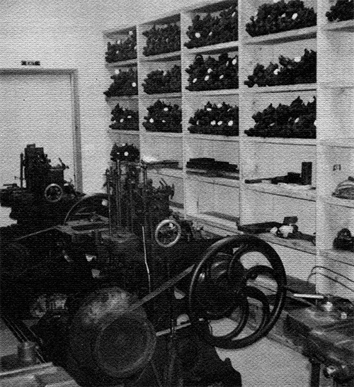
Symbol of a proud manufacturing
organization thrown amidst the
rubble of the foundry.
Apparently he was the only person within the
company concerned about the future of the
equipment, matrices, and "tradition" of ATF.
Theo had made it his business to try to keep
abreast of events at the foundry from various
perspectives, including Kingsley corporate
shenanigans in California, relations with the
Purepac company (ATF's landlord), and indeed,
with George Gasparik, the long-reigning,
cantankerous general manager. Kingsley made an
effort to move selecl: pieces of equipment to
California prior to declaration of bankruptcy,
but either the landlord or bank officials
halted the effort.
The landlord, obviously upset about delays
caused by the bankruptcy and the prospect of
never being reimbursed for many months of
unpaid rent, moved in on the foundry right
after it was closed, taking over the entire
forward area originally occupied by ATF
offices, randomly dumping filing cabinets,
desks, and other office equipment into the
aisles of the foundry and into the bathrooms,
completely blocking access to many areas.
Once this was discovered, the trustee took
legal steps to get the encroachment stopped,
but an extensive renovation project was
clearly visible (definitely off-limits) to
those attending the sale. Theo was in close
contact with all parties, trying to preserve
as much as possible. At one juncture, he
discovered absolutely no security at the
abandoned facility, and found that vandals had
entered and trashed one area, which included
the specimen book collection.
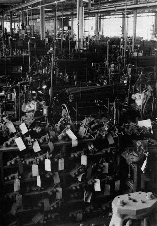
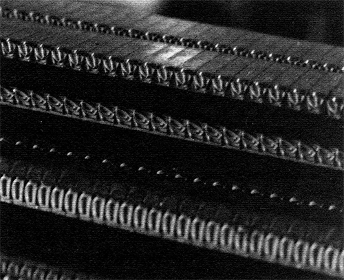
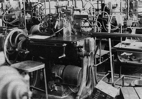
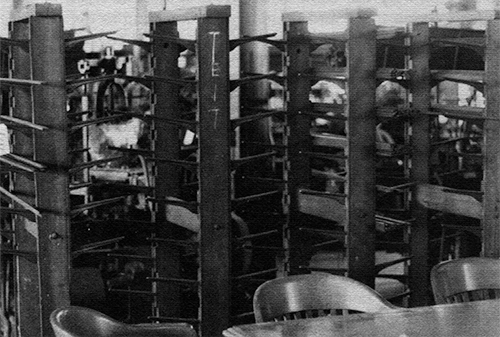
The Barth casting area with pivotal molds in the foreground.
Only about a third of the casting facility is shown in this view.
The Trustee's First Notice
The first announcement of trustee action
reflected an inflated appraisal of ATF's
facility and "good will," which had served to
underwrite loans against ATF assets granted to
Kingsley in 1988 totaling $650,000. The
trustee was seeking broad-ranging bids or
proposals from parties on things such as the
various copyrights and patents owned by the
company, the digital type activities (which
were largely botched and ineffeCtive), the
matrix collection, the machinery, and the cast
type on the shelves. This announcement was
sent to only a few persons and those names
apparently were provided by Theo Rehak, whom
the trustee consulted and employed to assist
in the sale—one of the few intelligent moves
made during the entire ordeal.
Hal Sterne of Cincinnati, who a year earlier
had inaugurated a new business called NA
Graphics (which among other things was selling
ATF type), was very interested in acquiring
the finished stock on ATF's shelves. On
receiving the first announcement, he made an
appointment to inventory the stock. When he
arrived, he found all aisles blocked with
materials thrown out of the office area by the
landlord. It was well over 100 degrees in the
closed, lifeless third-floor facility. He was
unable to do more than gaze at the stock from
a distance.
The auction was an on-again, off-again affair
for several weeks. In the midst of all the
turmoil, Stan Nelson and Elizabeth Harris of
the Smithsonian Institution in Washington were
trying to get possession of the foundry's
matrices. Three possibilities existed. First
was transferring all matrices to the
Smithsonian. A second possibility was that
only designated "obsolete" matrices would go
to Washington. And a final, very real
possibility was that no matrices would go to
Washington.
I confess I was greatly disturbed by the
prospects of the entire ATF library going to
the Smithsonian. In my estimation, such a move
would guarantee that all ATF designs would be
kept away from future utilization, and would
totally void anyone's desire to have a Barth
or pivotal typecasting machine from ATF, for
there would be no prospect of having matrices
to use with the machine. A tremendous
collection of largely Victorian faces was
donated to the Smithsonian several years ago
by American Type Founders and to date, no way
has been devised to enable access to these
matrices for even the most limited revival. I
cringed to think this might have happened to
all remaining ATF matrices. But at the same
time, I could only commend the Smithsonian for
pursuing tenuous and treacherous negotiations,
attempting to save the matrices from
destruction.
On-Again, Off-Again "Deals"
In mid-July, a deal was "on," Stan said; the
Smithsonian was to get all the matrices. He
arranged to have skids, packing materials,
etc., delivered to the ATF plant and a group
of volunteers was to be there to get the
wrapping done in preparation for shipment to
Washing-ton. This deal was cancelled literally
within hours of when I was to leave for New
Jersey. The legendary mystery, confusion, and
intrigue in dealing with ATF was far from
dead.
Personnel working at the foundry had shown
only contempt for its irreplaceable holdings.
On more than one occasion in the past, the
thought of selling mats for their value as
junk brass nearly prevailed. During the period
when White Consolidated Industries owned ATF,
George Gasparic had drawn up a lift of some
1,400 drawers of matrices he considered
"obsolete" and pledged to donate them to the
Smithsonian in good time. That transfer never
took place and now the Smithsonian was
feverishly maneuvering to at least get these
mats before the sale.
The Auction Is Announced
A few days later I received word from Theo
that an auction really was going to happen and
he provided a tentative date: Augult 24, 1993.
Then Stan reported another deal was "on."
Under supervision of a representative of the
trustee, he would be allowed to remove only
matrices pledged to the Smithsonian several
years earlier by WCI. Stan and his volunteers
were to be at the foundry to get the work done
at 9 a.m. sharp on August 10th. How and when
it was decided I would be a member of the team
has now escaped me, but when asked, I decided
I'd have to find a way to be there. Never
before, and never again would I have the
chance to actually work in the hallowed halls
of ATF, or get a chance to look at the
operation close-up.
A seven-hour drive on Sunday was uneventful.
My destination was Howell, N.J., and Theo
Rehak's home, where he graciously volunteered
housing and hospitality for me, Dan Carr of
Ashtuelot Village, N.H., Stan Nelson and
Stan's son, Matthew, from Columbia, Md. Under
other circumstances, it would have been
impossible to pull me away from Theo's
phenomenally wellequipped, orderly shop. But
I confess we spent precious little time
allowing Theo to do a "dog-and-pony show"; all
of us were too concerned about what was soon
to happen at ATF. Theo was unable to join us
for the trip to ATF the next day, but he did
all he could to brief us on what we would
encounter. Conversation went far too late that
night, considering the work ahead of us the
next morning.
Stan was the driver. His teenage son, Matthew,
Dan and I were the passengers. Stan had
directions from Theo and much to our delight,
he drove right to the ATF door without a
single wrong turn. Anton, the trustee's
representative, arrived almost the same
instant, and we all began our hassle with
Purepak's tight security, trying to gain
access to the building. Someone in their
organization finally gave the magical command
and we were given temporary ID tags. I was
amused to be labeled "Rik, Smithson Insn."
Next thing I knew, Stan was grabbing the
controls of an ancient freight elevator and
since there was no one to stop us, up we
went, moving from the clean, varnished,
air-conditioned environs of the Purepak
shipping department on the first floor into
the dark, dingy, environs of what was for all
intents, an 19th century factory, on the
third floor—ATF.
Packing Up the Smithsonian Mats
We were eager to explore, yet we knew we had a
job to do, and were at the forbearance of
Anton, whom we all knew would be calling the
shots. Stan led us directly to the matrix
"vaults" and began spreading out the wrapping
paper, tape, and other tools we were to use.
The "vault" term always has been used in
referring to ATF's matrix storage area, but in
reality it was an unrestricted area near the
rear of the very large room. Matrices were
neatly arranged in four waist-high cabinets
each between 30 and 40 feet long and made of
steel. They contained thousands of
half-inch-deep drawers arranged from the floor
up. I hesitate to speculate on the weight
these matrices represented, but ATF obviously
was keenly aware of it, for each cabinet was
strategically placed on an inch-thick steel
plate which spanned from one major reinforced
concrete joist to the next under this
third-floor room.
After brief instructions, Stan left Matthew,
Dan and me to work out how we would go about
packing the drawers. Stan would work directly
with Anton, pulling designated drawers and
stacking them on top of the cabinets. Only a
few minutes of their work revealed just how
much work was ahead for us.
The matrix "vault" area at ATF, complete with auction tags labeling the various
"lots."" That's Stan Nelson barely visible in the background.
Once drawers were pulled, we were to wrap them
in kraft paper, and stack them neatly on wood
pallets for steel banding in preparation for
shipment to Washington. Stan had thoroughly
studied the issue of weight. He'd calculated
the average drawer to contain 12 pounds, and
figured we should pack no more than 162
drawers on a skid. That would bring each to
about a ton. He figured he would need to haul
five tons spread over five skids.
There was a lot of work ahead of us, but we
could not suppress the urge to at least
glance at the goodies we were packing. One
person would comment on a font in hand, and
others would come to gawk.
A veritable history of typefounding in
America was passing through our hands as we
worked. "Drew" from Inland Type Foundry, the
original "Bookman" matrices from the Bruce
foundry. Numerous fonts from Barnhart Brothers
& Spindler. "Cushing" from the Boston Type
Foundry, and "Curtis Post" from MacKellar,
Smiths and Jordan. Each was laid out in its
appropriate drawer, topped with a detailed
inventory sheet telling which foundry it came
from, which mold would need to be used, and
miscellaneous details such as when extra
characters were added, or when a matrix was
replaced or recut.
There also were ornaments—oh, so many
ornaments. I was particularly intrigued with
the 120-point "Colonial Printer" cuts which
have graced so many printers' letterheads over
the years. Included were two variations which
I didn't recall seeing in ATF specimen books.
About 10 a.m., Barbara Henry (of the South
Street Seaport Museum in New York City)
arrived to help as we continued to wrap and
stack the drawers on skids. Only a few years
previously, a special casting of "Scotch
Roman" had been done for her museum and
Barbara wanted to see the matrices. They were
included among those on Stan's list, so
eventually she got her chance. I halted upon
finding the complete "Authors Roman" series
from BB&S. An overflowing case of 12 pt.
Authors Roman purchased in 1952 was the first
non-ATF font of type I'd ever encountered. For
a brief instant, I had the matrices in my
hands used so many years ago to cast that font
of type (which I still have). Dan Carr halted
on finding several drawers containing very
large sizes (72, 96 and 120-point) of what he
exclaimed to be "the ugliest typeface I ever
have seen." I glanced and said it was
"Publicity Gothic" from BB&S. Why I could
recall the name in an instant was beyond me.
Benevolent Overseer
Anton was captivated by our intense interest
in the matrices and with our knowledge of
ATF's history. He was a good listener and
quickly became aware of our desire to see more
of the foundry. He was tolerant of our
wandering away from the matrix area from time
to time in order to get a better look at the
facility. The auctioneer already had tagged
items for the sale, but the sale bill itself
wasn't available. Nevertheless, this short
encounter with the facility helped us brief
others concerning what an enormous, confused
jumble we all would face at the sale. It was
during the solitude of these forays into the
foundry that I was able to take the sill
photos (and a video) until I exhausted my
film/video supply.
Still, we kept to our task and by the end of
the second day, had all matrices for the
Smithsonian Stacked and banded on five skids
ready for pickup later that week. Dan and I
both departed, with very mixed emotions about
what our individual strategies would be when
the sale came. Dan was very seriously
considering not coming at all. "It's just too
much," he said, "and against all logic I find
myself toying with getting mats and a Barth
and a Benton pantograph and I don't think I
can afford either the money or stress of
bidding at the auction."
About Casting Type on the Barth
Theo had done a good job of explaining ATF's
complex facility to us. Apparently some effort
had been made when ATF was first established
in 1892 to create standards for matrix drives,
etc. But as ATF continued to merge in massive
additional foundries, such as BB&S, the effort
was diluted. Machines were moved in to
accommodate specific matrices and drives. And
in succeeding years if those machines didn't
seem adequately utilized, new letter designs
were cut to match the machines and thus, keep
them busy. That's how ATF ended up with
several 18 point machines, for example, with
each being paired off only to specific
matrices. Thus, to effectively cast on a Barth
machine, one would have to acquire the
specific machine designated for calling the
matrices you might also have acquired. And
italics always were cut to a deeper drive than
their roman counterparts.
Eighteen point Baskerville Roman and Italic
would require two separate machines. Theo also
explained that changing a mold on a Barth
caster was a complicated and tedious procedure
that rarely was done. One should not expect to
change the mold on a Barth, he admonished.
With this in mind, I resolved that I would not
bid on Barth casters. Still, I entertained the
idea time and again. A two-ton hulk with such
limited use would not be very practical in my
hobby shop—assuming anything already there
could be considered practical. Instead, I
would concentrate on finding a way to cast
foundry matrices on my Monotype machines, and
Theo counseled me on that matter too. In his
shop he demonstrated the "Hacker Block
Leveler" made by the Vandercook company years
earlier. Originally it had been made for
trimming the base of electrotypes and
sterotypes, but typefounders found the
machine capable of milling the feet of type to
get type to .918". This was important in the
1950's when European type (which was taller
than American type), was being imported to the
U.S. ATF had such a machine for milling the
fonts ATF imported, and I made it my goal to
obtain that machine.
Already having over 200 fonts of foundry
matrices on hand from my acquisitions in
January, 1993, at the Kelsey Company, I busied
myself during my long trip back to West
Virginia mentally working out a plan for a
matrix holder for my Supercaster.
I hardly recall the long trip, for with
haunting intensity, I was going through the
mental ordeal of trying to bring all my
fantasies associated with ATF into perspective
with the practical considerations related to
the sale. Though saving the foundry in its
entirety would be a laudable goal, it was not
physically possible—either for an individual
or a group of individuals. Financial
considerations aside, it simply was too
massive, too complex, and un-deniably
impractical.
Federal bankruptcy auctions apparently are
handled only by sales organizations, and their
experience seems to have little bearing on the
issue. One would have expected an auction
house specializing in graphic arts
liquidations to have been selected, but that
was not the case. The auctioneer hadn't the
foggiest notion of how to seek out interested
parties, and thus, leaned heavily on Theo to
provide names and addresses. This put Theo in
great difficulty, for no single person could
hope to know—or instantly recall—all
prospective buyers. This also precipitated my
feverish effort to complete an ATF Newsletter
containing details of the pending auction.
That was accomplished, though I fear the post
office failed to get most copies out in time.
Time to Go to the Auction
Being a solid eight-hour drive away from
Elizabeth, I was forced to anticipate my
success at the auction, and rent an
appropriately sized U-Haul truck before
departure for the auction. As I bounced down
the highway in that rattling 28-foot aluminum
can, I was haunted by the thought of coming
away from the sale empty-handed, with the
rental cost and all that discomfort going for
naught.
I was to drive to Allentown, Pa.,
where I would rally with Dave Peat and Dave
Churchman, who would be traveling together
from Indianapolis. I spotted Dave Peat's
distinctive "typenut" license plate as I
rolled along Interstate 78 near Harrisburg,
but unable to rouse his attention, opted just
to follow him the last harrowing 70 miles to
Allentown. The highway is one of several
designated by Pennsylvania as an Interstate,
though it isn't built to Interstate standards
and the heavy night-time truck traffic on this
direct-to-New York corridor was feverish,
moving at speeds far above the legal limit. My
only option was to "go with the flow" though
it was quite uncomfortable in the unfamiliar
surroundings of the U-Haul.
We rallied as planned at Allentown, and spent
a few hours discussing the next day. Dave Peat
would lead in his van because he had a map
reader (Dave Churchman). I would follow in the
U-Haul. We crossed stretches of the Garden
State Parkway we discovered restricted "no
trucks." No alternate route was known, so we
gambled (and weren't stopped).
"A bitchy matron was sitting at the top of the
stairs, handing out lists of the 714 lots
along with equal doses of heartburn. After
much yelling and cursing, we all got
registered and were issued a bid number.
Little were we to know that this was the
kindest encounter we were to have with the
auctioneer and his Staff."
Dave Churchman
In Elizabeth, we found that Elmora Avenue
circled the whole town and was a major artery.
Though Dave Peat and I both had visited ATF
previously, we were disgusted with ourselves
at not being able to locate such a large
building. An hour later, we finally found it
and were delighted to see parking facilities
had been set aside for auction attendees.
Quickly inside, familiar faces greeted us from
all corners. It was a veritable meeting of the
American Typecasting Fellowship. Everyone
wanted to visit, but we also were aware we'd
need every minute available if we were to
delve into what actually was contained in the
714 designated lots.
The "Viewing"
Pausing, looking out over the immense, quiet
foundry, dual emotions haunted all of those
who had reverence for this longstanding giant
"It was a case of sensory overload and a mild
depression, knowing that by the morrow it
would all be broken up and hauled away."
Dave Churchman
of a typefoundry. First was the feeling of
disbelief that we were actually within the
facility, freely wandering around, looking
into drawers, fiddling with machines, and
peering into the workings of an organization
we'd revered from afar. In many instances,
we'd spent much of our adult lives poring over
ATF catalogs, fondling ATF types, and
fantasizing over somehow gaining a more
intimate relationship with the people, the
tools, and the equipment that had become so
important to US.
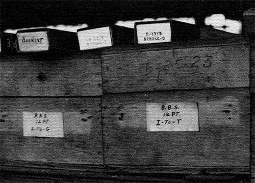
Plainly labeled BB&S implements found on a shelf,
carrying the date 6-25-23.
All were astonished that so much of the
foundry still existed, yet we were stunned by
the chaos we discovered. Bankruptcy papers put
the room's size at so,000 square feet, and
every square foot was thoroughly occupied. The
foundry had suffered immense abuse and neglect
in its final years. Copies of ATF's film about
typemaking were thrown irreverently in the
corner of a junky cabinet. Dave Churchman
found a matrix ATF had cut in the 1940's
commemorating printing's 500th anniversary
under trash on the floor in the women's
restroom. Precision tools so essential to
"All I saw was a handful of hopeful bidders
and a long room full of doomed machinery
awaiting the sledge hammer of progress. It
boggled my mind that in 24 hours it would be
little more than a footnote in
history—magnificent technology responsible for
the dissemination of knowledge now sadly
consigned to the dung heap of a scrapyard in
eastern New Jersey."
Dave Churchman
type-making were stashed in drawers, on
shelves, and under litter throughout the
facility.
Some had come from as far as California (Dan
Solo, for example) for this rare opportunity
and it was an overwhelming experience. Who
ever would have thought that he might get the
chance to look into cabinets containing
alignment characters for every font of type
ever manufactured by Barnhart Brothers &
Spindler? Hadn't all that been destroyed in
1929 when the Chicago foundry was closed?
Matrix fonts out of the Keystone foundry still
existing? ATF never lifted them. Weren't
they destroyed when Keystone closed in 1919?
And those fascinating glories about Laurence
Johnson getting matrices for Caslon Old Style
driven from original punches in England around
1858 (so they'd be precise duplicates of the
originals)—those historic matrices surely had
long-ago been replaced. Not so! In all the
instances noted, everything was still on hand.
And the records? Yes, all the records were
there too. But the landlord had brazenly
hauled everything out of the office area,
dumping filing cabinets and boxes of records
from one end of the foundry to the other,
wherever there might be an open corner. A huge
quantity of this material was literally dumped
in the two large ret rooms. Searching there
was an odious task, to say the least, for
commode facilities nearly all were inoperable
and filled to overflowing. So much history
about personalities, about designs, about
designers, and about the innerworkings of the
foundry was uncaringly thrown asunder.
Hired guards hung over us as if we all were
criminals, yet failed to detect pilfering
(surely not at the hands of any typecasters!)
in many lots. Fortunately, they kept a good
eye on the matrix collection—until things got
completely out of control when the sale was
over.
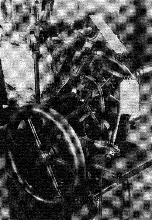
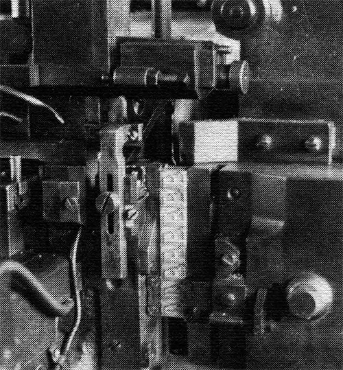
Pivotal caster up close.
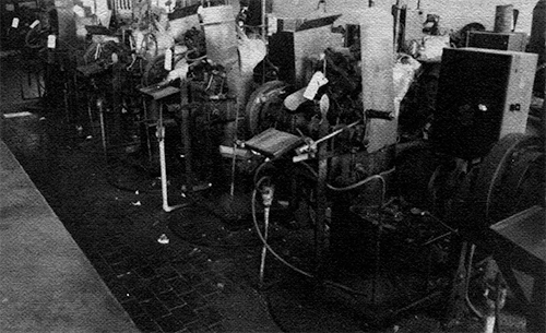
A row of Pivotal casters.
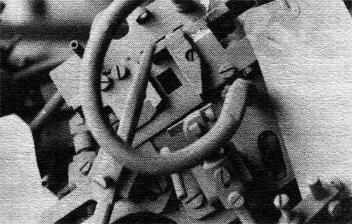
Shelves of molds for Pivotal casters.
A mold close-up (it's not out of focus—it's covered with a very heavy layer of dirt).
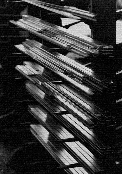
Type always was delivered from the Barth caster onto long
"sticks" which were piled onto racks for eventual delivery to
the dividing department where packaged fonts would be
assembled. These many sticks filled with Park Avenue and
News Gothic Condensed (enlargement above, full rack below) were doomed never to reach the fonting stage.
McGrew's Book—A Vital Reference
"I simply must get hold of myself and quit
being distracted," I said to myself as I
returned to the auction bill and tried to
give greater identity to the lots which
intereSted me. "What's really in this one
labeled Piranesi?" Though I had prepared lifts
of ATF matrix holdings from Mac McGrew's book,
and had made serious study of the auction bill
which I received prior to going to Elizabeth,
the research helped little in coming to grips
with how things were broken into lots, and
where various lots might be located. By late
afternoon, I had scrawled notes on dozens of
pages—dumb Stuff like "don't miss lot 457,"
and intelligent things like "forget 345—the
machine is cannibalized." I knew even cursory
study of the lots would be impossible as the
sale would unfold the next day, so I would
make sense of all my notes at the motel that
evening. For now, I'd concentrate on studying
the lots as well as I could.
It was impossible. Specimen books were in desk
drawers. Cabinets filled with trash also
contained select tools. Finished fonts were
concentrated in three separate areas, but
scattered elsewhere too. Two of these
locations weren't identified on the sale bill.
Who could possibly know which of over 100
machines was still functional, or where the
required components might be? Theo Rehak was
our only clue, and he tried valiantly to help
us all—individually—to make some sense of this
bewildering jumble of trash and treasure.
Simply Not Enough Time
A single day simply wasn't enough for anyone
to grasp the extent of the holdings, or to map
out any logical plan for acquisition or
preservation. Astonishment at what we were
seeing, coupled with bewilderment about the
pending sale turned us into zombies, wandering
aimlessly as we stared glassy-eyed at the
immense facility. Against this setting loomed
the menacing reality of auctioneer flunkies
shouting threats of bodily harm if we didn't
leave the place. Inspection time was over.
"Come back tomorrow with your cash money in
hand," they snarled. "We're 'gonna sell all
this Stuff even if it takes us 'til midnight."
Slowly, we moved away, turning our backs on a
newly discovered yet long-cherished friend. We
went back to our motel rooms to ponder what
was to happen the next day. The few hours
remaining would be consumed by last-ditch
efforts to correlate hastily written personal
notes with a confusing, imprecise, and
arbitrary arranged list of auction "lots"
provided by the auctioneer.
Sale Day Agony Begins Early
The sale was to begin at 10 a.m., August 24,
and the doors would open at 9. With a
tenseness of anticipation, nerves and muscles
tight, and sweat on the brow, folks began to
line up at 8 for their first taste of what
would be devastating bombardment of abuse and
mockery at the hands of the auctioneer and his
crew. Never mind that we'd not slept that
night because of anxiety over the sale. Never
mind we had spent every waking moment checking
and doublechecking the sale bill, trying to
glean more information about the lots, and how
the sale might be conducted. "Get your face
outta' here and don't come back 'til we tell
'ya." They weren't going to open until 9 a.m.
regardless of how many people were standing in
line.
Filing into ATF that morning was a somber,
silent, extremely tense and anxious group of
devotees, intermixed with junk dealers and
their cronies, joshing with each other about
their misbegotten ancestors and boastings of
their sexual conquests the night before. It
was these individuals whom the auctioneer
knew, and it was their relationship with him
that set the disastrous tempo for the day.
The auctioneer never had a hint that the
occasion was anything more than the sale of a
dismal, overwhelming bunch of junk.
Virtually every aspect of the sale was
arbitrary, clumsy, and above all else,
offensive. The metaphor of a bull in a china
shop is not at all out of place. The
auctioneer knew nothing about what he was
selling, and one could only wonder whether he
knew anything about auctioneering. He caused
massive confusion as he very arbitrarily
established procedures, then changed, and
changed again. The lots were described
wrongly, and since he was ignorant of
everything in the plant, the auctioneer
repeatedly referred to his lots
incorrectly—inconsistent even with the
confusing sale bill. Those who dared to ask
questions received only one clear answer.
"We're in charge. Got that?" We haven't the
foggiest notion of what we're doing, but we're
in charge!
In piteous bureaucratic ineptitude, the
federal bankruptcy court restricted selection
to an "approved" auctioneer—one who apparently
had bought the sacred privilege in high-level
New Jersey shenanigans. His contempt for the
bankrupt company, and everyone associated with
the sale, especially potential buyers, was
crystal clear. The arrogance of the father-son
auctioneer team was exceeded only by their
manifest incompetence.
"The auctioneer—a father-son team from
hell—was loud, bellicose, rude, antagonistic,
overbearing, boorish and not very bright.
While he had a loudspeaker that would peel
paint from walls, he would brook no
conversation when doing his spiel. Every other
word from his mouth was `sshh' and if buyers
continued to talk and not pay attention to him
(or his loutish father), he would become
apoplectic and threaten expulsion for the next
miscreant who opened his yap. Chuck Klensch
was kicked out for talking to me during the
middle part of the sale."
Dave Churchman
We knew what we were in for when, realizing he
had not assigned a lot number to the thousands
of documents contained in the facility, the
auctioneer decided to sell them all—as one
lot—at the beginning of the sale. He
admonished, "Just the contents. The cabinets,
desks, safes and filing cabinets will be sold
separately and if you win the bid, you must
remove everything from the containers
immediately." Mission impossible had just been
described. No one dared offer a bid.
When he didn't think things were moving
quickly enough, the auctioneer would throw two
or more lots together, constantly admonishing
all bidders that they were responsible for
removing everything they were winning. "I want
the mat facing machine. I don't want the two
other machines you just threw in with it," I
pleaded. "Take them all or quit bidding," was
his retort. Such antics surely reduced the
bounty significantly, and caused both
"saviors" and "vultures" alike great disgust
and profound grief. Jack Boggs, a metals
dealer from Ohio who attends several auctions
across the country every week, boiled with
anger saying he'd never before attended such a
poorly run affair. His records of successful
bids differed with those of the "official
record" and when he demanded to hear the
audiotape of the sale (required by law), they
insisted there was none.
"When hollered at by the crowd," notes Dave
Churchman, who described attendees as quiet,
orderly, and moderately competitive, "he
cursed them and said that he was responsible
only to the trustee and not to the buyers. His
inartful disdain for us and what he was doing
was pathetically apparent. One of his minions
confided to some of the malcontents that at
one auction his buyers had revolted, one
grabbing the microphone and threatening to
shove it where the sun didn't shine if there
was any more verbal abuse. I would love to
have seen this happen at the ATF sale."
Greg Walters describes two of many problems
relating to how the sale was organized.
Clumsy, Impractical Lots
"The sale of quills for the Benton pantographs
is a typical example. An engraving machine
needs at least three quills—the cylinders
which hold the cutting tool. The auctioneer
had rounded up all the quills and put them in
one lot, even though there were six machines
which use the quills. We were faced with one
lot, which everyone needed...
Park Avenue and Murray Hill designs top the huge pile of
patterns in the massive "heap" described by Greg Walters.
"Engraving patterns: again the auctioneer did
a great disservice to our community of casters
and historians. They put most of the patterns
in one lot. It is difficult to gauge the
weight of the lot, but I did a rough
calculation and guessed at 18,000 pounds. If
the guess is accurate, then a mixed metal
price of 10 cents a pound would total $1,800.
This is a major investment for someone like
you or me. It is a pittance to a scrap dealer,
so the bottom line was that only scrap dealers
were involved in the bidding. The winning bid
was $2,100 by a loathsome scrap dealer known
as John. He promptly began selling the
patterns for $2.00 each, and a pattern weighs
about one pound. Had the auctioneers broken
this one big lot into a few smaller ones,
others might have offered bids. Had the
auctioneers allowed people to buy patterns for
$1.00 each on inspection day, they could have
sold many hundred. As it was, the court and
creditors got the lowest price possible, the
collectors paid the highest price possible.
The only one making money was John."
Bids on Casting Machines
Every typecasting machine was marked as an
individual lot and that's how the bidding
started. Greg took the very first antique
pivotal caster for $50.00, but there were far
more machines than bidders. Junkman John took
most for $5.00 each and bidding changed as the
auctioneer began seeking "per machine" bids
for entire rows, with the winning bidder then
being able to name the casters he wanted. The
balance of the casters then went to the junk
dealers. Of course all the pivotal molds were
thrown together into three lots, with no one
having a clear knowledge of which mold went
with which machine. Fortunately, all molds
were purchased by either the Smithsonian,
Theo or Greg.
One of the Benton pantographs, so vital to the development
of typography and typesetting in the twentieth century,
stands stripped of its essential tools, awaiting the auction.
One Barth caster—over 100 were
included in the sale—amidst a snarl
of water, air and electrical connections
so prominent throughout
the foundry area.
Above are last-remaining
casts in the delivery
channel of the 96-point machine.
Regarding the Barth casters, Greg reports that
of the 96 lined, 67 went to junkman John for
$10.00 each. Greg bought six for $20 to $25
each, and Theo Rehak bought 17 at prices from
$20 to $50. The only other purchaser was
Kingsley, which bought six machines which had
been used to can zinc type, and paid $100.00
for each machine.
In the matrix department, things weren't
arranged in a manner pleasing to the junk
dealers. At least in theory, they were listed
by family and some choice families had 40
drawers, which would need at least $120 to
reach the scrap dealer's price range of from
$3.00 to $5.00 per drawer. After most choice
fonts were sold, junkers prevailed and bidding
was switched from "per lot" to "per drawer."
This tripped up my fragile mental presence and
caused me to pull out of bidding prematurely,
simply because I couldn't do the necessary
recalculation to determine where I was with my
budget. As it turned out, I stopped far short
of my allotted money supply, and many fonts
went to the junk heap which I could have
saved, had the auctioneer not tripped me up by
his change in procedure midway through selling
the mats.
How did we fare against the scrap dealers?
Greg kept far better records than I, and has
concluded that the scrap dealers only took
about 25% of the desirable fonts, but in the
volume fonts, scrappers took 78% of the
matrices. Of the approximate 9,600 drawers,
8,439 went to scrap dealers, meaning only
about 14% of the matrices was saved.
Specimen books were locked in glass cabinets,
and sold by the cabinet rather than by the
book. As with the engraving patterns, this
took many individuals out of the sale, with
grouped books bringing far less money than
they could have brought if sold individually.
Their condition and identity couldn't be
easily discerned through the glass cases.
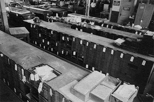
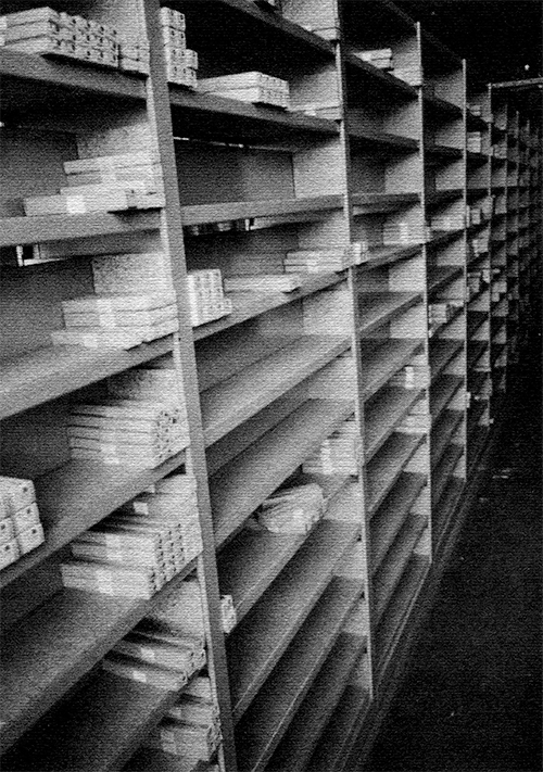
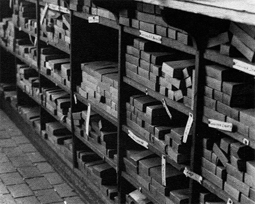
Sparsely occupied shelves in the enormous section of the
foundry devoted to storage of finished fonts, this area was
accessible during the auction, thanks to an extensive cleanup
effort by the auction crew. Can you imagine how fully these
shelves muff have been filled back in the 1930's and 40's?
Fortunately, NA Graphics acquired all caf1 flock which
remained at the foundry.
Hal Sterne and Tom Bell of NA Graphics
submitted an $11,000 bid covering most of
the finished, packaged type in the facility.
As Greg observed, this turned out to be one of
those rare instances in which scrapmen were
beat.
Staying with the auctioneer was a horrible
strain on one's nerves because of his
offensive behavior, and the screeching blast
of what had to be the worst amplification
system ever conceived. Several of us
suggested it was unnecessary, but you
"One of my worn memories is of the auctioneer
being pulled through the place in his aluminum
chariot, like Nero through the Forum, whilst
the blaring P.A. system was propelling his
shrill and hissing sarcasms into our withering
ears. Such was the ultimate example of the
defilement of a hallowed place. I felt it was
a very special site to those of us who revere
not Gasparik and his latter-day Stalinesque
cliques of flunkies, but those who came before
and created a manufactory of the finest types
in the world."
Theo Rehak
couldn't convince the warrior that he didn't
need his armour. I stepped away on several
occasions simply to regain my composure and
give my ears a rest, and know I missed items I
had planned to bid on. Fatigue was setting in
and rather than concentrating on what was yet
ahead, many of us admit to becoming troubled
by the prospest of moving our equipment out of
the facility.
"Give Me Your Money Now!"
To say procedures were clumsy is an
understatement. Soon as an individual won a
bid, a cash deposit was demanded and the sale
was delayed until the money was forthcoming.
Some of us had preapproved checks, but a large
portion of the sale was in cash money and the
auctioneer dismissed as "ridiculous" requests
from many that receipts for their cash be
given. Further, the auctioneer did his own
clerking, meaning his hastily scribbled notes
were the only record to document the bids and
the bidders. Worse still, as Dave Churchman
notes (Dave's been in charge of several
auctions and attended hundreds), "he was
looking at his paperwork and not the bidders
and thus missed many earnest bids from
frustrated buyers." When the sale ended at
4 p.m. (far ahead of the midnight deadline
threatened the previous day), some of us got
the message they were closing down and we had
to leave. Others were told they could remain
and settle their bills immediately.
Your Word Again Theirs
Of course, most of us kept notes on our own
bids, but as Jack Boggs discovered, it was
your word against the auctioneer's. In that
way, Jack's bids were recorded higher, in some
instances, than the winning bid. When I
settled up, I was listed as having won three
lots I didn't even participate in, and there
were other discrepancies too. But their bottom
line and mine were within $75.00, so I decided
not to argue. My principal concern was getting
my mats safely tucked away before the junk
dealers began their wholesale assault on the
drawers.
Chaotic Clear-Out Begins
When we arrived back the next morning, we were
forced to stand in one intermingled line. Some
of us were lined up to settle our accounts,
while others were waiting to have an
auctioneer representative assigned to them so
they could go through the facility, claiming
their lots. The idea may have been good, but
my immediate observation was that the junk
dealers were running freely through the
facility, while I was being closely
supervised. Many other typecasters came to the
same conclusion and the auctioneer's flunkies
soon became totally baffled by our cooperative
spirit, working on each other's equipment when
needed. I gave one matrix milling machine to
Ed Rayher and another to Theo. I stripped
another off its stand, realizing there was no
way possible for the auctioneer to identify as
mine remnants which I opted to abandon. In the
meantime, Dave Peat was helping by
disassembling another machine for me. My
"supervisor" was more than eager to take off
my hands the few matrix drawers I had won in
"lot" bids which I really didn't want, and
this gesture gained me added freedom in
breaking loose from him and getting things
done. It was a frantic rush to get my lots
assembled and wait my turn for the single
elevator designated to get stuff out of the
building.
The mad rush didn't end with the elevator.
Downstairs at the loading dock, the Purepac
people were trying to maintain order, but
there was simply too much demand. Most of us
brought moving equipment, but not even a
simple dock plate was available to us and
thus, many outrageous deals had to be struck
to get forklifts (from Junkman John) to move
things from the dock to our vehicles. It was a
hectic process of riding the elevator, trying
to get your truck to the dock, and then
rushing around the building and up long
flights of stairs to continue the ordeal. My
throat was dry, I was sweating profusely (it
was in the 90's), and filthy beyond belief. I
must have been looking pale too, for others
stopped me and asked if I was OK. Frankly, my
heart was pounding. Like everyone else, I was
working against all sorts of obstacles and
time seemed to be the biggest of all.
Greg Spills About 6,000 Mats
On one of my many trips into the parking lot,
I came across Greg Walters, who had just
spilled an entire handtruck loaded with
matrices. By his estimation, he'd spilled at
least 6,000 mats, and there he was, kneeling
in the sun-baked parking lot trying to pick
them up. I paused and offered condolences, but
knew if I didn't get back to my unprotected
stuff upstairs, it surely would disappear.
Further, I simply had to get checked out,
loaded and out that day, and the only
certainty was that the foundry would be locked
up at 4:30. Fortunate for me, Stan Nelson and
his Smithsonian associate, Larry Jones,
weren't working on such a tight schedule; they
helped me in so many ways, including slicking
around after the foundry was closed, to help
get my stuff onto my U-Haul once I finally got
access to the loading dock.
Theo, Steve Heaver, Ed Rayher, Dan Carr, Dave
Peat, Dave Churchman and so many others gave
me a hand at one time or another. Greg and
Theo, especially, were working with their
riggers in assessing how things would be moved
out. Folks were rushing in all directions, and
in the midst of it all, Junkman John was doing
deals and (though no one could prove it)
causing things to disappear. Fortunately,
those who didn't have large lots to claim were
able to haggle with him, and thus were able to
acquire things they really wanted but were
unable to bid on because of the processes
used. The only factor which made the situation
bearable was the fascinating and wonderfully
cooperative spirit among those of us who have
assigned ourselves the task of saving
typecasting for the future. Borrowed tools,
lent jacks, extra hands to ease heavy
equipment onto skids, sharing and splitting up
of oversize lots all took place in a friendly
atmosphere which absolutely baffled the
auction crew.
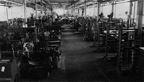
Additional views of the foundry. Above is a
second view of the Barth caller area looking toward
Elmora Avenue. Over 120 casters lined both sides of
the aisle, which extended all the way through the
foundry.
Additional views of the foundry.
Several racks designed to hold
numerous "flicks" of type coming direEl from the
caller. Moll, as you see, remained unused in the
latter years of the foundry though in earlier years, there
often was a shortage of flicks.
Additional views of the foundry.
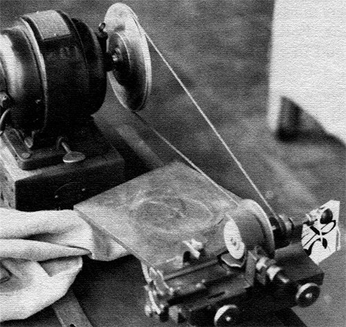
One of
several specialized tools devised at ATF over the
years. This one was used to prepare the engraving
quills used with the Benton Pantograph, which was
used either to engrave punches, or directly engrave
matrices.
Additional views of the foundry.
A cabinet located midway
through the foundry, found to contain packaged type
probably made (and forgotten) in the r93o's or
r94o's. Note, too, the endgrain woodblock floor
which was found throughout the huge foundry facility.
My Last Farewell
I pulled away from ATF for the last time about
5:30 p.m. August 25. An overriding
consideration all through the sale was fear of
acquiring too much weight to safety carry in
my U-Haul, but everything fit on the truck
easily, and I probably could have carried
another ton at least. Greg Walters wasn't as
lucky. He had to abandon Barth carers simply
because his rigger couldn't handle the added
weight (he hauled about 60,000 pounds). I
returned to the motel a few miles away where
several of us had stayed during the ordeal.
Stan, Larry and I got together for dinner, but
many others already had departed. I left the
next morning at 6, knowing I had to be back at
the office before the end of work that day.
Those with larger lots were forced to remain
longer and reports from both Theo and Greg
indicate matters got completely out of hand,
with Junkman John demolishing Barth caters
that didn't even belong to him; much other
equipment simply disappeared. There was
precious little time available for orderly
removal, and tension was intensified by the
fear of having equipment destroyed or stolen
before it could be moved out. Though in theory
everything in the plant had been sold, the
trustee ended up paying $17,000 for removal of
abandoned materials and general cleanup of the
room after everyone had gone.
A Dismal Failure
By financial measures, the sale was a dismal
failure. The Alan Atkins Appraisal Corp. had
placed a "forced sale value" on the foundry at
$149,484. Gross sale proceeds were $77,863.
Charged against this were costs for the
auctioneer, trustee, legal counsel, the
appraiser, miscellaneous expenses and final
cleanup costs. All this left net proceeds at
approximately $26,000—not even enough to pay
the salary of one highly skilled employee for
a year.
Those of us who bought matrices and equipment
tended to perceive our lots in relation to the
overwhelming size of the facility, concluding
that most of the foundry was lost. But in
succeeding months, as we have shared our
inventories, our conclusions have proven
premature.
As Theo has noted, despite "the heat of the
moment, the hostile environment, and with
little time (we would have needed a month at
least to do it right), still the essence of
ATF has been saved. The right people saved the
best of the faces and thus, the ability to
make foundry type is till on the planet. God
gives us what we need, not always what we
want."
Did It Have to Happen?
Obviously, Kingsley/ATF filed for bankruptcy
and that set off the chain of events which
ended the 101-year history of American Type
Founders. Legal terms such as secured
creditors, unpaid rent, and abandonment of
property all would suggest the foundry
couldn't possibly have survived. Perhaps not.
Theo Rehak indicates that Chapter 7
reorganization on the part of Kingsley
Machines, Hollywood, Calif., precipitated
ATF's demise. Obviously, the folks in
California didn't attend to ATF's financial
concerns with much interest. When filing for
bankruptcy, they claimed no secured debtors.
Yet the trustee found two the National State
Bank in Elizabeth, and the New Jersey Economic
Development Authority. These two organizations
had loaned Kingsley/ATF $650,000 in 1988.
Curiously, both debts were personally
guaranteed by a principal member of the
Kingsley organization, Michael J. Rawson.
Remarkably, ATF had made significant payback
on these two loans to where, only six years
after taking out the loans, jut $182,000 still
was owed. The fact that the rent hadn't been
paid since March of 1991 would suggest that
ATF was in deep trouble. But other figures
suggest inattention perhaps was the culprit.
With such a significant payback already
accomplished, one can hardly avoid the
speculation that ATF, under proper management,
could still be alive today. The world market
for type, perhaps, has not totally
disappeared.
3
By accident, the morning of the auction, I
discovered a cabinet in a corner near the
matrix collection, which contained many
matrices for cored ornaments and all the
Caslon swash caps from 84 to 120 point. Those
mats I wanted, but tied with this cabinet in
the same lot was another cabinet and a desk. I
won the lot, so I had to take it all.
The desk and cabinet provide clear evidence
that (a) ATF had a long and interesting past
including much involvement in evolving
technology for a while, and (b) that
everything in the foundry was hopelessly mixed
up.
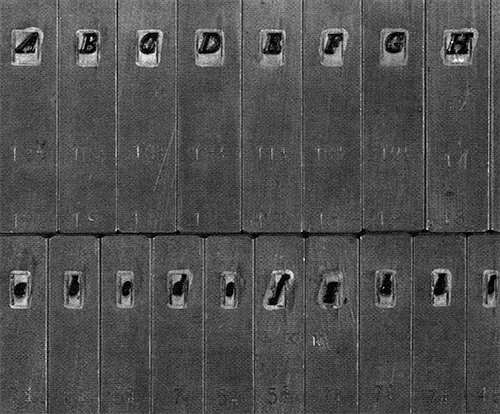
Some of the items retrieved: Six chemical
cartridges for filtering out sulphur dioxide
via a breathing apparatus—apparently something
used back when ATF was busy electroplating
matrices. In the same drawer, a bunch of
triangular type mold components carrying the H
(Hansen Type Foundry) pinmark, one of the
original foundries that merged in 1892 to form
ATF. They appear to be parts of an angle-body
mold.
Both a promotional booklet and a plastic line
gauge depicted the ATF Typesetter: “a
photomechanical system for text composition 5
to 14-point in lines up to 7½ inches wide.”
The system was introduced in the late 1950s or
early 1960s, as I recall; it produced
extremely high-quality work. In appearance, it
resembled the Friden Justowriter and had two
units. One was used for punching paper tape,
and a second was a photocomposition unit,
working from a spinning disk not too unlike
the old Varityper disk used for galleys of
display type. Why didn’t ATF’s system catch
on? Probably, it was poor marketing.
Other items reminded me of ATF’s involvement
in more recent technology: a handful of litho
plate erasers with ATF stamped on the side;
three bundles of 4"x4" cotton pads for offset
press cleanup, clearly marked ATF on the side.
Also present: a catalog of “ATF Spectype,” dry
transfer lettering made to match ATF foundry
type. The product resembles Formatt and other
more recent products. ATF apparently had a
good product but again had little marketing
success.
Though ATF acquired most of what remained of
Lanston Monotype, Theo Rehak says they did a
“purge” of the plant in recent years to rid it
of all materials related to Lanston Monotype.
They weren’t totally successful, for the desk
contained a Lanston leaflet plus two orphaned
matrices.
In a drawer was a font of 8 pt. Univers
figures “manufactured for ATF by Deberny &
Peignot, Paris.” ATF dabbled in the type
importing business, but that fact was little
known to many users of type.
Two specialty type products appeared in the
cabinet. One was a font labeled 12/14 Kimball
Sero, a font which had a special flange near
the foot of each letter, obviously made to
hold it in a stamping machine. Another item I
speculate to have greater historic interest:
it was a pied package of sort lines of
multi-nicked 8-point characters. Each letter
carried a different nicking combination, and I
speculate the type was made many, many years
earlier for use in a Unitype machine (or
something similar) which featured automatic
type distribution by means of special nicking
on the bodies. Also found: 12 sort lines of
6-on-4 Lightline Gothic—this 4-point type is
the smallest in my shop (though I do own a
3-point Monotype mold).
Also there: alignment proofs for 42-point
Americana Extra Bold, dated May 7, 1970; and
alignment proofs for 42-point Brush, dated
March 3, 1942; and two quarts of hydraulic
oil!
How would you have liked the job of
straightening out the entire
500,000-square-foot facility?3
Trial proof of 42-pt. Americana Extra Bold, dated
May 7, 1970, found in the desk drawer.
Note Martin Speckter's interrobang (?! combined)
was included in this font. Sadly, it has not carried forth
One of the great rewards of being a
participant in the auction at American Type
Founders was the opportunity to acquire some
of the tools and implements of typefounding,
found scattered through the plant like leaves
after an autumn windstorm.
Thanks to sharing on the part of several
“kindred souls” who won lots at the auction, I
was lucky enough to acquire several tools,
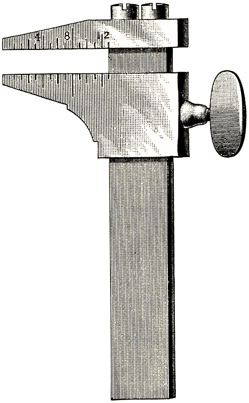
including a type gauge as depicted here, with
the illustration being taken out of Theodore
DeVinne’s book The Practice of Typography,
first printed in 1902.
DeVinne suggests it’s an implement for
measuring type, but doesn’t explain how it
works. The tool first landed in my drawer of
“nifty treasures from ATF,” but since I pulled
it out and used it the first time, it has
taken a permanent place on the work tray of my
typecaster. Remarkable in its simplicity, it’s
a measuring tool which I now find
indispensable, especially when casting
repetitive border elements which require such
absolute consistency in casting.
How it works: You start with a piece of type
you know to be precisely accurate. If calling
an 18x18 piece, for example, you know your
body size is fixed at 18 points, so you set
the tool on that fixed dimension. The two jaws
of the gauge are virtually parallel, but not
quite. There’s a taper of approximately one
ten-thousandth from outer end to inner edge,
and when setting up, the piece of type being
used as a standard should fit snug at the
center point of the jaws. Once locked with the
thumb-screw, the variable dimension—the
18-point width—can be checked in an instant.
You don’t even need to look at your type to
test it and know instantly whether it’s too
wide or too narrow.
Though this illustration is from a book published in 1902, it's
an accurate depiction of the type measuring tool from ATF.
Successfully reading a micrometer requires
concentration; accuracy hinges on whether you
close it loosely or snugly against the cast
type each time you measure. But using the type
gauge simply requires fitting the new letter
between the set jaws. If it passes all the way
to the inner edge, the letter isn’t wide
enough. If it barely fits, it’s too wide. If
it becomes snug at the center line, then your
cast letter is right on the money in set
width.
Using the gauge is so hassle-free the caster
is much more likely to use it frequently and
thus detect minor variations in set width long
before it becomes troublesome. Variations in
mold temperature will change the size of the
type quickly, and the variations will be far
beyond acceptable tolerances. Such variations
are instantly detected with a type gauge.
How I was able to cast type for over 20 years
without this nifty device is beyond me. The
saint who went before—the man who made this
gauge for “ATF Foundry No. 2” (St. Louis)—so
many years ago hopefully will rest well
knowing his tool is of inestimable value even
in 1994 to this struggling typecaster.
3
The Barth Was One Reason for ATF's Quality But Matrices Also Played a Crucial Role
Richard L. Hopkins
It’s undeniable: I have a long-standing
romance with the physical aspects of type. I
love to see and feel the impression of metal
types into fine paper. I also love to fondle
type itself—smooth, flawless bodies,
well-defined feet, nicks, smooth beards, clean
counters. On goes my list of terms describing
well-made type.
Having cast type myself on the Monotype for
over 20 years, I’ve personally witnessed all
variations of quality when it comes to type
aspects which simply are not visible to the
person studying a sheet printed from that
type. Stan Nelson has explained how absolutely
lousy the bodies of hand-cast type often
appear, yet if it has a good face, often type
will fulfill its purpose, regardless of how
poorly its body appears.
Personally, I’ve printed from forms made up of
little more than “bird cages,” as Harry Wearn
(our Monotype guru from England) describes
them. These are pieces of type off the caster
which have little more than a face and a
skeleton for a body—mainly hollowness.
With all this zest for type, it shouldn’t be
surprising that I always considered the
product turned out by American Type Founders
was literally head and shoulders above
anything ever produced on Monotype equipment;
ATF types usually combined flawless faces with
smooth, flawless bodies. I had always
attributed this superior appearance to the
Barth caster and its ability to move large
quantities of metal quickly, under great
pressure, with an absolute minimum of trapped
air in the mold cavity.
The brighter inner core of these Caslon 471 matrices is created by chrome plating as an
initial step in electrodepositing matrices. This assured longer life far the matrices, as
well as creating a more superior product!
Never before had it crossed my mind that there
was something else in the equation. That all
changed the first time I cast type on my
Monotype Super Caster using genuine ATF
matrices, acquired when ATF was liquidated in
August 1993.
Suddenly the letters coming out of my caster
looked surprisingly like those I thought could
only be produced on a Barth caster. Suddenly,
I realized ATF matrices themselves were a
critical component in producing superior type.
The deeper drive and near-vertical beards
somehow give more emphasis to the letter form
itself. And since ATF frequently chrome plated
the inner core of its matrices, the letters
seem to release from the mold and take on a
more shiny, smooth appearance.
It still is an unreal feeling when I find
myself casting type from the genuine original.
I’ve fantasized over someday having the full
range of sizes of ATF Caslon 471, for example.
Never did I dream that I would own all the
matrices themselves.
3
A belated, unexpected, and altogether
cherished item from the American Type Founders
auction has come into my hands: three bound
volumes containing copies of many (or all?) of
the early patents assigned to the Lanston
Monotype Machine Company. Dave Peat of
Indianapolis acquired the volumes in a much
larger “lot” of specimen books at the auction
and graciously has allowed the books to come
into my hands.
ATF, you will recall, acquired much of Lanston
Monotype when the company was liquidated in
1969. Later, according to Theo Rehak, ATF
purged its holdings of anything related to
Lanston Monotype, but somehow these volumes
survived.
They begin June 7, 1887, with a patent granted
to Tolbert Lanston for producing justified
lines of type. Therein his unit count system
was detailed. On that same date, Lanston was
granted a patent for a “type forming and
composing machine.” This device was a “cold
metal” machine wherein the types were to be
pressure formed out of lead instead of being
cast. Of course, Lanston later moved to using
molten metal in his typecasting machine.
The design
depicted in
the Bancroft
patent (see
text).
The last patent in volume 3 relates to a
machine for the production of type matrices,
patented August 10, 1915. Thereafter is a
tipped-in sheet referring to a fourth volume;
certainly many other patents were granted, but
copies held by the company have not survived.
The three volumes which do survive give a
welcome resource to researchers attempting to
date certain developments of the machine. For
example, on January 10, 1911, an attachment
for adding leading between cast lines was
patented by a U.S. citizen, Frank Hinman
Pierpont (who was residing in England, perhaps
working with the new English company). The low
quad mold was not developed initially; an
early version was patented April 18, 1911. The
short type mold for casting Multigraph type
was patented April 30, 1912.
The
keyboard in
I900 was arranged
as was the matrix
case-the QWERTY
keyboard came later.
Patents for the peripheral devices used in
manufacturing casters and matrices are
included. A matrix cone-holing machine was
patented April 28, 1914. On November 14, 1911,
a device was patented for applying identifying
markings to type machine (cellular?) matrices.
The company’s first address was in Washington,
D.C. Many early patents were granted to the
Lanston Monotype Machine Co. of Washington,
D.C., with Tolbert Lanston himself as the
inventor. As patents proliferated, Lanston’s
name appeared much less frequently.
The machine which most resembles composition
casters as they evolved was issued to J.
Sellers Bancroft on May 30, 1899, and assigned
to the company which still was in Washington.
This cursory report is provided primarily to
let others know of the existence of these
three volumes and to offer to share them with
anyone seriously interested in documenting the
early history of Lanston Monotype.
3
Wild Suppositions Give Way to Scientific Study: On the Hardness of Type Metal
David W. Peat
Richard L. Hopkins
Dave W. Peat is a long-time type enthusiast
and maintains one of the largest collections
of Victorian type fonts and pre-20th century
type specimen books to be found in private
hands in the United States. He resides at 1225
Carroll White Drive, Indianapolis, Ind. 46219.
For years I have been interested in the
controversy about the wearability of type
versus the composition of its metal. Until
recently, I had no non-destructive method of
investigating, but a “state-of-the-art”
machine became temporarily available to me
which can analyze the composition of alloys.
My study of type metal using this equipment
gives some direct analysis of the many claims
of superior metal once bellowed by type
manufacturers of yesteryear.
Was type metal featuring copper or nickel
something of substance, or was it advertising
hoopla? Or was there really any difference? I
have regarded ATF and Stephenson-Blake as
being manufacturers of the finest type in
terms of hardness and appearance. I now have
attempted to verify that assumption.
Actually, I have done two studies. First was a
study of the composition of type metal alloys.
Secondly, assuming hardness has a direct
relationship to wearability, I studied the
hardness of metal using samples as old as 130
years to type cast relatively recently. My
testing was done with a Wilson Hardness
Checker and an EDAX (Energy Dispersion
Analysis by X-ray) machine.
Type metal is composed primarily of lead, tin,
and antimony. Tin provides hardness and
toughness, whereas antimony prevents the alloy
from shrinking (and therefore becoming less
than “type-high”) upon solidifying in the
casting mold. An interesting phenomenon is
that any mixture of lead and tin, lead and
antimony, or all three melts at a temperature
less than any of its components. An alloy of
87% lead (melting at 620°F) and 13% antimony
(melting at 1,166°F) melts at only 247°F. This
is called the eutectic point. The melting
point of a ternary (three-metal) alloy,
however, is not reliable as a means for
assessing its composition of the metal.
One might wonder why foundry type metal was
not standardized. The simple matter of
economics provides one answer. Tin and
antimony are far more expensive than lead, so
cheaper type could be made by using an alloy
with a higher lead content. Founders also have
alluded to the fact that certain alloys “flow”
better than others, and thus they used
better-flowing alloys for smaller type sizes.
Thus, a single founder might stock more than
one alloy to accommodate casting various
sizes.
It must be pointed out that 100 years ago it
probably was difficult—if not impossible—to
analyze metal. How did a foundry verify its
“melt” when old type from a variety of sources
was the principal source of metal? I don’t
know whether they even tried!
Metal Composition
From the samples I studied, metal makeup
varied significantly:
Avg.
Low
High
Lead
52%
36%
69%
Tin
17%
9%
30%
Antimony
29%
21%
38%
The “Best” Types
Studying type made during the past 30 years,
the following are the best samples. I report
both metal composition and hardness. Three
readings were averaged when checking hardness.
Please note that the hardness of "80" does not
necessarily mean the sample is twice as hard
as one with a reading of "40."
Tin
Anti- mony
Lead
Hard- ness
Dale Guild Foundry
17%
36%
46%
80
Bauer Type Foundry
18%
38%
43%
82
Stephenson- Blake
17%
32%
50%
86
Interestingly, all the above alloys included
about 1% copper.
Considering the older foundries, the best
samples studied were:
Tin
Anti- mony
Lead
Hard- ness
MacKellar, Smiths & Jordan
17%
28%
54%
78
Indiana Type Foundry
25%
38%
36%
83
Boston Type Foundry
26%
37%
36%
87
All these samples also contained about 1%
copper. Although 11 of the 15 samples revealed
copper content of about 1%, only one had
nickel that was Cleveland Type Foundry, not
Keystone, which boasted of a superior nickel
alloy in its advertising.
American Type Founders type seems to have
"softened" since the turn of the century.
Tin
Anti- mony
Lead
Hard- ness
Foundry “E” (Marder- Luse)
31%
36%
34%
87
Foundry “A” (Boston)
23%
33%
44%
80
1966 casting*
15%
29%
56%
44
*I can verify this date for I actually
witnessed the type being cast.
Older Types Were Poorer
Some of the poorest type seems to come from
foundries making type before the introduction
of the point system (about 1880):
Tin
Anti- mony
Lead
Hard- ness
Johnson
15%
30%
55%
27
Conner
17%
32%
51%
33
Unknown (ca.1850)
12%
24%
64%
30
Union (ca.1890)
16%
28%
56%
36
Farmer (ca.1890)
14%
27%
59%
29
Single sample tests can be misleading, for
they might not be representative of the
millions of types cast by a founder over the
years. However, in several cases I analyzed
more than one sample and got very similar
results. For a truly scientific study,
additional samples would be necessary.
Foundry
Number of Samples
Results
Boston
3
All good
M.S.&J.
2
Both good
BB&S
2
Both fair
Cleveland
3
All fair
Cincinnati
2
Both fair
Union
2
Both poor
Farmer
2
Both poor
It would be interesting to make checks
studying the products of more foundries, and
to compare small sizes with large sizes.
Comparing Thompson and Monotype cast type from
different sources also might be revealing.
Type metal alloys from Theo Rehak's book, Practical Typecasting, reviewed [here] in this Newsletter
In Summary
Observation: Generally, the better the
composition (high tin and antimony
percentages) the harder the type. Types cast
before 1890 tested softer; they also had lower
tin and antimony content.
Curiosity: All the Stephenson-Blake type that
I have (perhaps 75 fonts) has a slight coating
of corrosion. I thought metal analysis would
provide an answer for this phenomenon, but it
did not. There was nothing unusual in the
makeup of S-B metal so perhaps there's another
reason. Perhaps they used no protective
coating on their type and exposure to sea air
during shipment to the United States
precipitated the corrosion?
Conclusions: There definitely is measurable
copper in the "best" type. Moreover, there is
a great deal of difference in the composition
and hardness of foundry types. Your comments
are solicited.
3
see PDF version for
Type Metals Product Specifications (Alloys) table
from Theo Rehak's book, Practical Typecasting.
Obviously the Work of a Lifetime: Monumental Type 'Bible' Now Available
Richard L. Hopkins
MacMcGrew’s newly released book, American
Metal Typefaces of the Twentieth Century,
published by Oak Knoll Books and put into
print as a finale to a preliminary edition
released several years ago, puts this
typophile somewhat in a compromising
position. Frankly, Mac’s stolen my thunder!
Heretofore, the massive information contained
therein was to be found only in a piecemeal
fashion (if at all), and was just something
one gained over many, many years of experience
using and studying type and talking with
people who know type.
For example, the late Steve Watts told me
about Repro Script being designed to align
with and match the weight of News Gothic
Condensed and I thought I was the only one in
the world having that fleck of knowledge. So
how’d it get in Mac’s book? Virtually every
page is crammed full of solid information
about type. I have known of Mac’s obsession
with type for at least 25 years, and had a
hint of his meticulous way of filing away
information on the subject. But precisely how
well he was organized, and how exhaustive was
his research—well, it didn’t reveal itself
totally until this edition came into print.
The book is styled with specimens on the
left-hand page and complete discussion of the
specimens on the right-hand page, including
designer, manufacturer, what sizes were made,
who made copies or “forgeries,” dates and
miscellaneous information to absolutely
delight the aficionado. Mac even credits the
many folks who pulled repros of fonts in their
collections right alongside the specimen.
Typical two-page spread (reduced) providing complete alphabet specimens on left-hand page, and extensive background
information on the right-hand page. From the second, revised edition of AMERICAN METAL TYPEfACES OF THE
TWENTIETH CENTURY by Mac R McGrew.
Prior to this edition, the only “bible”
typophiles had to work with was Jaspert, Berry
& Johnson’s Encyclopedia of Type Faces,
published in various editions over the years
and professing to cover the whole world with
regard to type design. Neither its
reproduction quality nor the quality of its
text can hold a candle to Mac’s edition. One
of the most fascinating conversations I ever
had was with the late Mike Mycoff in England
at the ATF Oxford meeting, wherein Mike
expounded on the hundreds and hundreds of
errors in the Encyclopedia. This was somewhat
of a revelation to me, for I had blindly
worshiped the edition and used it as an
unquestioned authority for so many years. Mike
said he even volunteered to help correct some
of the wrongs before a new edition was
published, but the publisher opted to go to
press without making any effort at revision.
Mike, in England, certainly could have been
the European edition of Mac McGrew but,
unfortunately, his death has prevented that
from ever happening.
Our extreme good fortune is that Mac’s goal
was to get the thing done and done right.
Likewise, it is our good fortune that Ben
Lieberman, publisher of the preliminary
edition, urged that such an edition be done,
enabling Mac to integrate additional specimens
and hundreds of revisions into this edition.
In this regard, time has worked to our favor,
for it’s a far better book now than it would
have been five years ago.
This is an edition filled with incidental
information which, as far as this typophile is
concerned, is of tremendous historic value. It
documents a world which simply doesn’t exist
anymore. It’s a tribute to the hundreds of
individuals who made type happen in this
century, and it’s a memorial to everything and
every player who stepped onto the typographic
stage in this century. It comes at an
excellent time, because there are so many
folks dabbling in type on the desktop platform
these days who have the impression it’s all
happened within the past couple of years—that
prior to PostScript and Adobe, simply nothing
existed. Mac’s book will put that notion to
rest in an overwhelming way.
There’s an anonymous quote on the dust jacket:
“This volume belongs in every typographical
library.” I agree enthusiastically. Indeed, I
have used the preliminary edition so very
often in my own pursuits. But having that
edition is a far cry from having the final
edition. You simply must have this edition
because it’s so much more complete, so much
better put together, and is remarkably well
produced, especially with regard to the actual
specimens.
The synopsis of type-making which precedes the
specimens is a very concise, thorough
discussion of the subject and covers all kinds
of matrix manufacture and utilization.
Likewise, the appendices are excellent and
painstakingly accurate. Where else will you
find a complete list of ATF or Ludlow or
Lanston or Mergenthaler fonts?
If you’re a type nut, you must have Mac’s
book. Sized 8 ½ × 11 inches, 376 pages plus 20
introductory pages, the book is available from
Oak Knoll Books, 414 Delaware Street, New
Castle, Delaware 19720. Call them at (302)
328-7232 for pricing and availability.
3
Regarding the level of interest in letterpress
printing in his immediate area, Jim Rimmer of
Vancouver, B.C., is please that in 1994 alone,
he has been able to put five people in touch
with presses and typecasters, which they all
have purchased.
"There is pronounced enthusiasm for the look
of letterpress, possibly brought by the fact
that almost all of the small printers here
'print' on variants of photocopiers,
possessing not even a 1250 Multilith or AB
Dick," Jim says.
There is that type of person—and there always
has been—who can feel the difference instantly
between mass garbage and the grace of good
printing.
Jim continues: "Over the past six months, I
have conducted five workshops in metal
typography and lino cuts. These classes were
sold out the first hour they were announced at
the colleges. I find this re-affirming and
heartwarming. It makes me feel I am not really
so very odd to have 12 tons of stuff in my
basement after all!
3
A Reference Every Typecaster Will Cherish: Long-Awaited Rehak Book is Published
Richard L. Hopkins
The well-organized appearance of Theo Rehak’s
new book, Practical Typecasting, is deceptive
to a fault. All of us who have ever run or
tried to run a typecasting machine know the
really important information is found in
scribbled notes, old photostats of technical
drawings, confiscated letters from technicians
of yesterday, and dirty manuals that long ago
lost their binding.
In his “Afterword,” Theo notes, “We have not
merely arrived at the end of an era...
something of the grandeur of ancient times is
about to be lost.” His book is an excellent
attempt to preserve some truly practical
aspects of our ancient craft for generations
which will, hopefully, follow. Those of us who
carry on at present have had the good fortune
of knowing at least a few old-time craftsmen
who were able to pass along some of their
practical knowledge to us. Opportunity for
such face-to-face acquaintance with
professional typecasters is literally at an
end.
On page 61, Theo alludes to an attitude: “Do
not show the new man anything! He will have
your job soon enough anyway: the less he
knows, the longer you will remain valuable.”
All of us have had such experiences, often
with the craftsmen who used to operate the
machinery we now own. Obviously, they had
some difficulty acquiring the knowledge they
had, and they wanted to make sure we learned
the hard way too—by trial and error. More than
one craftsman I have known was resolute in
withholding his knowledge, even if it meant
carrying it to the grave with him!
Now that American Type Founders is history,
never again will there be opportunity for any
individual to pick, nag, cajole, and otherwise
extract knowledge of the ancient craft from
the few long-time employees of ATF who
remained literally until the foundry’s death.
It’s our collective good fortune that Theo
Rehak devoted 12 years of his life to working
at ATF (an undertaking representing great
sacrifice, and even greater forbearance),
making a valiant (and successful) effort to
learn the trade while there still was an
opportunity. This book documents much of what
he was able to dredge from foggy memories and
neglected (now lost) files. Most of the
technical information presented
matter-of-factly in the appendices and
throughout the text simply is unavailable
anywhere else. It represents thousands and
thousands of hours of research, study, and
experimentation and even if not a single word
in the text had any value, the technical
information is well worth the cost of the
book.
You hear Stan Nelson talk of going back to
Joseph Moxon’s Mechanick Exercises on the
Whole Art of Printing, done in (1683–84), to learn the
process of hand typecasting. A principal
reason is that little practical, revealing,
and useful information has been published in
the interim—until Theo’s book was published.
The ancient apprentice program passed
information from the craftsman to the
neophyte (if he played his cards right). It
simply wasn’t something that was written down,
let alone published.
Diagram showing how the matrix is handled in a pivotal caster, one of many practical
drawings and photographs to be found in Theo Rehak's Practical Typecasting.
What use is Theo’s book? It’s only of passing,
ephemeral interest to the armchair typographer
or person who fantasizes about someday
becoming a typefounder. But if you’re about to
roll up your sleeves and delve into actually
becoming a typefounder, you’ll find Theo’s
book the kind of item quickly soiled and
intently studied, word-for-word, propped open
on the workbench by a hammer or screwdriver.
Literally, it contains essential information,
and along the way, also drops in a bit of
humor, philosophy, and some real-world
experiences worthy of not being repeated.
It’s my personal conviction that doing is the
best way of learning, especially when it comes
to running machines. But it sure is a big help
to have someone standing beside you advising
you, giving you all the formulas, and telling
you the ups and downs of the process. There’s
no way to duplicate the 12 years of intense
study Theo invested in typecasting, but his
book certainly is a laudable effort at
recording the most important information.
Yes, his book indulges the Barth, pivotal, and
other equipment peculiar to American Type
Founders, but two points must be made: (a) the
equipment might be unique, but the process is
common to all typecasting and therefore quite
valuable, and (b) ATF represented the
paramount achievement in mass production of
perhaps the best type made in the world and
certainly any serious student of typecasting
would benefit by knowing as much as possible
about how ATF practiced the trade. And one
also could complain that Theo indulges in
discussion of highly specialized and extremely
rare implements as if they were as common as
lead. But it’s better to know of a tool or
process and seek to replicate that process,
rather than to try to reinvent it totally from
ignorance.
I knew of Theo’s book long before it was
published and I also know much was omitted
simply in an effort to trim the book to an
affordable size. I lament these omissions, but
I praise and strongly recommend that you
acquire your copy now. There’d be no indignity
greater than heading down the trail of
becoming a typecaster sometime in the
future—and not having a copy of Theo’s book to
guide you!
Practical Typecasting by Theo Rehak, published
in 1993 by Oak Knoll Books, New Castle,
Delaware. Call them at (302) 328-7232 for
pricing and availability.
3
We frequently see new typefaces, for
electronic production or for instant
lettering, but new letterpress faces? That's
something different!
I was offered 12-point Littleworth among a
host of other faces by a firm in Bedfordshire.
I examined the Monotype specimen sheet,
decided the face was "different," and bought
it along with half a dozen other fonts. A
second face came with a box of Times bought
from Cambridge University Press which looked
interesting enough to cast, even though only
capitals were available.
Later, I visited Duncan Avery, at Monotype,
and asked for layout sheets (providing
essential tables of character widths and
machine components necessary for composition
casting) for both faces. To both the name
Littleworth and to a drawing of the second
face, Duncan replied, "That's not one of
ours." I assured him they were, for I had the
mats, so he began a search.
Littleworth was found among the specimen
sheets but the only other evidence of its
existence was the production record. This
showed one font of 12-point had been struck in
1929 and sent to the Monotype Printing
Department, and that two fonts of 16-point had
been struck in the early 193o's. Mats and
punches probably were sold at a
rationalization sale in-the 1960's, but the
firm had no idea where they went. I had bought
the only composition font of a very rare face.
The second face is officially known as Latin
Open Face Roman, which I have changed to Acorn
Outline, a name suggested to me when I first
cast it. Duncan found it was not designed as a
jobbing face but for the 4-line Maths Series.
I do not know how it is used, but it is now
available on film and so must still be used
somewhere. The only characters cut are all of
the capitals, five lowercase letters, and the
figure 1. There is also an italic font, which
I do not have, which contains only the
capitals. Printers who have used it say it
makes a good secondary display line on
business stationery.
John Eickhoff a spare-time typefounder,
operates under the name Acorntype. He may be
reached at 28 Honey Hill Road, Kingswood,
Bristol BS15 4HJ, England. Phone 0272-677903
3
Study Program Proposed For Typecasting Aspirants Prefaced by a Story of How a Collection Came to Be
Richard L. Hopkins
June 20, 1971—On that date I mustered enough
courage to fire up a Monotype machine and try
to cast my own type. It been in my
garage—where a car should have been parked—for
many months while I procrastinated because I
was fearful of what the machine might do.
Somehow I finally gathered the courage to turn
it on, and the exhilaration of the moment has
carried me a full 23 years as one of the small
band of hearty souls who calls himself a
“private typecaster.”
My initial goals were quite modest. A single
family of type matrices and a single machine.
Somewhere those goals got buried under tons of
additional equipment and now I find myself
with a letterpress shop which would have been
the envy of nearly all professional printers
back in the 1950’s and 60’s.
First I will attempt to record the effort
which has gone into assembling my plant. Then
I’ll explain the proposed 1995 workshop.
I Blame My Father
It’s all my father’s fault. He had a
tremendous fascination with machinery, and
especially precision instruments. This pitiful
son had to stand or sit in his basement
workshop while he explained things to me. He
had a lathe, a drill press, grinder, jig saw,
table saw, and all sorts of tools and
instruments used for making components for his
model railroad and model airplanes. He not
only assembled kits, he did things “from
scratch,” including turning out an O-gauge
Hudson locomotive in brass on his lathe, and
doing all the finishing work including placing
all the miniature rivets wherever they were
supposed to be.
My interest in printing was instantaneous when
I entered a printing classroom in the seventh
grade. I had illusions of being a big-time
writer or editor. Being able to do the
publishing myself really turned me on. By the
eighth grade, I was hooked. My printing
instructor did nothing to dissuade me—he gave
me my first composing stick and my first case
of type.
Santa Didn’t Bring a Press
Dad encouraged my activities. He built my
first typecase stand, drove me to old shops
across Charleston, W.Va. (where I grew up),
and allowed me to set up in a comfortable
basement corner close to his tools. The next
Christmas, I was the most unhappy kid alive.
Santa knew all I wanted was a printing press
but didn’t comply. I cried all day.
Mom tried to explain the difficulty in finding
such an unusual gift for a child, but that did
little to appease me. She promised to go
half-and-half with me (I carried newspapers
and therefore had a source of income) if and
when a printing press could be found. Indeed,
it was mom who spotted the classified ad the
next summer, and it was dad (using Grandad
Hopkins’ truck) who went after the beast with
me when we bought it. This was a 6×9 Pearl and
I still use that neat little gem—clear
evidence that I don’t easily abandon projects
once they’re undertaken.
I did a modest amount of commercial work
through my high school years, printing
invitations to parties, programs, business
cards, and most anything else folks would
entrust to me. Probably the biggest job I took
on was printing 20,000 charge receipts for the
neighborhood grocery. It took me a week to
hand-feed them one-up and this made me realize
for the first time that type could wear out.
An adequate supply of type always seemed to be
my problem. I made my first type purchase from
American Type Founders in 1954. Even then, it
was expensive. There was a Monotype sorts
caster at my high school which the instructor
used during summer to make the type students
had in their cases. I daydreamed about getting
a chance to work with him and possibly make
some type for myself, but it never happened.
I Skipped Our Date—for Printing
My years in college took me away from home and
my shop (except during holiday breaks), but I
quickly became acquainted with the typography
instructor in the journalism school and soon
had free run of that shop, including a
Heidelberg letterpress and Linotype machine. I
became adept at running both machines. While
at school, I met a neat girl who was at least
tolerant of my growing affliction. I stood her
up one evening in favor of working with my
instructor on a printing project he was
undertaking. She should have gotten the
message about my priorities then, but instead
became my bride and has put up with me—and my
printing—for over 33 years.
In 1964, I discovered a Monotype caster at
Mathews Printing in Charleston and arranged to
have a case filled with type cast on the
machine. The operator quoted $23. When
finished, the bill came to $64. I got the bill
adjusted, but this was the beginning of a
lifetime of over-extended financial resources
in pursuit of boundless typographic lusts.
I had a strong fascination with hand-set type
and after Lynda and I were married, I stored
typecases on top of the refrigerator in our
apartment when I was in grad school. (The
landlord probably never figured how we managed
to scratch up the top of the refrigerator!)
Back then, much was said about the superiority
of hand-set type, and I believed it.
Therefore, I didn’t take Linotype too
seriously as an instrument for my beginning
private press projects, though I did use it
frequently. I consummated my first “deal” with
the Lanston Monotype Company in 1967 when I
bought special roman ct and ft matrices for
Garamont. Typefounders of that day said the
characters didn’t exist. I knew better, so I
bought the mats and sent them off to be cast.
Constant moving in our first years after
marriage prevented extensive private press
activities, even though I always seemed to
have a press and a case of type nearby. The
big chance came when Lynda and I bought our
first home near Morgantown. I was just getting
out of the Army and the Government paid for
moving all my personal stuff from my childhood
home in the Charleston area, where Lynda had
lived while I was overseas. I managed to
include my teen-age collection of typecases
and press in that move, so at last, I was to
have it with me and I could really get serious
about having a private press.
At the time, my intimacy with a Monotype
consisted of three afternoons at a Monotype
keyboard in Hempstead, New York, where (while
in the Army) I managed to gain part-time
employment making up forms and doing general
shop work for a one-man operation that
specialized in limited editions. Had I not
been sent to Vietnam, I possibly would have
remained there and become owner of that shop,
for the owner was astounded by my interest in
the machine and knowledge of it—gained simply
from reading about it.
Displaced by a Four-Color Press
Offset was making tremendous inroads in the
commercial world and Rose City Press (which
had taken over Mathews after bankruptcy)
decided to go big-time with a four-color
press and a bunch of new Compugraphic
equipment. That giant step eventually caused
RCP to file for bankruptcy too, but a
short-term result was a homeless Monotype—and
I was asked if I wanted to buy it. Naïve as I
was, I made my $200 offer and ended up owner
of the whole Monotype department. It had not
been used for several years and all operators
had retired.
At this point I hasten to note that I had my
eye on many other shops too. This just
happened to be the first one where I was able
to negotiate a deal. On numerous occasions,
the shops ended up being junked simply because
their owners refused to let a “hobbyist” have
the equipment. These were the tools they’d
worked with all their lives and they feared
the equipment would be put to use in
competition against them.
I called long-distance and asked my dad to
arrange for a U-Haul. I would be down Friday
night with a student (Frank Parke). He was
going to drive the truck back and I would
follow in my Volkswagen. The folks at Rose
City had everything skidded and on the loading
dock ready for my arrival. Things went too
well. Forklifts, pallet jacks and stuff like
that made loading incredibly easy.
A pattern would emerge with our late-night
arrival back at home with a truck to be
unloaded. This predicament was explained to
fellow members of my Sunday school class the
next morning, and several men volunteered to
help after church.
Some of them had moved heavy stuff before and
knew how to use crow bars, blocks of wood, and
brains (rather than brawn) to ease the
top-heavy monster to the concrete floor
without even a heavy thump.
Safely inside the garage, the Monotype
remained for several months while I planned
and made all the connections. I needed to run
a gas line, an electric line, water, drainage
(into a bucket) and I needed compressed air.
My dad figured I should get the machine
running. Thus, every time my folks called, dad
would inquire. My excuse: I needed an air
compressor. I could have cast sorts without
the air compressor, but I didn’t know that at
the time. Finally, dad gave up, bought a
compressor and shipped it to me. He knew
money—more than anything else—was inhibiting
progress. To his credit, the same compressor
serves well even today in my hobby shop.
An Explosion That Didn’t Happen
In my high school days, I’d heard students
talking about metal pots exploding when they
were heated up because of expansion—that
you never turned them off without emptying
them. Mine was full of metal, so I was quite
fearful of what might happen when I lit the
gas flame for the first time. I even asked
Kathy, my daughter, not to go into her
bedroom above the machine during this first
test. Experience has since shown me that this
fear was totally unfounded, but at the time, I
kept a safe distance from the machine until I
could see the metal had turned to a liquid
with no explosion whatever.
I also feared I would overheat the mold, so a
flow of water was moving through the mold
sufficient to cool a steel foundry, but what
did I know? I knew that in the “neutral”
matrix position the machine would cast an
18-unit quad so I replaced the quad matrix
with a nifty border element which I would
surely cast in huge quantities before the day
was ended.
A Day’s Work: One Letter
Cautiously, I turned the machine by hand and
to my astonishment, I cast an ffl ligature
instead of the border piece—with the face half
off the body and hardly a body anyway because
of the chilled mold. Heavy water flow
instantly froze the nozzle and to my disgust,
I went to bed several hours later without
getting another piece of type out of the
machine. The 200-mile move, coupled with
several idle years, had gotten adjustment out
of whack, and I was unable to conquer so many
problems at once. But at least I had cast my
first piece of type. My day of infamy had
arrived.
Getting familiar with the machine didn’t
happen overnight. My ancient (1921, I believe)
operator’s manual was sufficient to do the job
even though it was written with the assumption
that you’d been to the Monotype School at
Philadelphia. I confess that it took two full
days to figure out how to remove the mold for
the first time, and I ran the machine nearly
three months before I found the lever which
sent the cast type to the galley.
Soon after I got the first Mono, I started
pursuing a second career as a weekly newspaper
publisher. This diversion kept me away from my
Monotype and basement shop more than I care to
admit. Always having a bent for doing “a
better job,” I found myself pulling repro
proofs of headlines and ads (hand-set in my
basement shop and then inserted in the paper,
which was offset-printed). Otherwise I had
little time for the hobby shop.
When I found time to work on the caster is a
mystery to me, yet I fought and eventually
subdued it. By 1973 I made my newspaper career
full-time, and ended my teaching job at West
Virginia University. With total disregard for
the prospect of failure, I uprooted my young
family and moved to Terra Alta, W.Va. The
hobby shop was moved piecemeal (I commuted to
TA twice a week, and took a car full of stuff
with each trip). But I left hauling the
Monotype and my Pearl Press to professional
movers who were to bring them with our
household goods. This was the only move ever
done for me by professional movers, and the
only move which nearly ended in disaster.
My Only “Professional” Move
The mover had unloaded almost everything at
our new home in Terra Alta by walking down an
aluminum ramp extending from the back of the
truck. When he came to the tailgate with my
precious Monotype, I expressed concern over
whether the ramp would hold everything. “No
problem,” he assured me. I instructed
everyone to jump clear of the machine if the
ramp did go. Sure enough, halfway down the
ramp it folded up like a cardboard box and I
watched in horror as my Monotype crashed to
the ground. The men did jump clear, but one
had the presence of mind to immediately swing
around and steady the machine after it hit
bottom. The result: nothing broken, no one
hurt!
I hadn’t thought much about matrices when I
bought my Monotype, and to my displeasure,
the only “decent” face I had was Century
Expanded. The machine had been used chiefly
for tabular work and there were about seven
fonts of 6-point Modern Condensed with Gothic
49 as a boldface, but who in his right mind
would want to cast that stuff? (I still
haven’t.) So a never-ending search for
additional matrices
began.
Mother Appreciates Baskerville
One occasion particularly haunts me. My
parents arrived for a weekend visit to see the
grandchildren. That same Friday, a sale flier
had arrived from Erie, Pa., announcing the
liquidation of a Monotype plant. I had called
and found the Baskerville 353 series could be
had for only $200.00. I went through the
motions of hospitality all weekend, but the
prospect of acquiring Baskerville matrices
distracted me. Mothers have a sixth sense
about things of this nature. Mom knew I would
be hard-put to come up with the money, so near
the end of their stay, she volunteered to give
me a check in lieu of my birthday, Christmas
and other traditional gifts for the year. I
was elated; mom and dad probably were just
relieved.
Another early acquisition was also assisted by
dad, who bid on and won a “Monotype smelter”
advertised by the school board back home. I
got all the matrices and other paraphernalia
from the high school shop where I had learned
printing; the instructor had retired and they
could find no one capable of continuing what
once was an excellent program.
Disasters in New York
Trips to New York to attend auctions never
worked out too well, but I went anyway. I
attended one auction in lower Manhattan and
was a successful bidder on a few manageable
lots. I was to return the next morning to pay
the bill and pick up my goodies. Lynda and the
girls would relax in Central Park until I
returned and then we’d drive home. The auction
was unbelievably disorganized and all buyers
were outraged. I had no way of calling Lynda,
nor would anyone hold my place in line if I
left. When I arrived to retrieve the
family—over three hours late—Lynda was so s
teamed she didn’t say a word to me until we’d
driven clear across New Jersey.
On another occasion in New York, I got all the
preliminaries out of the way only to find the
building’s elevator inaccessible and the
loading dock blocked by unattended trucks. I
searched until near exhaustion; suddenly a
shadowy “advisor” pulled me aside saying $40
would solve my problems. It was $40 I didn’t
have, but that’s what it took for me to get my
stuff on the elevator, and my pickup truck to
the dock to load up my first Thompson machine
and a bunch more matrices. When I arrived back
home I stopped first at the office. Folks
observing my arrival asked what was on the
truck, and before I knew it, volunteers were
following me to my home to help unload the
truck. Money? They wouldn’t consider it. And
you ask why I chose to live in a small town?
On All Fours—Searching for Mats
My family was constantly drawn into my
expeditions. I documented my first major
matrix acquisition in a little booklet
entitled, In Quest of Typographic Treasures at
the Archabbey. I still can see my two lovely
daughters crawling on their hands and knees
through those dark, filthy hallways searching
for loose matrices. But because of their
efforts, several incomplete fonts became
complete fonts.
On another occasion, Lynda and I drove
cross-country to Chicago in a 13-year-old
Volkswagen, surviving two breakdowns and a
flat tire, detouring to meet a guy at 6 a.m.
in Dayton, Ohio, so I could pick up a
treasured “type notcher” I found available
there. By this time I had ended my newspaper
career and started a commercial offset shop.
But still I was obsessed with Monotype.
Pittsburgh Is Mine!
My first full shop was from a legendary
typography house in Pittsburgh, Edwin H.
Stuart, Inc. The company’s owner was phasing
out Monotype primarily because of the high
cost and unavailability of qualified workers.
Over two years of negotiations finally landed
the “deal.” Everything in Monotype was mine
and what I didn’t take would be junked. When I
arrived for the pickup, the man in charge—a
long-time employee with an overwhelming
devotion to the craft—refused to accept the
fact that any sale might be made. He tracked
the boss all over Pittsburgh and finally got
confirmation. Reluctantly, I was allowed to
start the move. I took only one of the six
casters (there have been dozens of casters not
taken in my “deals”). This man was so
devastated by the affair that he died of a
massive heart attack one week later as he
awaited the Grant Street trolley, which he
rode home every evening.
I have nearly all the Monotype ever housed at
Pittsburgh, beginning with the Stuart shop and
ending—in early 1990—by picking a few loose
matrices off the floor at what once was a
massive in-house plant at Westinghouse
Electric. In between, I acquired equipment
from Herbick & Held, William G. Johnston,
Davis & Warde, Carnegie-Mellon University (the
legendary typography laboratory), and probably
other shops I’ve forgotten. A pattern had
developed. I had gained the reputation as
being the only idiot in three states silly
enough to go after Monotype equipment.
Probably the most bizarre situation developed
around 1979–80 when I received a call from Ron
Harlowe, owner of Harlowe Typography in
Brentwood, Maryland, a Washington suburb. He’d
somehow gotten my name as a person interested
in obtaining Monotype equipment. I was in the
throes of moving my commercial plant and a
dozen other projects, so I gave him less than
my usual burst of excitement. He insisted on
sending me a list, which arrived the next day.
The headline read “Over $100,000 of Equipment
for Sale—Only $10,000”; it was the most
detailed list of machines, parts, and matrices
I have ever seen in such a situation. Included
were two Monomatic II casters and three
Monomatic keyboards, all bought new in 1975.
Mono Shop Closed by a Gunman
The demise of this Monotype department was,
indeed, a sad one. The firm had been
established by Ron’s father years earlier in
Washington, D.C., and had earned the
reputation as the premier typesetting firm in
the region. Ron had taken over management
while the firm was still all hot metal. One
afternoon, a drug-crazed intruder burst into
the plant, robbed all the employees and held
everyone at gunpoint for an extended period.
Ron resolved to immediately move the plant
away from the city. In assessing use of
equipment, he concluded that even though over
$100,000 had been put into updating Monotype
just a couple of years earlier, he could not
rationalize reinstalling Monotype in
Brentwood. He kept the equipment in storage
and had been attempting to sell it for nearly
three years.
I visited several days after his call and we
agreed on a sale—$1,000 for everything. I was
embarrassed, but that was the best I could
offer. When I arrived a few weeks later on a
Saturday afternoon, Ron was there with three
employees ready to help. Believe me, this was
unusual. Generally, you’re left to fend for
yourself, and face nothing but hostility from
anyone that might be around. That’s why I had
two employees, Pat and Chris DeLauder, with
me. I intended to take only two casters, a
keyboard and all the matrices and parts, but
before I knew what was happening, Ron had
talked me into taking a total of five
machines, three keyboards, and several other
shop implements. His folks put everything on
the truck while the three of us stood
watching. I never stopped to think just how
overloaded the 28-foot U-Haul was until we
were high in the mountains of Western
Maryland. Fortunately, we got back safely.
Manure Forks Come in Handy
Unloading was a unique situation too. I’d
arranged with George Ringer, who owns a farm
nearby, and he met me with his tractor
equipped with manure forks on the front. The
forks went right under the skids and in less
than an hour, all machines were safely in my
garage and out of the falling snow. Inspection
revealed most of the matrices were new.
Monomatics are radically different from
Standard Monotypes (they were Lanston’s last
hurrah, introduced woefully late in the game,
totally eclipsed by cold type equipment), and
I’ve not been able to devote time to learning
how to operate them—yet!
Only on one other occasion did I run into help
when attempting to move a plant. I had
negotiated with Bill Darney, a man who’d cut
his teeth on Monotype and though he’d moved
into photocomposition, he had a strong interest
in preserving the Mono department at Davis &
Warde, Pittsburgh’s other major typographer.
Mac McGrew, a professional and hobbyist in
Pittsburgh, told Bill to call me.
I expected it would be a difficult move,
because all the equipment was still connected
and on the fifth floor of the building. Upon
arrival, I was told everything was mine except
the matrices. I was mortified. Keybars,
wedges, machines—nothing was worth anything
without the matrices. “Well maybe if you talk
to the boss yourself you can convince him,” I
was told. But the boss was busy with customers.
Finally, at 2:30 p.m., I got my chance. Nearly
1½ hours later, I won the argument and received
a go-ahead to make the move.
Bill and I rushed out of the office, knowing I
had only an hour before closing. I was
desperate, thinking I had rented a truck and
made the three-hour trip for nothing. To my
surprise, Bill had anticipated the outcome and
had workers completely dismantle the shop.
Everything was on the loading dock ready for me
to haul it away. Indeed, I did make a second
trip, but only because I had totally
underestimated what was there. Sadly, I had to
leave all ten casters for the wrecking crew.
Worst Experiences: USGPO
My worst experiences at making deals and moving
equipment were with the U.S. Government
Printing Office at Washington. The GPO’s
procedure for disposing of equipment is
cumbersome and involves sealed bids, so you’re
at a total loss as to what you should offer or
who you might be up against. And, of course,
you must wade through hundreds of monthly sale
mailings for a tremendous variety of equipment
in hopes you might find something of relevance.
Even getting on the bidding list was difficult.
A steady flow of surplus equipment lists passed
through my hands—so frequently that I started
neglecting them. Wouldn’t you believe it? I
missed the critical listing. Fortunately, Stan
Nelson, who works with the Smithsonian’s
printing exhibit, called from Washington,
alerting me.
Two Bids Won—No Merchandise
What remained of Monotype (the GPO once had
over 150 casters on its floor) was still set
up. I had a great chance to see what was there
and bid accordingly. The problem, however, was
that though I had asked for clarification,
after the fact I learned they were offering
only the cabinets, etc., and not their
contents. Thus, I ended up with machines and
cabinets, but nothing else (such as molds,
spare parts and matrices). In fact, I bid on
and won the molds in the next sale too, but
never got them because of inefficiency and
pilfering at the GPO.
On loading day, they took forever to process
very simple paperwork and again I was up
against deadlines when the truck loading began.
They literally chased me out of the loading
area so they could close the gates. I found
myself bouncing down Pennsylvania Avenue with a
truck fully loaded with unsecured, top-heavy
equipment in the back. Of course, a taxicab cut
me off. I could hear the machines and cabinets
tumbling in the back when I hit the brakes.
Thankfully, nothing crashed through the side of
the truck. I was in the Virginia suburbs before
I was able to pull over and assess the damage,
which was extensive. I had no way of lifting
the equipment upright, so I just came on home.
Acquisitions have spanned over three decades.
When I began, Monotype and especially Linotype
were still the predominant means for setting
type. I was literally taking working tools away
from craftsmen caught in the transition. I
adhere to my original idea of using the
equipment I have acquired. I taught myself to
use the Monotype, the Sorts Caster, the Super
Caster, the Thompson, and even the Material
Maker. And I have done a lot of letterpress
printing too.
Manufacturing “Birdcages”
Until the ATF organization came about, I was
forced to function independently, with little
knowledge of what others might be doing as
typecasters. The professional type-making world
was still falling apart and the amateur
typecaster hadn’t become recognized as anything
legitimate. Fortunately, the thrust of the ATF
group has changed that.
We’ve benefitted greatly from visits to our
meetings by Harry Wearn, who worked in various
capacities with Monotype England for over 40
years. It’s absolutely astounding how much we
don’t know about our machines, and Harry has
done a lot to ease that situation. When he was
at the Hill & Dale in 1988 for the ATF
Conference, helping me cast (for the first
time) on my English Composition Caster, he
initially was getting quite awful results. He
made constant reference to “birdcages.” The
term plagued me until I finally saw the
parallel. A piece of type which had only flimsy
fins of metal for a body is what Harry was
calling a birdcage. Over the years, I have been
quite adept at birdcages. Indeed, that first
piece of type I cast in 1971 was an excellent
birdcage.
My Changing Objectives
By the mid-1980s, I found myself with more than
enough equipment, but I then was being
asked—begged—by those professionals who still
had equipment to come and rescue what I could.
That’s when my shop grew extensively, and my
concerns necessarily shifted from printing to
sorting and inventorying the materials I was
acquiring. The largest single acquisition of
matrices was, by far, made when I acquired
what remained of Baltotype from Herb Czarnowsky
in the late 1980s. He had picked up additional
equipment after Baltotype folded, and it took
me over a year to haul the mats, machines and
other stuff from Baltimore, a van load at a
time.
From the beginning, preserving letterpress
equipment was my hobby goal, while my
professional goal was to keep up with
technology. All sorts of systems passed through
my hands as things accelerated—from the ancient
Friden Justowriter and typewriter-like
Varityper to the more recent Compugraphic
Editwriter and Varityper 6400 digital system.
Late in 1984, Linotype brazenly adopted the
PostScript language for its typesetters. Now,
every manufacturer offers PostScript and
laser-generated type, graphics and photos. The
entire photocomposition world disappeared in
six years. They don’t even call them
typesetters anymore. Now they’re
imagesetters.
Today’s Pace Is Incomparable
Compare this pace of change against a backdrop
of Monotype machinists and operators who spent
their entire working careers—often spanning 40
and more years—working on and operating
literally the same machines. With this slower
pace of development, typography, letter design,
machine improvements, and careful study of
aesthetics all were developed into a wonderful
body of knowledge. Now, there seems to be
absolutely no time for such information and
that unrecognized body of knowledge is totally
neglected on the back shelves of musty
libraries.
I’ll be the first to admit total fascination
with the do-it-yourself aspects of modern
composition and page makeup (desktop
publishing), yet I know firsthand that the
disciplined, planned, thoroughly studied ways
of letterpress production still have much to
offer—especially when put to use producing
volumes wonderfully described as “typographic
books” in yesteryear.
Much has been lost with today’s speed and
impersonal computer-generated production.
Compositors (even the term is now lost) no
longer have the intimate feel of perfecting
their product while working out widows,
orphans, bad breaks, too many breaks, lines
that are too tight, lines that are too loose,
and “rivers of white.” The compositor of
yesteryear was an intimate extension of the
author and made a significant contribution in
helping that author communicate most
effectively.
A Goal for the Next Ten Years
It has been only recently that I came to the
realization that I possess both the equipment
and a body of knowledge that few others retain.
Having gone through the period when skilled
typographers adamantly refused to share their
knowledge with anyone, I am quickly realizing I
must make a solid effort to share my knowledge
with others. Otherwise, the skills will
disappear.
For that reason, I have decided to devote a
full month each summer offering to and working
with a newer generation of individuals
seriously interested in using and preserving
the ancient processes. Each year, I will work
with three to five individuals, offering them
my knowledge of machines and other tools, and
availing them full use of my equipment in
producing their works while learning the
processes. That body of knowledge will include
design, copyfitting, Monotype keyboarding,
Monotype composition, display casting,
imposition, makeup, makeready, and letterpress
printing using the Heidelberg 10x15
“windmill,” the Heidelberg 15x20 cylinder
letterpress, and Vandercook Model 5.
Three Objectives
There will be three objectives. First will be
to acquaint new individuals with the old
processes through a strong hands-on experience.
Second will be to carry to completion a
booklet, small book, or other similar project
which represents a strong interest of the
learner, and meets my requirements as a
teaching project. Third will be to help and
assist these “new converts” in the acquisition
of equipment so that they will be able to
continue their newly learned skills in their
own home shops.
Individuals will come to Terra Alta and will
live in nearby commercial lodging for the
month. Each individual must provide his/her
own lodging and meals and must pay $200
toward materials to be used during the
sessions. There will be no other fees.
Sessions will be both one-on-one at the Hill &
Dale Press and Typefoundry, in a classroom
setting, and also as independent work at the
Hill & Dale. Days (including evenings) will be
long and intense, for the objective will be to
pack as much in as possible.
If you’re interested in becoming a student in
one of these summer sessions in the cool hills
of West Virginia, you’re encouraged to write to
me for further details.
Only with the success of such an endeavor will
my acquisition and careful inventorying and
sorting of all my letterpress paraphernalia
come to some meaningful conclusion. It’s an
amazing technology. The machines are absolute
mechanical marvels. Being successful at making
one run is a major reward in itself. Success of
this program will assure that a working
knowledge of our letterpress tradition will be
carried into the 21st century. I only hope
there are folks out there who share my interest
in preserving the past. If you’re one, I hope
to hear from you.
Where to Write
Write to Richard L. Hopkins, Post Office Box
263, Terra Alta, West Virginia 26764. It's best
to call in the evening—phone number is (304)
789-6153.
3
U.S. Bureau of Labor Statistics 1925 Report: Lead Poisoning Is Statistically Remote
Richard L. Hopkins
A wave of absurd paranoia is taking the United
States by storm regarding an unrealistic view
that anything even remotely hazardous should be
done away with totally, regardless of whether
the hazard is real, controllable, or imagined.
Of course, we amateur typefounders are gravely
affected by real, but mostly imagined fears of
lead poisoning.
Advice offered in the last ATF Newsletter
suggested simple ways of minimizing your own
risk in handling lead. But the question
remained as to whether a real health hazard
existed and was tabulated back in the days when
literally thousands of persons made their daily
wages handling lead in the printing trades.
Some interesting insight is gained from a U.S.
Department of Labor Bureau of Labor Statistics
publication done in September 1925, entitled
Survey of Hygienic Conditions in the Printing
Trades. (I’ve had the volume in my library. I
just never really looked at it before!)
Approximately 1,000 plants were visited in all,
and detailed reports were made of surveys of
536 establishments employing 81,314 people in
the following trades: composition (typesetting,
machine composition, hand composition),
typefounding, plate making (photo-engraving,
stereotyping, electrotyping, wood, copperplate
and steel-die engraving), presswork (platen,
cylinder, rotary magazine and newspaper, and
others), binding, ink grinding, roller making
and auxiliary work.
From the summary on page 2: “Practically all
the hazards created by the various operations
can be eliminated by sensible precautions, and
there is really no necessity for any more
danger to the health of the workers in the
printing trades than would be encountered
through employment in office work or any other
indoor occupation.”
Lighting and ventilation were considered major
problems. Some plants still were utilizing gas
lights when the survey was taken. The majority
of the plants depended on natural ventilation,
principally by opening the windows. Obviously,
this was not considered satisfactory.
Tuberculosis and lead poisoning were listed as
the top two problems in the industry.
Tuberculosis cases totaled 29; only 14 cases of
lead poisoning were reported from among the
81,314 individuals surveyed.
From page 203: “Acute and violent cases of lead
poisoning were seldom found or heard of during
the survey. The rarity of these cases is borne
out by the mortality statistics issued by the
U.S. Bureau of the Census, which gives the
death rate for lead poisoning per 100,000
enumerated population... as 0.2. This is
significant when one considers that over 100
different occupations are engaged in industrial
use of lead, some of which are constantly
exposed to lead. ...The lead used in the
printing process is in metallic form which is
relatively insoluble, except when oxidized by
exposure to the air. ...”
As indicated, there were 14 reported cases: 8
compositors, 5 stereotypers, and 1 lithograph
artist.
Page 205: “In one of the two type foundries
surveyed it was stated that only one case of
lead poisoning had occurred, 15 years ago, and
the other one stated that no case had been
found during the past five years. Among the
employees in one of these plants 14 trade
workers were found past 60 years of age, and in
the other plant, 16. All, except two, claimed
they had never been afflicted with lead
poisoning. One of the two, a 64-year-old type
dresser, stated he had an attack of alleged
lead poisoning for two weeks 44 years ago, and
the other, a 62-year-old type inspector,
mentioned an attack of lead colic over 40 years
ago. Both of these establishments had the
employees examined regularly for possible
affliction.”
Fumes, dust (especially in cases of old type)
were cited as possible risks, but it was
concluded the most likely exposure was deposit
of oxide on the hands being conveyed into the
mouth. Eating in the workroom and carelessness
in washing the hands were cited as the most
likely reasons for contracting lead poisoning.
This information has been reproduced for two
reasons: (1) to allay growing fears we
ourselves might be developing (because of the
hysteria prevalent throughout the country) and
detailing some sensible precautions, and (2)
to provide everyone with some solid details to
pass along to distraught friends regarding the
remoteness of lead poisoning when simple
precautions are taken.
A final thought: keep in mind the thousands of
people covered by this report worked at
printing full-time and that meant a lot more
than 40 hours a week back in 1925. Their
exposure surely was several times more intense
than any exposure we might have as part-time
typecasters and hobbyists.
3
In hand as a response from Laurence Pion of
Moose Jaw, Saskatchewan, Canada, is a four-page
full-size newspaper which he publishes monthly
titled The Reviewer. He does it on a pony
Miehle (circa 1892), and the publication
features an ad for “up-to-the-minute
typographic services featuring the latest in
1920’s type machines: Intertype, Monotype,
Ludlow and Elrod.”
Richard L. Hopkins
“I especially enjoyed the Kelsey story, as I
had a Kelsey press when I was 10 years old.”
Gordon K. Rouze
Houston, Texas
“The day after I read your Kelsey article, my
son came in with a little gift—a cut of a
Kelsey press he picked up at an antique store
in Annapolis. It’s pretty old but in rather
decent condition. I do believe it’s the model
press my dad bought for me (a used 5x8) when I
was in the seventh grade and had just taken
printing. That was in 1939.”
Jim Kapplin
Baltimore, Md.
“I must admit I related most to the Kelsey
story. I picked up my first press, a 5x8, at
the plant in Meriden in 1949. We (I) cut short
a vacation on Cape Cod and Martha’s Vineyard so
I could pick it up early. My wife still hasn’t
forgiven me. ...Regarding Ed Rayher’s problem:
OSHA wants everybody to live in a hermetically
sealed cocoon. Phooey!”
Al Fick
Cottonwood, Ariz.
“What a typographical treat! No. 17 brought
back memories to me, especially on page 14
where you picture a 5x8 Kelsey hand press and
cabinet. It was in 1925 when I bought one of
these and to a large extent formed my printing
trade with it. Lamentably, the press is gone,
but the cabinet is still in use at Graphic
Crafts, Inc. (my commercial shop) now run by my
son. Our company is now 68 years old, so you
can guess if I established it in 1925, I’m no
youngster (84 years) and love this business as
much as ever.”
Richard Hess, Sr.
Lancaster, Pa.
“Thanks for latest ATF Newsletter. Again a
beautiful piece of work and indeed l
abor-intensive to say the least. The presswork
is immaculate but, who once complained that the
book was printed offset, would not only forgive
you for doing the whole thing offset; I would
praise you. Letterpress seems harder all the
time, more difficult to do right without the
industry backing you; or is it that I’m getting
old?”
Vance Gerry
Pasadena, Calif.
“Just got to page 14 of latest ATF Newsletter.
That cut is a picture of my Kelsey cabinet.
Only difference is that the 5x8 is bolted to an
additional plywood top which is clamped to the
cabinet. Mine contains a drawer, one blank job
case, and nine Yankee cases.”
Ed Weber
San Francisco, Calif.
“It was worth the wait to see my Lydian Bold
wooden ABC, XYZ on your cover.”
David Kent
Austin, Tex.
Editor’s note: David loaned the wood type
characters to me for use with the Chappell
article many years ago. I publicly apologize to
him for holding the letters so long, and then
forgetting to acknowledge the source of the
letters in Newsletter 17. I apologize again.
Richard L. Hopkins
“I am one of the few 100% letterpress
commercial production shops. No fax, no film,
no copy, no chemicals, no blankets, no
computers, and if necessary, no electric, for
I have foot treadles and oil lamps. Bring on
the ink and paper!”
Francis Stanley
Richmond, Ind.
“Andy (Bush) and I are setting up a letterpress
shop here in New York City and plan to have hot
metal. As of yet, I can’t give any details, but
we’re interested in getting into Monotype
casting. If you have any leads on shops being
sold in our area, let us know!”
Howard M. Bratter
85 East 10th St., Apt. 6-Q
New York City 10003
“Thank you for the beautifully designed and
printed newsletters. I can only imagine the
time and effort you put into them. That makes
them so much more special. I’m 64 and started
in a job shop at 18.”
Joseph Blass
Mount Carmel, Pa.
“Things are really hectic here in the shop—the
Linotype is red hot trying to cope with a
workload that is increasing as Christmas draws
ever nearer. Who said lead was dead? My
experience certainly disproves that statement;
may well have to expand yet again to keep pace
with demand.”
Bruce Anderton
Shipley Slugset
Bingley, West Yorkshire, U.K.
“Warren Chappell’s ‘Reminiscences’ (in
Newsletter 17) cover a time that I knew. His
three factors of letterpress printing are
understandable to letterpress workers: shape
of the alphabet, means of translating it into
type, and the integrity of the impression. I
might wonder how an ordinary pressman would
react to being admonished to ‘watch the
integrity of his impression.’”
Jim Rimmer Uses Lanston Punches To Strike 'Goudy Bible' Matrices
Jim Rimmer
Richard L. Hopkins
Jim Rimmer, a resident of Vancouver, B.C.
(Canada) is an innovative and skilled artist
when it comes to type design. Working exclusively
in the hot metal/letterpress arena, he has done
various original designs (one named
Fellowship after our
organization), as well as various revivals and
adaptations. The following quote reflects his
enthusiasm: "I just turned 60 and I don't feel
any different than when I was 20. This type of
thing is just the greatest. I hope I live to
be 100!"
In the late 1920’s, Frederic Goudy produced a
typeface named Goudy Newstyle, which was used
by his Village Typefoundry in supplying fonts
to patrons—until the entire facility was
destroyed by fire.
Bruce Rogers was commissioned to design the
World Lectern Bible in the 1930’s and decided
Goudy’s Newstyle face should be used.
Considering the size of the project, it was
only logical that the design be made to work on
the Monotype Composition Caster. Working with
Sol Hess, and with Goudy’s blessing, the design
was reworked to fit the unit rows of the die
case. In the process, certain small revisions
were made to the design, resulting in its being
renamed Goudy Bible. It was sympathetic to the
original and was cut only in 18 point.
Original Mats Were Large Comp
It is my understanding that only the one die
case of matrices was ever struck, although it
is possible others were made and sold.
According to the current holder of the Lanston
material,Gerald Giampa, the former is true,
though there may have been a set of rough and
unjustified strikes made when the punches were
in the possession of Mackenzie-Harris.
Giampa kindly lent me the punches so that I
could make a set of flat mats for use on the
Monotype sorts caster. In going through the box
of punches, we noted there were three small
capitals in the box: ORD. We went on a search
for another box that might hold the balance of
the small caps, but after a lengthy search, we
gave up.
I remembered that a local Bible supply store
had a large Bible on a lectern in its front
window and on inquiry was delighted to find it
was a copy of the very same Bible. On studying
the Bible, I realized wherever it appeared
(which is quite frequently, by the way) the
word Lord was set cap and small caps. Thus,
it’s likely the remaining small caps never were
cut.
To make my matrices, I bought a length of
1 ¼" × ⅜" copper bus bar and cut it up into
one-inch lengths. I milled the side and head
bearing surfaces to a perfect right angle and
filed off the slight corner burrs. Since I
intended (initially) to cast my fonts on the
Thompson caster, I stripped the backing shoe
out of the Thompson matrix holder so it would
accommodate my matrices (which were going to be
much thicker than standard Monotype display
matrices). My reason for the thicker matrices
was a feeling that the extra thickness would
minimize the chance that the blanks would curl
up as the punch was driven in. I milled all the
blanks to .303" and lapped them on cutting
cloth and then polished them on denim with
copper polish to have a mirror finish for the
image surface of the matrices.
Side Bearings on Wrong Side
Because the side bearing built into the punches
was intended for composition matrices instead
of display matrices, I had to account for this
when I built a striking jig to punch the mats.
(Side bearing is fixed to the right edge of
composition matrices; just the opposite is true
for display matrices.)
It stood to reason that a narrow letter punch
like “i” would have some deadwood on the
non–side-bearing side of the punch. To make up
for this, I shifted the matrix blank a little
on each of the narrower letters to eliminate
the need to have to mill off a lot of metal
when side fitting the mats.
I made it so the widest letters (m, w, M, W)
would have about a 9-point side bearing and
brought all the narrow letters as close to this
(a point or so) to get them into rough
justification. This left me room to
second-guess the setwise fitting of the mats.
Specimen of Goudy Bible, cast by Jim Rimmer from
matrices he made from
original Monotype punches.
I made my striking jig on my hobbyist milling
machine—that name appropriately reflects my
machining skills. The striking jig works well.
That fact that it produces a slightly rough
finish is of no concern to me.
When striking mats, I made up a feeler gauge
.052" thick, which I placed between the piston
of the hydraulic press and the stop plate. I
pumped the press so that the punch was pressed
slowly into the copper, and when my feeler
gauge was just trapped by the piston of the
press, I knew I had a depth of drive of .052"
or thereabouts.
The next step was to re-mill the side bearing
to take off the side swell created by the punch
displacing copper as it was pressed into the
blank. Similarly, I took off the surface swell,
which was removed by rubbing on a file held in
the vise. I don’t own a needle depth gauge, so
I did trial casts on the Thompson to check the
height. In most cases all I needed to mill off
the surface was .001". The rest was lapped
again and recast until the depth of drive was
.050", making the type .918".
Unfortunately, no specifications were to be
found in Lanston files regarding die case
arrangement or the unit values of each
character, so I proceeded to fit each letter of
the font according to dimensions of the neck of
the punch. It was easy to see on each punch
that the sides of the shoulders (setwise) had
been run through an accurate milling or
grinding device to eliminate any wideness of
fit created by the angle of the punchcutter’s
point. Both sides had been milled off to an
exact 90 degrees to the shoulder of the punch.
I checked these with my micrometer and noted a
tentative letter width, casting samples to
those widths. The pointwise alignment of the
font was built into these incredibly accurate
punches, so I needed to do little to check
alignment. All letters lined up well!
Doublechecking Set Width
After I had enough type cast to set a line to
match the one example of the type I had, I set
a line to match. It was a measure of about 25
picas and I was a little disappointed to find
my line came out about a pica wider. The
problem was not word spacing. I could see that
each word in my line was a point or more wider
than the example. Thus, I went back and altered
the widths a little until my line matched the
example precisely. Everything seemed to fit
well using ¼ point as a minimal increment,
though this possibly is not accurate to the
wedge of the composition caster.
I cast a few fonts on the Thompson and then
decided it would be a good idea to make the
mats work with my Supercaster as well. To do
this, I took a spare Supercaster holder and
used my milling machine to remove the raised
spline in the bed of the holder. Then I used a
key-slot cutter to mill slots in the bottom and
top edges of my new mats. Since there was now
no spline to keep the type in alignment, I made
certain that the lengths of all the mats were
such that they were a press fit into the body
of the holder.
This modification of the Supercaster matrix
holder was altogether successful and I have
cast several fonts from my new Goudy Bible
matrices. If you’re interested in acquiring
fonts or have need for a more extensive casting
of this face, I would welcome your call or
letter.
Punch/Matrix Cutting Possibilities
After some years of owning a Weibking/Ludlow
pantograph, it looks like I am on the verge of
being able to use it. I have worked out the
problems of scaling and distortion, and have
finally obtained a cutter grinder. I have a
large number of collets and cutter blanks with
the pantograph, so it made sense to have some
parts made for the cutter grinder to be able to
grind these points to their collets. This has
been done, and now I await the repair of the
grinder’s motor.
I also have been given still another pantograph
of a more generalized industrial purpose. It is
a Taylor Hobson, made in England. It seems that
the company no longer exists, so again it was
necessary to have parts made for it. The device
will scale 18 to 1, and is still very accurate
and tight; I attempted to engrave a 72-point
leaf to cast on the Supercaster using only a
pattern made of cardboard (coated with shellac
to make it stand up to the abrading of the
follower). The pantograph scales nicely and
there seems to be no distortion. The edge of
the leaf seemed sawtoothed and the finish of
the face was rough. I cast some, though, and
was happy to see that the pantograph was
okay—the problems all are with me!
On the threshold of being able to produce
another type of my own design by the use of the
pantograph makes me all the more eager to
continue on with this adventure.
Other Projects
I have some large comp matrices which I wanted
to cast on the Supercaster, feeling I would get
better type than off the Composition Caster. To
do this, I made a holder of the same width,
height, and thickness as the regular English
display-matrix holder. To make it hold the
large comp mats, I milled a channel running the
same direction as the mold blade from the back
to the front of the holder. Into this channel I
place a small carrier which has a screw with a
pin on the end which goes into the side hole of
the large comp matrix. This keeps the matrix
from falling out as the cast type is pulled
from it.
Because the large comp mats have a reversed
side bearing, I made a scribe line on the
crossblock side of the surface of the holder
body. I have an adjusting screw on this end of
the holder, which allows me to shift the mats
to get the image of the mat in line with the
crossblock and the scribe line of the holder.
This is a bother, and failure to get it very
close for the first cast will result in a
squirt on matrices where there is not much
sealing surface (especially wider characters).
I arrange the mats in lots according to unit
values, so it is only necessary to line up
setwise on the first of each group. This holder
also is a little unpolished, but it works and
does no damage to the mats or the bridge of the
caster.
If you are interested in Jim’s processes or in
acquiring his type, contact Jim Rimmer at 1182
Hastings St., Vancouver, B.C. V6A 1S2, Canada.
Phone (604) 522-5321.
3
New, spiffy home—shown here are two complete Barth
foundry casters (and corners of two others) cleaned up and
installed in absolutely pristine conditions (especially when
compared with their former home) at The Dale Guild
Typefoundry, Howell, N.J. On the shelves are numerous
molds for pivotal casters. All equipment was acquired by
Theo Rehak at the auction of American Type Founders.
John Eickhoff of Acorntype Typefounders, 24
Honey Hill Road, Kingswood, Bristol BS15 4HJ,
England (Telephone 0272-677903) submits the
following: SPACE NEEDED. English Monotype parts, manuals,
cellular mats offered for American Monotype
display mats, dingbats. No lists of parts.
State your requirements.