Even-though it-might be judged 'old news," this
Newsletter would be grossly negligent not to
report enthusiastically on the seventh biennial
ATF Conference at Buena Park, Calif., very ably
directed by,Mark Barbour of the International
Printing Museum. The July 15-17, 1994, meeting
was followed by technical sessions on both the
Linotype/Intertype and the Thompson typecaster.
Our America:!! Typecasting Fellowship is a
diverse mix of historians, professionals,
collectors, and hobbyists. This Conference had
something for everyone. A strong emphasis was
placed on the technology behind the_ equipment,
and a more ideal setting could not be dreamt of.
The International Printing Museum encompassed
all necessary facilities, from a tremendously
thorough and well-displayed exhibit of printing
equipment and paraphernalia, to a lecture hall,
lunch room, banquet facility, and even a large
unused room for the auction. Further, the Buena
Park Holiday Inn was an easy walk away, down a
peaceful street.
All stops were pulled to allow full access to
the exhibit items, including fiddling with them
trying to figure out how they worked. Midway
through the Conference, Mark gave a guided tour
and demonstration of the more significant
pieces, such as the Unitype (which assembled
and distributed specially nicked hand type),
the Model I Linotype, the Rogers Typograph
(which cast solid lines of type from matrices
assembled via a guiding wire mechanism), the
extremely rare Linotype-Junior (devised by
Mergenthaler Linotype to compete in the same
price category with the Typograph and Unitype),
various other models of the Linotype and
Intertype, the Intertype Fotosetter, and
finally, the Monophoto from English Monotype.
His -tour wasn't restricted to pointing at
things; he actually turned their mechanisms,
opened them up, and allowed participants to get
close, handle parts, and thoroughly examine
everything. Further, he noted what parts still
were missing and explained efforts to duplicate
those parts to achieve the museum's goal of
having everything operational.
The museum exhibit, which was roughly divided
in half by the lecture hall, (featured a
working laboratory housing an Intertype,
several presses, the rare All-Purpose Linotype,
and a Ludlow Typograph. Many of these items
were put into use during the technical session.
Two Thompson machines, orne equipped to handle
Linotype matrices and another to handle
standard Monotype mats, were heated and ready
for action in the working laboratory.
The 53 participants came mostly from the United
States, with Gertraude Benoehr coming from
Germany, Susan Shaw coming from England, and
Glen Goluska and Peter Bartl from Canada. All
were treated to a wide-ranging program, a field
trip to Ernie Lindner's web printing plant, and
Pat Reagh's letterpress shop equipped with
three Monotype comp casters and a Supercaster.
While at his plant, Pat gave a practical
demonstration on the use ·of photopolymer
plates on his Heidelberg cylinder press.
The formal program was thoroughly·planned and
presented with great authority and gusto. As so
often is the case in ATF meetings, the audience
invariably contained the "other" experts on any
subject related to letterpress and therefore,
lively and intelligent question-and-answer
sessions always ensued. Presentations included
Carl Schlesinger talking on Mergenthaler's
interesting and frustrating life; Corban Goble
on Mark Twain's nemesis, the Paige Compositor;
Bill Berkuda on linecasting maintenance and
concerns; Harold Sterne on "alternate" Linotype
keyboards; Pat Reagh on photopolymer plates;
and Bill Davis from Monotype Typography, Inc.,
on type design modem and old.
That was just Friday. Saturday included Mark
Barbour's discussion of the Lindner collection,
especially the Linotype Junior; Thom Hinckley
on the Monophoto; Charles Potter on Joseph
McCann and the typesetting race of 1885
(Charles is an employee at the U. S. government
printing office and grandson of Joseph McCann);
Paul Duensing reviewed casting on a Thompson;
and a roundtable discussion was staged
regarding typecasting museums around the world.
Susan Shaw gave and update on preservation
efforts in England (more on this elsewhere).
Keynote speaker was the colorful Ernie Lindner
himself and his wide-ranging talk featured
intimate glimpses of his interesting and varied
career which never got too far from the
Linotype. His uncle helped bring the Lino to
the West Coast, and their company remained with
the machine throughout its history.
This Conference was followed by spirited
technical sessions. First impression: Bill
Berkuda was too young to be an expert on
Linotype. But oncehe began talking, we knew
otherwise. He blew the entire group away with
his exhaustively detailed knowledge of
linecasters, including all the models and their
differences. John Kristensen has a report on
those sessions on the next page.
I was more involved in helping Paul Duensing
and Roy Rice with the Thompson sessions. The
machines had never been run before at the
museum, but thanks to the efforts of all
involved, especially Jim Walczak, both machines
performed admirably. The museum had some great
matrices so we decided to cast a few fonts of
Lombardic Caps for participants and the work
continued long into the night. Early in the
a.m. we were tying up fonts. Phil Driscoll
commented that theretofore, technical sessions
had dwelt on precautions and he'd gotten the
mistaken notion that production work couldn't
be done on the Thompson. Glad he hung around!
Every Conference is a tremendous "morale
booster" for those of us attempting to preserve
our ancient and honorable craft. The people who
named our group (I wasn't in that session)
surely had it right. The word fellowship is the
key. With such immutable interest in
typecasting and letterpress, it's inevitable
that we have developed abiding friendships, and
it's always great to get together again, and to
welcome all newcomers into our fellowship.
Mark and the Museum must be applauded for a
splendid, beautifully executed Conference. Be
sure you are with us next summer at Charlotte!
3
First steps have been taken in arranging for
our next Conference-dates and location have
been established. Pat Taylor says the meeting
will be September 26 through 29, 1996, at the
Holiday Inn (Airport), near Charlotte, N.C.
Scheduling the meeting later in the year was
discussed and agreed upon by those attending
the Buena Park Conference.
Paul Duensing, Bill Riess, Rich Hopkins, Pat
Taylor, and Rick Newell met at Lake Wylie;
S.C., November 11, 1995, to begin planning the
program for the 1996 meeting.
If you have suggestions or wish to volunteer
for a spot on the program, you're encouraged to
write to Pat, 52 Fairway Ridge, Lake Wylie,
S.C. 29710. He certainly would appreciate help.
The motel is conveniently located off
Interstate 85 with easy airport access.
Complete details, reservation forms, etc., will
be sent to all persons on the ATF mailing list
at a later date.
3
John Kristensen | Firefly Press Boston, Massachusetts
It was a hard decision: Which of the tech
sessions to attend at the 1994 ATF Conference?
(No hope of doing both alas; they had to run
concurrently.) On one hand Herr Duensing's
prowess with Thompson casters was legendary,
and sooner or later I was going to have to
learn how to keep them from piddling their
cooling water and molten lead all over the
floor. A Thompson caster was still only a gleam
in my eye, however, something to dream of as I
tried to get my Orphan Annie to cast decently
solid 36-point type. My Model 5 Linotype, on
the other hand (vintage 1928, as I discovered
thanks to Ray Ballash's keepsake) was real and
present, still largely a mystery to me, and
with a number of ailments that I could hardly
describe, let alone solve.
And so I decided to attend the Linotype
session. Our instructor was Bill Berkuta, a
professional linecaster machinist in Los
Angeles. The realization that LA still had a
full-time Linotype machinist raised the city in
my estimation; Boston hasn't had one for years,
not one who makes house calls. Bill was a
surprise right from the moment he gave a
presentation during the Conference. For one
thing he was about 40 years younger than any
Linotype operator or machinist one expects to
meet these days. For another, it was difficult
not to notice his height. He told the joke
himself: "I'm six feet eight inches tall, the
same height as a Linotype. Any-door I can walk
through I can move a machine through." As Bill
spoke to us, however, the really remarkable
thing about him became apparent. He knew his
subject cold. There was nothing of the show-off
whiz kid about his knowledge. He was simply and
superbly competent.
On the Monday morning following the departure
of the fair-weather typecasters, about ten of
us gathered with Bill at the back of the
International Printing Museum. Some of us owned
Linotypes and some of us owned Intertypes, but
we were all aware of how dangerously little we
knew about running and maintaining our
machines. From the Museum's enormous collection
of historic linecasting machines Bill chose
two, an F-4 Intertype and a Model 33 Linotype,
as demonstrators. To an early question: Which
machine was better, Linotype or Intertype, Bill
gave a long and considered answer without
committing himself either way. The condition
and features of a particular machine, he said,
are more important than the make. Certain
devices, like Linotype's own mechanical
quadder, were never any good and are best
avoided. Intertypes have smaller diameter mold
wheel center shafts that are somewhat more
prone to wear. In general, however, don't get a
more complicated machine than you need. If you
are going to be composing mostly straight
matter (and who among us sets mathematics text
books or advertising copy in hot metal these
days?) then a mixer machine with auxiliary
magazines only means more complicated
maintenance and harder-to-find spare parts. As
they say, horses for courses.
It was Bill's plan, and one that he tried
valiantly to pursue, that he should show us
through the successive mechanisms of
linecasters: The assembling of the matrices;
the casting, trimming and ejecting pf the
slugs; and the redistribution of the mats. At
nearly every step, however, one or another of
us would have a question, often tangential, or
would exclaim, wonderingly and aloud, that we
had rim our machines for X number of years
without realizing what that thing did. My own
revelation was the widow-quadder, a microswitch
controlled device located at the right end of
the matrix assembler that permits full-length
lines to be justified · but short lines to be
quadded without the operator having to switch
quadder modes manually (and then, inevitably,
forgetting to switch back.) I had no idea what
this device did except that it sometimes kept
my lines from casting at all. As Bill explained
this and so many other components, my
admiration for him and the machine grew. It is
such an ingenious device!
We were not all equally ignorant-most of the
other guys knew all about widow-quadding—but
one area of maintenance had us all intimidated:
the adjusting and replacing of the back and
side slug trimming knives. Monotype operators
cannot know the frustration of discovering that
a galley of type is longer on one side than the
other or that slugs are lower in the middle
than at either end. Most of us had ignored the
problem for fear of making it worse, but Bill
took us through the process of adjusting and
replacing the knives. Much of the information
was in the maintenance manuals, of course, but
seeing it done made all the difference, and
Bill's running commentary included many
pointers that are never mentioned in the
literature. When he finally had us all at least
thinking that we knew what to do with side and
back knives, Bill revealed that for this
problem, at least, there was a "silver bullet"
solution, a device called a Curle saw that was
essentially a milling machine for slugs. He
just happened to have one with him and
demonstrated it for us; it went right to the
top of my wish-list.
For two days Bill instructed us, reassured us,
and gave us the strength to go home and face
our own machines. The only statement he made
for which he was unable to provide convincing
evidence was his modest assertion that he
didn't know everything. By the afternoon of the
second day ( on which the Thompson caster group
had, en masse, defected to visit Dawson's Book
Shop and Los Angeles Type Foundry) we would-be
linecaster machinists were overloaded with
information and wondering if maybe brain
surgery wouldn't be easier. Bill Berkuta,
however, was still in his stride, and we spent
the last couple of hours considering the
circular spacebands of the Rogers Typograph.
You never know when such knowledge might come
in handy.
3
Publishing obituaries is very difficult. Since
we all are getting older, it's obvious we're
going to be dropping off. That's one reason I
don't dwell on much in this area. But three
folks have passed away this past year who have
been significant players in letterpress and
also ATF.
Roger Levenson in California, a great
aficionado and practitioner, passed away last
year at the age of 79. He founded and operated
his Tamalpais Press in Berkeley, devoted
exclusively to hand-typeset and hand-printed
work; from 1953 until his retirement in 1976. I
personally recall his help when I was
completing my book, History of the American
Point System (second edition still in print, by
the way). Another unnamed person (still
unpublished) refused to help me by letting me
see what was purported to be pertinent
information in his possession. Roger, on the
other hand, had something truly unique-the
first published explanation of the point
system-and quickly volunteered to send it to me
with no request for credit or praise. I never
met him personally, but we corresponded
infrequently over several years. Those in
California certainly could speak more
eloquently of his long devotion to our craft.
We'll certainly miss Roger.
Roger Frith, a mere "youngster" at 50, passed
away this summer after a painful illness. He
suffered greatly, but kept his focus and even a
week before his passing was still talking about
typecasting projects and hopes for "someday."
He was instrumental in getting the Tennessee
State Museum set up with a solid printing
history exhibit, and also was extremely active
in pursuing typecasting personally. He had and
used Monotype equipment, and certainly had
wonderful plans that were cut off by his
untimely death. Roger :worked closely with both
Stan Nelson at the Smithsonian, and Theo Rehak
at the Dale Guild Typefoundry in his attempt to
learn all the nuances of the craft. He attended
our Conferences, was a visitor to my home, and
certainly could be counted among our most
enthusiastic associates. His was a distressing
loss to our fraternity.
Harry Wears of Avon, England, passed away
Christmas Eve, 1995, after a bout with cancer.
Harry holds a particularly important place in
the hearts of Monotype devotees both here and
in England because of his profound knowledge of
the system, his exuberance, and his ready
willingness to share his over 40 years of
experience with Monotype (as an employee of the
English corporation). Harry was a featured
celebrity at both the 19?8 Terra Alta
Conference and the 1990 Conference at Nevada
City, providing invaluable instruction to our
technical sessions following those meetings. He
also traversed the U.S. visiting various ATF
associates at their shops giving very personal
assistance to them and their Monotype
operations.
Above all else, Harry's involvement gave
credibility to those of us attempting to
preserve and operate Monotypes. He was deeply
involved in Monotype when it was at its zenith
in the commercial world; His working with us
provided a tacit endorsement of our efforts to
continue an excellent tradition.
Those of us who are older would say he was one
of a passing breed-a man totally devoted to his
profession, and eminently qualified to provide
instruction and assistance. He proved himself
by practical application. This best could be
exemplified by an incident just before the
Terra Alta Conference. Harry was to demonstrate
on my Supercaster and was giving it a quick
going over prior to the meeting. He turned it,
fiddled with it, turned it, adjusted, yet
remained mystified. He began disassembling the
machine. Then he finally exclaimed that one of
the main drive cams was installed upside down.
"How could that be? It must have been put
together wrong at the factory," Harry
explained. That meant it had been operated for
nearly 20 years at the U.S. Government Printing
Office prior to my buying the machine, and
never had anyone detected the problem. I'm
certain I never would have, but I know the
machine runs far better now that Harry has put
it in order.
He was willing t0 help us and share his wealth
of practical knowledge gained through years of
touring the world for the corporation, going to
remote Monotype installations to help wherever
and whomever needed aid. Harry was the last
instructor at the famed Monotype School at
Salfords. I shall always remember a touching
moment when, during the 1988 Conference, he
presented to me various technical posters
portraying the Monotype mechanism posters which
had hung for years in the classrooms at the
Monotype school—posters he had personally taken
down when the school was finally closed.
Somehow we all had thought Harry would be
available to help us for years to come. His
passing certainly has broken an invaluable link
with the years when Monotype was the preeminent
typesetting system in the world. We certainly
shall miss him greatly.
Videotapes. Before closing, I must comment on
the fact that I have several reels of videotape
taken during Harry's various technical
sessions. With his passing, there's a greatly
increased significance to these tapes. So why
haven't they been duplicated already? Simply
stated; the tapes in their present form are of
little value. Massive editing is necessary. And
lots of additional information needs to be
injected before the tapes will make much sense.
The work will have to wait until I have both
the time and equipment necessary to do them
justice.
3
Putting a date on Monotype items is becoming
increasingly difficult. Therefore, it is of
great help to find and read publications put
out by Lanston Monotype in the U.S.
Lanston's publication Mono Facts, issue number
1, published in 1940, revealed the following:
Stylescript was just being issued (they had a
huge 17x22 specimen showing of same). Lanston
was just announcing completion of Monotype
Fournier, No. 403. That edition was done using
that face. Also; the company was promoting the
recent completion of Monotype Bell, Series 402.
And the company had just completed a special
size of Baskerville 353, 10¼ point, prepared
especially for the Rumford Press of Concord,
N.H., which used the special size for doing
composition for Harper's Magazine. Previously,
it was rumored this special size was done for
the Reader's Digest, but apparently this was
not so. Finally, the publication included the
text of a radio interview hosted by the
Franklin Institute, wherein Lanson's well-known
type designer, Sol Hess, was interviewed.
Here's one pertinent comment from Hess:
"Nothing would give me greater pleasure than to
be able to enumerate the factors of success
(for a new typeface) to you. Unhappily, no one
can foretell whether a new type design will
warrant the expense of manufacture any more
than a new design in any other form of
invention. Type design is just as tricky as
designing radio cabinets, ladies' dresses, or
men's neckties. The consumer decides whether it
will be accepted or not, and no one can
influence that decision."
Another publication giving a lot of dates has
recently come into my hands. It's entitled Type
Design by Douglas C. McMurtrie, with an
introduction by Frederic W. Goudy. It was done
by Bridgman'Publishers, Pelham, N. Y., in 1927.
It's a critical review of faces then available,
giving a bit of their history. The major
players then were American Type Founders,
Barnhart Bros. & Spindler, and the
fast-developing typesetting machine
manufacturers—Linotype and Monotype. He said
plagiarism of designs was common for these
newcomers, and applauded ATF's steadfast
refusal not to steal from others. By the way,
the built-up headpieces used in this
publication were stolen precisely from this
book. Mine were built up from Monotype
ornaments just as were those used in the book.
It was exciting to find I had mats for all the
characters—6, 9, 12, 18, 24 and 36 point—used
in the original.
3
Susan Shaw came to the ATF Conference at
Buena Park to report on activities in England
which were precipitated a couple of years ago
by the dissolution of the Monotype Corporation.
It now has developed into a working museum of
type under the auspices of the Merrion
Monotype Trust, which is busy trying to raise
the estimated £2.5 million necessary to make
things work. An excellent report on those
efforts was given in the Times of London
October 25, 1993.
Under this arrangement, the museum will run as
a business, providing jobs for 12 engineers
including two believed to be the only
craftsmen still operating equipment necessary
to manufacture matrices for the Monotype.
The museum's equipment was to be moved from
Salfords to a location in Stockwell which is a
building with history of its own- a horse
hospital during World War I. That equipment
includes 540,000 patterns for the various fonts
developed by Monotype.
Susan indicated at the Conference efforts were
underway to also acquire the holdings of the
Stephenson-Blake foundry and with such an
acquisition, the entire history of
typefounding, especially for the
English-speaking world, could be housed in a
working environment all under one roof. It's an
enviable dream and we certainly hope it all
comes to be a reality.
3
Nearly 20 years ago, Richard Hopkins showed his
devotion to preserving the heritage of
hot-metal type by issuing an invitation to the
first meeting of what later became the American
Typecasting Fellowship. In a recent ATF
Newsletter, he continued to display his concern
and enthusiasm for metal type in offering a
seminar workshop in typecasting at his Hill &
Dale Private Press and Typefoundry in Terra
Alta, West Virginia. On July 30 through August
6, 1995, that idea became a reality.
The students were carefully selected from among
the applicants and limited to those with a
sincere and abiding interest and desire to make
type "the old-fashioned way"-by casting it in
metal. The number of students accepted was
necessarily small, being limited to a group
which could conveniently gather around a
machine for hands-on instruction.
Prior to arrival, the students were asked to
state their objectives and intended use of the
instruction and to describe a specific project
they wished to complete during the "academic
term." Small brochures, a chapter from a book,
and a series of Shakespearian sonnets were
among the projects. When the class gathered
July 30th, these projects were reviewed and
incorporated into the proposed course of study.
There followed a review of The Monotype System,
the relationship of point-size to set-size, and
a tour of the shop with demonstration of some
of the casters.
The first full day of instruction covered the
capabilities and limitations of each machine,
the basics of operation, safety features and
hints on maintaining quality of output. The
students were assigned to machines according to
the needs of their projects: the Display Caster
("Orphan Annie"), Thompson, Keyboard, or
Composition Caster. For the latter, "Dean of
the University" Hopkins provided the basics of
keyboarding, the unit system, etc. The OA and
Thompson students, ably directed by "Visiting
Professor" Paul Duensing, learned to change
matrices, set sizes, and alignments and then
began casting.
As the course progressed, the composition
students were introduced to the caster and
learned to change wedges, mat cases and molds,
and to measure quad sizes and alignment. Later
in their instruction they dealt briefly with
fixed spacing in the setting of poetry, the
basics of tabular composition, and were given a
quick overview of the three kinds of
letterspacing. They then keyboarded their texts
and ran the ribbons on the caster to complete
their projects.
OA and Thompson students switched machines,
learning essential setup procedures for both,
and then launched into casting up full cases of
type and spacing for their projects. After
that, they proceeded to cast a complimentary
font for all participants.
An unexpected delight was the impromptu sale of
duplicate display mats from the Hill & Dale
collection, and the casting of many dingbats
for distribution to fellow students. Some also
purchased fonts of matrices for various type
families to augment their personal holdings.
The goal of the instruction was to provide
basic knowledge of • running the various
machines and making simple adjustments.
Adjunctive reading materials regarding
Monotype mats, metallurgy, mat case
arrangements and similar topics were
distributed at points appropriate to working on
the projects.
Students and faculty were housed in
comfortable, tastefully appointed lodges in the
Alpine Lake complex, convenient to Hill & Dale.
On the final day, graduation diplomas were
awarded (to the accompaniment of "Pump and
Circumflex" by the music department)
designating each graduate as Master of
Typecasting.
At the conclusion of the course, great
enthusiasm to use their newly found skills was
exhibited by the students and deep satisfaction
was expressed on the part of the faculty and
instructional staff at having passed along
knowledge which may help preserve the hot
metal tradition. More than one student
mentioned a desire for a graduate-school course
in the future. That decision is pending while
the Dean and his wife recuperate.
3
I cannot thank· Rich and Lynda, Paul and Ginger
enough for the incredible experience of
Monotype University. I really had no idea what
to expect. I felt timid and ignorant when I
arrived, though with a perfect glass of iced
tea and with Smokey [Hopkins' pet cat] next to
me, I was much less afraid. I had only seen a
Thompson, and a college field trip to L.A.
Typefounders was very gray and foggy in my
mind.
The first sight of the "dragons" in the
basement was overwhelming-almost as good as
seeing David at the Academia in Florence.
Though I was patted on the back for
enthusiasm, I honestly believe everyone felt
the same. I was awed by the monsters who became
dear, dear friends by the end of the week. I
especially miss Annie [sorts caster], though I
think I'll find another old girl soon, whether
in Madison or Milwaukee. Amos Kennedy and I are
trying to set up a typefoundry "for the school"
[University of Wisconsin] and I've promised to
teach him all I know.
One of the more entertaining events of the week
outside the shop was our expedition to the
supermarket. I learned more about my fellow
students than they know. What I saw carried
itself into the shop: Dan's perseverance,
Chris's economy and focus, and Howard's joy in
the details. It goes without saying that the
standards were of the highest quality.
I admit I felt a bit smug when Adjunct
Professor Theo Rehak visited Wednesday and said
that type ought to be made as perfect as
possible. At first I thought I was being too
fussy in my assessment of the type we made the
first day [it was recast at her suggestion];
now I have no regrets. The night with Theo and
everyone else sitting outside on the deck at
the Alpine Lake home we called home for the
week stands large in my mind. It was of
mythical proportion to have the "old" stories
being retold. Between the moon and the men, I
couldn't help but feel a sense of harmony
between ourselves and the craft we hold dear.
Another valuable moment for me was an evening
chatting with Ginger Duensing (while she did
the dishes) about the nature of relationships
and type people. It goes without saying the
pleasure of working with Rich and Paul. Have
the two of you ever considered writing a book?
Perhaps it could be the project for Monotype
University graduate studies?
Rich's basement was almost unbelievable. Not
just because of all the "stuff," but because of
the way the love and care emanated from every
object in the place-from the mats to the
specimen books to the dingbats. I wish we all
had a year to spend down there just printing
and organizing and casting.
We all came with great expectations and hopes
and left with a concrete knowledge and greater
love for type founding. I already miss it
greatly. Thanks for conducting Monotype
University. One_ will never know how far this
week will reach into· the future. From your
hands to ours—to our students (and hopefully
theirs as well).
I am happy to be woven into this tapestry of
lead, tin and antimony, of language and really,
of life. Is Monotype University worth a second
session? Yes. Hell yes! I knew nothing when I
came. The testament of the full case of Bembo
and the flurry of dingbats I cast and left
behind are solid evidence it was incredibly
worthwhile. The fact that I am going to pass on
what I've learned, as well as continue my
craft, should be evidence too. Finding the
support that comes with peers who inspire me to
continue this work is a clue. Just working with
Rich and Paul would be of enough value (at
least to me) to attend again. Please see what
great things have been created. The pond will
not smooth over this ripple!
3
My reasons for wanting to atte"nd the first
Monotype University are quite simple: it was a
once-in-a-lifetime opportunity -to learn... to
experience a system of setting type that I was
a couple of decades late in discovering. As my
interest in publishing books printed
letterpress strengthened and became more of a
life goal, I realized that what I could publish
was to a large_ extent dependent upon an
affordable supply of quality type. With
typefoundries closing all around the world, it
seemed that learning how to cast my own type
was a critical component to attaining my
publishing goals.
I actually believe that I'll be able to
continue my typesetting career by going
backwards, providing composition and fonts for
all the people who are just now beginning to
discover letterpress. I first saw a Comp Caster
running at the ATF Conference in Nevada City,
and the thrill of hearing the machine run made
a lasting impression on me and I knew then that
I had to learn how to operate a Monotype.
I knew very little about casting type when I
arrived at Monotype University. Although I had
been gathering manuals. on the Monotype System
for a couple of years and had re~d them many
times over, the information they provided still
left an enormous gap between the theoretical
and practical application. I knew nothing, and
knew I knew nothing. For sure, I had to learn.
When I first read about Monotype U, it took me
all of about five seconds to realize I had to
go!
And now, after graduation, I have a great store
of practical experience that will allow me to
really' get my caster up and running. I feel
quite confident that I can make quality type.
The learning environment at the Hill & Dale
Typefoundry was so conducive to learning that,
even had I never actually cast type there, I
feel could have-come home with a lot more
confidence in-my ability to operate the Comp
Caster. The fact that we were actually able to
operate the equipment with experienced people
gave me all the information necessary to come
home and begin casting; Well; almost all.
I now know that I have a Comp Caster with a
display attachment (something we didn't cover
in school). But with the information I now
have, plus a helpful hand from my northern
neighbor, Jim Rimmer, I should have the best of
both worlds operating shortly—setting display
and composition on one machine. Wow!
I certainly hope there is a second Monotype
University. I know. there are more people out
there who want to learn, al}d this was such an
experience I hope others get to attend. In
fact, my partner, Jules, and I would love to
come back next year and assist.
3
The carpenters were gone, and so were the
electricians. My introduction to basic plumbing
was over (I had assisted Theo Rehak), and
there I stood after months of moving,
renovating and organizing, looking in awe at my
newly installed Monotype composition caster,
"Orphan Annie," and strip material maker. All
key elements of a Monotype shop were assemble
except one—how to properly operate it all! I
had tried in vain to find a retired Monotype
operator in New York City, where I live, to
instruct me. And what limited ability I had to
run this equipment came from watching John
Kristensen at Firefly Press adeptly operate his
machines. John was fortunate enough to have a
career Monotype operator, who went to the
Lanston Monotype school in 1918, show him the
intricacies. (I had had better luck learning
the Linotype; there are still skilled operators
in New-York City.)
Early last summerTheo Rehak said Rich Hopkins
was going to hold a week-long seminar in West
Virginia, and call it Monotype University. I
couldn't have asked for more! I called to
enroll. The class was limited to four students
and at that point all slots were filled. Then
one of the original four declined admission and
there was room for me—as long as I fulfilled
the prerequisites. Rich demanded we submit
printing samples and a proposed typesetting
project. I think that I was more nervous
picking out those samples than I ever was
preparing for the SAT's.
I was accepted for the summer term (Rich wrote
me that my printing samples were "somewhat
limited but tastefully done, and the presswork
is good"), and I arrived at Rich's home in
Terra Alta along with the other students and
Paul and Ginger Duensing, eager to get
started. After introductions, we immediately
got down to business, Rich gave us all a tour
of his extraordinary shop. and outlined how
the course would go. With our
student-to-teacher ratio of 2 to 1, we
received the epitome of personalized
instruction, but the faculty had its work cut
out. Rich started out with Chris Stern and me
on the Composition Caster, Dan Jones and Lisa
Beth Robinson concentrated on the Thompson and
Orphan Annie with Paul Duensing.
Chris and I started with the complexities of
basic Monotype keyboard operation—setting the
keybars, the justification drum, stopbar, and
line length. I encountered trouble figuring out
how to get the keybars seated properly on the
keyboard. Even more difficult was trying to get
them off. But working along with Chris
certainly made the process easier! After keying
our tapes (mine was riddled with error-laden
lines that I had to "kill") we moved to the
caster. By examining the machine with us in
great detail, Rich made its very complicated
mechanics quite surprisingly understandable.
The great revelation for me was how to remove a
matrix case! This had me stymied back in New
York.
Throughout, I carefully followed Rich's
instructions-sometimes a bit too carefully.
Once while I was running the machine, Rich told
me to stop it and take the matrix case out so
that we could make some adjustments to the
caster. That done he told me to turn the
machine over, which I diligently did, and
Splam! A squirt. Seems I made the cardinal
error of not putting the matrix case back in
the machine before restarting it. Rich was able
to stop the caster while I bounded in the
opposite direction. Paul observed that he'd
never seen me move so fast! My next lesson: How
to clean the machine after a squirt.
I was not the only one to tangle with flowing
hot metal. Paul had told stories of how
Thompson pots have a tendency to abruptly empty
at times, and during Monotype University was
one of them. All it took was for the choker to
stick in the open position when the pot was
swung back, and the stream started. I rushed
for an ingot mold to catch the molten metal
while others scrambled for ladles. For that
matter, I never saw Paul move so fast, grabbing
a rubber mallet and starting to bang the choker
valve shut.
I left Terra Alta with many pounds of Henry
James in newly composed, cast, and justified
Monotype Baskerville. That was a tangible
success; but the camaraderie, the esprit de
corps, at Monotype University is difficult to
put into words. I think we were more than just
enthusiasts, we came to learn to use a splendid
craft that is on the verge of being forgotten.
Rich and Paul gave us an opportunity that I
doubt we might otherwise have had.
Most significantly for me, what I learned at
Monotype University helped me get my machines
up and running. Okay, I had to make one urgent
phone call to Rich—somehow I had forgotten how
to get the normal wedge out of the Caster. Rich
talked me through and I ran my first successful
work that same evening.
3
Dan was the quiet student, much more intent
upon getting things done than talking about
them. And he was short on words in talking
about the teaching sessions afterwards. Here
are some of his comments:
What a week! I call it a time of "focused
enthusiasm," where so many people brought
together their creativity and effort to gain
new experiences.
And on the last day, we rested.
Signs of our late-night extra efforts showed
in the tired forgetfulness on Sunday. Things
were left behind. I was aware the success we
enjoyed was helped by the complete variety
of our skills and backgrounds, allowing more
flexibility to plan activities, as exemplified
by the one-room schoolhouse of yesteryear.
The group lessons were a success because of
many factors, but importantly because there
were two teachers. (I attended a class many
years ago. It was one-to-one training; so the
group of about six did a lot of standing
around.) A second teacher gives you "eyes in
the back of your head" when operating a
machine. Also, you can answer the phone,
etc., without everything grinding to a halt.
After Mono U sessions were over, a flurry
of letters and phone calls ensued. Then I got
this exclamation from Dan in the mail:
Well, I did it! There is a Display Caster in
my garage. The machine is clean,
well-maintained as best I can see, with a few
exceptions.
That means all four students now have
equipment at their disposal and, hopefully,
our ranks of typecasters are increasing. That
is the goal, after all. Hurray!3
First of all, be it understood I had nothing
to do with naming our teaching sessions. Paul
Duensing coined the term "Monotype
University," and he is the one who cooked up
our haughty academic titles.
The sessions were exhausting, going
sometimes from 8 a.m. until 2 the next
morning. But I couldn't have had more
attentive students. They were so anxious to
learn, we had great difficulty deciding to
shut down each evening.
I was worried, because of suspected
electrical limitations, about being able to run
two machines at once. I never had the need
before. Much to my surprise Wednesday, I
discovered we had three casters going at
once. And the breakers didn't pop either!
I couldn't have pulled it off without Paul's
help. And I must publicly thank my wife,
Lynda, who kept the office going while I
indulged in this hiatus, and also managed to
be a good hostess. Also, I must recognize
Ginger Duensing, who came along to keep
Paul company, but also helped the entire
group keep a better perspective on what
really was happening—that we shouldn't take
ourselves too seriously.
Lastly, I must recognize the master
typefounder, Theo Rehak, who though he
dropped in only for a few hours on his
return trip from Nashville and Roger Frith’s
funeral, added a tremendous degree of
credibility to our efforts.
Whether another University is held depends
on perceived need. If you are interested in
being a student, I'd love to hear from you.
The more you can tell me about your interests,
the better it will be. For sure, it was an
emotional high for me. I thoroughly enjoyed
the experience.
3
Ludlow Matrices for Sale. Superior
Composition of 401 West Monument Street,
Baltimore, Md. 21301, phone (401) 718-3223,
is going out of business and has disposed of
all machinery. Only things remaining are
fonts of Ludlow matrices: Bodoni Campanile
24, 30, 36, 48; Century Bold 14, 30, 36, 48;
Coronet Lite 18, 24, 30, 36; Coronet Bold 36,
48, 72; Garamond Bold 36, 48, 60; Garamond
Bold Italic 36, 48; Garamond Lite Italic 18,
24, 36, 42, 48; Hauser Script 48, 60; Karnak
Medium 24, 36; Medium Condensed Gothic
14, 36; Record Gothic Bold 30, 36, 48; Stellar
Lite 18, 24, 36, 42, 48; Stellar Bold 14, 18,
48, 60, 72; Tempo Black, Heavy, Heavy
Italic, Heavy Condensed, Heavy Condensed
Italic, Medium; Times Roman 48; Times
Roman Italic 18, 36, 48. Asking $40.00 per
font. Call immediately. Must dispose all
before end of December.
Matrices Available. A religious order
has matrices to dispose of. Contact August
Steiner-Zehender, 10811 White Pine Highway,
Morenci, Mich. 49256. They have about 400
mat cases with documentation, sorts and
accents available. Fonts include only
American Monotype. No display. Machines
have already been disposed of. They want to
move the equipment out soon. Phone (517)
458-7771.
If you are in the Southwest and are seeking
to acquire Monotype equipment, I recommend
that you contact Jeffrey Carleton Lyon, son
of the late Gene Lyon, who has his equipment
for sale. It consists of a caster with display
speed device, a keyboard, and a number of
accessories including mats and molds.
Address is Route 3, Box 106c, Santa Fe, N.M.
87505.
Monotype equipment for sale. Al Mears in
the Chicago area, phone (312) 227-8442, has
a Giant Caster and a Display Caster, plus
matrices. He's getting anxious to dispose of
them. Call soon!
Cast Monotype fonts, foundry type in
cases, and miscellaneous Linotype equipment
including liners, pot well scrapers, border
slides, and matrix fonts all are for sale by
Fred Short, Copy Rite, 441 West 11th Street,
Indianapolis, Ind. 46202. Write for details.
Monotype matrices (display and composition) wanted
in or near Seattle. Contact Chris Stern at
(360) 826-5306.
3
When Andy Birsh and I purchased the
matrices for Cincinnati Initials at the ATF
liquidation in August of 1993, ever casting
from them seemed highly improbable.
Indeed, after the auction maelstrom, we felt
that merely saving the mats from the scrap
heap was enough. It was Theo Rehak of the
Dale Guild who broke the good news that we
could get type from our mats. I found out later
that I was to be the one to cast that type!
Until I met Theo, my experience with hot metal
was limited to the Ludlow and Linotype. Casting
foundry-grade type was not something I thought
an ordinary individual could do. But although
ATF itself is gone, the knowledge and means to
make foundry type survive.
For a first project, Theo and I chose the three
versions of 48-point Cincinnati Initials
(Plain, Outline, and Ornamental), the mats for
which probably date from the 1870s. Examining
the mats, he determined that they had never
been drilled for automatic casting, nor had
their drive-depths been modified to ATF
specifications. This meant that these initials
had always been produced by hand on a
Bruce-style pivotal caster.
Of course, it wasn't enough to have the mats!
Not just any 48-point mold would do. f needed a
unique Cincinnati Type Foundry 48-point mold.
When ATF formed in the latter part of the 19th
century, the trust gathered in the diverse
molds of the foundries that were merged. The
result was a staggering number of molds, many
of which ATF destroyed later when faces were
deemed obsolete or after mats were modified for
automatic casting on a Barth caster.
Fortunately, ATF had never scrapped the
particular mold we needed, and Greg Walters had
purchased it at the auction. So I was able to
assemble the elements: Theo had a Bruce pivotal
caster of the correct size to accommodate the
casting of 48-point type. Greg was willing to
lend the mold, and I had the mats.
Luckily, the 48-point Cincinnati mold was
mounted on a block and thus ready to use. A
block is, in essence, the frame a mold is
bolted to. The block mounts on the stool of the
pivotal caster. Had the mold not been mounted,
I would have had to track down a proper block,
and blocks are not necessarily interchangeable.
After mounting the mold and block on the
caster, we centered the nipple against the mold
opening to assure a solid cast. We inserted a
mat and loosened the "boss" bolt at the top of
the block to adjust the set (width). Changing
the set on a pivotal mold is not an easy thing.
Loosening the finicky boss can sometimes result
in losing the set altogether. But sometimes a
gentle (or not so gentle) thwack with a mallet
is required to do the trick. And so the casting
began, with the widest character first.
The first cast was a "back cast." This means
that the crank of the caster is pulled towards
the operator, resulting in a gentler drop of
the pump piston. We checked the seating of the
mold to make certain that it was pressed
firmly against the nipple p_late. We also
checked the nipple and made sure the mat sat
flush with the mold surface. (Any play in
these areas could cause a squirt or result in
type coming out higher than type high.)
Amazingly, we got a piece of type! After this
first cast, we checked the set, height, and
feet of the type. We tightened the pump spring
for a more solid cast and gently finessed the
set.
Then we were ready (or a true cast. I had to
throw the crank from its "noon" position to
about 4 o'clock and do it with the proper
"snap" (Theo says "you've got to hit a home run
every time"). I threw the crank over and heard
the groaning of the pump piston-I didn't get
burned! Then I finished the crank's revolution
and saw a freshly minted piece of 48-point type
in the mold. I was thrilled!
I had a number of days of rather laborious
"hand-and-steam" casting to-go (this is, after
all, a 19th century job). I felt sure it would
pay off. After the casting, I broke off all the
jets and rubbed (filed) the left and right
sides of the type. Theo then plowed and dressed
the type by hand in a dressing vise, and
lastly, I fonted the new type.
Although it took about six days to cast, dress
and font 14 single-letter fonts of 48-point
Cincinnati Initials, I felt the time had been
well spent when I showed the fonts to Edward
Harwelik, a veteran caster from ATF. He said,
"I'd buy that type!"
Rich's Note: "Hand and Steam" refer to the
department at American Type Founders where the
pivotal casters were kept. The term originally
referred to the fact that some of the casters
were turned by hand, where the others were
driven by a central steam power system. The
steam disappeared from the foundry years ago,
but the term remained. This article is
reproduced to provide evidence of the
excellent cooperative spirit which reigns
amongst those of us still keeping the craft
alive. It required Greg, Theo and Howard all
three to make this project possible. And it
worked! Congratulations to all!3
Theo Rehak, successor to American Type
Founders, reports he now has I 5 Barth casters
on line and operational. (He reflects there was
a time when he never even dreamed of owning one
I) "I am wistful in hindsight, thinking about
certain machines that would be useful right now
and are history." He says the late Roger Frith
advised him not to beat himself up over what he
could have done but instead, be happy with what
he did save. Good advice.
Among his most recent. accomplishments: The
release of "Guild Samson," a project which
encompassed revival of a lost 1931 design done
by that master of uncials, Victor Hammer. This
involved creating patterns and· engraving new
matrices, as well as Barth casting of the
14-point design. Fonts, including weight fonts,
are available from the Dale Guild Type Foundry
at 4621 Rt .. 9 North, Southard, Howell, N.J.
07731.
Regarding the design, Theo comments that it is
lacking certain characters in the original
production: no ampersand, for instance. Though
I could not contain myself and made a double f
ligature (may Victor forgive me). It is not an
exact duplication of the original as to size
and weight as it was copied from Hunter
Middleton's resurrection, the original document
(type, matrices, punches) having been lost.
Hence the admonitory 'Guild' in the name."
An Intercepted Message from Edmund Cutler of
Christchurch, New Zealand, to Jim Wzlcaak in
Oxon Hill, Md., reveals a devoted typefounder
in that far-away place. He has made for himself
a hand mold (guided by Moxon and U.S. friends)
so to allow casting ofMonotype Lutetia matrices
found in a trash bin. He has succeeded
admirably, as his page in It's A Small World
this year demonstrates. Now, of course, he's
got the bug and is venturing into engraving
steel punches and making his own matrices, also
to be used with his hand mold.
The Hill & Dale Foundry offered its first
casting from historic Kelsey matrices late last
year in the form of Corinthian, as shown above.
This ornate letter was cast from matrices which
probably came from the New England Type Foundry
before the turn of the century, using a
Monotype Supercaster. Happily, the entire
casting now is· sold out and additional fonts
are not available at this time.
Andrew Dunker of Jackson, Mich., was one of the
pioneers when it comes to making
electrodeposited matrices of antique fonts.
Recently Dave Peat has acquired his entire
collection of matrices and typecasting
paraphernalia. Upon learning I had the
requisite .043" mold for the Thompson (the
standard Andy always used) Dave convinced me to
do up a limited casting of what Dave considers
one of Andy's more notable "copies"-Card
Gothic. If you're interested in a font, contact
Dave at 1225 Carroll White Drive, Indianapolis,
Ind. 46219. And our next combined effort will
be the casting of 36-point· Ispen Initials.
These will be cast direct from original
matrices from the Boston Type Foundry which
Dave acquired through some mysterious chain of
events. The mats were never fitted for
automatic (Barth) casting; the fonts will be
done on the Monotype Supercaster. Write Dave if
you're interested in acquiring a font.
Greg Walters of Piqua, Ohio, a major
participant at the ATF auction, reports
completion of construction on a special pole
barn and he's moved in all his Barth casters,
as well as Vandercook four-color proof presses,
etc. Now he's got the task ahead of getting
things hooked up and running. Even with the new
building, space is limited so he plans on
putting the machines on wheels so he can move
them about the building when they need to be
used.
L.A. Typfounders. Among extracurricular
activities at the ATF Conference in Buena Park
was an expedition to find L.A. Typefounders.
Several of us made the trip and were welcomed
by Willie, a long-time employee now in his
70's, who was manning the shop that day. Two
retired castermen work part-time on alternate
days to keep the shop running. It's now owned
by Barco Type Founders in Bensenville, Ill.
Equipment includes two Material Makers, two
Elrods, five Composition Casters, one Giant,
four Thompsons, and one Japanese caster modeled
after the Thompson (and much improved, too).
The latter came from Charles Broad ("Mr.
Antique"/Typefounders of Phoenix) when he
passed away several years ago. Much of his
antique. type is on the shelves in original
wrappers.
We had a free run of the shop and a very
cordial welcome. I picked· up a. specimen of
type from the Giant, exclaiming it was the
absolute best type I'd ever seen made on the
Giant (reproduced herewith). "What's your
secret?" I asked. Willie replied ''We just run
it and the type always looks that good."
Humbug! Another interesting observation: None
of the Thompsons had a stop-cast lever. Turn
them over and they cast, every time. I asked
about this and Willie was hard-pressed to
remember such a device. Seems they ripped them
off the machines many, many years ago.
3
William Thierbach of Fort Myers, Fla:, wrote
offering thanks for the special ATF issue. "I
became a compositor in a Mono & Lino
composition plant in 1926 in New y ork. City.
Have been retired since 1967. Am now 90 years
of age and have some fond memories of the
business-having started as an apprentice and
wound up running the plant."
Tad DuBois of Freeland, Wash., writes an
enthusastic letter indicating interest in our
organization. "I am a wood engraver,
papermaker and printmaker (BF A from the
University ofMas~achusetts, Amherst,
and a MFA from. Syracuse) and my wife and I
are setting up a studio on Whidbey island. My
experiences within the Goudy Typographic Lab at
Syracuse, added to experience with the
Hampshire Typothetae as a student in
Massachusetts, have forced me to believe I am
doomed to an existence that will include lead,
ink and paper."
So What's A Monotype? "One-of-a-kind images
produced by directly printing from a plate
which has been pained with ink and which is
transferred onto paper." So says the New York
Metropolitan Museum of Art and, I presume,
that's why they contacted me about a show held
in October titled "The Monotypes of Sam
Francis". Sorry, but I'm more partial to the
Monotypes of Tolbert Lanston.
An Interesting Explanation is offered by Ralph
D. Howell, Jr., of Boca Raton, Fla., as to why
Jim Rimmer found only three small cap
letters—ORD—among the punches for Goudy Bible
(reference ATF Newsletter No. 18, dated June
1994, page 39). In Hebrew there were distinctly
different words used for God. "Jahweh," being
the most reverent, when translated was
represented in the King James version of the
Bible as "Lord," and to further edify the word,
it always was printed as caps/small caps. Small
caps were used nowhere else, and thus; the need
for only three matrices, especially for a font
intended for Bible work exclusively.
Anthony Smith of Aylesford, Kent, England (who
handles distribution of the Newsletter to our
friends in England), speaking of the ATF
demise, says "It could so easily have happened
here, at Monotype, and may yet happen with
Stephenson-Blake. But there is a hard core of
us fighting to make sure that they stay in some
sort of operational shape. If they disappear
completely, then it will deal a severe body
blow to the few remaining letterpress
enthusiasts here in U.K."
Edward Cummins writes from Australia: "My
father was printing in his own name since 1933.
In fact he set his last type about 10 days
before his death. He was in his 90th year. He
began teaching composition to me in the very
early 1950's when I was 7. I later went to
Sydney Technical College where I graduated as a
comp. During that time I tried my first
experiments in typecasting using a mold I made
myself. Inspired by Caslon & Co., I tried hard
but all I produced were type spaces. My heart
was in the right place."
Bob Trogman of City of Industry, Calif., handed
me this rare specimen at the ATF Conference in
Buena Park. If you don't recognize it, its the
special design done for the New Yorker magazine
and reportedly very heavily guarded. How Bob
came to get the type is beyond me. I tried to do
an article on the design some years ago but the
magazine politely told me to "take a walk."
Thomas R. Winkel write from Box 6023, Con-
cord, Calif. 94524, seeking casting equipment:
"I am interested in purchasing a Thompson
caster with mats in prime condition. Also a
strip machine. I'm a retired printer-music
publisher-now printing books from hand-set
type."
Very interesting message received. "I presently
work with metal as a tool and die student, but
will be going into patternmaking shortly. I am
also a printing nut who not only marvels at the
sight of the elegant characters quietly
reposing in an old ATF box, but who even goes
so far as to insist on keeping the family's old
and broken-down typewriter, simply because the
old metal letters and numbers therein, though
dusty and homely a script, are just too
beautiful to abandon. That unnaturally orange
type, computer-generated onto that unseemly
green screen just doesn't do it for me. My
family wonders about me and the old typewriter.
I've decided I'd like to learn the art of
punchcutting.
"This is undoubtedly the sort of letter you
wouldn't expect to receive as letterpress
battles the clicking mouse in something
slightly more intriguing than a Mike Tyson
fight. But I'm hoping your Newsletter may help
me get in touch with those craftsmen who may be
willing to pass their skills and knowledge of
the making of type on to a neophyte like me,
who nonetheless, considers herself an artisan
as well." Christine Schuler, Webster, N.Y.
The Versatil Sorts Caster. Jim Walczak of Oxon
Hill, Md., reports he recently completed
casting a full case of 8-point 648 on his
Sorts Caster (who says you can't do small type
on a Sorts Caster?) and then jumped into a
special project casting 16 point 668 caps on a
12-point body. "The Sorts Caster has become an
invaluable aid-I break out in grins every time
I think of its versatility."
You can't accuse me of not making stupid
errors. Just look at the cover of my last
Newsletter. Right there in 30-point type it
says "Number 17." Not so. Inside on page one it
says No. 18, and that's for real. Sorry 'bout
that bibliographers!
3
Dan Solo of Oakland, Calif., sent a very kind
letter. His "Solotype" collection of over
10,000 alphabets, nearly all retouched repros
of good old letterpress fonts, is well-known
and reaching an even greater audience through
books published by Dover, demonstrated his
extensive knowledge of typefounding and
electroplating techniques by pointing out
technical errors in my last Newsletter. "I have
never heard of chrome being used as a starting
layer but rather as a 'wash' (a very thin
layer) applied after the matrix is totally
finished and ready for use. I think the chrome
was generally applied to matrices engraved in
free-machining brass. If you look at ATF's
washed mats, you can almost see the brass
through the chrome—it is that thin. I believe
the theory here is that the tin the type metal
has an affinity for the copper in the brass,
and ultimately will cause pitting. The chrome
wash keeps the type metal from touching the
brass." At one time, Dan owned two Thompsons
and a pivotal, plus a horizontal pantagraph and
a Benton engraving machine, but he broke
himself of the habit. "I am certain that if
typefounding were a viable business today, I
would be in it. I never did anything in my life
that I enjoyed more."
It's Always a Pleasure to hear from Arvind
Patel, a typefounder from Ahmedabad, India. His
far-ranging letters demonstrate an extensive
knowledge of American typefounding, including
the use of the Thompson. In discussing the
casting of quotation quads on the Thompson, for
example, he explained "we had to get a special
cam for the matrix holder which would draw the
protruding part out of the type mold. The
Thompson company did not make or supply it. A
local technician made it for us." This answers
a question I've always had regarding how to use
the special quotation quad matrices I have with
my machine. I will also admit to never making
the effort to actually use them with my
Thompson. With this new knowledge, I'm glad I
didn't!
Phil Driscoll of Clinton, Mich., has forwarded
an excellent article from the magazine,
American Rifleman, August, 1993, titled
"Bullet Casting and the EPA." The article
identifies the process of drossing a pot as
something which generates hazardous waste,
saying to be safe, dross must be stored in a
leakproof container with lids that will prevent
lead dust from blowing around. "This is where
the average bullet caster will find himself in
a dilemma. If you can't legally throw lead
smelting waste in the trash, or take it to a
dump or keep it forever, what can you do with
it?" The writer is to be commended for listing
about 16 companies which will accept dross. If
you want a copy of the article, contact Phil at
135 East Church Street, Clinton, Mich. 49236.
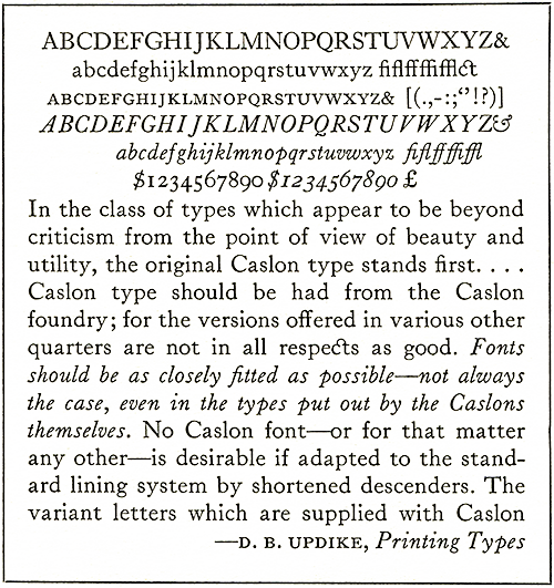
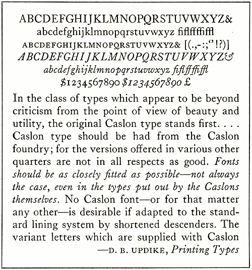
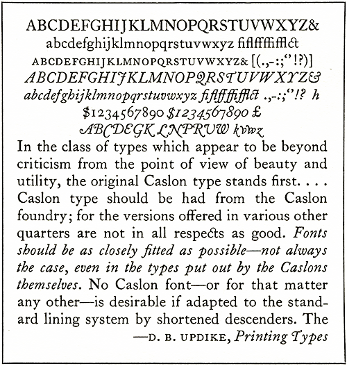
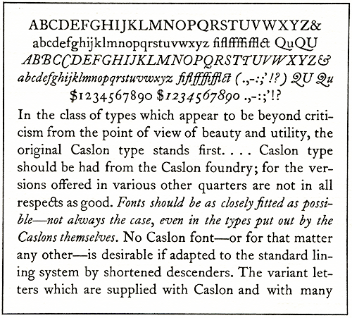
Dan Carr of Ashuelot, N. H., responds to my
efforts to run Caslon 337 tighter than
recommended. "I do enjoy your refitting of 337.
This is one of the most rewarding aspects of
owning your own typefoundry—rewarding and
incredibly time consuming. I have done refits
for 36-point Caslon 337 which I tightened up
and also cast-so that it could be underleaded
(i.e., on 30 pt.), and on English Monotype
Bodoni, 16 and 8 pt. which I opened up and
equalized the space surrounding each letter.
Even one eighth of a point can make an
enormous difference in the quality, but the
Bodoni took nearly a week to refit."
Interested in acquiring. I have received a
letter from Brian Zugel (508) 428-6485, who now
lives at Cape Codd, Mass. He is the former
son-in-law of the late Harry Bollinger of
Alden, Mich. Brian says "I am interested in
acquiring a Monotype, either a flatbed
letterpress, Kluge, or Heidelberg Windmill, a
lock-up table, type cases, a proof press, and
miscellaneous equipment." If you're in the New
England area and can help out, please give him
a call.
3
Does type rust? Absolutely. Especially if it is
new, uninked, and in a humid environment. Dave
Peat of Indianapolis, Ind., a man who has
revived, cleaned, and carefully stored more
antique fonts than most of us have ever thought
about, recommends a product called Sheath RB-I
Water Displacing Rust Preventive for use on all
type which is going to be stored for a while.
It's made by Birchwood Laboratories, Inc., of
Eden Prairie, Minn. It's described as a "water
displacing corrosion inhibitor, fingerprint
neutralizer, and lubricant for all metals. It
forms a thin, transparent film which lifts
moisture from metal pores and prevents
corrosion with a continuous polar protective
film... Harmless to plastics, rubber, paints.
Contains no silicone or wax." Having lost
brand-new type to corrosion, I was looking for
something like this. I've put the stuff in a
spray bottle and now spray any galley of type
before its stored. Thus far, I'm very excited
about the prospects. Ask me in 30 years
whether it works as well as I expect it will.
3
Medical Alert. If you're into working around
molten metal, you're bound to get yourself
burned sooner or later. Theo Rehak absolutely
swears by a product called Silvadene. It is a
prescription drug, but perhaps you can get your
doctor to write a prescription so you can have
the salve on hand before it is needed. Theo
says it not only promotes healing, but actually
minimizes permanent scars also. My doctor, in
writing out a prescription for me, expressed
doubt about avoiding scars, and added this
important advice: Even before you knock the hot
metal off your body, rush to ice or cold water
to immediately reduce the temperature of the
burned area. He says super-heated water within
body tissue causes as much or more damage than
the metal itself, and quick cooling can
significantly reduce damage to your skin.
3
I have received numerous kind comments
regarding my handling of the American Type
Founders auction in the last Newsletter. Some
have reported they still are unable to read the
piece in its entirety for they become too
dejected. We devotees took the heat in a letter
printed in X-height, but that writer was so
ill-informed she should never have been
printed. (Mac McGrew came to our defense with
excellent rebuttal.)
Jerry Kelly of New York City wrote his reaction
to the sale this way: "You summed up my
feelings, and I would guess the feelings of all
those at the sale, so very well. It was
depressing and fascinating; a bizarre madhouse,
made bearable only by the presence of so many
devoted friends."
Alan Waring of Fairfield, Conn., said "Can't
thank you enough for the account of one of the
saddest funerals of all time. It is a pathetic
history of the ineptitude of owners and
management. The throat was cut a long time ago,
and it would have necessitated a great deal
more than a transfusion to quicken the corpse."
Another gratifying response to my piece on ATF
came from J. Ed Newman, Edgewater, Fla. "To say
your report was moving is certainly putting it
mildly. Although I've enjoyed and kept all of
the previous issues, this one surely is the gem
of them all. I'm just so glad that you and
others were able to save some of those
historical and irreplaceable items. Bravo!"
Wilbur Doctor of Kingston, R.I., said he had
read several reports on the auction, but "with
their limited scope had not given a clue to
what a wall-to-wall nasty operation was run...
You've made an important contribution to hot
metal history."
Al Fick of Cottonwood, Ariz., put it this way:
"American Type Founders touched the lives of so
many printers that a person who worked at the
trade and used that lovely formed lead from New
Jersey would have to be made of stone not to be
moved emotionally on hearing of the ignominious
end of an epoch. Your account (is)... a
sad/splendid '30' to ATF."
McGrew Views Gasparic Differently.
"You and others have described George Gasparik
as "cantankerous," or other less-than-endearing
terms, but somehow I got in good with him
comparatively, at least. On my latter visit, he
and other staffers escorted small groups of us
through the works. I deliberately got in
George's group, and gave him 'a print copy of
an article I hand written about Morris Benton.
That must have impressed him, because a couple
of times later he phoned and asked me to send
copies to people who had asked ATF for such
information. When I had exhausted other sources
for specimens of various rare ATF faces, I sent
a list to George. He went through company files
(although not all the way or very thoroughly, I
suspect) and pulled out several gems which
otherwise would not have been well represented
in the book.
—Mac McGrew, Pittsburgh, Pa.
"Love it. Read every word. Thanks for your
martyrdom." George Olcott, Prats de Mollo,
France.
"I am aware of the time commitment you face and
I must congratulate you on your work. I look
forward to getting future issues as they are
released." Michael J. Coughlin, St. Paul, Minn.
3
My foundry is a 16x24 backyard shed with only
a woodstove for comfort during cold winter
months. Although casting has progressed
successfully on a year-round basis, there has
been some aggravation associated with my
city-water plumbing network to cool the molds
and to carry off the waste water (which was
collected in a 55-gallon drum for garden use).
After four years of fussing with overly cold
water, worrying about waste of a precious
resource, and repairing freeze-cracked copper
lines in winter, I decided to make a
self-contained cooling system. I leaned toward
a gravity-fed tank system suggested in the
English Monotype School instruction manual.
This low-tech approach grew complicated as I
added up the components: Two tanks, pumps,
float-valve, piping, hoses, electrical wiring,
and even wood framing to support the supply
tank 10 feet overhead.
At the ATF Conference in Buena Park, the
subject surfaced in discussions with our
proverbial inventor and idea man Monroe
Postman. He said "No problem" and described a
"closed loop" he had built and was using
successfully in his shop. He rigged a pump,
motor, pressure gauge, bypass valve and hoses
on a bucket full of antifreeze and said it
worked fine.
It started with a bronze gear pump from W. W.
Grainger, Inc. I can't detail all the mistakes
and trips to the hardware stores I had to make
before getting happy results. After successful
casting runs with the cooling unit attached to
my Thompson and my Sorts Caster, J have
started ripping out some of the over I 20 feet
of outmoded pipes and drainage to my four
machines. In less than five minutes I can wheel
the unit to any of them, make hose connections
and go to work. Starting and stopping the flow
is a simple flip of a switch. Flow control is
easily adjusted by output and bypass valves on
the unit, and whatever valves are on the caster
itself.
I modified each of my casters by attaching a
short piece of washing machine hose to the
water supply line on the front of the machine.
The only other modification is the plugging of
the machine drain and rerouting drainage to my
device. I'll be happy to provide a schematic
and bill of materials for anyone interested.
Speaking of Jim Walczak, he writes in October
saying he'd just survived a heart bypass
operation. Good news!3
Beginning in the Boston Atheneum with my first
reading of Joseph Moxon's Mechanick Exercises
on the Whole Art of Printing I acquired an
interest in the making of type that has reached
well beyond my devotion to its use. Many years
later the spark ignited that day has lead to
the design and cutting of the type you are now
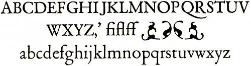
reading, which I have called Regulus.
That sunny autumn day as I read the chapters
describing the cutting of punches by hand I
absorbed Moxon's enthusiasm for type and type
design. The Oxford edition was rich with the
vivacity of the hand-cut Fell types used in
headings and the Van Dijck text types which had
been derived from the same originals Moxon
admired. Perhaps the most enduring inspiration
came from the notes made by Harry Carter, where
it was not possible to miss the delight. I
remember spending some time studying the Fell
alphabets, wondering why I found these
irregular letters fascinating and satisfying.
It would take the effort of cutting my own type
to answer that question.
Cutting punches seemed impossible, so I read up
on hand molds and later tried to make a
primitive contrivance with a Monotype display
matrix clamped to its end. Eventually I did
cast and hand trim the feet of enough letters
to print a simple logo for my press, but soon
enough I had a chance I'd thought impossible. I
got a Monotype casting machine. In 1977 I'd
thought there were no more machines left for
sale. I kept reading about handmade punches,
matrices and molds, but I was busy learning the
mechanics of a Composition Caster. Occasionally
I would buy files or other tools I thought
might do the things Moxon described.
In 1984 there was a Conference of the American
Typecasting Fellowship in Washington, D.C.
Julia Ferrari, my partner at Golgonooza Letter
Foundry, and I decided we ought to go, but for
me there was an added attraction. At the
meeting, a punchcutter, Warren Chappell, was
to speak and I determined that was the time to
learn more about punchcutting. I was also
looking forward to meeting Stan Nelson who I'd
heard was a practicing punchcutter. By the
time that we were heading back home I had been
advised that cutting punches was not
impossible. I'd seen Stan cut a punch and
furthermore, he'd promised to help.
Because of the fortunate contacts at this
meeting Julia and I went to England in the
Fall to attend the Monotype School and while
we were there with the help of Harry Weam we
acquired the necessary matrix holder for
casting foundry matrices on a Thompson caster.
Most of the other tools I used were gathered
from flea markets or were homemade; friends
began to send me files and gravers. So with a
well-seasoned desire and much good help I was
launched. Before long I was cutting ornaments
and accents; then a set of figures, some large
trial letters one of which is used above as the
initial; then I cut long descenders for 12
point Bodoni and I began to cut Regulus.
Cutting a whole typeface even in one size takes
some time and it takes a little longer when you
are evolving the design as you go along. I
determined that it would be a learning process;
I wanted to discover how certain qualities of
hand-cut type faces related to the use of the
particular tools, but also it was to be a
finished work when done. In 1989 the lowercase
was completed. After much delay, capitals were
completed in 1994.
In the meantime I learned much. I progressed
from hammering my punches into the copper to
pressing them in to make matrices. From heating
punches for hardening with a torch I switched
to using an oven. Instead of justifying
matrices by hand (that is, by filing them
square to set the eye of the casting cavity at
a specific and even depth) I began using a
milling machine. At every stage new tools and
jigs were made at our foundry or rescued from
the recent general disposal of the American
metals industries. The most valuable clues came
when, in 1992, I had the good fortune to go to
Paris and learn from professional punchcutters
the traditional techniques of punchcutting
handed down there continuously for at least 350
years. That story has been told in these pages
before. Gradually, I gained a better sense of
the craft.
So it is with the pride of a long and
difficult, though joyful, endeavor brought to
completion that I present the first several
lines of this article set here in Regulus, a
type cut by hand at the close of the twentieth
century, a proof that the value of an art or a
craft is in its practice. The first use of the
type is in a book of poems to be published by
Golgonooza Letter Foundry. A prospectus is
available from the foundry at P.0. Box 111,
Ashuelot, N. H. 03441.
3
Subtitled: "How to get out of a dead-end job
and learn a new and exciting career."
I love type. I like the different faces and
sizes, I like the pin marks, I like the
notches, I even like the weight. I like new
type and old type; unusual and common type. I
love it all. I have maybe 750 cases of type,
and just added onto my warehouse so I can store
more type. Recently I have become depressed
because sources are drying up and I can't
satisfy my lust for more type. The local
printers whom I haven't managed to clean out
lock their doors and pull down the shades when
they see me coming.
Imagine my pleasure when I saw that Dave
Churchman was advertising some Thompson
casters. Visions ran through my mind of galleys
of new type, type in packages, type in cases,
type all over the shop. I called Dave, who
convinced me I could not live another day
without a Thompson, and that my life would be
even more pleasurable with four. Cashing in my
life insurance, I sent my check and awaited
their shipment.
After an agonizing wait, two huge crates with a
$800 freight bill were delivered to my shop.
The freight company had written down the wrong
class of freight, and following much heated
discussion, will be dragging him into court
next week.
Next came the job of deciding which Thompson to
get running first. Really, it wasn't too big a
choice, the one that had a motor and a pot
looked most promising.
A day and a half of cleaning with solvent,
scrapers and wire brushes got it ready to go to
work. The pot was easy, it was not hooked onto
the machine so I put the whole thing in the
solvent tank. There is a nifty hand wheel on
the right side of the machine to turn it over
manually, but would you believe-they don't say
which way it is supposed to turn. Clunk.
Sproing. I decide it doesn't go
counterclockwise. Hmm. It doesn't go clockwise
either. Wait. It would turn if I put the thing
in neutral. Wham! Let's see. "Do not turn the
machine over and permit pump cam lever
(a76TcIT) to drop when pot is disconnected. The
blow may break the lever." Gee. If it was that
important, why did they put it on page 74? Who
reads beyond page 3 anyway?
O.K., it goes clockwise, in neutral, everything
is turning freely; time to wire up the motor.
Can't really see the nameplate, but the voltage
is 220. No problem. I remove the remains of the
old switch that looks like something found on
the front of a 1910 electric range, hook it up
to the 220 single-phase circuit, and hey, it
turns. Grind. Grind. Grind. 0.K., shut it off
and oil it. I have some open gear "tar" grease.
Work a little onto the gear, try it again. Nice
and quiet. Next I turn it on and let it run for
an hour or so while further details are seen
to, such as the drip oiler and hooking up the
gas.
Natural gas isn't available, but gas is gas,
right? I use propane. I don't have a propane
regulator, so I use the acetylene regulator
from a cutting outfit. I turn on the gas, stand
back, and try to light a match. Another match.
Another. Whump! Well, I was getting tired of
shaving anyway, and haircuts cost $7.50 these
days what with the barber college closing down.
The book says it takes 45 minutes to melt a
potful of metal, about what my Model 31
Linotype takes, so I write the time on the pot
in chalk to check it out. I adjust the
regulator. The fire goes out. I light it again,
adjust the regulator, it goes out. I light it.
I set the thermostat for 600 degrees: It goes
out. I crank up the regulator, set the
thermostat to 800 degrees, it doesn't go out. I
sit down and rest. Next time I look at the pot
the whole thing is on fire; the solvent in the
insulation from immersing it in the solvent
tank is burning. Oh well, maybe it will melt
faster. It couldn't melt slower; two hours
later and it barely is hot enough to cast a 36
point square dingbat, but-hey! Here are some
results.
I turn the machine by hand and notice the cast
character is not centered on the type body. No
problem, that's what this nifty little screw on
the mat holder is for. I try again. And again.
0.K. It looks good. Now, I engage the motor.
Perchunk, perchunk, perchunk—type comes out.
Now, this is the way to make type. Finally I
relax a bit and watch the machine do the work.
S. Ss. Sss. Ssss. Squirt. Squirt. Oops. Running
too-fast; not enough time to cool down. I
engage the stop motion and put the machine in
its slowest gear. Perfect type every time.
Anybody care for an 18-point square dingbat on
a 36-point body?
Realizing this is perhaps not the most popular
item, I decide to change mats. I clamp up a
little squiggly matrix and close up the mold to
18 points. I turn on the machine. Squirt! I
make several rapid circuits of the shop
thinking about hot lead, Thompson Typecasters,
and Dave Churchman. Returning to the machine, I
notice the five-gallon bucket that is catching
my cooling water runoff is overflowing all over
the floor and under the wall into the room next
door. By now it is evening: the fuse that blew
when the motor jammed hasn't been replaced, so
the hall lights are off. As I run at top speed
into the next room to save things on the floor
from water damage, I don't notice the door is
closed. Fortunately, the door is repairable.
Subsequent casting sessions have seen improved
gas nozzles and a better understanding of the
machine operation. I missed out on Rich
Hopkins' Monotype seminar; but I do learn by
experience-if slowly. I have had a great deal
of help from other operators over the phone as
well. At the time of this writing, I have about
ten galleys of dingbats, and am getting a
second machine ready to work. I am in need of
parts, especially mat holders and mold parts,
mats, and additional machines. Any help would
be appreciated; call me at (800) 228-7794 days
or (208) 667-4043 evenings Pacific time. My
address is John Hern, 1900 Millview, Coeur
d'Alene, Idaho 83814.
3
The mere fact that one has any recollection of
what metal type is about is surprising enough
in today's environment. Still being able to
make one's own type is just short of a minor
miracle. But then to be able to put some sort
of distinguishing mark on that type is
literally beyond comprehension—just the sort of
goal which would haunt someone like the
proprietor of the Hill & Dale Private Press and
Typefoundry.
Those who study typefounding history know the
early founders frequently identified their
types through the use of a "pinmark."
Initially, the pin was functional in the
casting of type in a hand mold and also on the
pivotal caster as a means of retaining the type
in the mold until it ws the appropriate time
for it to be extracted. With more recent
developments in typecasting machinery, such as
the Barth caster at American Type Founders, or
the various Monotype and Thompson casters, the
pink lost its functional use and disappeared
from the caster's mold. ATF actually ground off
some pin marks in older molds which still were
used, and ceased using the pinmark to
distinguish its production.
Taking the opposite approach, other
typefounders used special means to retain this
"mark" on their types even though doing so was
beyond the functional necessities of their
operations. Certainly it was their mind that
having a distinguishing pinmark made their
founders product a little more "authentic" or
unique.
Baltotype was one such organization. Though in
its earlier years Baltotype is reputed to have
had some authentic early foundry casting
equipment, very quickly (like about 1920?) this
equipment was abandoned in favor of more
productive Monotype equipment. Somehow there
was a stigma associated with being a "Monotype"
foundry. Yet Baltotype was far more than that,
actually creating matrices for some of its own
fonts, and being aggressive in introducing new
fonts by electrodeposition matrices. The series
which Baltotype called "Airport" was
electrodeposited from Futura matrices imported
from Germany many years before Lanston Monotype
got around to introducing "20th Century."
Indeed, a few Airport variations always offered
by Balto never were manufactured by Lanston.
Perhaps for these reasons, Baltotype felt if
prudent to make its type appear in every way
more like "foundry" type by modifying its
Thompson caster modes with a special
larger-sized nick, and a pinmark.
When Baltotype unceremoniously was liquidated
in the late 1970's, all the company's Thompson
casters were purchased and shipped to
California. Ten years later, I acquired the
bulk of Baltotype's matrix collection, along
with one composition caster, from Herb
Ccarnowski, former vice-president of Baltotype,
who had purchased these materials at the
liquidation auction, and had operated (with his
two nephews, Tom and Bob Fokker), Volker
Brothers Type Foundry after the Baltotype
demise. With this equipment were several boxes
of stuff which literally took months to unpack
and sort out.
One afternoon I unpacked a parcel which
contained a complete set of Thompson caster
body pieces. Close inspection revealed, much to
my delight, that all contained the
distinguishing Baltotype pinmark. My thoughts
quickened at the prospect of reviving the Balto
pinmark in my own castings. I even tore down my
Thompson mold and began inserting the body
pieces when I discovered Balto also had an
oversized nick. The mis-match was
irreconcilable. If I attempted to use the body
pieces, metal would squirt through the open
hick and screw up the works big time.
On several occasions later on, I tried
unsuccessfully to trace the original Baltotype
Thompson casters in hopes of getting one of
Balto's unique models. Then last year I
acquired what remained of the Thompson
equipment at the Kelsey Company. This included
one completely unfunctional Thompson mold which
didn't even have a nick. It was work, banged
up, and designed for casting .047" matrices
instead of Lanston's more common .050" mats.
The thought popped into my mind. Perhaps this
mold could be milled down and fitted with a new
pin, and perhaps it could be made to
accommodate the Baltoype body pieces. Surely my
good friend Dick Hartzell, though now retired,
might be able to help me so I sent the mold off
to his company, Hartzell Machine Works, now
operated by his son.
That was the right move! It took a few months,
but Dick became infected by my enthusiasm and
by scrounging through stuff stashed at the
plant, found necessary components and agreed to
rework the mold. In the process, Dick told me
Hartzell Machine Works had always done special
Balto body pieces fitted with unengraved pinks,
put into supply many years ago in anticipation
of future orders from Baltotype.
Being of no present use to him, Dick agreed to
let me have these body pieces with the refitted
mold.
My first casting of type with a Baltotype
pinmark in my refitted mold, was done in late
December, 1994. Now I'm actively seeking help
in engraving the pinks of these new body pieces
so that the Hill and Dale Foundry will be able
to cast type with its own, unique and
absolutely distinguishing pinmark.
There ca be nothing more esoteric, totally
useless and still absolutely wonderful. Other
typefounders can only dream of having their own
pinmark. I soon will haven, even if I have to
engrave the pins with chisel! I expect
commensurate congratulatory notes from all you
envious typecasters out there!
If you're a typecaster and want your specimens
reviewed here, do some setup at 17 picas and
send it off to me. I'll be happy to include it
in the next Newsletter. An article about what
you're doing will be welcome too!
3
My mother kept this clipping of Ripley's
"Believe it or Not''.from the March IJ, I9JJ,
Charle§ton ( W Va.} Gazette, published six
years before I was born. Surely she had no hint
there'd be a printer in the fam ily. The
caption read "1oo Linotypists could set all the
words of all the languages on earth in less
than 12 days: Within this time they could set
in type every word acquired by the human race
in 50,000,000 years." Well, perhaps.
3
Just as forms were being closed for this
edition, Carl Schlesinger called reporting
success in his enduring effort to have Ottmar
Mergenthaler, inventor of the Linotype,
commemorated via a postage -stamp. The United
States Postal Service has announced a 32-cent
stamp honoring Mergenthaler will be part of a
block of four honoring important American
inventors.
Carl, author/editor of The Biography of Ottmar
Mergenthaler (available through Oak Knoll
Books), was a technical consultant on the
Mergenthaler stamp and has long championed
issuance of such a commemorative. The first-day
issue will be at the Postage Stamp Mega-Event
Show at the Jacob Javits Convention Center in
New York City February 22, 1996.
The stamp, measuring 1 5/16" x 1 9/16", will be
printed in color via offset. The other
"communications pioneers" also featured will be
Frederic E. Ives, developer of the glass
crossline screen in 1885 enabling halftone
photo reproduction), William Kennedy-Laurie
Dickson, producer in 1891 (with Thomas Edison)
of the Kinetoscope, a forerunner to motion
picture photography, and Eadweard Muybridge,
who in 1877 did pioneering work in the
development of stop-action photography.
3
So why is Rich showing a photo of a Monotype
mat case? Because it's an extremely rare
Lanston mat case made before cellular mats were
invented, probably around 1904-1908. Prior to
seeing this one at Pat Taylor's in November, I
didn't think any had survived.
From Lanston's Pony Specimen Book of Monotype
Faces, published around 1912, it is stated "In
1904 we received four first order, 28
Monotypes, from the Government Printing Office.
To fill this specification we had to make new
matrices and we determined to furnish these in
the cellular form, on which we had been
experimenting for several years... In 1908 we
perfected our mold for casting low spaces and
quads, or high if desired, in lines of
justified matter which enabled us to reduce
the 'depth of drive' to .030"...
"We shared our improvements with our customers,
who returned every old matrix they had, whether
worn out or not, for liberal credit in exchange
for cellular matrices."
I thought Lanston had succeeded in getting all
the old matrices out of circulation, but the
two gems in Pat Taylor's possession prove this
wrong. These mats pre-date the cellular matrix
and are held in the case by parallel rods just
as English matrices. The mats themselves are
much less sophisticated. And yes, they're .050"
drive, verifying all that was said so long ago.
Note the bar attached to the end by two screws,
used to hold the rods in place. And note the
back side (inset) where there's no steel cover
to protect the cone holes.
3
Typographic History is steeped in little
tidbits of information that go a long way in
helping us better understand and appreciate the
designs associated with the tales. The long
history of Caslon is punctuated by tales of
disappearance and revival. Legend has such
events taking place over the past 200 years in
both the United States and England. No matter
how appealing, unfortunately these stories do
not stand up to close examination.
Perhaps from the outset we should be clear as
to which Caslon letterform is being discussed.
Long before the present explosion of type
designs, there already were numerous faces
carrying the Caslon name. For instance, the
American Type Founders listing of "Unclassified
Type Faces and Sizes" published in the
company's 1951 specimen book, listed 31 faces
by that name in addition to the eight designs
then in active circulation.1 Many had little or
no resemblance to the original design and it is
the original which is of concern here-the
design created by the first William Caslon back
around 1725 (when he cut his first font of pica
type) in England. William Caslon is heralded as
England's first major type designer and he
enjoyed the good fortune of being able to
capitalize on his creative genius, building it
into a type-founding enterprise which endured
for several centuries. The Stephenson-Blake
foundry that existed until very recently in
England traced itself to William Caslon I.
After introduction, the Caslon letterform grew
to dominance in England, outselling the Dutch
models which had been in vogue in that country.
Ready availability had much to do with this
success, for it surely was easier to buy from a
founder in London than import from a
typefounder on the Continent. It was only
natural, then, that the Colonial American
printers would obtain their types from this
same London enterprise and thus, Caslon was the
dominant (but not exclusive) design found in
most Colonial American Printing offices.
For Americans, this type should have a tender,
deep rooted appeal as it was the typeface used
by John Dunlap, of Philadelphia, in setting up
the Declaration of Independence, in 1776. Here,
not overseas, it gained its greatest support.
The American Type Founders, in 1895, was the
first to call it by its designer's name. Only
18 years later did the Caslon foundry in
England, adopt the designation.2
As other designs (and typefounders) came on the
market, Caslon's influence was slowly
diminished and ultimately, the original face
fell into obscurity. If you are to believe
legends, the face was totally unknown to
contemporary printers by the 1850's. The modern
style of roman letter introduced by
Giambattista Bodoni in Italy had become a
dominant influence of the day and even the
Caslon-Smith foundry, as the firm was then
known, offered such "newer" letter styles to
satisfy printer demands. The stage was set for
a "revival." The story is well told by of
typographic history and creator of the
legendary ATF Typographic Library.
In a lengthy article published by The Inland
Printer, April, 1921, titled "William Cason and
His Types,"3 Bullen makes great effort to
dispel some of the myth related to the first
revival. Therein he recounts that in 1844,
Charles Whittingham, a famous London printer,
was embarking on printing a volume entitled The
Diary of Lady Willoughby and sought a strong
old style appearance in keeping with a document
related to the reign of Charles I.
Through studying earlier type specimens,
Whittingham decided the original Caslon face
would be altogether appropriate. So he went to
the Caslon-Smith typefoundry in search of the
original types. The claim was made in an 1896
article published by the Grolier Club in New
York, that "the establishment of Caslon was
ransacked for the punches and matrices, and
that missing ones had to be replaced."
Bullen goes to great detail in quoting from
Caslon specimen books of that period, all of
which proudly asserted "this foundry includes
the works of hate justly celebrated William
Caslon, by whom it was originally established."
Bullen concludes that it was very unlikely
there was a need to ransack the foundry. The
matrices surely were kept in a n orderly and
reverent fashion, readily available once the
need was reestablished.
After publication of the Diary, popularity of
the original Caslon design slowly increased. It
was not until as late as 1860, however, that
the original design once again was shown in a
Caslon foundry specimen book. Bullen notes it
had been absent since 1786. Even when not
listed, however, the foundry made statements
such as this, which would give credence to
Bullen's assertion that the design was far from
"lost" at the foundry:
This establishment is also possessed of the
original works of the justly celebrated William
Caslon, which were engraved in the early part
of the last century. Among these are the
improved Elzevir's, now so frequently used by
most eminent printers and admirers of the art
of typography in reprinting facsimiles of the
works of old authors and antiquarian records.
It might also be noted here that A. F. Johnson,
in his A History of The Old English Letter
Foundries, suggests in a footnote that the
Caslon face never went completely out of style
in England, and that, indeed, Whittingham had
used the face on the title pages of books
printed of Pickering in 1840.5
After dismissing the English revival, Bullen
begins to tell the story of how the
Philadelphia typefounder Lawrence Johnson, in
1858, "visited the Caslon typefoundry in London
and there purchased special casts of all the
characters of all sizes of the Caslon types
with which to make facsimile matrices for use
in his typefoundry." As it happened, Caslon
types were shown in Johnson's house-organ at
least a year before they reappeared in a Caslon
specimens book.
It also should be noted that the design itself
was first labeled "Caslon" by Henry Bullen in
ATF's first collective type specimens book of
1895. The Caslon foundry had theretofore called
it "Old Face."6
This Johnson legend is dear to this author's
heart, for the Hill & Dale Private Typefoundry
now possesses most of the Caslon matrices
herein alluded to. Other sources suggest that
Johnson, rather than obtaining casts of the
Caslon letters, actually had strikes made from
the original punches held at the Caslon
foundry. This would have been altogether
reasonable, for why go the trouble of
elctrodepositing (a process very much in its
infancy at the time, by the way) matrices from
types specially cast for the purpose when the
punches were also available? Indeed, this
theory is borne out by the fact that some of
the Caslon mats now in my possession very
obviously are driven matrices.
There's no doubt some of them are historic
matrices dating back to 1858 and Laurence,
Johnson. But perhaps their significance is
overplayed by Bullen, who would have been
partial to such a cute story, and thus, less
inclined to do the exhaustive research he
invested in the Whittingham episode. His
statements regarding the Johnson revival imply
that Caslon had disappeared from use in this
country and that Johnson, keen on typographic
events in England, carried the revival to the
United States.
Knowing no better, I subscribed to this notion
myself until the late 1960's when I struck up
correspondence with Bob Bretz, then curator of
special collections at the Carey Library of
Rochester Institute of Technology. With access
to to so many historic documents at his
library, he spotted incongruity in the story.
He discovered printed documents employing
Caslon types with definite publication dates in
the 1850's, and also cited typefounder's
specimen pages showing the Caslon face in all
its glory, specifically specimens of the John
T. White Typefoundry of New York. These
specimen pages also date to the late 1850's.
With this and many other "sightings" to
reinforce his theory, Bob suggested the Caslon
design never really went out of style in the
United States as it purportedly did in England.
Perhaps it was no longer as popular, but at
least one typefounder was still showing it in
his specimen book prior to when Johnson
"revived" it.
All these details had fallen into the dark
crevices of my memory until collaborating,
recently, with Dave Peat of Indianapolis on the
reproduction of an extremely rare type specimen
in his extensive collection. As his printer, I
was focusing on camera techniques and fidelity
of reproduction—and color separation of an
extremely rare two-color page—all in an effort
to make this specimens reproduction from the
Boston Type Foundry, dated 1856, to be as good
as it possibly could be. The negatives were
made direct from the original, so I had the
privilege of handling those remarkably
well-preserved pages extensively during the
process.7
Then, after the project was finished, it hit
me. The publication included a full page of
Caslon specimens. In my estimation, they're
authentic Caslon letters, too. Thus, this is at
least the second type foundry known to be
offering Caslon types prior to the Johnson
"revival" of 1858.
Surely Bullen had access to such specimens when
he wrote the articles quoted earlier. But
there's another factor which must be realized.
Bullen's article evolves into a discussion of
how ATF handled Caslon. The designation ATF
gave the Johnson matrices when they took
possession of them after closing the
Philadelphia facility was "471." MacKellar,
Smiths and Jordan, successors to Johnson,
earlier had designated the face "71" and the
"4" was added by ATF to denote the matrices had
come from the Philadelphia foundry.
Later, Bullen notes, the descenders were
shortened to make Caslon 540, a face which
conformed to the ATF "standard line" created
early in this century. He points out that for a
brief period, Caslon 471 was taken out of
production by ATR in favor of 540.
In other words, the article evolved into a
thinly veiled promotion of ATF's Caslon types.
If you might have thought Bullen to be an
impartial historian, keep in mind that he was
advertising and publicity director for American
Type Founders, a role he had much experience
with. Indeed, Bullen's first significant job in
graphic arts was that of advertising director
for Golding Company (a manufacturer of graphic
arts equipment including platen presses), so
there's no doubt he knew what was necessary to
promote a company's "official line."8
For this reason, perhaps he chose to omit
pertinent facts to give greater authenticity to
the matrices then in the possession of his
employer—ATF. By 1921, when the article was
written, the matrices of probably all the other
foundries mentioned herein also were in
possession of ATF because of mergers and
buyouts. ATF had the choice of which Caslon
face would be used by the foundry. Perhaps the
Johnson matrices were judged to be closest to
the original. Or perhaps Johnson matrices were
merely in better condition. Or perhaps they
were better matched to the casting equipment
adopted by the consolidated foundry.
It might be wise to insert here the observation
that several typefounders claimed to have
"original" Caslon renderings. Here's a
contemporary view of these offerings by Lewis
Gandy, as Caslon approached a high-point in
popularity right after the turn of the century:
So great has been the demand for it that very
type foundry has a "Caslon," and it has also
been cut in many sizes for the composing
machines.
What are the virtues, and what are the
shortcomings of Caslon type?
... It would seem all type founders consider it
a good face—that all it needs is a few
"improvements" to make it perfect. For that
reason they have in many stances mailed it
almost beyond recognition. One of the chief
sinners in this respect is American Type
Founders Company. Being the successor of the
Johnson Type Foundry... they have always been
in a position to supply the genuine Caslon,
their No. 471. But they do not show this face
in their specimen book.
Instead, they offer what they call Lining
Caslon; that is, Caslon's face with shortened
descenders so the various sizes can be cast on
smaller bodies.
Another equally great sinner is the Keystone
Type Foundry, who have "improved" Caslon's
design to its damage.
But the greatest sinner is the Inland Type
Foundry, who emasculated the Caslon letter
until its every virtue was destroyed.
The Linotype Company has other been guiltless,
for instead of cutting for its machine the
genuine Caslon it copied the Inland Type
Foundry model.
The Monotype Company is another iconoclast that
must here be hauled to the bar of justice. In
1902 it made a very good copy of Caslon's
10-point size, and later of the 6- and 8-point
sizes. But instead of adhering to the good
example already set, it chose as models for the
other sizes up to 36-point the Inland Foundry
face.9
Please not this criticism was written in 1916;
most of the complaints therein mentioned were
answered by newer, more accurate renderings of
the original by the companies mentioned, and as
already noted, ATF reintroduced 471 after only
a brief period of "removal" from its active
list.
Another cute story will add to the evidence
relating to "other" founders having the face.
It relates to Will Bradley and printing he did
at his Wayside Press in Springfield, Mass., in
the 1890's. When he decided to acquire Caslon
about 1895, he placed orders for all sizes with
the Dickinson Foundry, which by then was the
Boston branch10 of American Type Founders. Out
of all sizes he could get only five. Three of
the fonts came from the Boston branch(10) and
two from Philadelphia. A rather humorous
evidence of the then-meager quantities being
sold was revealed in the fact that the colored
labels on the Boston packages of type were
faced almost white, and that Philadelphia
packed were turned yellow and covered with
flyspecks.11
Obviously the fonts had originated at the
respective branches, and obviously they were
judged to be very similar in character for ATF
to have decided to mix fonts from both sources.
This additional evidence is sufficient to
suggest Lawrence Johnson didn't single-handedly
create a revival when he obtained types and/or
matrices from England. The design never had
left the inventory of other American founders,
and was actively displayed by at least two
Johnson competitors.
Indeed, a third founder displayed Caslon types
before the so-called Johnson revival. The Peter
C. Cortleau foundry of New York (later absorbed
by Farmer, Little & Co.) displayed Caslon in
its 1857 specimens.12
Certainly the original was kept very much alive
by Stephenson-Blake, successors to the Caslon
foundry in England. By 1930, the demise of most
foundries in the U.S. eliminated several poor
renderings of Caslon. But as mechanical
composition assumed a dominant role in type
composition, replicating the original design
remained a hot issue for these manufacturers.
The Linotype Company issued several Caslons,
ending with Caslon Old Face. American Monotype
issued three Caslon ending with Caslon 337,
Intertype offered a respectable Caslon and
Ludlow offered True-Cut Caslon, also a good
representation of the original. These many
improved renderings of the face essentially
answered all criticism lodged against earlier
efforts as stated in the Lewis Gandy quotation
reproduced earlier in this article.
The absolute most exhaustive effort to
replicate the original had-cut design was made
in England by the England Monotype Corporation.
Caslon 128 was the third cutting of Caslon by
the company. It was preceded by Series 20 and
Series 45 in 1903 and 1906 respectively. Series
20 was a close approximation of William
Caslon's 12-point original, extended through a
range of 7-12 point including the odd sizes.
That rendering was listed in Monotype specimens
books as late as 1960 as "old Face Special." In
his appraisal of the materials of Cambridge
University in 1917, Bruce Rogers noted that
Series 20 could be recommended but that Series
45 was not as good.
Series 128 was cut as part of the installation
agreement for bringing Monotype equipment of
the prestigious R&R Clark printers in
Edinburgh. It was begun in 1915 and the first
sizes were completed in 1916. Considerable
effort was made to exactly recreate the
original Caslon size for size including the
many kerned characters and swash. Minimal
compromises were made to fit the face to the
unit system. Each size from 8 point to 24 point
in composition was made with it own unit
arrangement in an effort to perfectly match
Caslon's hadn't-cut originals: each size
required a separate set of keybars, stoppers
and wedges.
Typographers and compositors using 128 in
England counted their attainment of skill by
their ability to visualize the effect of the
variations in each size. A line set in 9 point
capitals for example has a radically different
effect than a line set in 10-point
capitals—it's not just a question of scale.
Stanley Morison complained of the difficulty in
predicting the shape of the capital T from size
to size. He also noted small differences
between the originals and the letter of Series
128, citing the difficulties in solving
technical problems as the cause. Morison noted
a particular affection for several sizes among
them the 8 point, the 14 point and the 18
point. Nevertheless two issues of The Fleuron,
of which he was not only editor but chief
typographical advisor, were set in 128.
Series 128 was used a R&R Clark to finish a
multi-volume history of the British army which
was halted in production when the foundry had
run out. When the typographically demanding
author G.B. Shaw was offered a page in foundry
type in Series 128 he chose the latter—even
though he had specified foundry type, hand-set
only. This was a milestone marking the
acceptance of the Monotype system of machine
composition as equal—preferable?—to hand-set,
foundry quality.13
The Caslon design has successfully moved from
metal to digital. A very good rendering has
been prepared and issued as Adobe Caslon,
complete with most of the original swash, long
f, and other 18th-century eccentricities. And
most recently the Carter & Cone "foundry" has
seen the need to issue a font called "Big
Caslon," a digital rendering specifically
created to more closely conform to William
Caslon's tight fit and razor-thin serifs in
larger sizes.
Perhaps it would be appropriate to discuss the
individual characters shown with variations of
the Caslon letter with regard to their
authenticity.
The cap Q begins the discussion. Caslon's first
specimens sheet showed an exceedingly long
tail. Later specimens from the Caslon foundry
showed a tiered (Q) tail. The long tail was
available as a two-letter character—Qu, QU—with
foundry and English Mono but not with other
machine versions. The Q, which looks like a
fancy numeral 2, is authentic, though Caslon's
original again had a very long tail. This also
was retained in two-letter casts—Qu, QU—with
foundry versions, and with English Mono 128.
Other italic characters which are authentic to
Caslon, though often replaced with
"regularized" letters, include the T, Y, F, and
h. The h, especially, often mistaken for a b.
MacMcGrew notes the F was inverted by ATF to
create the British point (£) currency
symbol.14
The tied ct and ct are authentic, but the st
and st are not; in Caslon's time, the long s
was still very much in use, and thus st an st
would only be correct. Most manufacturers also
included long s metrics: s, si, sl, ss, st, sh,
sb, sk, ssi, ssl, s, si, ss, st, sh, sb, sk,
ssi, ssl.
No swash characters were part of the original
Caslon design. They were added later. At ATF,
T.M. Cleland did the letters. Sol Hess is given
credit for the swash characters in the American
Monotype design, though the same characters
also were offered by Stephenson-Blake and by
English Monotype. American Monotype offered
only the 11-point size in composition matrices:
ABCDEGKLMPRVWkvwz. English Mono offered them in
all sizes.
Finally, Updike's comments on the lowercase
swash characters must be included:
The variant letters which are supplied with
Caslon and with may other types in the nature
of old style, are characteristic and
useful—such as swash italic capitals, the
italic lower-case v and w used to begin words,
and the k for use at the ends of words. These
swash letters, as employed by thoughtless
compositors or designers, have sometimes
produced very absurd effects. Only certain of
the swash italic capitals can be successfully
placed in the middle of a word, the design of
the rest suggesting their position either as
initial or final letters. Used "discreetly,
advisedly, soberly," swash letters give variety
and movement to a page of type.15
So what is the future of Lawrence Johnson's
matrices in the closing years of the 20th
century? Most importantly, they have been
preserved. And with the efforts of Theo Rehak
and the Dale Guild Type Foundry in Howell,
N.J., matching foundry casters also have been
preserved. Additionally, efforts are being made
to enable use of these matrices with Monotype
equipment. Rehak already is offering new
castings of Caslon 471 (roman, italic, swash
and quaint) in 14 point. The key to their
continued use, therefore, is better expressed
as. Matter of real and/or perceived demand. If
there is sufficient demand, these matrices will
enjoy continued use well into the 21st century!
3
Caslon Resources and Notes
ATF Foundry Type Descriptive Price List,
issued January, 1951. Six pages of
"Unclassified ATF Type Faces and Sizes" begin
on page 47. Steve Watts, ATF Type Director at
that time, told this author in 1965 that the
list was compiled by him, after completing an
inventory himself, on his own time, investing
countless hours sorting through matrices then
in disarray in ATF matrix "vaults" and in the
foundry's basement.
Robinson, Hugh L., "Caslon Types," from the
RIT Typographer, Spring, 1952, Vol. XV, No. 3,
page 31.
Bullen, Henry L., "William Caslon and His
Types," The Inland Printer, April 1921, pages
51-54.
Gress, E.G., wrote a complete "Caslon
Number" for the periodical The Business
Printer. The issue, published May, 1930, (Vol.
2, No. 5) including over 40 pages of specimens
and varying articles regarding origin of the
face and excellent references to contemporary
use.
Johnson, A.F., History of The Old English
Letter Foundries. London: Faber and Faber,
Limited, 1952. Page 249.
Bullen, previous reference.
Supplemental Specimen Sheets from the
Boston Type Foundry. Boston: John K. Rogers &
Col, 1856. Facsimile edition produced by David
W. Peat, 1225 Carrol White Drive, Indianapolis,
Indiana. 46219. Available at $10.00 postpaid.
"Henry Lewis Bullen," an article appearing
in the November, 1898 issue of The Inland
Printer, reproduced in its entirety in Maurice
Annenberg's A Typographical Journey through the
Inland Printer, 1883-1900, pages 629-630,
published by Maran Press of Baltimore, 1977.
Gandy, Lewis C., Caslon Type and Its
Appropriate Use. Boston: The Pinkham Press,
1916.
The fonts coming from Boston could well
have come from the Boston Type Foundry, whose
specimen is mentioned earlier in this text.
Both the Boston Type Foundry and the Dickinson
Type Foundry of Boston entered into the ATF
merger in 1892.
Gress, previous reference.
Ovink, G.W., "Nineteenth-century Reactions
Against Didone Type Model-I," from the
periodical Quaerendo, published April 1971.
Pages 23-24.
Dan Carr of Ashuelot, N.H., graciously
prepared all material herein pertaining to
Caslon 128, as well as supplying the freshly
cast specimen. Many thanks, Dan.
McGrew, Mac, American Metal Typefaces of
the Twentieth Century, published by Oak Knoll
Books, New Castle, Del, 1993. An extensive
discussion of Caslon and its variants is found
on pages 62-73.
Updike, Daniel B., Printing Types, Their
History, Forms and Use. Published in two
volumes by Harvard University Press, Cambridge,
Mass. Second printing of third edition was done
in 1966. See especially pages 228 and 229.
Monotype Caslon No. 37
The first size to be cut by the American Monotype Company was 8-point, which was cut for Vogue magazine in the summer of 1903, when the magazine moved from foundry type and band comp to Monotype machine composition. This was reported by Walter Gillis, whose Gillis Press did the composition for the magazine.4 Then Lanston developed the cellular matrix and opted to recall all matrices and opted to recall all matrices made prior to that time. This design, No. 37, was introduced as its revised Caslon design when Lanston brought out the cellular matrices. It's interesting to note no names were then used; the company used only numbers to designate type faces until sometime in teh 1920's. The design met with immediate criticism, prompting the introduction of Caslon 137. Caslon 37 must have had some fans, however, for it continued to be offered for over 50 years.
Monotype Caslon No. 137
A number of users would not accept Monotype's No. 37e. To satisfy them, the company went back to its original side-hole matrix design, re-issuing it as No. 137e. Apparently Monotype was satisfied with Caslon 37g (italic), for it was supplied with Caslon 137e; no Caslon 137 italic was cut. This design is labeled "Inland Caslon" by Lanston Monotype. Naming came several years after the design was introduced (because at first only numbers were used) and may have been done in error. The Inland foundry attempted to eliminate all kerns and thus, eliminate the need for ligatures. Perhaps 37e was really the one modeled after Inland Caslon? Linotype also issued Caslon 137, a rare collaboration between the two companies. Linotype said "advertisers and printers... will welcome Caslon 137, for it has sufficient color and weight to print clearly on coated and calendered papers."
Monotype Caslon No. 337
Finally, the American company decided to do what it should have done in the first place—cut for its machine and exact limitation of Caslon's original face in both roman and italic. Introduced around 1915, this was the American company's last effort to mimic the original and generally was well accepted. At that early date, only the standard "C" matrix case arrangement was available and thus, the design was modified in text sizes to conform to that machanical restriction. In display sizes, this was not necessary, though set widths were excessive in comparison with the original. To get Caslon's original letters F, Q, Y, T, and h, special "alternate" characters had to be ordered. This specimen is done in 12-point with short descenders. The 11-point size with long descenders more closely matches 12-point foundry. Swash characters are 11-point, the only small size offered.
Stephenson-Blake Caslon Old Face
This setting is done from types cast by Stephenson-Blake Company, successors to the Caslon firm in England. The company prided itself in offering the" original fonts
cast from matrices driven by Caslon's
original punches and therefore,
it can be assumed this depiction of
the face is the standard by which
all others must be judged. Small
capitals were available, but not for
this specimen, hand-set at the
Hill & Dale.
American Type Founders Caslon 471
This setting is done from types cast by Stephenson-Blake Company, successors to the Caslon firm in England. The company prided itself in offering the" original fonts
cast from matrices driven by Caslon's
original punches and therefore,
it can be assumed this depiction of
the face is the standard by which
all others must be judged. Small
capitals were available, but not for
this specimen, hand-set at the
Hill & Dale.
Linotype Caslon Old Face
Linotype issued five different Caslon
designs, including Monotype 137.
Finally, Lino developed this design,
"an exact and faithful reproduction
of the original Caslon letter" which
was shown in specimen pages
intermixed with Caslon foundry
specimens with the claim the
differences could not be discerned. To
get around the restrictions of no kerns
with Lino matrices, 1he firm
offered numerous two- and
three-letter matrices so the kerning f
could be properly presented. Fred
Williams has used these special
characters in composing this specimen.
Finally succeeding on its fifth
attempt with the design, Mergenthaler
stated no face "has suffered
more grievously than has Caslon from
the efforts of succeeding generations
of type founders to improve and refine
what was in its original state the finest
vehicle for the printed conveyance of
English speech... yet devised."
Ludlow True-Cut Caslon
Having the same problems as Linotype
with kerns, Ludlow also issued
a series of 19 special two-character
mats to accommodate the heavily
kerned lowercase f. Alf the long s
and swash characters also were
issued. The italic is not nearly as
tightly fitted as the foundry or
Monotype version in smaller sizes,
but Ludlow's angle-body matrices
made for a far better fit in larger
italic sizes. Specimen is a joint effort
of Merle Langley & Andy Birsh.
Monotype Caslon No. 128
This version was the third attempt
at capturing the essence of Caslon's
original done by English Monotype
Company. It was introduced after
Monotype developed set width
standards varying from the original
"C" arrangement. Further, the
design was developed in close
collaboration with the
Stephenson-Blake Company (successors to
Caslon) and therefore, it can be
comfortably said that this is the
absolute best machine-composed
representation of William Caslon's
original. It's important to note that
sets vary from size to size, just as
they did with the original
hand-engraved design. This specimen
was composed and cast by Dan Carr.
Adobe Caslon
This, via pbotopolymer plate, is the
digital version of Caslon issued by
Adobe, the result of extensive
research into derivation of of the
letter, Adobe issued all quaints,
swash characters, and even a great
variety of ornaments with its
Caslon rendering. Lost in the past
20 or 30 years are all the
phototypesetting versions; all of those
systems are now in complete disuse
and discussion would be pointless.
This is an atttempt to put onto paper the
various gyrations I went through to get this
edition of the ATF Newsletter into type and
printed. Specifically, I wish to discuss the
composition done for this issue.
The nameplate is in 72-point Caslon Italic 4371
cast from Lanston matrices on my Supercaster,
intentionally "tightened up" for closest fit.
Same for the 48-point heading "Dispelling
Caslon Myths." All other heading are in either
14-point 3371 italic with swash or 18-point
337.
Initially I had resolved to do the text of this
entire issue in Caslon 337. Over the years I
have done a lot of experimentation with the
font, and I applied the things I have learned
here. Caslon 337 was used exclusively
throughout this 11-page section. It's been
rumored American Monotype intentionally "opened
up" the face and misaligned certain characters
to give the ace a more rustic, dated
appearance. In doing composition, it's
impractical to mess with the alignment of
individual characters, so I avoided that. But I
did cast all my type a quarter point narrower
than specified by Lanston. The text is 11 point
with long descenders, cast at a 10 ¾ set. A
12-point mold was used, with no additional
bedding. This type of(as well as the quotations
and cutlines within the text) is 9 point with
long descenders at 8 ¾ set, on a 10-point
body. After first proofs, I discerned it to be
too tight, so I leaded half a point using cut
card stock. The footnotes on this page are 7
point with long descenders, cast at the
standard 7 ¼ set, on an 8 point body plus an
additional half point of paper leading added.
I was so proud of myself in developing this
special 337 treatment. Then I read Douglas
McMurtrie's Type Design, published in 1927,
wherein he says Caslon 337: "When slightly
tighter fitted than normal it makes possible
very fine composition indeed." As Fred Goudy
said, "the old boys stole our best ideas."
All remaining pages are done using Caslon 137.
I figured this particular design, which
remained popular long after 337 was introduced,
deserved a good viewing too. I used 10 point on
an 11-point body at 9 ¾ set, and 9 point on a
10-point body at 8 ¾ set. All keyboarding and
casting was done at the Hill & Dale by yours
truly—Rich Hopkins.
3