The American Typecasting Fellowship's fourth
biennial conference is set for Washington,
D.C., June 21–24, 1984. Conference coordinator
Stan Nelson has sent information and
reservation forms to all on the ATF mailing
list, but encourages those who may not have
received information to contact him
immediately.
Stan, an avid amateur typefounder, a charter
member of our group, and a museum specialist in
printing at the Smithsonian Institution, has
arranged an exciting meeting featuring an
international slate of speakers. On top of
that, he promises access to the many wonderful
typecasting treasures at the Smithsonian.
Warren Chappell, designer of both Trajanus for
the Stempel Foundry, and Lydian for American
Type Founders, is to speak “In Praise of Hot
Metal” Friday, June 22. John Dreyfus, renowned
English scholar of printing history and
recipient of the American Printing History
Association “Annual Award,” will speak on the
English Monotype Corporation that same
afternoon. (Mr. Dreyfus was instrumental in our
joint conference at Oxford, England, two years
ago.)
Jim Rimmer of Vancouver, B.C., Canada, will
make a presentation on the process of engraving
in typemetal. His talk will be on Saturday
morning. (For a preview of his subject, see
page 27 of this Newsletter.) The afternoon
program will concentrate on subjects related to
the Smithsonian collections. Also Steve Saxe
will talk about the history of the Bruce
Typefoundry, and Stan Nelson will talk about
Mergenthaler’s invention of the Linotype.
Special seminars will cover many subjects
including “management of a type foundry,” “the
care and feeding of typecasters,” “preparations
for making your own matrices,” and “everyman
his own electrotyper.” Special tours are
arranged for the Smithsonian’s Graphic Arts
Hall, the Folger Shakespeare Library, the
Library of Congress (featuring a Gutenberg
Bible), and possibly other points.
As in the past, attendees are encouraged to
bring 100 keepsakes (not larger than 9×12
inches folded) for distribution.
Registration was to be closed May 20.
Registration fee is $100 ($75 for spouses), is
payable in advance, and covers costs excepting
hotel accommodations. The Hotel Washington has
been secured at a special $67 per night ($77
double) for the ATF meeting. Contact the hotel
for reservations. Send your ATF registration
fee to Stan Nelson, Graphic Arts Department,
National Museum of American History,
Washington, D. C. 20560.
3
Guy Botterill of Baltimore, Md., who has
gathered one of the finest collections of
handset metal types to be found anywhere, was
among the Americans attending the Oxford
Conference. He took opportunity at that time to
ask about availabilities from the various
European foundries represented. This is his
report.
Representatives from various type foundries in
the United Kingdom and Europe were present at
the Oxford Conference. Much information was
learned from these interesting people.
Alfred E. Hoffmann, director of Haas
Typefoundry, Ltd., Gutenbergstrasse 1, CH-4142
Munchenstein, Switzerland, has many distinctive
typefaces available. All type is on Didot body,
American height. Castings of Haas designs
include Boutique, Bravo, Diethelm Roman,
Francaise Legeres (similar to Auroil
Condensed), Graphique, Helvetica series
including Helvetica Extra Wide Light and
Medium, Herkules, and Profil. In addition,
Hoffmann has acquired fonts in their original
wrappers from stock shelves of European
foundries, now defunct. Types from the Berthold
Foundry in Germany are Akzidenz Grotesk and
Post Antigua. Deberny & Peignot (Paris) faces
include Cristal and Meridien. Designs from the
Olive Foundry (Marseilles) are Antique Olive,
Banco, Chambord, Choc, Diane, Mistral, and
Vendome series.
Font weights are in kilograms (one kilo equals
2.2 pounds). The best way to ship is regular
parcel post, with a 20-kilo (45 pound) limit. A
25 per cent charge will have to be added to
total price, including packaging. Custom duties
are five per cent. Examples of prices are:
16-pt. Vendome Extra Condensed, $113; 14-pt.
Mistral, $105; 28-pt. Cristal, $60; 20-pt.
Choc, $145; 12-pt. Boutique, $90.
Wolfgang A. Hartmann, administrator of the
Neufville Typefoundry, Traversa de Gracia 183,
Apartado 2529, Barcelona 12, Spain, can offer
exquisite types such as Adagio, Bernhard
Cursive, Carnaby (Windsor), Columna, Folio
series, Fortune, Futura series, Horizon,
Impressum, Legende, Maxime, Privat,
Stradivarius, Trafton Script, Venus and Weiss
series. These faces are castings of matrices
from the defunct Bauer foundry in Germany. They
are available on pica body or Didot body,
American height. Poster types in plastic
material include designs of Beton, Folio,
Futura, Souvenir, and Venus. The April, 1984,
pricelist shows 9–12 point at $44 per kilo,
14–30 point at $39 per kilo, 36 and up at $35
per kilo. Since you have to know how much a
font weighs, it is wise to get an advance
invoice before ordering. Special prices of
plastic type are available on request. All
prices are F.O.B. Spain.
Geoffrey Hulett, agent for the Stephenson-Blake
Foundry, Sheaf Works, Maltravers Street,
Sheffield S4 7YL, United Kingdom, advises that
many fine designs are still being cast,
including Caslon Old Face, Chisel, Consort,
Impact, Lectura, Mercury, Perpetua, Times
Roman, Verona (not the ATF face), and Windsor
series. Current prices in British pounds (one
pound equals about $1.50) are: 12-pt. Caslon
Old Face 40A 80a, £71.24; 10-pt. Consort Light,
£39.48; 10-pt. Lectura 29A 72a £28.11; 12-pt.
Verona 40A 80a £48.05; 14-pt. Windsor, £47.68.
Limited castings of Mole Foliate show 48 pt. at
£45 and 60 pt. at £61. A special casting of
22-pt. Union Pearl is being considered if there
is sufficient demand. Also available is Mazak
super hard zinc type, the nearest thing to
brass.
Gertrude Benoehr, agent for the Stempel
Foundry, Hedderichstrasse 106114, D-6000
Frankfurt 70, West Germany, discloses
information on castings of faces such as
Helvetica, Melior, Optima, Palatino, and Trump
Mediaeval. The authorized agent for Stempel in
the U.S.A. is American Type Founders in
Elizabeth, N.J. Consult your local ATF dealer.
Latest prices list 10 pt. at $70, 18 pt. at
$90, 24 pt. at $102. Trump Mediaeval cost is
higher, showing 10 pt. at $146, 14 pt. at $139.
Some sizes of certain designs, including
Claudius, Codex, Delphin I, Discus,
Information, and Jaguar, may or may not be in
stock at Frankfurt.
Availability will be confirmed through
ATF. Practically any face ever cut by Stempel
can be had, but only by a special casting from
matrices in their archives at a very high cost,
minimum amount being 50 pounds.
Lovingly composed from the hundreds of
"jewels" in his typecases, these specimens are
printed direct from the metal fonts in his col-
lection and supplied by Guy Botterill to
illustrate this article. (Thanks, Guy, for
trusting my presswork!)
Yendall & Company, Ltd., makers of Riscatype,
Risca, Newport, Gwent NP1 6YJ, United Kingdom,
have diminished their range of faces and sizes
somewhat, but still offer Blado, Calligraphia,
Gill Sans, Colonna, Imprint, Klang, Latin
Antique, Plantin and others. May, 1982, prices
in British pounds show 10 pt. at £9.04 per
kilo, 12–16 pt. £8.56 per kilo, 18–72 pt. £8.14
per kilo. To get actual font weight, send for
advance invoice. Half-size fonts are available,
but only in 6–24 point, at same rates per kilo.
Huib van Krimpen, son of the Dutch designer,
Jan, who cut such artistic creations as
Lutetia, Romulus, Spectrum, and Van Dijc, gives
insight into the Amsterdam-Tetterode Foundry,
Postbus 61500, 1005 HM Amsterdam,
the Netherlands. Typefaces available from stock
include Amazone, Excelsior Script, Gracia,
Mercator, Lectura, Libra, Pascal, and Rondo.
All fonts are Didot body, and American height
is 15 per cent extra. Latest prices indicate
8 pt. Mercator, 10 pounds, at $94; 20-pt.
Excelsior Script, 9 pounds, $100. Prices vary,
considering design and font weight, F.O.B.
Amsterdam.
Other foundries include the Gujarati Foundry,
196B Gaiwadi, Girgoan, Bombay 400 000, India;
Technograf, UL Mazowiecka 11, Warsaw, Poland;
Typoart, Grossenhainerstrasse 9, Dresden, West
Germany; Grafotechna, Vrilicheho 09, Praha,
Czechoslovakia.
Most of the types listed in this report are
shown in the Encyclopedia of Type Faces.
Specimen sheets, catalogs and details may be
obtained by writing to the various foundries.
3
What’s going to happen to our shops when we are
gone? Of all the issues confronting those of us
who have collected typecasting, matrix making,
engraving and printing equipment, this probably
is the most thought-about but least discussed
subject confronting us.
We have spent our lives saving the equipment
from the junk heap. Perhaps our efforts will
not be fully appreciated for a couple more
generations, but what will assure the equipment
will survive until that time?
Some in our midst feel no amount of planning
can force heirs to dispose of printing
equipment properly. If heirs choose to do
otherwise, they will!
Such a view assures the worst, so perhaps we
should ask what a good procedure would be, and
whether ATF might be of assistance in the
matter.
Harold Berliner, a lawyer among us, suggests
one of our first considerations is to seriously
review our collections and answer the
all-important question as to whether our
collections need be kept intact, rather than
broken up.
Stipulating that a collection be kept together
often creates unnecessary—and troublesome
complications. Harold suggests—and I agree—that
few of us have collections which merit being
kept together after our deaths.
I have additional thoughts and some opinions
(no legal advice). Perhaps these thoughts will
help us see the problem more clearly.
First, it’s vitally important for your
decisions to be known to parties named in your
will and that your wishes are acceptable to
those named. Equipment that is willed to
persons who do not want it, do not need it, or
cannot house it, will probably receive
something less than the tender loving care you
intended. This is true of both institutions and
individuals.
Just because you think an institution should be
concerned with preservation does not assure
that the organization will be so inclined.
Check things out beforehand. Assure yourself
that it’s an established, ongoing policy rather
than the whim of a transient staff member.
When I began teaching at West Virginia
University, I discovered an excellent
collection of wood type being used for printing
dumb posters, wall signs, and generally being
abused and misused. The organization which had
donated the type surely didn’t have such use in
mind. But there was no procedure established
for its proper care and I am sure it has fallen
upon equally hard times now that I have left
the school.
The next consideration I throw out is that you
make specific provisions to assure that the
recipient not have associated expenses.
Inheritance taxes, legal fees, storage fees,
etc., should be covered in advance. Some
recipients might even refuse the gift if they
end up having to pay hard cash—or get involved
in legal hassles—to accept their gifts.
A third consideration is the important matter
of naming one or more individuals to be
consulted by your executor for proper guidance
in (a) establishing value, and (b) assisting in
disposal of your equipment. Again, it is
crucial that these persons know of their
designation and accept the responsibility
beforehand. Equally, it is important that
provisions be made to cover the expenses of
these persons, such as travel and lodging.
Fourth is the matter of time. For some reason,
in too many instances there is no time
available to handle proper disposition of
bulky, cumbersome equipment. Nothing can be
done properly in a week or two. Talk with your
lawyer about somehow assuring enough time will
be available to bring in qualified persons to
assess your collection and inventory it. Then
allow them enough time to find potential buyers
and allow the buyers time to come and claim the
equipment. Lack of time assures haphazard and
inadequate disposition. The Harry Weidemann
estate disposal (see Newsletter No. 7) is
evidence enough of this fact.
Often the local printing equipment dealer gets
called in, yet he rarely has appreciation for
preserving the older processes
Finally, I would recommend specific (rather
than vague) procedures to be out lined.
Recently, a hobbyist surprised a few of his
friends by designating them in his will. By
being vague, he created conflict as to who
would have first choice, second choice, and so
on. Further, he caused them out-of-pocket
expense by not providing for inheritance taxes.
It didn’t happen, but his will could have
created bitter conflict and maybe even legal
strife between recipients because of its
vagueness.
The local used printing equipment dealer
definitely has little appreciation for the
things we have collected, yet he often is the
one consulted when your stuff is cleared out.
Perhaps ATF could establish what might be
called a “pool of names” of qualified persons
willing to serve as consultants to assist
executors. Perhaps, too, we could help in
finding potential recipients willing and able
to give your tools and equipment a new home.
Many of us, it’s sad to say, already have too
much stuff and we’re not able to absorb another
person’s collection. Thus, it is most important
for those who aspire to own equipment to let
active typecasters know of their desires and
needs. That’s the only way we might assure
continued use of our equipment, and perhaps ATF
can gather such information.
I cringe to see equipment going to institutions
that have no use for the equipment, no
appreciation for it, and either abuse it, store
it in destructive environments, or send it to
the junk dealer. In nearly all instances, the
potential future use of the equipment is
impossible because procedures to gain access to
it (or even to learn of its existence) always
are complicated. That’s why it’s probably
better to keep the stuff in private hands in
the first place.
This article hasn’t even addressed the problem
of preserving the knowledge you have acquired
about running and using your equipment. If
you’ve got a protégé, you’re lucky. Otherwise,
my advice is to start writing and publishing
your experiences right away. Things like this
Newsletter can help, but you must get it
written down.
Equipment and knowledge for future
generations—the subjects definitely need a
place on the agenda for future ATF conferences.
In the meantime, have you drawn up your will?
3
Monotype Casters Take Back Seat to Microcomputer-Temporarily
Richard L. Hopkins
I’ll admit it. For the last year my spare time
has been consumed by a new and equally
fascinating hobby—microcomputers. I figured I’d
have to learn about computers or be left behind
by the technology of printing today (I am a
commercial printer too, folks!).
Adopting a computer was similar in many ways to
adopting a Monotype. I figured the only way to
learn was by doing—so I bought an Osborne 1 and
have never been the same since.
And both the Monotype and the Osborne have
earned these definitions: versatile, efficient,
fascinating—exasperating.
My life has changed permanently. I sit at the
glowing screen writing letters, working
estimates, doing mailing lists, and checking
the work schedule—and I plug ’er into the
digital typesetter to send data there too!
If I had the cash, there’s no doubt I would buy
that fascinating system Monotype International
has developed to punch tape (using a computer)
for driving a composition caster. If... if!
Working with electronic data is fun and is a
challenge. But I am glad I have gotten back to
the Monotype too, for there’s nothing to match
the pride of accomplishment you feel when you
step back and admire a freshly cast, made-up
page of metal type. In my book, no computer
ever will match that feeling. I and should
know, because by day I play the digital game
with electronic preview and the works. Part of
this issue was composed on the Varityper 6400
digital system—completely made up into pages
electronically. The initial keyboarding was
done in my easy chair with my Osborne in my
lap.
But I am sure you also can tell which pages
were lovingly made up in metal, and printed
direct from type using that wonderful, very
traditional process that’s called letterpress.
3
The Printers Composition Matrix Its History and Development
Richard E. Huss
To all who have “subscribed” to this book, and
to those who will yet subscribe, GREETINGS: I
wish to advise you that due to additional
research and editorial work on this subject,
publication of this book will be delayed to
some time in 1984. Sorry to keep you
“guessing.” The publisher will be Oak Knoll
Books, New Castle, Delaware. Please don’t give
up on this book.
It will be printed letterpress, estimated 80
pages, but at this time no price can be
announced.
Please send your letters to RICHARD E. HUSS,
15 Meadia Ave., Lancaster, Pennsylvania 17602
U.S.A. or phone evenings (717) 393-7270
3
A VIP Tour of Monotype International No Serious Type Caster Will Ever Forget!
Richard L. Hopkins
John Dreyfuls explains letter design and master drawings
prepared for making several of the now-famous typefaces
created and issued by Monotype International.
It’s been long in coming, but here’s tangible
documentation of the superior view ATF members
received at Monotype International’s
manufacturing facilities at Salfords, Redhill,
Surrey, England, July 19, 1982.
Our spirit of hot metal preservation was given
a strong boost by the apparent continued
activity of this corporation on a world-wide
basis. Though similar facilities in the United
States were discontinued in 1969, Monotype
still is very much alive in England. In fact,
the company has made a pledge to keep hot metal
alive for at least 10 years so to assure a
continued supply of matrices and parts to those
still committing themselves to the hot metal
process.
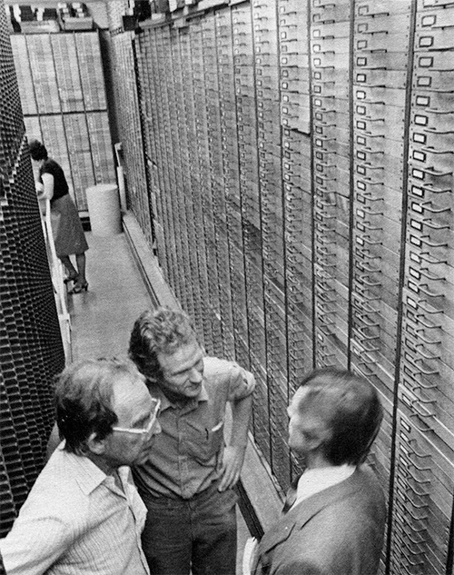
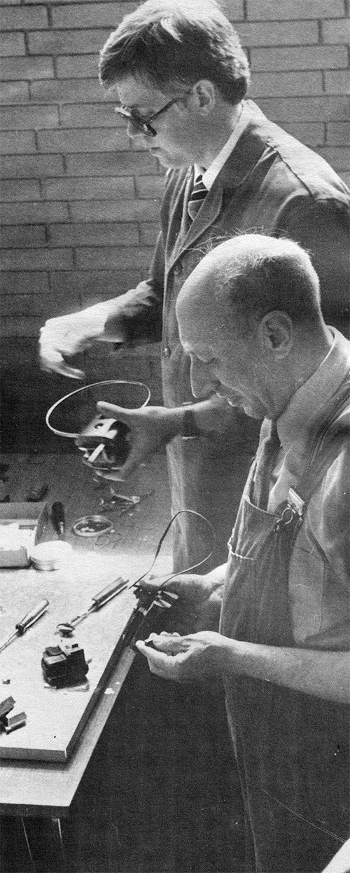
Rodger Glessner and others
inspect contents of one drawer of brass
pattern letters. Such patterns are used
in cutting punches.
The advance of technology, however, has not
been ignored by this organization—far from it.
The Lasercomp equipment demonstrated to
interested ATF members represents some of the
most advanced and sophisticated typesetting
equipment available anywhere in the world. In
deed, modern technology was also being applied
to the hot metal system by means of
computerized keyboarding and counting, enabling
a keyboard operator to eliminate the need for
key bars, stopbars, or, indeed, everything
relating to matrix requirements before the job
is initiated. With aid of the computer,
counting and final punching of a caster ribbon
are separate and completely automated.
Huib van
Krimpen, Bram de Does, and Duncan
Avery are dwarfed by floor-to-ceiling
drawers of pattern letters for virtually
every English Monotype design.
Our tour would logically begin with drawings
for type designs and, indeed, John Dreyfus,
consultant to the corporation on typographic
matters, had a superior sampling of Monotype
letter designs available for us to
study—including notes made while the designs
were in development.
We did not see the actual process of converting
the designs into brass patterns, but most of us
were genuinely overwhelmed at the size of the
area wherein all the company’s master patterns
were housed, readily available when needed for
cutting new punches.
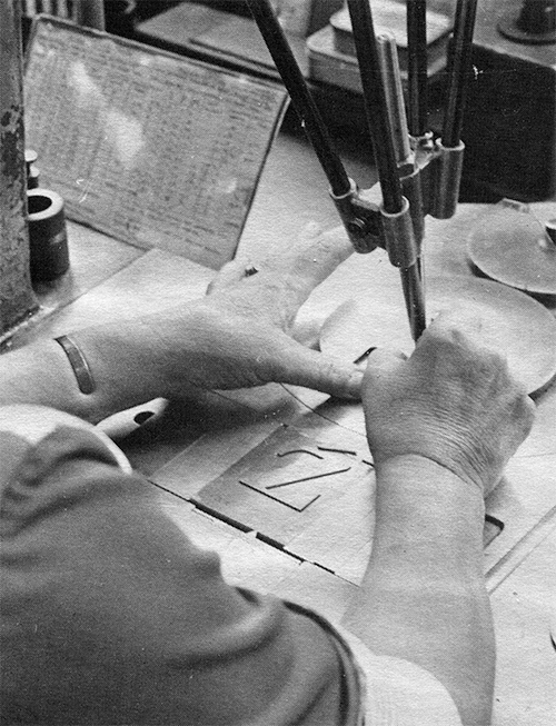
Brass pattern is carefully traced by skilled operator
of pantograph, which is a precision engraving tool
capable of recreating the pattern to any specified size.
Punch cutting activities were most evident,
with workers operating pantographs for this
purpose. It is to be understood that punches
are retained and generally reused unless wear
or damage mandates a new punch.
The process of matrix making is fascinating to
the casual observer and virtually unbelievable
to the person understanding exacting
requirements for depth of drive, squareness,
alignment, tilt, etc. Uncompromising precision
in this area assures that a replacement letter
will align with a font that is several years
old.
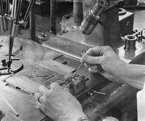
Operator loads a blank punch in holder for
subsequent engraving.
To retain such precision, microscopes are in
evidence everywhere, generally as integral
parts of the various machines used throughout
the process of converting a roll of square
brass stock into hundreds of finished matrices.
Milling the sides for squareness is essential
if the punch is to be driven into the brass to
proper alignment. Likewise, the surface of the
brass blank must be polished to a mirror finish
with absolutely no flaws, for this surface
ultimately will form the face of the typecast
character.
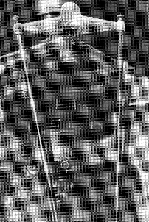
The holder is inserted in
the top of the pantograph and
almost microscopic
cutting tools form the relief letter in steel.
Throughout the matrix manufacturing facility,
numerous special-purpose machines stand ready
to perform their tasks—from drilling the cone
hole to milling sides to drilling the side
holes to stamping indispensable identification
numbers. For example, one device has a
needle-like gauge which extends into the face
of a newly stamped matrix to determine depth of
drive. The same machine mills the bearing
surface of the new mat to the unvarying 50
thousandths depth of an English composition
matrix.
One can only marvel at the scrupulous care
which must be taken to assure that all these
devices remain to their exacting standards yet
retain their ability to turn out matrices on a
“mass production” basis.
Inspection is an on-going process at each step
in matrix manufacture. Yet each matrix must p
ass the ultimate test by being enlarged 50
times its size and examined for alignment,
width of letter strokes, unblemished face, and
other details. Only then is the matrix sent to
the consumer.
The first step in making brass matrices is to cut square stock
into short lengths which eventually will be milled to finished height
of a matrix.
Rows of highly polished brass blanks
stand ready with punches which will be stamped into the polished
surfaces.
Operator inserts a tray of matrix blanks
into the powerful punch press for rapid-fire punching of several
identical letters.
This device accurately measures the depth of
drive after matrices have been punched and mills the mat's bearing
surface to assure a precise 50 thousandths drive on all mats.
Overview of portion of matrix making facilities showing
some of the numerous specialty machines necessary for the process.
Device which precisely mills the sides of matrices to
proper alignment and squareness.
This machine is
used to mill matrix sides to accommodate the matrix comb.
Enlarged to fifty times its original size,
the image of a composition matrix is examined
in every detail against a specific ground glass
template which shows set width increments and
precise letter positioning.
One of several highly skilled men
working in the mold department. Various
parts are laid out before him; each is
hand-fitted to the most demanding tolerances.
With regard to precision, only the manufacture
of a Monotype mold can compare with the
manufacture of a Monotype matrix, and ATF
members had a chance to visit these facilities
also.
The mold, ultimately, determines the precision
of five surfaces on a piece of type; squareness
on all dimensions is mandatory. Yet the mold
must withstand the constant pounding of the
matrix case, the heat of molten type metal, the
corrosive nature of the water coolant, and the
potential of wear created by the constant
motion of the mold.
Parts for the mold are, indeed, mass-produced
from extremely high-grade steel. And they are
produced to demanding specifications. Even so,
the ultimate assembly of each Monotype mold is
a process demanding the highest skills of each
workman involved in rubbing and checking each
part to fit precisely to the next in a
hand-assembly process. Nowhere in any industry
will one find machine work practiced to closer
tolerances or greater precision.
Sections of the Monotype works not viewed
included areas where machines are cast,
machined and assembled. This activity has
diminished in recent years, yet it does
continue at Salfords.
The legendary Monotype School remains, and ATF
members were given a chance to visit casting
and keyboard facilities within this area. That
is where the computerized keyboard was
demonstrated. Students from all over the world
come here to become expert Monotype operators.
It was no surprise to see keyboards with Arabic
keys, and casters with reverse delivery so that
such a language could be properly assembled in
galleys. Also in operation was a large-comp
caster doing 18 point at the time. (To we who
are novices, it was reassuring to see an expert
machinist “have a squirt” as we toured the
facility.)
We first met David Belfort at the New York ATF
Conference hosted by Pat Taylor in 1980. At
that time, David promised if we were to come to
England he would give us a very special tour of
the facility.
Aided by Duncan Avery, John Dreyfus and many
others, David and the Monotype Corporation
exceeded our fondest expectations. Witnessing
such an open and cooperative spirit, ATF
members could only respond by saying long live
Monotype. And thanks, once more, for such a
memorable tour.
3
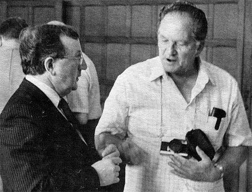
Paul Quyle
David Belfort, our host from Monotype International,
in discussion with Paul Quyle.
Twice in my life I have made a half-hearted
attempt to cast type: once with my 72-point
English-made hand mold, and once with my
charcoal-fired ancient Bruce Pivotal Caster.
Both attempts met with indifferent success, but
still with enough success to kindle a desire to
do more.
Since that time I have been slowly, very slowly
moving toward the day when I can finish
construction of a new print shop. This new shop
will include a small type foundry. Equipment
has been obtained and put into storage waiting
to be resurrected when the great day comes. I
now have tons of scrap iron in the shape of a
Monotype sorts caster, two Linotypes, a
Thompson caster, Bruce Pivotal caster, Elrod
casters, and a stereotype caster, not to
mention several hundred fonts of foundry mats,
old punches, tools, and an electroplating bath.
All this sits waiting for me to get up my
courage to quit my procrastinating and get to
work. However, in my mind, owning a piece of
machinery and having the courage to learn to
use it, are two very different things. Any
machine that has more than two moving parts,
starts getting beyond my competence. I am a
good blacksmith. I can forge, harden, and
temper a steel tool without too many problems.
In fact, my more knowledgeable printing friends
look at my printing and tell me they really
don’t know any better blacksmith.
Up to this point, I haven’t found much in
typefounding that needs the sledge-hammer
approach. So I keep putting off the
typefounding. The desire is there, some day I
will get it all together and start casting
type. I don’t want to sell type, I just want to
fill my own cases, and share with my friends. I
want to do what I can to keep some of the old
faces alive.
Then out of the blue I learned of the ATF and
the Conference at Oxford. This could well have
been what I needed to tip the scale—to actually
get started. It was better than I dreamed. I’d
actually meet those people whom I had only
heard about. I talked to, and learned from
those people who had gone the same route—people
with answers, with practical experience, and
people who convinced me that I too could do it.
Though the Conference was in England, and was
International in scope, it was the American
group that gave me the greatest boost. I felt
the Europeans were very knowledgeable, but they
were more interested in academic and
professional values. They made professional
contacts, and presented their research papers,
but they had little of the practical, “nuts and
bolts,” “let’s do it,” attitude of the
Americans. The difference in the lectures was
striking. A paper read in a virtual monotone
contrasted sharply with the excitement and
excellent presentation of Stan Nelson. Stan not
only had enthusiasm and a wealth of personal
experience, but also superlative visual aids.
Everyone I met at the Conference was friendly
and helpful. I enjoyed them all, but the high
points were the discussions with those from ATF
during the bull sessions after hours. I learned
more, and gained more confidence from these
talks than any other part of the Conference.
The European professionals probably know more
than all of us put together, and for some of
our more advanced founders, probably were the
most important contacts of the Conference. For
me as a beginner, it was the friendly, “here’s
how to do it,” of the ATF that was the most
encouraging.
For me, seeing the molds and punches, the
finished type and printed pieces of Stan
Nelson’s was a revelation. I now know it can be
done—the eye and hand of the craftsman can
still produce beautiful functional type. Both
Pat Taylor and Rich Hopkins made a great
impression on me. These men have gone beyond
the hand approach, clear to the functioning
machine foundry, and were willing to share
their experiences without reservation with a
beginner. The time I spent with them will be
treasured. Many others, like Paul Duensing,
were a gold mine of information and help.
Every single part of the Conference was
excellent, but the extras, like the trip to the
Monotype plant and the J. Barcham Green Paper
Mill, should be commented on. The treatment and
the welcome we received went far beyond
anything we could have expected. They were
friendly, informative, helpful, and kind. I was
impressed at the Monotype plant. Every person I
talked to knew what he or she was doing, and
was pleased and proud to explain it. They
stopped machines to show me. They explained the
hows and whys to me. For the first time in my
life, I was able to see and understand the
total production of a Monotype typeface. I
doubt that the business they will secure from
all of us put together will begin to repay them
for the wonderful buffet they gave us. Their
kindness will be long remembered.
The few of us who went to the J. Barcham Green
Paper Mill owe a special thanks to Harold
Berliner, who made initial contacts. I have
made some hand-made paper, so the process was
familiar to me. However, to see the mill in
operation as a viable commercial operation was
a real thrill. The warmth and friendliness of
Simon and his father made it far more valuable
than just seeing the operation of the mill.
To end everything, I can only say, “It was
great!”
3
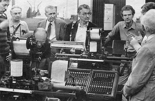
Paul H. Duensing
Some of the Oxford Conference participants
in the Monotype School keyboard room include Dan
Driscoll, Paul Duensing, Roland Hoover (looking
at keyboard), Rodger Glessner, Muir Dawson,
Bram de Does, an unidentified Monotype guide, and
Barney Rabin.
Among the many who attended the Oxford
Conference were a number of typographically
famous names, known for long associations with
the graphic arts profession.
Duncan Avery and David Belfort of the Monotype
Corporation, Ltd., contributed useful comments
at the lectures and co-hosted a day at Salfords
for the non-British attendees.
Suzanne Ferris runs the Sea Pen Press and Paper
Mill in Seattle with her husband, Neal Bonham.
She’s a former student of Prof. Walter Hamady
of the University of Wisconsin.
Guy Botterill, type collector and enthusiast of
Baltimore and proprietor of The House of Type
(which is a press name, and not a graphic arts
dealer), survived many logistical mishaps with
usual good humor.
Perpetually pleasant Gertrude Benohr spread the
sunshine of her personality on behalf of D.
Stempel Type Foundry and Stempel’s sister firm.
Haas Type Foundry was represented by Alfred
Hoffmann. The former proprietor of the Bauer
Foundry, and currently of Fonderie Neufville of
Barcelona, Wolfgang Hartmann was a welcome
addition. The venerable Stephenson Blake
Foundry was represented by Geoffrey Hulett; Dr.
G. W. Ovink, long associated with Typefoundry
Amsterdam, was there.
Designers of type included John Lane, until
recently with Autologic of Los Angeles; Dr.
Berthold Wolpe (Albertus, Pegasus, etc.); Bram
de Does, typographic designer to the House of
Enschede at Haarlem, Netherlands and designer
of the recently introduced calligraphic
photocomposition series Trinity. With so many
graphic talents represented, it is difficult to
say who should be titled “calligrapher,” but
certainly Dr. Gunnlaugur S. E. Briem of
Iceland, Roy Rice of Atlanta, Dr. Arthur Osley
of Surrey, and Karina Meister, formerly of
Austria and now resident in Amsterdam, must all
be in the front row.
Scholars, of course, abounded at this meeting
and, aside from those on the program, the group
included the venerable Nicolete Gray, authoress
of the standard work on decorated typefaces;
John Dreyfus, longtime typographic advisor to
both the Monotype Corporation and Cambridge
University Press, and prolific editor and
author of technical books and articles; Prof.
Gerd Fleischmann of the Fachhochschule
Bielefeld; Janet Ing from the University of
California, Berkeley; Nigel Roche, an associate
of James Mosley at the St. Bride Printing
Library; Thomas Conroy, University of
California Library School; Eleanor Garvey of
the Houghton Library, Harvard University; Dr.
Claus Gerhardt, Johann Gutenberg University,
Mainz; Michael Hutchins of London’s Camberwell
School of Arts and Crafts; and W. D. Thorn of
the National Library, Australia. Muir Dawson,
famed Los Angeles book dealer, was there.
From North America, fine printers and private
press proprietors included Charles Hinde, Santa
Clara, Calif.; Laurence Hines, Sedona, Ariz.;
Roland Hoover, Washington, D. C.; Rodger
Glessner, York, Pa.; William Rueter, Toronto.
From Holland came Huib van Krimpen, son of
well-known Enschede type designer; and from
Kent, England, the talented Graham Williams.
In the typecasting field, Paul Quyle of
Murphys, Calif.; Barney Rabin, Marblehead,
Mass.; Kit Kunze associated with Harold
Berliner’s Type Foundry in California; machine
dealer Ernie Lindner of Los Angeles; and the
resident punchcutter of Joh. Enschede en Zonen,
Haarlem, Hendrik Drost enjoyed the proceedings.
3
We cannot fail to comment on an article in the
San Francisco Chronicle of March 1, 1983, which
reported that Adrian Wilson, designer and
printer of fine books, recently had received
more than a quarter of a million tax-free
dollars from the MacArthur Foundation of
Chicago. The grant is made on the basis of
“exceptional talent, originality,
self-direction and promise for the future.” His
wife commented that he always has been “long on
prestige and short on money-earnings.” His big
splurge, the article said, was going to be the
purchase of a second-hand Heidelberg press.
3
A followup to the article on the Gujarati Type
Foundry in the last ATF Newsletter is a must,
for since that time, several of us have been
privileged to meet Mr. Modi (at the home of
Lillian and Parker Worley at Haddonfield, N.J.)
during his visit to the United States in
August, 1983.
As a professional typefounder, Mr. Modi has an
unusually keen understanding of the interests
and desires of amateurs and enthusiasts, and
has expressed a willingness to work with us in
filling our needs especially for older type
designs for which he has matrices at his
foundry.
He admits the large portion of his business
today is Univers, Times Roman, Gil Sans, and
other modern faces available on the English
Monotype, yet he is willing to cast from
matrices filed away—which represent the past 80
years of typefounding in England and the
United States—providing there’s enough demand.
As a follow-up to my efforts to provide English
names for the various faces shown in his
specimen book, Mr. Modi went to his fantastic
record books and provided a complete list of
original names for all faces in his specimen
book, along with names of the foundries which
originated the designs. Those included H. W.
Caslon, Inland Type Foundry, Barnhart Brothers
& Spindler, American Type Founders, and J. G.
Schelter (probably of England).
Further to help us identify faces we might
want, Mr. Modi is willing to ship a quantity of
his casebound specimen books to us for
distribution in the United States. He hastens
to note there is not an abundant supply of
these historic books available. They were
printed around 1930. If you want a copy, please
notify me in writing immediately. Cost for
overseas shipping and postage in the U.S.
should equal about $25.00 per book. I will ask
for your check now and will receive the bulk
shipment and then forward individual copies to
those who have sent checks. This definitely
will take time—a year may not be too much time
for everything to gel.
Mr. Modi is not oblivious to the march of
progress. He is most interested in developing
appropriate photocompositon technology for
introduction into India, and expresses
dissatisfaction with what is currently
available, especially with regard to letter
designs. But he also laments the lack of
commitment to learn a still-valuable
trade—typefounding—on the part of the younger
generation of Indians.
By talking with him, it quickly became evident
that problems involved in casting type know no
national boundaries. He grieves over “cold
faces” on castings from the Super Caster, and
candidly admits that the best results still are
obtained with the trusted Bruce casters still
in heavy use in his foundry.
Mr. Modi is an extremely rare person in the
trade, for he not only knows the business,
mechanical and technical sides of typefounding,
he also is well acquainted with the artistic or
design aspects and has been deeply involved in
developing fonts for the various languages in
use in India.
3
Relocated Monotype Equipment To Be Used in Book Arts Teaching
Richard L. Hopkins
Sometimes the most casual information can bring
gratifying action. In the last Newsletter,
Harry Bollinger mentioned in a note his desire
to commend the Lancaster Press of Lancaster,
Pa., for its desire to properly dispose of its
remaining Monotype equipment. I am now happy to
report all remaining equipment went to the
University of Alabama where Richard
Gabriel-Rumonds, Glenn House, and others are
really seriously approaching their bookmaking
courses in the School of Library Science.
And speaking of bookmaking and the book arts, I
have received a most attractively produced
flier from Richard Mathews at his Konglomerati
Foundation in Gulfport, Fla., explaining his
objectives and displaying the operations in
attractive photos. The cover photo features the
Monotype sorts caster in operation;
Konglomerati was outfitted by Pat Taylor of the
Out of Sorts Foundery in Larchmont, N.Y.
Also speaking of the book arts, the Book Arts
Review of December, 1982, featured a lengthy
interview with Pat Taylor “Casting About for
Type: An Interview with Pat Taylor.” In the
interview, Pat mentioned with regard to casting
type, that “the biggest problem, though, is
that anyone who wants to make type has to have
that rare combination of artistic interest and
mechanical ability.” Truer words were never
said.
Another book-art note:
Janet T. Ing, who attended the Oxford
Conference, has sent along a most interesting
announcement of the book arts master’s program
underway at Mills College, Oakland, Calif.
Promotional literature is most interesting: “A
unique master of arts degree that combines
studio courses in letterpress printing and hand
bookbinding with the academic study of
typography, history of the book and graphic
design in a liberal arts setting.” She asks for
help in locating hand-casters closest to
Oakland.
3
Those of us who attended the last two or three
conferences of the ATF were given
demonstrations and shown slides of the art of
matrix making for Monotype machines. Matrices
or “mats” for Linotype or Intertype machines
are made by a similar method with differences
due to the different ways they’re used in the
machines to cast type.
Whereas with the Monotype individual types are
cast either as sorts or composition, with
Linotype mats are assembled to cast slugs of
a predetermined length. This requires a
completely different configuration of the mats
used in Linotype composition. Whereas the
Monotype mat is flat with the punched letter on
the flat side, the Linotype mat has the letter
punched on one of its edges, once the blanks
are machined to the proper dimensions. See
illustration.
Linotype Mat
Width of letter
and width of mat
must be equal.
Starting from scratch, a drawing of the letter
is made ten to twenty times larger than the
finished size. A template is then made from
this drawing reduced to four times the finished
size. The template is used in a pantograph
machine as a guide for the stylus. On the other
end of the pantograph, the cutter works on the
end of the punch to give the configuration of
the letter. This punch is then inserted
properly in a die-punching machine which
punches the engraved end of the punch into the
brass matrix blank to a fixed depth.
Commercially, the manufacture of the Lino mats
is a sophisticated process and requires
sophisticated machine tools, especially for
mass production which may require as many as
thirty operations. For an amateur, however,
where time is not too great a factor, it is
possible still to purchase blank matrices
finished to the proper thickness depending upon
set width of letter—then, if a proof is
available of the letter wanted, steps can be
taken to engrave the character, thus
avoiding the entire punch-making process.
Linotypes and Intertypes are still being
manufactured and sold, primarily in undeveloped
countries where computerized typesetting has
not taken hold. The word is that some companies
have standing orders for new machines to be
delivered every year, and that the manufacture
of mats proceeds apace to keep up with the
limited demand and also to retain the
prevailing skills.
Space does not permit going into detail as to
the step-by-step process of engraving the Lino
mats, but the writer encourages correspondence
regarding this operation. Either call (813)
383-5683, or write to 600 Sutton Place,
Apt. B-204, Longboat Key, FL 33548. After May
1st (617) 631-4202 or 12 Pequot Rd.,
Marblehead, Mass. 01945.
3
English Linotype Organization Still Offering Matrices for Sale
Richard L. Hopkins
From F. Bryant, sales director for Linotype &
Machinery Ltd. in England, comes the news that
matrices are available from that firm for a
great variety of faces—if you’re willing to pay
the price.
“You are correct in that we are affiliated with
the Mergenthaler organization and it is
probably true to say that organization is now
totally dedicated to the supply of photocomp
equipment...
“The hot-metal linecasting machine has nearly,
but not quite, entered into the category of
history but at the present moment the machines
are still being made and sold on a regular
basis certainly by two manufacturers in the
United Kingdom.
“We have currently available ex stock but in
addition to that we do have an enormous range
of typeface punches of faces no longer in
production and further we have punch facilities
which enable us to cut punches to almost any
desired face that can go on to linecasting
machine mats. But, as I mentioned, ‘specials’
are labour intensive and hence expensive.”
In Germany, Paul Duensing reports, Linotype has
made its last matrices and will discontinue the
operation. Paul obtained this information on a
recent visit to that country.
As this issue was going to press, it was
learned that Harris and Mergenthaler, who once
bitterly competed for the matrix market, had
agreed to merge their remaining operations in
an effort to supply those still demanding
matrices throughout the world.3
If you operate a Monotype caster—especially an
American caster—and know of a manual which you
need but don’t have—contact me. Lewis Pryor has
sent all the Monotype technical manuals from
the Harry Weidemann estate. We hope to give
them proper homes so their usefulness can be
continued.
The list exceeds two typewritten pages. Please
contact me directly. Before you ask, no
specimen books are included.
Proceeds from the sale of these items will be
split between the ATF Newsletter fund and Lew
Pryor
3
How do you distinguish a Garamond period from a
Bodoni period in 6 point? If it’s foundry type,
the alignment is different and perhaps the
nicks are different—but if it’s Monotype, you’d
better not get them mixed up in the first
place.
Monotype matrices obviously needed a system to
distinguish the indistinguishable—mats that may
vary from each other by only a few
ten-thousandths of an inch, but enough not to
be interchangeable.
The solution was a simple numbering system, but
its application has raised questions ever
since. Composition sizes have a letter added to
the series number, and that is seldom a
problem. But the number itself is something
else, for there are exceptions to every
apparent rule.
Italics, for instance, in the display sizes are
always designated with a “1” annexed to the
corresponding roman number; except in a few
cases. From there on, the “rules” are vague.
Boldfaces may have a number adjacent to their
light counterparts, or the same number plus 100
or 200, or an apparently unrelated number.
After that, it’s anybody’s guess.
The list herewith contains many obsolete and
private numbers, and is thought to be more
complete than any other single list. It is
derived from Lanston sources, except for a few
numbers of composition mats from users who
couldn’t have gotten them from other
manufacturers, and a few most trusted sources.
Now for a little quiz. (1) What four italics
violate the “annex 1” rule? (2) What face has a
different number for giant sizes than for
composition and regular display sizes? (3) What
series is/are misnamed, apparently because
Lanston duplicated the wrong foundry faces? (4)
What type family has two different numbers for
each of several family members? (5) What faces
with different series numbers are apparently
identical? (6) In what family is only the
widest member named “Condensed”?
The answers to these questions point out some
of the inconsistencies and irregularities in
Monotype faces. (1) The italics of 11, 21, 42
and 790 are respectively 1111, 2111, 41 and
1891—the first two because 111 and 211 were
already in use; the third possibly because the
faces were copied from originals of two
different foundries; and the latter because of
confusion between Rockwell Antique and Stymie
Bold. (2) Caslon Old Style is 337 in 6 to 36
point, 437 in larger sizes; 337 is a copy of
ATF’s Caslon Oldstyle 471, while 437 is a copy
of Caslon and Company’s Caslon Old Face, from
which ATF’s face was derived. (3) An old
Monotype specimen sheet for Condensed Gothic
515 says, “Formerly our 18-51; we found it did
not match the balance of the series, so we have
given it a new number.” But Plymouth Italic 601
was never given a new number, although in
display sizes it is a copy of ATF’s Post
Oldstyle Italic, not Plymouth Italic. (4) Most
versions of Copperplate Gothic were cut first
as C2 cap-and-small-cap fonts, plus display
sizes. When the Plate Gothic arrangement was
developed, these faces were recut under new
numbers. (5) 6 point Alternate Gothic 51 and
Alternate Gothic 77 are both 5 set, C1
arrangement, and apparently identical; English
Caslon Old Style Italic 370 and Inland Caslon
Old Style Italic 1370 also appear to be
identical. (6) 51 and 77 are both called simply
Alternate Gothic by Monotype, while the wider
177 is designated Alternate Gothic Condensed!
Now for a few serious questions for which I
want answers if you know them. (1) The Mono
book says Cheltenham OS Italic fonts have 91
characters in display sizes, but logic accounts
for only about 80, unless foundry swash caps
have been copied—does anyone have a 91-mat font
to check this? (2) Greco Bold and Italic 326–
3261 are offered by several Mono founders, but
not mentioned in any Mono literature I have
seen—can anyone confirm these mats to be
Monotype, Thompson (pre-Mono), etc.? (3) Mono
says Scotch Italic 361 fonts contain 13 swash
caps—can anyone provide a proof of them in 24
point for me?
Toward compiling a comprehensive book on
American metal typefaces of the 20th century, I
have gathered nearly all Monotype faces or
their foundry counterparts, with the following
exceptions: 35, 44, 47, 50, 59, 62, 63, 73, 78,
81, 82, 89, 92, 103, 108, 110, 117K, 134, 143,
1591, 161, 161K, 165, 172, 185, 189, 205 (old),
207, 208, 212, 222, 2541, 263, 301, 316, 317,
325, 4031, 4491, 458, 618, 630, 690, 890. If
you have any of these fonts, please contact me
at 181 Mt. Lebanon Boulevard, Pittsburgh,
Pa. 15228.
3
Several months ago, Harry Bollinger of Alden,
Mich., advertised for Monotype matrices,
machines, etc., in a trade publication. He got
several answers and obtained what he wanted. In
capsule form, here are some of the replies he
didn’t take advantage of:
Somerset Commercial Printing, 206 South Market
St., Somerset, Ohio 43783, phone (614)
743-1307. Francis A. Emmert listed several
fonts of mostly ordinary Monotype display faces
and border molds for the material maker.
Schneider Printing Company, 2401 Meadows
Avenue, East Peoria, Ill. 61611, phone (309)
699-3212. Edward H. Schneider lists a gas-fired
Thompson, two molds and over 150 fonts of mats
for $700.00.
Lehigh Typesetting Service, Inc., Allentown,
Pa., forwarded a list of several fonts of
composition matrices, a Thompson, some fonts of
display matrices, five 15×17 casters and three
keyboards.
Joseph Brennian Co., 3832 North Jasper St.,
Philadelphia, Pa. 19124, phone (215) 743-3500.
Ronald Brennian listed several loose fonts of
composition mats and display mats. Apparently
all had been cast as sorts—not in die cases.
Gray’s Printing, 11 East Eighth St.,
Wilmington, Del. 19801, (302) 652-5626. Stan
Golden listed 18 fonts of composition mats in
die cases, chiefly Kennerley and Caslon.
Monotype Composition Company, Inc., 2050
Rockrose Avenue, Baltimore, Md. 21211, phone
(301) 467-3300. George Evans, Jr., lists nearly
two pages of composition matrices in die cases.
Most of the usual Lanston faces are on the
list.
3
'I Dreamed of Casting My Type...' and Other Letters
Are your eyes playing tricks?
Your sense of proportion is not off. Those are "real
hands" holding a miniature matrix case which fits into a miniature Monotype machine
(shown in b(l(;_kground). The model, complete in nearly every detail, is at the Monotype
factory in England, where it was built by factory employees several years ago. It's about
one-fourth actual size and even has an electric motor which makes it "go through the
motions" of a life-size caster.
Richard L. Hopkins
“Years ago I dreamed of someday casting my
type, but by the time the shift to photo
composition brought casting equipment within
reach, I had no place to house it, or the
energy to get into it. I do appreciate what you
are doing with the Newsletter.”
Carroll Offerman
111 Lusk Avenue
Iowa City, Iowa 52240
Ray Ballash of Cerritos, Calif., combines avid
interests in two hobbies. He has a Model 14
Linotype and other printing equipment in his
basement, and uses this equipment to publish a
journal for a railroad museum at Pinnacate,
Calif. It’s strange how folks often get into
matching hobbies. I know at least two other
amateur printers who also are involved in
railroad museums.
Richard L. Hopkins
“I was not offended by your editorial mistake.
I was slightly amused and was delighted finding
myself a world citizen... We are commercial
typefounders and are enjoying good business.”
Arvind M. Patel
Gozaria Pole
Shahpur, Ahmedabad 380001
India
(Your editor mistakenly placed Mr. Patel’s
foundry at Islamabad, which is in Pakistan, in
an article on page 3 of issue 8.)
“Having joined the retired group, I am
contemplating the finalization of a big
wish—being back in the composing and printing
of jobs that I can enjoy... Most of my Mono
time was spent on tabular work keyboard and
casting at the Office of the State Printer.
Have run strip, Giant, Thompson and Elrods, so
have a general knowledge of casting. Wonder how
many people know about turnback on the
keyboards for casting box heads for tabular
work? Our work involved a lot of 6/6, 6-set,
set 60 picas wide. One year I ran clean-up
(second shift). Kept six comp casters running
12 hours per shift—that’s a lot of 6-point
pieces. But water long under the bridge.”
Ralph B. Ahlgren
3335 Becerra Way
Sacramento, Calif. 95821
“Can you suggest a source for Intertype machine
parts and supplies?”
John W. Whalen | Wayzgoose Press
48 Gwynne Avenue
Ottawa, Ontario K1Y 1W9
Canada
“I know where you can buy 22 Linotypes in one
swell foop if you’re interested. It sure is sad
to go into a once-active shop and see all those
machines just setting there waiting for the
junk man. I think I’m beginning to resent the
computer age—they take all the fun out of
type.”
Harry Bollinger | Talponia Press
At the Blue Mill
Alden, Mich. 49612
“Interesting article on the Paige Compositor
which was largely financed by Sam Clemens. I
had been intrigued looking over the one in the
Mark Twain house in Hartford, Conn. Not
operable, of course, and some parts missing,
but what a tremendously complicated machine. It
sits there in a basement room idle and
neglected.”
John E. Hancock
406 Mohawk Avenue
Scotia, N.Y. 12302
Henry Wylan of Milwaukee, Wisc., relates an
interesting (and typical) experience in
discovering an English sorts caster on the
verge of being tossed out of the Milwaukee
Technical College. He took a U-Haul and rescued
the machine and says it’s in excellent
condition. Henry tunes and works on pipe organs
as a business. He already has an Intertype and
says organs and Intertypes are quite similar in
many ways. We hope in future issues he will
enlighten us more fully on this thought.
Richard L. Hopkins
“After working as a commercial artist in and
around printshops for 20 years, in 1974 I was
fortunate enough to become a teacher of
letterpress printing with handset type in the
Library School of the University of Alabama...
Many were the times I felt alone, frustrated,
even desperate. I looked forward with dread to
the day when the last font of metal type was
too battered and worn to print another word.
Membership in ATF and APHA has given me the
sure confidence that such a day will never
come; and the willingness, no, the eagerness
with which these groups share knowledge and
resources gives me greater understanding of
‘fellowship.’ I salute the lot of us. May our
tribe increase.”
Glenn House
University of Alabama
Graduate School of Library Service
University, Ala. 35486
“The Green family has engaged in paper making
since the end of the seventeenth century.
Successive generations practiced their craft in
East Malling until, in 1810, John Green
purchased Hayle Mill at Maidstone.” Thus begins
the introduction to Jack Green’s Papermaking by
Hand in 1967 which was my introduction to the
Green family and to English hand papermaking.
Until 1798, when Nicholas-Louis Robert invented
the machine that was to change papermaking from
craft to industry, all paper was made by hand.
It was a traditional craft, handed down from
father to son in what today is known as
“cottage industry.” By the early 1900s most
paper was made by machine, with handmade paper
in demand only for fine bookmaking, banknotes
and special papers unsuited to mechanized
making.
In the United States, machine-made papers
rapidly supplanted the handmades, and in 1907
the last commercial hand mill in the U.S. was
closed. In England, with its long tradition of
hand papermaking, its demise was slower, but
nonetheless inevitable. In 1974, when I first
came to know Remy Green, then managing director
of J. Barcham Green Ltd., the Hayle Mill was
the last remaining commercial handmade paper
mill in England. Thus it remains today, now
managed by Simon B. Green, Remy’s son.
Through the kindness of Remy and Simon, the ATF
members attending the Oxford Conference were
invited to visit Hayle Mill. Our visit began
when Simon picked up eight of us at the
Monotype Works at Salfords. An hour’s van ride
brought us to Graham Williams’ Florin Press,
housed for the time being in a converted Oast
House—a hop drying barn.
Our first evening in Kent was celebrated with
dinner at Graham and Nina Williams’ recently
restored fourteenth century home, where the
Press is soon to reside. It was a lovely dinner
with most gracious hosts. The next morning the
group met at Hayle Mill to see how paper is
made by hand.
Hayle Mill lies in a quiet valley quite near
the town of Maidstone, but as you leave the
main road and descend into the valley, time
seems to roll backward. Like hand papermaking,
Hayle Mill has changed in the last hundred plus
years, but in both cases the changes have been
subtle. We entered the mill grounds to find the
mill built squarely across the stream, its rear
wall a part of the dam. The mill wheel, no
longer powering the beaters, stands in the
interior of the mill slowly rotating in a
trickle of water.
Our tour began in the room where in days past
women stood at cutting tables fitted with
upright blades, cutting rags into small bits
prior to beating. Rags are no longer used as
the primary material for hand papermaking at
Hayle Mill—the addition of synthetic fibers
makes them unsuitable—so cotton linters bought
in sheets from a primary processor provides
the “furnish” for the beaters. The rag room
now houses a beginning museum. Two hand
presses and a Typograph, a slug casting
machine in which the matrices are strung on
wires, are the major pieces of equipment now
in place.
The next area we visited was the beater room,
where two beaters were in action preparing
pulp. Beating is the first step. The “furnish”
(cotton linters, plus other fibers such as flax
and manila) is combined with water to make the
pulp. The beater is a long oval “tub,” on one
side of which is a roll with phosphor bronze
blades rotating above a bedplate with similar
blades. The action of the roll and bedplate
separate the fibers of the pulp and suspend
them in the water.
After beating, the pulp flows to a storage
chest on the lower floor of the mill where it
is kept agitating until it flows into the vat.
Our path from the beater room took us down a
winding flight of stairs past the mill wheel
which in years past had powered the beaters. It
has been idle for many years, but recent energy
prices may make its use economic once more.
The vat room was our next stop. This is where
paper is made, and I think most of us expected
to see old men, ancient papermakers, stooped
over the vats patiently forming sheets of
paper. What we actually saw was a group of
young men—none over thirty, I would
guess—plying that ancient craft with skill and
enthusiasm.
The process, however, is the same as it has
been for centuries. The vatman dips a wooden
mould into the vat of pulp, and gives it an
appropriate shake as he lifts it. This shake
causes the floating fibers to interlock as the
water drains off, forming the sheet.
I think most of us expected to see old
men, ancient papermakers, stooped
over the vats patiently forming sheets
of paper.
I think most of us expected to see old men,
ancient papermakers, stooped over the vats
patiently forming sheets of paper.
The mould is a slatted wooden frame covered
with a screen and fitted with a “deckle”—an
open frame which serves to hold the pulp on the
mold while the sheet is being formed. After the
water drains from the sheet, the deckle, and
the mould with its mat of wet fibers is passed
to the coucher.
The coucher presses the mould face down on a
piece of felt on a low stool, transferring the
new sheet to the felt, and places the mould
back on the vat for the vatman.
Only one deckle is necessary for two moulds,
because while the coucher is transferring one
sheet from the mould to the felt, the vatman is
forming another sheet on the second mould.
After couching the sheet, the coucher lays on
another felt, then couches the next sheet, and
so the “post” grows. When the post is
completed—usually 144 sheets—the vatman and
coucher roll it to a large hydraulic press,
where the post is given an initial pressing to
remove most of the water from the sheet.
After standing under pressure for a few hours,
the post of paper is removed from the press and
the sheets of still-damp paper separated from
the felts. The “waterleaf” is still quite
fragile at this stage, and must go through
further stages of drying, pressing and curing
before it is ready to be packed for sale.
Our tour continued through the drying lofts
where in days past “spurs” of paper (4 to 6
sheets) were hung over cow-hair ropes to dry.
The long sides of the loft stretch across the
valley, and are made up of vertical slats that
could be opened or closed to control the
drying. Remy also showed us the “rooms” where
the paper was dried after sizing: Vertical pine
posts, 12 feet high forming sections of about 8
by 10 feet area in which canvas was stretched
in layer after layer to hold the sheets.
Now the loft is occupied by a drying machine
that has controlled electric heat, and the
sizing is done in the vat as the paper is made.
More efficient methods, but not nearly as
interesting.
Our visit to the mill ended as we watched four
women fully inspect each sheet for flaws,
sorting the sheets into stacks of beautifully
textured Barcham Green papers.
3
For Sale — Complete Giant Monotype Caster
department for sale. 18 to 72 point molds, 50
fonts, two casters, duplicates, many extras.
Copyfire Type, Inc., 441 West Eleventh St.,
Indianapolis, Ind. 46202.
Wanted — Magazine comb (Matrix Channel Guard,
#I-298 or I-299), need 2 and magazine cover
(Matrix 90- or 91-channel Linotype magazines).
Also need pair duck bill pliers for adjusting
channel entrances and extracting mats. Fred C.
Williams, 24667 Heather Ct., Hayward, CA 94545.
Wanted — Intertype magazines and matrices.
Gilbert Minnich, Star Printing, P.O. Box 2121,
Cumberland, Md. 21502.
Wanted — Parts and supplies for: Scan-a-graver,
6×9 “Cadet” (styli, plastic plates, spare head,
wiring diagram only). Photo-Lathe 10×18 (as
above plus metal plates, 8×10 cylinders w/wo
arbor shaft). Metal patent bases or blocks, for
mounting cuts. D. Test, 390 Lincoln Ave.—ATF,
Newark, N.J. 07104.
Equipment Available — In Boston there are two
Monotype Companies who are leaving the
business. If you are interested, please call me
at (617) 227-4225 and I will be glad to talk
with you—George R. Mccoubrey, President, Bloss
Composition, 150 Causeway St., Boston, Mass.
02114.
3
U.S. Comp Matrix Production Continue—Facilities Now in California at Mackenzie-Harris
Richard L. Hopkins
Hartzell Machine Works, Inc. has been
successful at selling its American Monotype
composition matrix manufacturing operation to
Mackenzie-Harris Corporation, 460 Bryant
Street, San Francisco, Calif. 94107. Telephone
(415) 781-5629.
The California firm plans to manufacture and
supply from stock the same precision matrices
that Monotype has been noted for since the turn
of the century in sizes 4½ to 12 point.
A release from Mackenzie-Harris says the firm
“has a history of almost 70 years in
typefounding and composition for the trade in
the United States and many foreign countries.
It is our intention to continue the tradition
of dependable service at fair prices for those
who still value Monotype quality.”
Hartzell, meanwhile, will continue as exclusive
hot-metal distributor for the Monotype
Corporation of England, supplying English mats
and caster parts. Hartzell also will continue
to offer mold repair and many American caster
and key board parts from a vast supply of new
parts stock.
Keyboard paper also is available from Hartzell.
Before the equipment and stock were moved from
Hartzell at Chester, Pa., your editor visited
and saved this period of Monotype history on
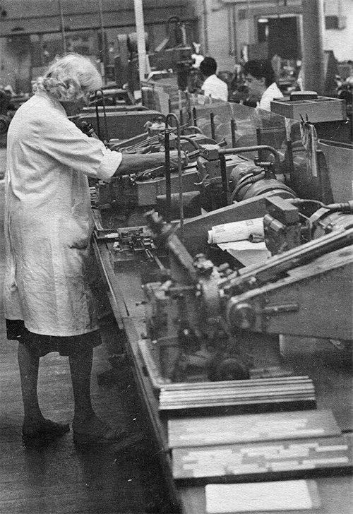
film, as shown on these two pages.
3
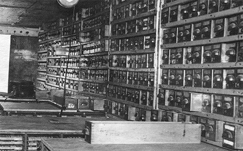
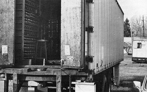
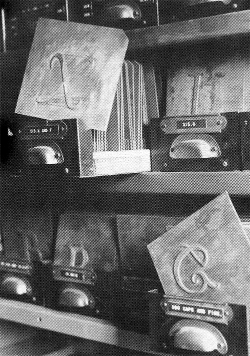
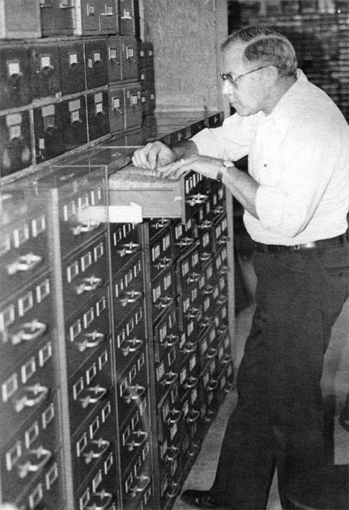
Matrix and pattern storage at Hartzell Machine Works was
reduced to a very compact size when materials were obtained from
American Type Founders Company. The patterns, all of which
originated with the Lanston Monotype Company, were stored in a
single 60-foot trailer. Drawers of patterns lined the walls of the
trailer, while counter-height cabinets contained stock composition
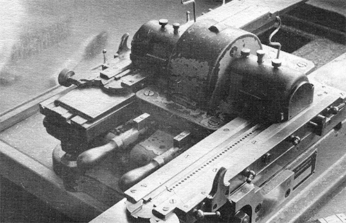
matrices ready for sale. Photo above shows some of the large brass
patterns, these for Goudy's Deepdene, housed in the various
drawers. Photo below shows the ends of some of the trays which
contained literally thousands of stock matrices.
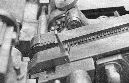
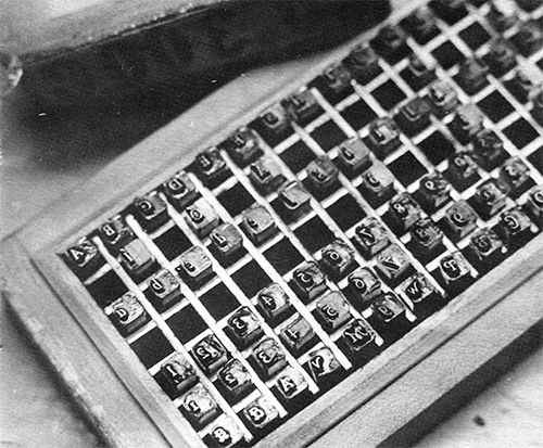
Typical box of steel punches for
10-point Californian (No. 300).
Faces of punches are protected from
oxidation by a gel which makes them
appear worn or smashed.
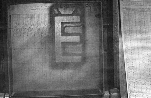
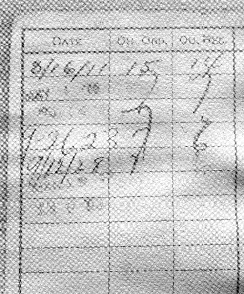
Record cards were maintained on every single
pattern or punch made by Lanston,
and as the card above indicates, many
of the cards have long histories, the
first entry here begin made in 1911.
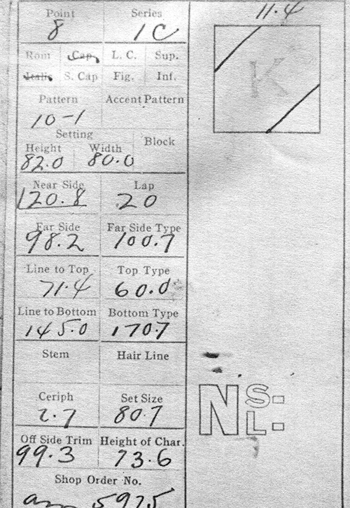
The face of a punch record card giving exacting
specifications for letter positioning, stroke width, etc. Inspection
assured all matrices manufactured conformed to these specifications
before shipment.
Dick Hartzell searches through one of
several drawers detailing the complete history of punchmaking at
Lanston Monotype.
Historic Matrices, Early Literature, Traditional Process Demonstrated
Richard L. Hopkins
For the record, the Oxford Conference was not
merely for the American Typecasting Fellowship.
Rather, it was held in conjunction with the
Printing Historical Society with support from
l'Association Typographique Internationale and
the British Library.
Participants heard reports and they also had
much opportunity to see historic items related
to the typefounding trade.
These two pages reveal a very small sampling.
Although we did not tour the Oxford University
Press (because of space limitations) the Press
did send several items of great interest for
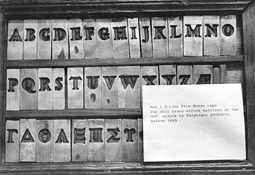
display at our lecture hall, including the
struck brass matrices shown at left, which date
to 1685. At right, OUP typefounder Don Turner
(foreground) joins Stan Nelson for a
demonstration of the ancient process of casting
type using the hand mold. Tools on the table
include historic molds used by Turner along
with reproductions of similar tools
painstakingly made by hand by Stan Nelson.
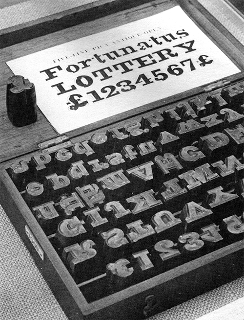
Below is shown a priceless box of steel punches
on display at St. Bride Library. The face is
"Extended Skeleton" cut for the V. & J. Figgins
foundry about 1849. Also shown at St. Bride-
some of the early literature promoting the
Monotype machine in England, along with the
unusually large punches for a five-line "Pica
Antique Open," cut for Caslon and Catherwood,
successors to the Chiswell Street Foundry of
William Caslon, about 1820.
3
Sterling Type Foundry Tradition to Be Continued-Dave Churchman Buys Plant, Moves It to Indianapolis
Richard L. Hopkins
The Sterling Type Foundry of Charlotte, Mich.,
has been moved and is being re-established by
David C. Churchman of Indianapolis, Ind. Dave
successfully negotiated acquisition of the
equipment and standing inventory of the foundry
from the heirs to Frank Sassaman, whose death
was announced in the last ATF Newsletter.
Churchman has completed the move of equipment
to Indianapolis and actively solicits your
continued business. Sassaman had operated the
business, specializing in typecast ornaments
and commercial logotypes, since 1951. Although
the casting equipment, which consisted of
Thompson and Neurenberger-Rettick casters, is
not yet installed, Churchman already is
organized to sell from the large inventory of
materials on hand at the time of Sassaman's
death.
A new catalog is being prepared. Please contact
Dave Churchman, Sterling Type Foundry, P.0. Box
50234, Indianapolis, Ind. 46250.
3
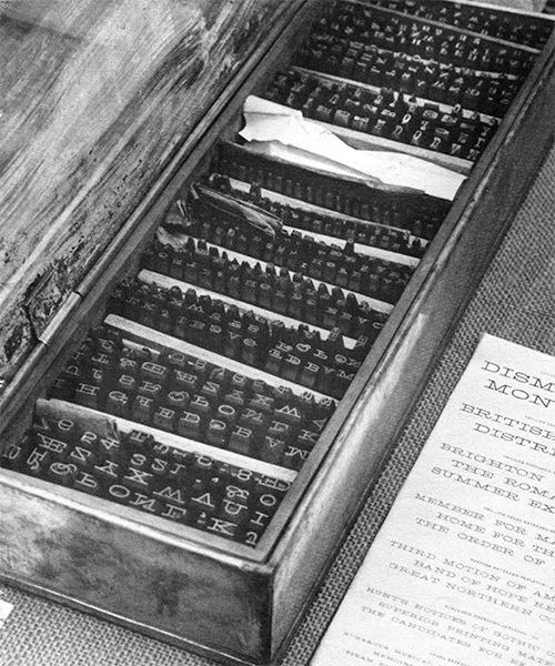
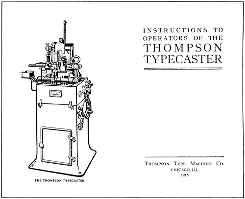
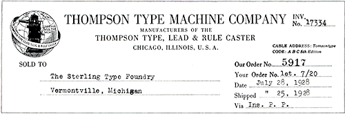
Two rare items found in Sterling Type Foundry records by Dave
Churchman include a 1916 edition of a Thompson operator's
manual and an original invoice from the Thompson company dated
1928. "Used all over the world" is the slogan on the logo.
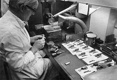
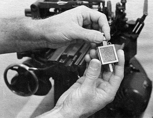
Original Font Cut in Lead, Matrices Are Electroformed
Jim Rimmer
Richard L. Hopkins
An exciting new typeface—called Juliana
Oldstyle—has taken shape in Vancouver, B.C.,
Canada, and the experience of that process is
shared with us by the designer-founder, Jim
Rimmer of the Pie Tree Press and Type Foundry.
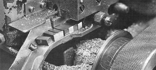
Jim is producing his design by engraving the
letters directly onto lead quads cast by him on
his Thompson for the purpose. After the lead
masters are complete, Jim electro-deposits mats
on the masters and thus is able to cast
adequate quantities for composition. “I am so
wired up about this that I took the liberty of
putting together my experiences so far, and
thought that if this were not too long, perhaps
you would print it. It seems to me that while
it’s still fresh to me, I can more clearly
relate the things that stopped me up, etc. This
whole thing really is a blast, and I don’t know
why I didn’t try it years ago.” Jim also will
be on hand for the ATF Conference to discuss
the process.
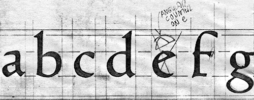
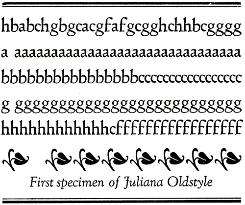
"For your interest, this is a copy of some of the
developmental work on my type." The drawings here,
actual size, were developed by Jim Rimmer prior to
cutting the letters in type metal. A specimen,
printed letterpress, and accompanying article below.
Some time ago, I was foraging through a bucket
of old foundry type which had been dropped off
at the house by a printer who wanted type cast.
I found among the type three promising ornament
pieces, and after cleaning them up with lye, I
put them under a microscope to see if they were
in good enough condition to electroform into
mats. Examination showed that they had been
hand-cut in type metal and then electroformed
(the method that, for lack of other technology,
I use). Artistically, they were nice and to the
naked eye, the curves were smooth and finished.
But under the microscope they were quite
crude—perhaps boldly incised would be a more
fit term. Their roughness led me to believe
that I could probably cut that well after a
little practice. The pieces were cast on a
24-point mutton.
Straight away, I started cutting a 24-point
flower, of which I am sending along a line. I
was elated at how well the cutting came out. I
did the cutting under the microscope with a
moderately fine graver which I had used to do a
little wood cut. The effect was much like
cutting a linocut, except that the metal cuts
like a sort of firm cheese, and the scale of
the hand movements seemed very strange for a
while.
The graver looked like a huge meat cleaver
under magnification, and I had the feeling that
the slightest slip would take off a generous
piece of metal, when in fact, it was a bit that
you could hardly see out from under the glass.
This exaggerated scale actually makes the job
of control of weight and shape easier, which
point I will get back to.
I practiced for about two weeks, cutting random
letters and ornaments, and suddenly realized
that I had cut 25 pieces of type. At this
point, I decided to plunge in and tackle an
alphabet.
For the past year, I had been doodling an
alphabet design, and had the design pretty well
established, although I had never gotten to the
inking stage since I had no immediate prospects
of getting a pantograph. When it got down to
actually inking in the design, I wasn’t sure if
the one I had been developing was the one I
wanted to cut. I had recently been reading up
on bits and pieces about the Ashendene Press,
and had become quite fond of its Subiaco type.
Although its influence on my type may seem
obscure to others, I feel it very much
influenced my design, if not in general form,
at least in its angular curves. My face differs
greatly in that it isn’t a semi-roman, as is
the Hornby face. I pretty much established my
new design in pencil in one day, and by the end
of that week had taken it up to the finished
art stage.
When cutting my practice letters, I was stumped
about how to get a clean, accurate drawing onto
the type metal piece. I had tried various
methods including drawing it directly onto the
metal with a graphite pencil, or rubbing an
image from a pencil drawing on paper onto a
thin wax coating on the metal. This proved to
be too fuzzy an image to follow accurately, and
maintain weight and curve throughout an entire
font. Perhaps when one has done more cutting it
would be easier to use a pencil image, and let
the actual cutting establish the type’s feel—in
much the same way punch cutting is said to do.
I thought about some kind of transfer system,
and tried rubbing Letraset onto the mutton
piece. This worked really well. You get an
accurate and sharp image, with no loss of thins
and other detail. The obvious problem was that
it came out right-reading—no good for type,
which must be a flopped image.
I was aware when trying Letraset that some
litho shops could make a custom sort of
“Letraset” sheet. The stuff I had made came
from my artwork is called INT—a graphic arts
product manufactured and distributed by
3M. My sheet was made up with the type flopped,
so that it would come out right when printed. I
had it made up so that I had enough characters
to be able to afford to bugger up a few. This
happened. I found that the waxy black image
would stick more firmly to the type metal if I
first shellacked the metal. Even using the
shellac, the image had a tendency to slide
aside when the graver was brought up to the
image in the finishing cuts, although it’s not
as annoying as it sounds. It will do until I
find a better method of getting the image to
bond to the metal. But for now, I’m thrilled
with the result, flaws and all.
INT, a 3-M product, was used to prepare letter designs
for transfer to the quads
As regards justification of the matrices: I am
cutting my face in 18 point on the face of
24-point blank squares, of which I have cast up
a sufficient number on the Thompson to do the
job. In the preparation of the artwork I had
planned for the 18-on-24 size, and above each
letter I cut a clean square of Amberlith for a
lineup mark to rub the type down to. These
marks extended eight points to the left, and
all of them were cut exactly to this alignment
above each letter as a guide to base alignment.
Since I did the artwork up to a scale of three
inches, these marks were planned out to be cut
correspondingly larger. In effect what happens
is that the mark lands on the top right corner
of the 24-point quad, and you know you are
lined up. I use an eyepiece magnifier to make
sure the lineup is exact. Result of this fuss
is that when the type is made up into a little
form and tied up for the electroplating bath,
it will come out with little or no dressing of
side and head bearings to make all letters line
up on the casting machine. A little effort made
will save headaches later on.
Since there is a lot of negative space around
each image, I cut this dead metal away on the
saw, by setting the saw gauge to a point lower
than the height of a high space. This results
in the dead metal area sticking up above the
surface of the copper mat so it can be rubbed
away to a perfectly flat surface with a flat
file.
Some of the easier countered letters I have
counterpunched with a shape made from filing
three-inch common nails into the required
shape. I have done this only on such letters as
b, d, p, q, as it seems just as easy to gouge
out the counters and bowls without punching. If
I do counterpunch, I leave the dead metal
around the outside for strength until the
letter is punched.
The fitting of the letters and the
determination of each one’s set value I
established by having prints made of the large
drawings and pasting them up into words and
letter combinations. These are then shot down
to 18 point and any alterations in set noted. I
work on the standard quarter-point set system,
and I feel I can make any further adjustments
for set size at the trial casting and proving
stage.
In cutting the letters, I had no idea what
tools were available, so I have used the same
knife-edged graver mentioned earlier to do the
roughing out cuts. I have another, which I
think is called a sheep-foot graver, to trim
the outside shapes of the letters. As for the
counter areas, I had nothing small enough to do
this, so fell upon the idea of sharpening
medium sewing needles to different shapes. The
needles are husky enough that they won’t bend
under a little pressure, and small enough to
get into tight corners of counters and
joinings.
I had to fight the urge to cut right up to the
image in the roughing cuts, and found that it
was best to stay just off the line—say about a
half point away. The advantage of this is that
you won’t cut into the shape, and once the
letter is roughed out, it’s easy to run a
graver or fine file around the perimeter of
each letter to accomplish the finishing.
An advantage of the type of transfer type that
I am using is that if it becomes necessary to
face a character down to eliminate slips, you
can rub a lowercase x onto a small piece of
clear acetate and lay this over the type piece
to see if the letter has been enlarged
noticeably by dressing it down. This works well
for middles. As for the control of weights, you
can do the same thing to stems and thins after
the image has been taken off the type by
dressing down. Smoke proofing also is a great
help in controlling the general look of the
face.
To me the whole thing is a gift... last month
I had no way of producing a design of my own.
I had expected the cutting to take the better
part of a month, but I am surprised to find
that I have completed the cutting in just eight
days. The plating tank, however, rushes for no
one, and I expect the more mundane aspects of
the operation will take more than two months. I
have heard that in the cutting of type
(punches) the feeling is established to a great
degree by the action and accident of the
graver, and this is true in my case. In spite
of this, I feel that I got out of the design
the type I wanted, and then some. In view of
this, I do not make excuses for the type and
its final appearance—I am happy enough to leave
it as it stands. To me, the whole thing is a
gift from somewhere, because last month I had
no way of producing a design of my own.
It is hoped that my enthusiasm in these lines
is not taken for egotism. No one knows more
than myself what a fledgling I am at this
point, and how much there is to learn about
type. I hope that anyone who has toyed with the
idea of cutting letters will give it a try
because it’s surprisingly easy to get some kind
of a shape at first, and each one gets better.
The making of this type is for me the
realization of more than 30 years of casting,
drawing, setting and ogling type. The
anticipation of what now lies ahead in the area
of cutting original designs, by whatever means,
thrills me beyond words.
3
Various Private and Commercial Typecasting Projects Reported
Richard L. Hopkins
The floral specimen line shown on this page is
from a special casting offered by Bob Halbert,
Route 20, Box 76, Tyler, Texas 75708. He cast
40 fonts and offered the 4A fonts at $30.00
each plus postage and handling. "It's a hobby
and I don't care about making money out of
it-just personal satisfaction in keeping hot
metal friends happy." Bob says the original
design called "Letters Ornate," was shown by J.
Gille about 1820. He understands it still is
cast in 60 point in Europe, but is not sure by
whom. Patterns were made by a friend from
Xerox copies of the design, and then mats were
engraved on Giant-style mats; casting was done
on a Super Caster. From the response to date,
Bob is gratified and hopes to try additional
designs in the future.
At the Hill & Dale there's been some special
casting activity too. A commercial printing
shop contacted me about a "type with some good
old-time flavor." I did a trial casting of
"Schaeffer" (had the mats but had never seen a
specimen before the casting). They loved it and
ordered a few galleys of hand comp for a book
of nursery rhymes currently in production.
Three of our noted ATF participants continue to
do their parts in keeping hot metal alive and
available to others.
Harold Berliner's Type Foundry has issued very
well-done fliers on special subscription
castings of several faces unique to the
foundry-and many wonderful border pieces too.
If you do not receive the mailing, write the
foundry at 224 Main Street, Nevada City, Calif.
95959.
Pat Taylor's Out of Sorts Letter Foundery also
has issued a comprehensive listing of English
and American Monotype faces available in fonts,
sorts or composition. (The cover features a
charming wood engraving of two type characters
done by John DePol.) Address 641 Center Avenue,
Mamaroneck, N.Y. 10538.
And we must not· pass over the fact that Dave
Churchman has revived the Sterling Type Foundry
and has only recently issued a new sheet of
typecast cuts. He intends to continue the
Sterling tradition of supplying typecast cuts
and ornaments to all printers. His foundry's
address: P. 0. Box 50234, Indianapolis, Ind.
46250.
And how about you? Whether you are doing it
"just for yourself" or for sale, let us know
and send us typecast specimens or built-up
forms (no damn repro sheets) and we will be
sure to give you mention in the next
Newsletter.
3