Onward Metal Soldiers:
A New Team Takes Charge of this Irreplaceable Publication
Welcome to the 46th issue of the American
Typecasting Fellowship Newsletter. This effort
comes from a new team, taking the reins from
Rich Hopkins and continuing the publication of
this invaluable resource. The “youngsters”
taking charge of the ATF Communications
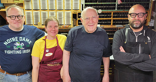
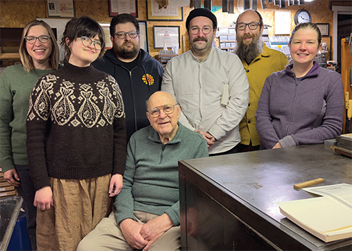
Committee are Val Lucas, Fritz Swanson, and
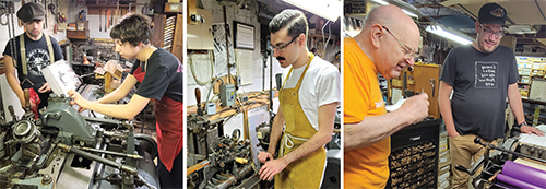
Sierra Brown. Val began typecasting in earnest
in 2021, and after working with Rich Hopkins at
Monotype University Ten, realized just how much
information was contained in these pages—not
only technical advice and tips, but history,
connections, and the entire story of American
typecasting. Fritz and Sierra attended Monotype
University Eleven, and joined the Committee as
experienced editors. With the backing of The
Printing Stewards, this new team hopes to
continue publishing useful tips, deep dives
into history, and new research in all areas of
typefounding.
Articles, news, letters, classified listings,
and general typecasting stories are welcomed
for future issues. Submission queries (as well
as suggestions, comments, or complaints) may be
sent to
newsletter@americantypecastingfellowship.org.
Selections from the print editions will be
hosted digitally after publication on the
updated website,
The Next ATF Conference Will Be Hosted by the C. C. Stern Type Foundry
Mark your calendars, the next ATF Conference is
tentatively scheduled for July 31 to August 3,
2025 in Clatskanie, Oregon! The C.C. Stern Type
Foundry will host four days of fellowship,
including technical sessions, a panel of
presentations, a banquet, a swap meet, and an
auction.
Technical sessions will occur at our new
purpose-built facility, located five miles from
the town center, which houses operational
Monotype composition and sorts casters, a
Thompson sorts caster, Linotype and Ludlow line
casters, and a Monotype material maker.
Presentations will be held downtown at the
Clatskanie Cultural Center, a restored historic
Odd Fellows Hall and theater that has a
spacious ballroom and a 170-seat performance
hall. The center is within walking distance of
the conference hotel and various local dining
options.
The official conference hotel will be the
Clatskanie River Inn, which has forty guest
rooms and also offers an RV Park for those who
wish to camp by the river and still be
centrally located. A discounted rate at the
official hotel will be announced in early 2025.
A limited number of Airbnb, Hipcamp,
and private lodging options are also available
in the area. Other nearby hotels can be found
in Astoria, Longview, Kelso, and Kalama.
The town of Clatskanie, Oregon is just over an
hour’s drive from Portland (PDX) International
Airport and 2 hours and 30 minutes from
Seattle-Tacoma International Airport (SEA).
Clatskanie is 30 minutes from the
Kelso-Longview Amtrak train station. The mouth
of the Columbia River and the Pacific Ocean is
less than an hour’s drive west of Clatskanie
on Highway 30.
Final dates, registration, and a call for
conference presentations will be announced
early in 2025.
Val Lucas is the proprietrix of Bowerbox Press,
and has been hauling home heavy letterpress
equipment since 2005. In 2021 she began working
with Jim Walczak of Sycamore Press and
Typefoundry and has become smitten with
engraving and casting new type of her own
design. She teaches letterpress and bookbinding
at Towson University.
Sierra Brown is a poet, technical writer,
letterpress printmaker, and wannabe typecaster
living in Grand Rapids, MI. They have been
volunteering with The Printing Stewards since
its inception. They are honored to learn from
you.
Fritz Swanson has been a writer, publisher,
editor and teacher for nearly 25 years. He is
the publisher of the quarterly poetry journal
The Index (theindexpress.com) and the village
weekly newspaper The Manchester Mirror
(themanchestermirror.com). He is the
co-founder of The Printing Stewards
(printingstewards.org), a non-profit currently
focused on preserving Greg Walters’ typecasting
legacy. When Fritz was eight years old, an old
farmer, and former Heidelberg pressman,
impressed him by casting his name on a Ludlow.
Fritz teaches writing at the University of
Michigan.
This newsletter is being published with help
from The Printing Stewards, a non-profit
organization dedicated to preserving the
tradition of casting and printing from metal
type. For more information and to become a
supporter, visit printingstewards.org3
In August 2023, I was invited to attend a small
session of Monotype University with Rich
Hopkins at his Hill & Dale Private Press and
Type Foundry in Terra Alta, West Virginia. I
had heard of these sessions, as my mentor Jim
Walczak and many other typecasting
acquaintances had attended and taught at
previous Mono U sessions. I had worked with
Rich previously, helping to cast a run of
Sapphire foundry mats on the Super Caster. This
was a valuable experience for me—learning how
the Super Caster worked and the intricacies of
adjusting characters to match an existing font.
I was eager to learn more, and when the idea of
a new Monotype U session was floated, I jumped
at the chance.
The session included Terrence Chouinard and
Kris Branco, and we planned for five days of
intense casting. We all arrived in West
Virginia on Sunday, and descended to the
basement shop to plan the week. The three of us
all had some typecasting experience but in
different ways, and we each wanted to focus on
a particular process.
Terrence Chouinard, Val Lucas, instructor Rich Hopkins,
and Kris Branco at Mono U 10 in Terra Alta, WV
My goal for the session was to get more
familiar with the Super Caster, and to cast
foundry mats using Rich's custom mat holder. We
spent some time going over changing the mold.
Then, I selected a font of 12 point Incline
Gothic from the extensive collection of foundry
mats in Rich's collection. The foundry mat
holder needed adjustment for each different
mat, so I got plenty of experience placing and
shimming mats to fit. I spent much of the next
few days casting four small fonts. I hope this
experience will help me figure out how to cast
foundry mats with the Sorts Caster using a
similar method.
While I worked on the Super Caster and drooled
over Rich Hopkins' collection, Kris and
Terrence worked on getting the Composition
Caster running from the Welliver interface.
While I'm very interested in this machine, I am
still overwhelmed by its complexity and prefer
the Super and the Sorts Casters.
After finishing the font of Incline Gothic, we
turned to creating our diplomas. I selected a
Monotype design for the border and changed the
Super Caster mold over to 24 point. Kris and
Terrence worked on casting the composition
type for the diploma text. We combined these
elements with hand-set foundry type, and
colors. As the diplomas rolled off the press,
it felt official - we were Monotype University
graduates.
Then, Rich, Kris, and Terrence finished
printing a keepsake of the week on the
Windmill. Meanwhile, I decided to test some
foundry mats I had borrowed from the
Smithsonian collection of ATF mats recently
acquired by the International Printing Museum.
I chose two simple ornaments from an old BB&S
face called Fanchon, which fit on a 24-point
body. I cast a small galley of these, sized for
easy setting in a grid. Then I packed them up,
along with the type samples, our printed
keepsakes, and ephemera from Rich's long
printing career.
That week was an unforgettable experience, and
it solidified my desire to set up a foundry of
my own. I feel more comfortable using the Super
Caster, and I am confident that I can
troubleshoot more issues. Now, I just need to
find the space!
3
Just after my semester ended, in the middle of
December, Rich Hopkins hosted the Printing
Stewards for Monotype University XI. I went
down, along with fellow board member Jody
Harnish, and two of our longtime stewards
Sierra Brown and Gerald Schulze. We arrived at
Rich's on Sunday December 10th, and we left
Terra Alta on Friday December 15th.
Erin Beckloff, Sierra Brown, Jody Harnish, Rich Hopkins,
Gerald Schulze, Fritz Swanson, and Val Lucas after
Monotype University Eleven, 2023
Sunday
On Sunday we established a plan: to set a poem,
the poem's title, and decorate it with a
border. This was Rich's ambitious proposal. The
task was broken down as follows: On Monday, we
would learn the Thompson and cast an ornament.
On Tuesday, we would learn the English Super
Caster and cast the title. On Wednesday, we
would get an introduction to the Composition
Caster and the Welliver system. And then, cast
our poem. Thursday was set aside for finishing
up tasks and printing our poem. I suggested the
poem "Adam's Curse" by William Butler Yeats.
Monday
Each day at Monotype University starts at the
dining room table. We sat around the table and
talked with Rich. We learned more about how
Rich came to live in Terra Alta, and about his
background as a newspaperman and printer. Rich
is very practical minded, and he wanted to know
about each of us, or as he puts it, "What puts
food on the table?" So, while Sierra and I both
self-identify as "poets" he insisted that we
confess our sins. Sierra is a technical writer,
and I am a university professor. That satisfied
him. Gerald and Jody had a slightly easier time
of it, because each has an honest line of work
with no caveats; Gerald is a designer and
printer, while Jody is a librarian.
From there we dug into practical matters. We
discussed the character of type metal, and we
had a brief introduction to the Thompson and
how it can be distinguished practically from
the Super Caster. Rich notes that the Super
Caster releases each piece of type "free" while
"the Thompson pushes one piece of type out of
the machine by pushing the new piece in." The
consequence of this is that the Thompson is
hard on kerned characters. It was for this
reason that Rich suggested we cast the ornament
on the Thompson.
Our first task was to select an 18 point
ornament. We selected a pair of Granjon-style
ornaments which, in Rich's specimen, were
unnamed.
Once we had our matrices selected, we had to
fit them to a matrix holder and otherwise get
the machine set up. Because of our inexperience
as typecasters, I think Rich's approach was to
allow our design process to guide what skills
we developed at the caster. So, in this case,
because we had selected an 18 point mat, we had
to change the body piece on the mold in order
to switch from a larger size down to 18. My
notes don't reflect how big a point size change
we made.
Rich introduced us to the blackbox, the
vertical mold blade, the body pieces, the
stripper spring, the jet plow, and the overall
mold assembly.
Rich then spent some time trying to demonstrate
sliding the new body piece in without
completely disassembling the mold. Then, once
failing that, proceeded to completely
disassemble the mold. I shot a good video of
that process for our future reference. We then
exercised the choker valve, got the matrix
mounted, and did some test casting. We went
through some rounds adjusting the set width
until we felt satisfied that the ornament was
properly positioned on the body, and at 2:30
p.m., we broke for lunch.
After lunch, we set about casting the ornament.
Tuesday
On Tuesday, our goal was to learn about the
English Super Caster by casting the title. We
had decided that the poem would be set in 12
point, and so we went about trying to find an
18 point title. But, at the end of it all,
after hunting for a few different matrices that
we couldn't find, we decided we really liked
Albertus Bold, and even though it was 30 point,
we decided that that was what we wanted to
cast.
As on Monday, we spent some time looking at the
box of parts that goes with the Super Caster
Mold, and generally discussing that mold and
the machine. I shot a video of that lecture.
From there I shot a number of videos of Rich
disassembling the Super Caster Mold and
preparing the machine for operation. The
matrices were selected, the machine was set up,
the matrices had been sorted by set width, and
so with everything ready, we took our break for
lunch.
Then, it was back into the basement. We drossed
the pot and got on with casting.
And, like on Monday, once casting got started,
my notes taper off. I have lots of photos and
videos shot, though. My recollection of Tuesday
is that casting 30 point on the Super was quite
different from casting 18 point on the
Thompson. The Super is, of course, much easier
in terms of adjusting set width. And, because
we were casting letters instead of ornaments,
we had a LOT of opportunity to practice both
matrix adjustments and set width adjustments.
BUT, because the bodies were much bigger, we
ran into birdcaged type more often. The
Thompson was like a manual pickup truck:
challenging to operate, but relatively reliable
once in operation. The Super Caster was, to me,
more like an exotic sports car. Lots of
features and fine tuning, but prone to
fundamental breakdowns when in action. I have a
VERY LONG video of us pulling the piston from
the pot so that Rich could instruct us on how
to clean it and re-insert it. We got very
comfortable moving the pot in and out, cleaning
the nozzle, adjusting the tension on the
spring, etc. And of course, we became VERY
familiar with the type saw as we cut apart sort
after sort to check to see if our maintenance
work was having a positive effect on the type.
I think Tuesday was my favorite day. All the
days were wonderful, but Tuesday was especially
wonderful.
We decided that though all we NEEDED was to
cast the letters for the title of the poem
(ADAM'S CURSE) we would instead cast an entire
caps font for each of the four of us plus Rich.
So, in my notes, I wrote out our casting scheme
for all the caps characters, plus figures and
points. We started with the letters for the
title, and then cast as many more of the
characters as we could, with the ambition to
return to the casting at the end of the week.
Wednesday
Day three was our daunting exposure to the
Monotype Composition Caster. Doubly daunting
because on the one hand it was the most
complicated machine, by far, that any of us had
ever encountered, but also because it is the
machine Rich clearly loves more than anything
else. So, the delta between our capacity and
his enthusiasm was enormous. This put a fair
bit of pressure on us. But, nonetheless, we
stepped up.
The morning roundtable was a whirlwind. We had
a full packet of material from Rich, and of
course, a long lecture on all of the elements
of the handout. There was no time on Wednesday
morning for the human color we got on previous
mornings. We got more information on the
history of the Welliver and just a lot of a
lot.
We converted the poem into a text file
appropriate for the Welliver digital system.
We, at this point, had a brief debate about the
length of the poem in the context of the amount
of ornament we had cast. But after some
discussion, we concluded that the amount of
ornament we had cast would be sufficient to
frame the poem. And so, we went ahead with the
casting.
We selected 12 point Bembo, found the
appropriate mat case, and inserted it for
casting. The exact sequence of events is a bit
fuzzy in my memory, but the thrust of the
problem is that part way through casting, it
became apparent that the mat case had been
assembled in a way that did not match what the
machine expected.
For example, several of the spaces were instead
casting letters, and several of the letters
were transposed with other letters. We were
most of the way through the poem at this point,
though, so we went ahead and finished the
casting with the idea that we would cast
replacement letters as needed once we could
assess what was needed.
The last two paragraphs compress several hours
of work. And confusion. And frustration.
Once the poem was cast, we moved it onto a
galley and took the galley to a slanted top in
the pressroom. I assessed the poem and gave
Rich an "order" for what characters we needed
to replace what had not been cast. Rich then
pulled the mat case and had Sierra assess it
compared to how the mat case arrangement was
displayed in his book.
Sierra observed that the case arrangement was
extremely divergent from the illustration in
the book, both with characters in odd or
inexplicable places, but also with some
characters just missing. Most of the mat cases
had been assembled by whatever firm had owned
them originally, and like with type cases you
get from many different printing businesses,
the little variations are always puzzling. But
this mat case defied reason. We could not
imagine what specialty task it had been
rearranged to accomplish.
So, with Rich's guidance, Sierra disassembled
the case and went about rearranging the
matrices to match the illustration in the book
so that we could reliably cast what needed to
be cast. Sierra will likely have a better
recollection of that process.
Like with so many other moments over the week,
it was in the problems that we found our most
profound moments of education.
For my part, I was in the press shop swapping
spaces out that had been cast as characters,
and, where possible, swapping characters that
had been transposed into the wrong words. Some
characters wrongly cast in one spot were
available as wrongly cast characters in other
spots. But not everything equaled out, and so
eventually Rich needed to cast replacements for
me to finish the task.
Lunch happened at some point that day. We went
back to our lodge for dinner, and to
decompress. It was a hard day.
The poem was cast, the characters were
corrected, but I wouldn't count the effort as
pleasing, and I did not come away from the
experience with a robust understanding of the
machine. While we spent all day sorting out
problems, little of it was directly related to
the operation of the machine itself. And so,
unlike the preceding days, I did not finish the
day with any confidence that I could further my
education on my own. The Composition Caster
remains, for me, a mystery.
Thursday
On the final day, we had a lot of divergences
to attend to. Val Lucas and Erin Beckloff were
visiting and staying with Rich overnight.
Sierra had taken over finishing with the
correction of the poem and preparing it for
printing. Gerald was focused on getting our
diplomas prepared for the press. And so I
assisted Jody in the casting of the remainder
of the Albertus Bold 30 point caps font.
For Jody and I, it was a long day at the
caster, making adjustments and correcting
problems. We brought Rich in as needed, but we
also grew more comfortable as we operated the
machine. It was a real pleasure to watch Jody
grow more confident in his own assessment of
how the machine worked and what it needed to
continue to cast good type. I cut apart so many
sorts, and we became very familiar with the
different degrees of swiss cheese internal
structure one can find in cast type. I cut
sorts, and we troubleshooted until we could get
sufficiently solid casts. When we did, I was
happy.
We also visited with Erin and Val, and of
course drew on Val's knowledge as an
accomplished caster.
Gerald and Rich printed the finished poem, as
well as our diplomas.
Friday
On Friday we had waffles with Rich, and we
loaned him a few of our ATF matrices that he
was interested in casting on the Super Caster.
They were the proper depth of drive, and he has
a mold set up to cast 24 point without
adjustment when combined with his foundry mat
holder.
We said our goodbyes, and with a long day of
driving ahead of us, we headed out.
3
An extended version of this article will be
published on the author’s CircuitousRoot.com
website after this
number of the Newsletter has been published.
This census is dedicated to the late Gregory
Jackson Walters and the late Theo Rehak,
without whom there
would be little to take a census of. I would
like to acknowledge the generous help of
Patrick Goossens (Letter-kunde Press) in
providing access to original ATF and Dale
Guild documents.
Rev. 5, 2024-05-04
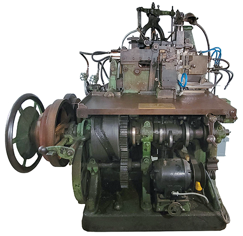
Introduction: The Barth Type Caster
The typecasting machine developed by Henry
Barth and Ernst Lietze at the Cincinnati Type
Foundry, commonly known as the Barth Type
Caster, is a derivative of the earlier Foucher
type caster developed in France. In very
simplified terms, the Barth is a Foucher with a
choker valve.
No. 3 ½ Barth caster #XX, from the Gregory J. Walters
Typographic Archive in Piqua, OH
The initial Barth patents were filed in 1886
and for several years the Cincinnati Type
Foundry used it in their own production and
sold it to other foundries. After the
consolidation of about two thirds of the
typecasting industry into a single firm in
1892, the resulting firm, American Type
Founders, soon standardized upon the Barth as
their machine for volume production. ATF
constructed several hundred Barth casters for
their own use, but, unlike Cincinnati, did not
produce them for sale. ATF also destroyed
several hundred Barth casters as their
operations declined and were consolidated from
the second quarter of the 20th century onward.
The remaining casters were sold at auction in
1993. The majority of these were purchased by
scrap metal dealers. Ultimately, twenty-five
Barth casters have survived into preservation
and continued use by the community of
typecasting enthusiasts.
The Barth caster was usually referred to as an
"automatic" machine in surviving internal
American Type Founders Company (ATF) documents.
The late Theo Rehak referred to it as a
"foundry automatic" caster. In both later ATF
marketing literature and in popular usage it
was more commonly called the Barth type caster.
Both the term "automatic" and the name Barth
will be used for it here.
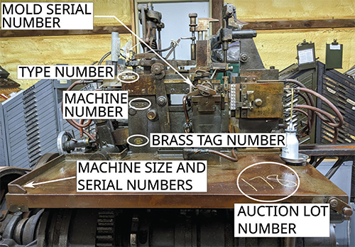
Identifying a Barth by the Numbers
Several different numbers either appear on or
can be associated with each Barth caster. Some
of these are identified below. The four numbers
which are most important for the purposes of a
machine census are the machine size and serial
numbers, the “machine number” (which is not
a serial number), and the “type number” (which
identifies the size and type of mold installed).
Size Number: Barth casters were made in several
sizes, numbered 1 through 4 (with some
fractional sizes). Machines of a particular
size could be equipped with molds in various
styles over a range of body sizes. For example,
the machine equipped with a 72 point mold at
the Gregory Jackson Walters Typographic Archive
of the Printing Stewards and the machine with a
60 point mold at CircuitousRoot are both size
3 1/2. The “apron” of a Barth is the table-like
flat surface at the front of the machine. The
size number is stamped on the front left upper
surface of the apron. The full range of body
sizes ran from 3 to 144 points.
Serial Number: Barth serial numbers were
assigned within each size range. For example,
the size 31/2 machine at CircuitousRoot is
serial number 6 (of the size 31/2 machines),
but machines 1-6, 2-6, 3-6, and 4-6 are all
attested.[1] The serial number was stamped on
the apron just below the size number, but at
some point it was intentionally defaced by ATF.
On some machines, it remains barely legible, on
others it does not.
Machine Number: At some point prior to the
completion of the move from Jersey City to
Elizabeth, a “Machine Number” was assigned
to each machine. This appears on a rectangular
plate riveted to the front left of the mold
stand.
Type Number: The most prominent number on a
Barth is the “Type Number,”[2] this is a three
to five digit number which appears on a
silver-colored tag riveted to the upper left of
the mold stand.[3] The last two digits of this
number encode the type of mold used. But this
number cannot be taken in isolation. It must be
used in conjunction with the first one to three
digits, which indicate the body size of the
mold. The chart decoding this was published by
Rehak in Practical Typecasting (1993,
188-190)[4]
So for example the machine at Circuitous-Root
is Type Number 6003, indicating a 60 point mold
of type 03 (within the various 60 point mold
types). Turning to the table, we find that a 60
point type 03 mold is a type B-4. The ‘B’ in
this indicates that the mold originated in the
New York foundry of ATF (prior to consolidation
into the Central Plant). Fortunately, further
information survives about the B-4 mold (this
is not the case for all molds).
Other Numbers: One number is prominent on a
Barth but of limited use in a census. This is
the brass tag number5 which appears on a round
brass tag riveted to the mold stand. It is a
five digit number appearing under the initials
“A.T.F.” It was part of an overall ATF
inventory of casting and non-casting equipment
(now lost). Brass tag numbers are used in some
surviving internal documents and may in some
situations be useful (especially in double
checking other numbers for typographical
errors).
Each machine was also assigned a lot number in
the 1993 auction. This number is no longer
physically present on machines which have seen
use since 1993, but it remains useful for
tracing provenance.The mold serial number is
very important in ATF records, but is not used
in this census.
Early Production Estimates
Production Before ATF
ATF inherited four general categories of
casting machines from the foundries which
merged to create it in 1892:
-The MSJ/Ziegler-patent casters from MacKellar,
Smiths, and Jordan
-Non-Barth “automatic” casters, including
Foucher casters from the Central Type Foundry
-Pivotal type casters, of many sizes and styles
-Barth “automatic” casters
The MSJ/Ziegler machines became the initial ATF
“space and quad” machines. At some point, ATF
began using Barths to cast spacing material as
well. We do now know if any of the
Ziegler-patent casters survived in use until
the 1993 auction. The Fouchers (and quite
possibly other automatic casters) were scrapped
during the initial consolidation of ATF
foundries in the 1890s. Many pivotal casters
were retained throughout the history of ATF,
but there is no record of new pivotals being
constructed by ATF. By 1894, ATF had
standardized on the Barth as its “automatic”
caster.
The scant information we have about Barth
production comes from a few remarks in the ATF
corporate Annual Reports from the 1890s.
Working backwards from these, (ATF 1894, 4-5)
we know that the Cincinnati Type Foundry built
at least thirty one Barths before the formation
of ATF in 1892. Of these, eighteen were either
used by the Cincinnati or sold to foundries
which became part of ATF. At least thirteen
more were sold to foundries which did not join
in the 1892 creation of ATF (these thirteen
casters were acquired by ATF from these
foundries by 1894).
It is likely that more than these thirteen
Barths were sold by the Cincinnati Type Foundry
to other foundries which did not become a part
of ATF. If so, these would have continued in
use outside of ATF for some time. There is,
however, no actual documentation of this.
Production By ATF
Between the formation of ATF in mid-1892 and
its second Annual Report in August 1894, ATF
built thirteen additional Barth casters, giving
it a total of forty-four at this time.
A surge in production was ordered in November
1894, and by the end of 1895, Barths were being
installed at a rate of six per month. The 1895
Annual Report also says that they were being
manufactured in Cincinnati, Philadelphia, and
New York. The 1898 Annual Report says that “The
equipment of the several foundries with
automatic machinery is now practically
completed, and the expenditure for further
improvement of plants will be much less in the
future.’’ (ATF 1895, 3)(ATF 1898, 3) This rate
of production, seventy-two machines per year,
suggests that it is likely that all Barths were
produced by the first years of the 20th
century. Most of this would have been before
ATF moved to the new Central Plant from 1903 to
1906.
We do not know when the last new Barth was
produced. Rehak says that automatic typecasting
machines “attained their high-water mark with
the 1905 Barth conversion model (Old No. 1).”
(Rehak 1993, 39)
Maximum Production Numbers
No production records for the Barth caster
survive, so all conclusions about their
production numbers will be incomplete.
In the 1930s, during the transition from the
old Central Plant to the Elizabeth plant, ATF
created a document entitled “Automatic Casting
Mould Data,” the first five pages of which
survive. (ATF 1930s) It is unique in the
archives of surviving documents because it
lists machine serial numbers. (It also gives
type numbers, mold serial numbers, mould type
names, the locations of the machine (in
Elizabeth or in Jersey City) and the machine
operators’ names.)
If we make the reasonable assumption that Barth
serial numbers start at 1, then the highest
serial number recorded for each type of machine
represents the minimum number of machines of
this size built. These highest serial numbers
are:
Size
High Serial Number
1
226
1
1/2 235
2
76
3
28
3
1/2 38
4
20
The following sizes mentioned by Rehak are not
attested in this document. They were either all
scrapped by the time this document was compiled
or they were mentioned only on the lost later
pages: 1 1/4, 1 1/4 wide, 1 1/2 wide, 2 wide,
2 1/4, 2 1/2.[7]
Adding up these figures, the total is five
hundred and fifty-four. This number is a solid
minimum for total Barth production. The real
figure may be slightly greater, as there are
several reasons a caster might not be reflected
in this total. Four reasons are most likely[8]:
-Six sizes of machines are not mentioned in
this document.
-A higher-numbered machine might have
been listed on a page missing from this docu-
ment.
-A higher-numbered machine might have
been scrapped before this document was com-
piled.
-A higher-numbered machine might have
been exported to Stephenson, Blake in England
before this document was compiled.
Of these, twenty-five machines survive.[9] This
gives a total survival rate on the order of
four and a half percent. Much as we mourn the
loss of so many fine machines, this is actually
a fairly high survival rate for typecasters and
for historic industrial machinery as a whole.
Surviving Machines
Twenty five Barths survive in the collections
of the Letter-kunde Press[10] (LK, Patrick
Goossens), the Printing Stewards’ Gregory
Jackson Walters Typographical Archive (PS), and
CircuitousRoot (CR, Dr. David M. MacMillan). No
other surviving Barths are known to anyone in
the typecasting community with whom I have
communicated.[11] Shown on the next page is a
summary of the machines we have.[12]
-Machines 226 and 322 were listed by ATF as
scrapped, but with different brass tag numbers.
3
Other -6 machines (e.g., 1 ½ - 6) were
certainly constructed, but they were scrapped
before the mid-1930s and do not appear in
surviving records
The name “Type Number” was used in the
mid-1930s ATF document “Automatic Casting Mould
Data” (ATF 1930s). The term “Mold Number was
used for the same thing in other documents, but
that term introduces confusion.
The machine modified by the Dale Guild to
cast their B42 type has a Dale Guild tag
reading “B-42” in this location.
It was called a ``brass tag number’’ in ATF
internal documents. It would be called an
“asset tag” today.
The emphasis on No. 1 and 1 ½ machines for
body type is clear. The low production number
for No. 2 machines (none of which survive) is,
however, surprising to me.
But (ATF 1930s) may oversimplify. At least
one surviving machine (No. 259) is listed as a
No. 1 (1-113) in it but has No. 1 ¼
(1 ¼ - 213) stamped on its apron.
It is unlikely that a machine with a serial
number higher than any listed would have been
sold by the Cincinnati to a non-ATF foundry
prior to 1892. It is also unlikely that any new
Barths were built after this document. By the
1930s, ATF was scrapping Barths, not building
them.
Sixty-two were purchased by scrap dealers at
the 1993 auction. At least four hundred and
sixty-seven Barths were scrapped by ATF itself
before 1993.
The machines of the former Dale Guild Type
Foundry.
I would love to have been inadequately
informed here.
ATF. [n.d., mid-1930s based on internal
evidence]. “Automatic Casting Mould Data.”
[Incomplete contemporary blueprint of a
typescript.] Elizabeth, NJ: American Type
Founders Company. This is preserved in the
archives of the Letter-kunde Press, Antwerp.
Nineteenth Century Innovations Transform Typefounding — A Brief Look Back
Stan Nelson
Of all the necessary components required to
make printing practical and economical,
printing types formed the most original and
essential element. For those of us who continue
to set type by hand, printers’ letter (ie. type
or sorts) appear deceptively simple and
uncomplicated, and because of this, we tend to
take type for granted. But these characters
have a fascinating history, first being
entirely the product of highly skilled hand
labor, then transitioning into a system of
precise, mechanized manufacture. This article
begins with a review of the traditional methods
used to make printing type, and then deals with
several early efforts to improve type
production just before the introduction of
typecasting machinery. Specifically, these
innovations were a.) the invention of the
lever/trigger type mold, b.) the invention of
sanspareil matrices, and c.) the introduction
of the force pump/pump pot. With this in mind,
we can now take a look at how type was made by
hand and endeavor to give the subject some
context.
Typefounding was a trade that resisted
significant innovation until early in the
nineteenth century. To better understand the
storm of change waiting in those busy decades,
let’s look back nearly two hundred years to
when the Industrial Revolution began to be
evident.
From the time of Gutenberg in the 1450s, until
approximately the first quarter of the 1800s,
changes in type making involved the fashions of
letter design, the evolution of ornamental
materials, the multiplication of type sizes
(first small, then large), and the
establishment of typecasting as a specialized
industry. The process of cutting a steel punch
with which to strike a matrix, and then casting
types from that matrix in a hand mold, had
remained largely the same. But with the coming
of the Industrial Revolution, change became a
fact of life. Like many other trades,
typefounding felt the effects of this new
force.
‘Innovative yet cautious’ is a good way to
describe the printing trades during the
nineteenth century. In our times, we have
accepted the idea that rapid technological
change is a uniquely modern phenomenon. A 1970
book by futurist Alvin Toffler introduced the
term “Future Shock and defined it in simple
terms as “too much change in too short a period
of time” (Toffler and Farrell 1970) with the
associated stress and disruption. But printers
in the days of David Bruce Jr., inventor of the
pivotal type caster, were experiencing their
own form of future shock well over a hundred
and thirty years before it was described by Mr.
Toffler, for they too were adjusting to and
struggling with an accelerating pace of
invention. For example, mastery of the art of
‘throwing for face’ (casting a good printing
surface on a type) competed with the growing
use of machinery. The pivotal caster seemed to
reduce hard won skill to the ‘turning of a
spit’. Iron hand presses replaced wooden ones
even as cylinder presses supplanted hand
presses generally. The same year (1838) that
David Bruce Jr. patented the first commercially
successful typecasting machine, Samuel Morse
demonstrated his telegraph, which significantly
aided the efficient use of the steam
locomotive, only recently introduced. With each
passing decade, printers and type founders
began to experience a world in which these
advances in transportation and communication
“annihilated time and distance,” effectively
increasing their markets; while with the new
presses, printing could be done faster and on
rolls of cheaper, machine made paper. Print
shops and type foundries became factories.
Simultaneously, cultural juxtapositions
occured. The Kiowa and the Comanche nations
still lived and fought for their traditional
ways on the western plains. Just imagine being
in the 1820s and 30s, where simply by traveling
west you would be transported from a bustling,
crowded European-style city to vast, open
prairies that supported enormous herds of
buffalo and the people who lived by hunting
them.
In the east, the first quarter of the 1800s was
a time of the odd juxtapositions of both old
and new; of technologies that were common in
the days of the Romans abutting innovations as
novel as steam power and machine tools.
Lighting consisted of candles, whale oil lamps,
and later gas burners – for Edison’s light bulb
was as yet unimagined, neither were the
electric motor and the phonograph. Wood fires
were still used for cooking and warmth. Even
despite the introduction of railroad travel in
the 1830s, people traveled locally by foot, on
horseback, or by horse drawn vehicles. Such
were common through the end of the century.
Running water was not routine, and most people
still relieved themselves in privies.
Until nearly the end of the nineteenth century,
most printing type was set in composing sticks
by skilled typesetters, and many a printer,
despite having newer and faster printing
presses, still continued to work with improved
versions of the basic hand press – presses
which worked in much the same way as
Gutenberg’s had in the mid-fifteenth century.
Notably, for the first four decades of the
nineteen hundreds, type continued to be cast
laboriously in hand-operated molds. Let’s focus
then on this process of making printing types,
a method that had resisted innovation and
remained unmechanized for nearly four hundred
years.
The techniques developed in the workshops of
Johannes Gutenberg, and the type making tools
that evolved from his invention, can be seen in
the punches, matrices, and molds used then for
centuries. Of course, none of Gutenberg’s
materials have survived, and while recent
investigations of the earliest printing have
complicated our narrative, there is sufficient
evidence to support the fact that Mr. G was
using movable types that were cast, and that
many of the smaller types employed in the
printed Indulgences of 1454 / 1455 display the
characteristics of types made from matrices
formed with punches, which is the process that
we will examine here.
As we all know, for a set of printing types to
function, they must all be of exactly the same
body height, and the same body size, having
parallel sides. Of course, they must also vary
in width to accommodate the differences between
narrow and wide letters. A lower case i and an
upper case W must still range in line perfectly
with each other, along with all of their
brethren. This could only be accomplished
through the use of a single, adjustable type
mold made of brass or iron, whose two
dimensions are fixed, but that adjust
infinitely to any width. I am fond of quoting
Theodore L. DeVinne, who first observed in his
seminal book, The Invention of Printing,
published in 1876, “In this type-mould we find
the key to the invention of typography. It is
not the press, nor the types, but the
type-mould that must be accepted as the origin
and the symbol of the art. He was the inventor
of typography, and the founder of modern
printing, who made the first adjustable
type-mould.” (De Vinne 1878, 67)
So let us take a look at this critical tool.
French mold with its parts identified
Regardless of the particular design of a type
mold, of which there are several structures,
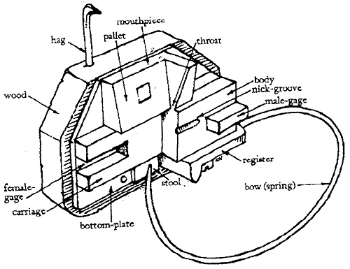
all such molds consist of two mating halves
that slide against each other in order to
accommodate variations in the width of letters,
while maintaining both a constant height and
body size. There must be a funnel of some kind
to direct molten metal alloy into the mold, as
well as a clamp with which to position
interchangeable letter dies (called matrices)
beneath the mold. This clamp is a combination
of a supporting spring and two cheeks called
registers that close upon the sides of the
rectangular matrices. In addition, there are
guides to keep the two halves of the mold
sliding parallel to each other.
Matrices must be carefully prepared to fit the
particular mold that will be used to cast type.
In order to create a matrix, one first had to
cut a punch, which is an actual-size model of
the letter’s printing surface cut in steel, by
hand, using files and hardened steel gravers. A
hand-engraved punch was carved and filed to the
exact shape of a character, using a variety of
techniques that allowed very precise details to
be generated. The face of the punch must be
perfect, since thousands of cast types will
replicate it. This brief description is a
disservice to the complexity and artistry
demanded of a punchcutter, who was capable of
engraving entire fonts of punches having
hundreds of separate characters, all of which
must sort with each other. A punch may take as
few as four hours or as many as several days to
engrave. When finished, the steel punch was
then hardened and tempered to make it strong
and durable enough to be pressed into a blank
of copper that was then filed meticulously to
fit the type mold. All of this latter work
falls under the heading of fitting or
justifying the matrix. Ironically, a face
beautifully cut but badly fitted is less useful
than an indifferent design that is properly
justified, for at least it will ‘scan’ well.
To expand upon this, justifying a matrix
requires a lot of fiddling. The letter shape
impressed into the copper was intentionally
driven below the desired depth. It then had to
be made exactly level with the surface and kept
at a constant correct depth. It also had to be
precisely located both side-to-side as well as
up-and-down.
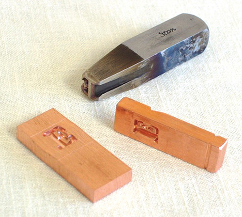
The punch, its unfitted strike and justified matrix.
This ‘Bodoni’ E was cut for the Greek Font Society.
The ‘set’ (side-to-side) adjustments affect the
relationship of each letter to its brothers and
sisters, and the ‘up and down’ aspect refers to
alignment. This would seem a simple matter, but
round letters and letters with serifs need to
be carefully placed so as to print perfectly
even sentences. It’s a matter of making optical
adjustments.
Once the type mold and matching set of matrices
were ready, casting could begin. The hand
founder worked at a small furnace that
supported an iron pot used to hold molten type
alloy, a mixture of tin, antimony, and lead.[1]
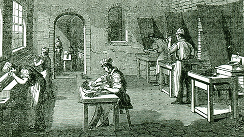
Casters working at their furnaces, from The Penny Mag-
azine, October 26, 1833. The foundry at William Clowes
& Son, Ltd., London.
Molten type metal handles well at a reasonable
working temperature of about 750 degrees
fahrenheit. It does not produce toxic fumes at
those temperatures since they are far lower
than the temperature at which lead vaporizes
(approximately 920 degrees F.) Using a special
spoon, the founder scooped up tiny amounts of
liquid metal and dumped it into the funnel
(mouthpiece) of the hand mold while
simultaneously giving the mold a sudden jerk or
shake. This technique was called ‘throwing for
face’ and was an acquired skill, necessary to
form a sharp casting. As suggested earlier in
this piece, learning to get consistently crisp
clean casts took years of experience to do
efficiently. There are many variables regarding
the temperatures at which type metal melts,
depending on the specific percentages of tin,
antimony, and lead. A mixture of 4% tin, 12%
antimony, and 84% lead will melt at 463 degrees
Fahrenheit, but “a good margin of temperature
should be allowed for transit from pot to
mould.” (Fry’s 1972)
The cast letters then passed through several
different hands as they were dressed.
The sprues or jets formed in the mouthpiece of
the mold were broken off by unskilled help. The
sides of the types were rubbed smooth (often by
boys or women), taking into account some
letters that had overhanging bits called kerns
which required special care to finish. After
lining up the types in long sticks, the bottoms
of the cast types were trimmed with a special
plane, and the thin edges of the cast types
were scraped smooth. They were then given a
final inspection and wrapped for delivery to
the printer.
There you have a highly abbreviated outline of
the process of making type by hand. Clearly it
was labor intensive, required highly
specialized skills, and took a lot of time–but
there was no alternative. That is where type
founding stood until Bruce’s successful type
casting machine was patented in 1838 and then
improved significantly in 1843. His, as well as
several other casting machines, established the
new standard for the manufacture of type after
a few years of resistance by some members of
the printing trade.
Meanwhile, three important early nineteenth
century innovations to the hand casting of
types are worth mentioning. By far the most
important of these was the invention of the
lever mold, sometimes called a ‘trigger’ mold.
It is significant because in text sizes it
allowed the caster to produce twice as much
type as before.
In 1809 John Peek, an English millwright in the
county of Surrey, England, patented a “machine
for the more expeditious method of casting
printing types, by which three motions out of
five, made in the ordinary method of casting
types, are saved.” (Peek[1809]1859, 117-118)
His invention consisted of adding a complex
assortment of interconnecting levers and a coil
spring to the standard hand mold used at that
time in England.
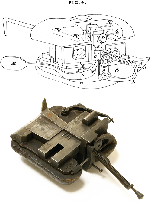
Peek’s patent drawing with a photo of a similar lever
mold is in the collection of the Type Museum, London.
With this alteration, the founder needed only
to fill the mold in the usual manner and then,
upon opening, the type was ejected from the
hand mold by squeezing a lever (trigger). When
working optimally, this improvement nearly
doubled the rate of casting smaller bodied
types from roughly 2,000/4,000 types to
6,000/8,000 types a day (Fournier and Carson
1930, 104).Working days were twelve to fourteen
hours long. But Peek’s invention, which was
intended (I believe) to be retro-fitted to
existing, traditional molds, was overly complex
and had too many moving parts. A transplanted
Scottish typefounder, Archibald Binney, of the
Philadelphia foundry of Binney and Ronaldson,
patented an improved printers’ type mold in
1811 that became the standard form of lever
mold, as it was a simpler, more efficient
design.
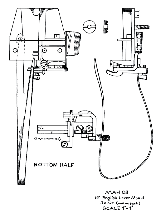
Drawing of a 12 point English lever (trigger) mold, using
Bruce’s invention.
As a result, Binney has been given much of the
credit for the successful introduction of this
faster mold. There were additional lever mold
designs as well as Bruce’s, but his design
appears to be the most widely adopted.
The layout of the Binney lever mold altered the
time honored arrangement in which the matrix
was tied to the upper half while the spring
supporting the matrix was fixed to the lower
half. His invention essentially turned the mold
completely over, transforming the bottom half
into the top half, and moving the spring and
the matrix abutment (called the stool) to the
former upper half – which had now become the
bottom. This accomplished the essential step of
combining all of the moving parts on one half
of the mold, so that they could be actuated by
a lever. When the lever (trigger) was squeezed,
it tipped the matrix to free it from the type,
and with a forceful opening motion, the newly
cast type was thrown from the mold. A small
under-cut was often made in the narrow face of
the mouthpiece of the upper half, which
momentarily caught the cast type and helped to
free it from the opposite half. This notch was
a feature that also appeared later in machine
molds. To reiterate, the rearrangement of the
hand mold, essential to the success of the
lever mold that is believed to have been the
invention of Archibald Binney, would become an
integral part of the pivotal machine as well.
But that is yet to come. Meanwhile, another
valuable innovation beckoned.
Sanspareil Matrices
The second important innovation referenced
above was the development of ‘sanspareil’
matrices. These were large, durable matrices
made of sandwiched layers of brass plate.
Around 1810, at about the same time that lever
molds expanded type production in small bodies
of type, the introduction of sanspareil
matrices facilitated the casting in molds—not
sand—of very large types suitable for printing
large broadsides and posters.
In the late 18th and early 19th centuries,
there was a growing use of posters, which
expanded the need for large types. Typefounders
had regularly cast these types up to about six
lines of pica in ordinary hand molds (six lines
= 72 points, or approximately one inch). When
larger types were needed, they were often cast
using wooden or brass models in combination
with the process of sand casting – an ancient
technique in which a temporary mold is formed
in moist sand that is packed around a pattern.
The technique is fairly slow, and the cast
types are often flawed, but it was the only
practical means for producing large poster
types. Of course, very big faces had been
produced by cutting massive punches in steel
and striking them into copper using enormous
pressure, but this was extremely difficult to
do, and displacing so much metal distorted the
copper strikes very severely. It was really
‘pushing the envelope’.[2] To cast poster type,
what was needed was a form of durable brass
matrices that could be produced efficiently
and economically–ie. ‘sanspareil’ mats–which is
French for ‘unmatched.’
The idea behind sanspareil matrices was to
simply abandon the use of a punch and to saw
out the letter instead, much as one would to
make a thick stencil. To make the letter on a
sanspareil mat, the top layer of the composite
brass plate was pierced using drills, saws, and
files. It was then riveted to a second plate
that formed the bottom of the matrix’s casting
cavity.
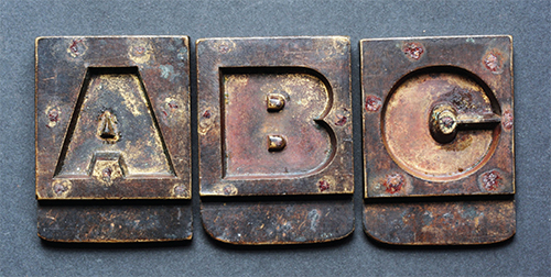
Sanspareil matrices in the collection of the Type
Museum, London. (Photo by James Mosley.)
The counters or centers of letters such as an
O or a Q were riveted to the bottom plate. The
skills of some workers were surprising, as even
complex ‘in line’ designs were made in the form
of sanspareil mats. Sanspareil matrices could
be made from five lines of pica up to sixteen
lines or more. So, the practical limit for the
size of cast poster types was then determined
by what could be effectively cast (Figgins
1967, 39).
Casting very large types was never easy.
Large-bodied hand molds, frequently mounted on
long iron arms (called barrow molds–as in a
wheelbarrow), were developed in order to cast
these often enormous letters. In those large
sizes, shrinkage also becomes a factor. Big,
cast poster types would also be prohibitively
heavy, requiring a lot of valuable metal. That
is why the specialized hand molds used in this
period often employed cores of various kinds to
reduce the amount of metal needed to form the
letters. The invention of machine-engraved wood
types in the late 1820s and early 1830s brought
the use of most sanspareil matrices to a close.
You could say wood type sawed off that branch
of typefounding.
The Force Pump
The third innovation that appeared in the 1820s
became necessary as type designs became
extremely delicate or fancy and were thus
difficult to hand cast.
A force pump/pump pot. One of two that were in the
collection of Theo Rehak. This one was sold to the
Museum Plantin-Moretus to facilitate casting from their
matrix collection. The second, barely seen in this photo,
is in the workshop of Stan Nelson, Charles Town, WV.
The ever inventive David Bruce Jr. created a
force pump in 1834 that squirted molten metal
into the hand mold under considerable pressure.
Such were used regularly well into the 1850s in
the production of type, and continued to be
used throughout the ‘machine age’ of
typecasting during the process of justifying or
‘fitting’ matrices. The force pump allowed the
matrix fitter to quickly produce accurate trial
castings in order to test the progress in
justifying the matrices. It was a tool uniquely
suited to its purpose. Also, it is worth noting
that the combination of lever mold and force
pump, in use, very much resemble elements of
the casting machine that followed within
decades, and patented by David Bruce, Jr. in
1838.
Conclusion
Typefounding was the critical element in
Gutenberg’s system of printing using movable
letters, and after a rapid period of
refinement, the process for casting printing
type remained pretty much the same for the next
three hundred and sixty years, until a series
of improvements hurried typefounding into the
age of machinery.
The invention of the pivotal type caster in
1838, which was radically improved in 1845,
mechanized the production of printing type. By
the mid-nineteenth century the hand casting of
letters had become a minor, specialized
activity, used to make limited amounts of
letters. With the introduction of the
pantographic punch and matrix engraving
machines, automatic typecasters, Monotype,
Linotype, Ludlow, and other composition
systems,. typefounding became sophisticated and
efficient. As the earliest printers often made
their own type, typecasting once again found
its way into print shops in the form of
Monotype and linecasting machinery. With vastly
increased typecasting capacity, as well as the
many improvements in telegraphy and
transportation, some typefounders such as the
American Type Founders Company became very
large industrial operations. While many of our
readers have limited experience with the ‘hot
metal’ trade as it once was, some of us
remember the days when the U.S. Government
Printing Office had 120 Linotypes and forty
Monotype casters running at one time. We ‘old
timers’ have seen a trade that had evolved and
thrived for hundreds of years reduced in its
last days to a ghost of itself, and then we saw
it succumb to the changing technologies that
eliminated most of it.
It is this rich tradition of evolution and
innovation that we have inherited. In some
cases, we are able to preserve it as a form of
living history and as a resource that will
serve those who are willing to continue working
with actual printing type. Who knew that there
might be a renaissance of letterpress
(photopolymer and all)? Let’s see where it
takes us.
Footnotes
Lead often makes up from two thirds to three
quarters of the alloy of type metal, but it is
an admixture of tin and antimony too. Founders
as early as the time of Joseph Moxon (1684)
called it metal – not lead. The alloy is a
thorough blending of its component parts and
quite safe to handle. Please respect the
tradition and call it type metal – not lead
type.
Another method for making large mats, little
known and rarely used, was to use a lead
pattern to cast brass matrices. These could
then be finished with the large punch used to
form the lead pattern. This is a subject for
another time.
References
De Vinne, Theo L. 1878. The Invention of
Printing. New York: Francis Hart and Co.
Fournier, Pierre Simon. (1766) 1930. Fournier
on Typefounding; the Text of the Manuel
Typographique (1764-1766). Edited and
translated by Harry Carter. London: Soncino
Press.Carter,
“There are surprisingly few small machine
book-printers who are well known for their
work. D.B. Updike’s Merrymount Press is the
most famous—and one of the last to install a
typesetting machine. Others are the
Southworth-Anthoensen Press... These names come
first to mind because these presses have
specialized in “fine” books—but there are many
other small plants of this type which have not
so specialized...”
Peter Beilenson. The Dolphin, Number 4, Part 2,
Winter 1941.
Over the last year I happened to acquire a copy
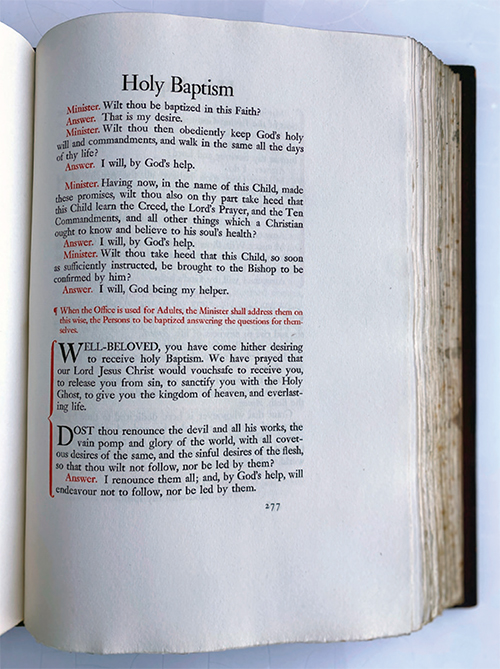
of the Merrymount Press Book of Common Prayer
(Episcopal Church 1928) and also a copy of the
Anthoensen Press book Tudor Place (Peter 1976).
Both of these volumes, produced in the early-
and mid-twentieth century respectively, are
monuments not only to book production in their
time but to the typographers that used the
typesetting methods available to them (see
figures 1 and 2). While there are many other
examples of books from that century that are
“monumental,” the Merrymount Press and the
Anthoensen Press went to extraordinary lengths
to compose and print with type in ways unlike
other presses of the time. Daniel Berkeley
Updike (1860-1941) and Fred Anthoensen
(1882-1969) were contemporary printer-scholars
who took their trade and typesetting more
seriously than others. There were other book
designers and publishers at the time who were
also serious about the “look” of their books,
but Updike and Anthoensen were involved in the
actual production of the books they were asked
to print.
Beginning with Updike, the Merrymount Press
(1893-1949) was set up for type composition by
hand. When commissioned by J.P. Morgan to
produce the Book of Common Prayer in 1928 (the
book was not completed until 1930), the press
needed a large quantity of Janson type (Nash
1974). Morgan had agreed to have the book
printed in the Janson types, but the type in
quantity was not available from the Stempel
Type Foundry. To have the type he needed for
the project, Updike had acquired a Thompson
Type Caster, and he cast the Janson from
electrotyped mats supplied by the Thompson
Corporation. Thompson had used the type
purchased for the sample pages from the Stempel
Type Foundry to create Thompson-style mats.
Figure 1: Book of Common Prayer
Figure 2: Tudor Place
The Thompson-style flat mats were handed down
from the Merrymount Press to Dan Bianchi, who
gave them to Rocky Stinehour in the early
1960s. Sometime around 2001 he gave them to
John Kristensen at his Firefly Press, and they
now reside in our shop in Bar Mills, Maine.
They include all of the sizes and styles used
in the making of the Book of Common Prayer, as
well as all sizes of the initial capitals,
which were drawn by W. A. Dwiggins. The details
of the composition and history of the
production of the book are to be found in The
Making of the Book of Common Prayer of 1928
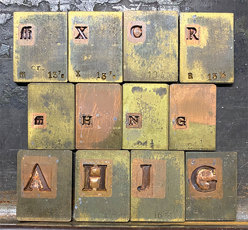
(Hutner 1990). John used his English Thompson
Type Caster to cast cases of all of the sizes
of the Janson and the Dwiggins initials from
these original matrices (see figure 3).
Figure 3
The Book of Common Prayer produced by
Merrymount has been called one of the greatest
books of the 20th century.
“This Book of Common Prayer is indisputably the
magnum opus of the Merrymount Press. It
“exhibit[s] the elegance, superb design,
scholarship and printing which represent the
best of American work” (Hutner 1990, xii).
“Its beauty comes from its balance of
color—black and red to white—the proportions of
the text on each page and the lustre and
evenness of the printing” (Hutner 1990, 59).”
The book was also printed in a limited number
on vellum; hence the need for the book to be
set entirely in type instead of printing,
distributing and setting in sections. Printing
on vellum requires that the book be printed
(due to second color registration, temperature
and humidity) as quickly as possible with no
delays.
Fred Anthoensen’s shop in Portland, Maine also
had a large quantity of hand type acquired from
the best European foundries, but utilized the
Linotype as well. Through the years 1944-69,
the press was well known in New England for
producing books and quarterlies for scholarly
institutions, including the Boston Athenæum,
the Colonial Society of Massachusetts, Bowdoin
College, Peabody Essex Museum, Massachusetts
Historical Society, Limited Editions Club, and
many others. Typesetting these books required
typographic refinements from Anthoensen that
Mergenthaler Linotype had on hand and supplied
on request. Most, if not all of the faces used,
are still in use at the Ascensius Press,
including the thin italics for Baskerville and
Caslon. There are odd bits too, including
things like true-cut Janson small caps, Porson
Greek, Fraktur German, the special logotypes
used in the Hunt Botanical Catalog, and many pi
mats from years of setting the complex
bibliographical work necessary for the papers
of the Bibliographical Society of America
(McMasters 1958). To take on complicated book
work requires many pi boxes of accented
characters, ligatures, diphthongs and italic
figures, most of which cannot run in the
magazine (see figure 4).
Figure 4: ligatures and dipthongs
Tudor Place, a masterpiece, was set in 18 point
Caslon, on a 50 pica measure, on a Linotype
with a 30 pica mold. That means, of course,
that the slugs were butted together in specific
measures to make a fifty pica line. Several
colleagues have examined the book and cannot
identify any example of where Lino slugs butt
together; an extremely difficult task for
anyone who has tried to do it and succeed,
especially over ninety pages of forty eight
lines each, all printed on handmade paper.
Another consideration in the composition of the
book was that the Linotype operator had to keep
in mind whether the first part of the line’s
word spacing was set “tight” or “loose,” so the
adjoining slug on the line had the same visual
word spacing. Like the Updike Tacitus, the look
of the type on the page in Tudor Place is
magisterial; text block proportions in relation
to the page’s size are perfect, the density of
the type and richness of the ink on paper are
sumptuous, and all together these elements
create an impression of elegance seldom seen in
printed books.
The Book of Common Prayer and Tudor Place are
extraordinary examples of work done by two
presses that produced so much common work
uncommonly well (it has been estimated the
Merrymount Press printed over 20,000 items).
Utilizing composition by hand or Linotype,
under the right hands and with supervision from
craftsmen, book composition can be a truly high
art. The knowledge and skill of the master
printers and typographers still alive today is
being lost at an increasingly alarming rate due
to the lack of enthusiasm by younger printers
to “do the work.” The members of the ATF have
to make sure that at least the physical
materials survive for future practitioners of
our craft; better yet, we must show others how
it is done.
References
Beilenson, Peter, ed. 1941. The Dolphin 4 (2).
Episcopal Church. The Book of Common Prayer.
Boston: Merrymount Press, 1928.
Hutner, Martin. The Making of the Book of
Common Prayer. Connecticut: Chiswick Book Shop,
1990.
McMasters, Rachel. 1958. Catalogue of Botanical
Books in the Collection of Rachel McMasters
Miller Hunt.
Peter, Armistead. Tudor Place. Washington DC:
Anthoensen Press, 1969
Notes and Queries
Regarding the Welliver Interface: First, can
anyone send a software “patch,” or a trick to
allow more than one hyphen at the end of a line
of composition when setting text? I would
prefer three. With short lines, when only one
hyphen is allowed it makes very wide spacing on
the next line. Right now, I have to manually
hyphenate the text. Second, has anyone figured
out if there is a way with the interface to
allow space for a drop cap? The only way I have
been able to do it, with, say, a three line
dropped cap that is 3 picas wide, is if I have a
30 pica measure, to set cast the first three
lines at 27 picas, determine where the last of
the three ends, and then set the balance of the
text on 30. Any other ideas?
Email
scott [at] ascensiuspress.com3
Discovery and rediscovery are terms that are
often puzzling and highly subjective. They seem
to reference a process or a certain point in
time when e.g. information or an object is
found (again). Take note that the confusion is
mainly on the part of the discoverer; the
discovery has been quite aware of its own
whereabouts all along. After the process of
(re)discovery has ended, the discoverer has to
deal with even more confusion as they cannot
declare something a (re)discovery on their own.
A group or community has to establish that a
(re)discovery has been made: after all, there
might be a lack of common knowledge on the part
of the discoverer.
So, without making bold claims about discovery
or rediscovery, let’s take a closer look at an
object that we recently came across in the
Letter-kunde collection: the Benton shading
device. For the sake of brevity I assume the
Benton engraver, the machine that the device
attaches to, and its workings, are known to the
reader. If this assumption is not true for you,
I can highly recommend Theo Rehak’s Practical
Typecasting (1993) or David MacMillan’s
CircuitousRoot (MacMillan, n.d.). I was lucky
enough to learn to work on this machine at
Project Letter-kunde in Antwerp and engraved a
newly designed font with it: Deinze type.
Context
The shading device was invented by Linn Boyd
Benton in 1913 and perfected by Morris Fuller
Benton (Rehak 1993, 131; Cost 2011, 97). In
order to fully understand the device, we have
to address the decorative typefaces of this
period, especially those used in lithographic
printing and the specific market segment ATF
was interested in. Although lithographic
printing opened up a whole new range of
possibilities in terms of artistic typefaces
and title pages, it had some cost-increasing
disadvantages when producing books (Lommen
2016, 224). A craftsman had to be hired to make
the stone and the printer had to mix two
different and highly specialized types of
printing. ATF would likely have had two reasons
for investing in a device that could engrave
decorative and, more specifically, shadow
types. The first reason is to eliminate the
designer making the stones. If it would be
possible to assemble the design in metal type
and then transfer it to the stone, this would
be of interest for ATF. Some experiments have
been done in this direction, as we know the
typeface Offset Engravers was specifically cut
in metal to be transferred to stone (McGrew
1996, 235). The second reason is to print
decorative title pages in letterpress for the
cheaper segment. Surely, the more intricate
designs of lithographic printing could not be
realized in metal type, but simpler, more
straightforward title pages could easily be
produced, leading to cost reduction for
printers.
Description
Having laid out the context and issue at hand,
let’s take a look at the device that was
invented to help engrave these decorative
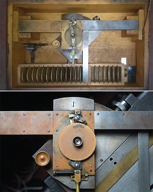
types. The device is stored in a wooden box
that is clearly tailor made for the device and
its attributes. It consists of a stainless
steel platform with a t-shaped part fixed on
top. The wooden box also has nineteen brass
disks with notches all around. The notches for
each of the disks are placed at a different
interval. Three disks do not have any notches
at all. Next to this the box holds a metal
screw-like device, a small metal plate, a brass
strip, and two pieces of hard plastic.
Workings
The device locks onto the back of the Benton
engraver enabling the ruler to cover any
pattern to be engraved on the machine. When
locked into place, the arm of the Benton
engraver can be used to engrave a straight line
with the help of the ruler, and the ruler can
be moved by pulling a small handle to move the
notched disk. The appearance of the device and
its workings can be viewed on the website of
Project Letter-kunde:
https://www.letter-kunde.be/benton-shading-device/
Shading device in the box and attached to the machine
Purpose
The big question is: Why would you need a
separate device for this? Why not fabricate a
pattern to mimic the exact font and use that
for the engraving work? Next to the obvious
‘to avoid mistakes,’ I want to point to another
reason why the shading device was worth
investing in: variety. In order to fully
understand this, we have to take a look at the
type of letters this device was used to
engrave. For a non-native speaker like myself,
the name “shading device” presents problems: Is
it a device to make typefaces that display a
shadow or is it a device to add a shaded look
(or a greytone) to a certain typeface? I tend
to believe the latter, but for the sake of
explaining the possibilities of the device,
we’ll take a look at the first-mentioned
typeface: the shadow font.
Shadow fonts were hugely popular at the
beginning of the 20th century and have remained
a popular form of display type ever since. The
shadow font consists of three components: the
outline, the face, and the shadow, as depicted
below using an artist impression of Engravers
Shaded.
Left to right: full font, outline, face, and shadow of a shadow type
It does not take long for a skilled engraver to
recognise the potential of fabricating a
pattern with only the outline of the font and
combining this with the shading device. By
doing so, he or she does not have just one font
at his disposal. By varying with the hatching,
he can create numerous fonts with just one
pattern. The face of the type can be white,
black, and any desired greytone, and this
applies to the shadow too. This means that
instead of one possible letter to be engraved
from one pattern, there are now at least six
possibilities and many more, only limited by
every possible greytone one can imagine. The
Bentons and W.F. Capitan undoubtedly have
considered this creative freedom, judging from
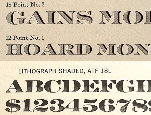
Lithograph Shaded, which is an exact copy of
Engravers Shaded, with exception of the
hatching on the face (McGrew 1996, 205).
Engravers Shaded vs Lithograph Shaded
Another advantage of the shading device is that
existing patterns could also be adjusted and
turned into seemingly completely new fonts. A
commercial company like ATF would have
certainly realised the advantages of this.
Conclusion
The Benton shading device has intrigued me from
the moment I first saw it, and I hope I have
been able to share my fascination. It provides
a very straight-forward solution and opens up a
world of possibilities at the same time, like
all great devices do. The Benton shading device
remains in the Letter-kunde collection until
someone decides to design a new shadow type and
engrave it. Don’t hesitate to let us know if
you fancy the idea.
References
American Type Founders Company. 1912. American
specimen book of type styles: Complete
catalogue of printing machinery and printing
supplies. Jersey City, New Jersey: American
Type Founders Company.
https://archive.org/details/
americanspecimen00amerrich.
The Colliery Engineer Company. 1899. Elements
of lettering and sign painting: A treatise on
the history, classification, and practical
application of the various styles of letters of
the alphabet. Scranton: The Colliery Engineer
Company.
https://archive.org/details/
elementsofletter00inte/page/
n51/mode/2up.
Cost, Patricia A. 2011. The Bentons: How an
American Father and Son Changed the Printing
Industry. Rochester (N.Y): RIT Cary Graphic
Arts Press, Cop.
Gray, Nicolete. 1976. Nineteenth Century
Ornamented Typefaces. N.p.: University of
California Press.
Lommen, Mathieu. 2016. Het boek van het
gedrukte boek: een visuele geschiedenis. N.p.:
Amsterdam University Press.
During my visit to Rich Hopkins’ shop at the
tail end of Monotype University Eleven, Rich
showed off a new digital microscope he was
using to enlarge a piece of type’s pin mark and
look at other small details. This microscope
had a digital color screen above a lighted
platform, The microscope could be raised or
lowered. This looked like a good tool for
aligning type to the baseline and checking type
details when casting.
At Jim Walczak’s shop, I learned to align type
using a traditional microscope setup modified
by Jim. A type alignment tool was mounted under
the microscope, with a mirror to bounce the
image up the eyepiece. I found this somewhat
difficult to use. Each time, it required me to
take off my safety glasses and stand on tiptoe
to look through the eyepieces, which did not
adjust to the right width for my eyes. Still,
this setup allowed for a clear look at the
alignment of type on the body, and it allowed
us to get a great match to an existing piece of
type.
I purchased a microscope similar to Rich’s from
Amazon. It had a 7” LED screen, attached
lights, and SD card capability. It worked great
right out of the box for looking at a type’s
face and its pin mark. While the microscope
itself did pivot to view an object at an angle
other than just straight down, it did not allow
for the type alignment tool to be properly
viewed, The tool had to be held so that the
type would lay flat on the surface) Jim and I
decided to build a holder for the tool and set
up a mirror to transform this new microscope
into a copy of his existing station.
Jim Walczak at the microscope in June 2024
L: the base with angled mirror and type alignment gauge;
R: base on the microscope for viewing type
I found an extra type alignment tool, one with
a metal rod sticking out the front, which we
could use to mount it in a holder. I
experimented with a small piece of mirror and
the type alignment gauge held under the scope.
I did this to find out approximately where the
mirror and the tool needed to be situated.
In the wood shop, we used scraps of wood to
create a base to support a vertical piece for
the type holder and a slanted base for the
mirror. The support for the holder went through
several iterations, but in the end, the
solution was simple. A small hole through a
vertical piece of wood allowed the rod to be
inserted upright in the wood. We then cut a 2x4
board at a forty-five degree angle to support a
mirror under the scope. I arranged these two
pieces until a clear view of the type holder
could be seen in the scope. Then, I attached
both to a wooden platform base. The base is set
in place under the scope (which must be raised
to its highest setting) and held in place with
a large rubber band. This makes the base easily
removable, which allows for viewing other
materials, such as flat mats or the occasional
insect.
The scope allows for magnification up to forty
times, and images or video can be saved to the
SD card. I no longer need to take off my safety
glasses or strain to see into the eyepieces.
We’ve moved into the digital age for viewing
type up close.
3
Cutting New ATF Matrices at the Greenboathouse Press
Jason Dewinetz
The book currently in production at
Greenboathouse Press is a poem and accompanying
essay by Crispin Elsted (of the Barbarian Press
in Mission, BC). The essay includes a number of
quotations and references in various languages
that require a range of diacritics, which, as
any printer and/or typecaster knows, can
present a challenge when it comes to selecting
a typeface for the project. For the former it’s
a matter of what’s in the type cabinets, while
for the caster the question is which box of
mats includes accents?
Like many North-American printer/casters, my
shop has an embarrassing shortage of
diacritics, so I really didn’t have much
choice. What I do have are the original ATF
foundry matrices for 16 point Cloister
Lightface (roman, small caps, italic, & swash).
I also have, strangely, the matrices for 16
point Cloister Oldstyle (a slightly darker
version of the Lightface), but only the italic
& swash, no roman or small caps. I honestly
don’t know why I even have these, as they’re
not much good without the roman, but there they
are on the shelf. (As a side note, if anyone
reading this has the mats for 16 point Cloister
Oldstyle roman/small caps, please let me know.
I’d be happy to sell/trade the italic mats to
get the roman & italic back together.)
I decided to use the Cloister Lightface for
Crispin’s text both because it’s a lovely text
type (if you’ve seen any of Bob Barris’ books
you’ll know what I mean), but also because the
mats include a full set of accents, both in
caps and lowercase, in both the roman & italic.
Also, of course, because I could cast fresh as
much type as I’d need for the project.
So, I got to work. A few years ago, Dan Jones
was kind enough to give me a custom matrix
holder for the Super Caster that holds a range
of foundry mats. It’s a very simple contraption
with a basic cavity where pretty much any
size/shape foundry mat can be set and secured
with shims & set screws.
I’d used it many times before and had
determined the shims I’d need under the ATF
mats so that they would seat correctly on the
mould. The CLF mats are 16 point, but I was
casting on an 18 point body to be set solid for
printing. Dan has also sent me a 16 point mould
and a modified type carrier for the Super
Caster, but I haven’t gotten around to testing
it out yet.
First, I cast two very full cases of roman, the
full range of upper and lower-case accents, and
a good amount of the small caps. Then it was
time for the italic. The Cloister Lightface
italic is a nightmare to work with because
nearly every single character has a kern, and
many have kerns on both sides. The problem is
that most of the mats were engraved. Well, all
of them were engraved, but some of the more
common characters were then cast and
electro-deposited. The engraved mats, of
course, have beards, and while the kerns are
designed to fit, the beards are not. When cast
at ATF or at the Dale Guild, the type was
pushed past a set of knives on the Barth caster
that very carefully cut away the beards as the
type exited the caster, in some cases doing
very tricky under-cuts to ensure fitting. On
the Super, however, I don’t have those knives.
This means nearly every single sort has to be
hand-finished: not just dressed on a file,
which is tedious but simple enough, but
hand-finished with a tiny 3-sided file to rub
away the beard without damaging the kern.
After casting a relatively small 150-a/30-A
font of the italic, along with all of the
accents (á, à, ä, and â for all of the vowels,
plus ñ and ç), I hunkered down with a loop and
a file and hand-finished every single sort.
While it was a small font, any of you who have
spent time hand-finishing type will know what a
slog this was to do.
Then, I set the text for the book. It’s a short
text. The poem is two pages, and the essay is
seven. Once set, I ran each forme on the press
to pull proofs to look for typos, etc. It was
then that I got a swift kick in the balls.
The three wooden trays that hold the ATF mats
(one for Lightface roman & small caps, one for
Lightface italic & swash, and one for Old-style
italic & swash) have no labels on them, and the
mats themselves also have no identifying marks.
They just have stamps for type size, set width,
and, on some mats, indications for kerns on
left, right, or both sides, as well as a few
stamps indicating that the mats are St Louis 2
depth). The only thing identifying which mats
are in which tray is a slip of old cardboard.
When casting the italic, I grabbed the tray
with the cardboard slip that had “16 Lightface
italic.” I checked that the set had all the
same accents as the roman, and I got to
casting. However, on pulling my first proof,
the mistake became blatantly obvious. The
italic I had cast was significantly darker than
the roman. At some point, the cardboard slips
identifying the italic Lightface and Oldstyle
mats must have gotten swapped. I had not only
cast the wrong italic, but I’d spent upwards of
20 hours hand-finishing all of those sorts,
only to discover they weren’t the sorts I meant
to cast.
So, back to the caster. It was at this point
that I discovered that for some unknown reason
the Lightface italic mats do not include a full
range of accents. The mats only include á, é,
í, ó, ú, and ñ, none of which I needed. What I
did need was ä and ç. I figured I had two
options: use the Oldstyle italic I had already
cast and dressed, reluctantly accepting that
the italic would print darker, or cast the
Lightface italic and live without the accented
ä and ç. Neither of these options was
appealing.
I then remembered that I also have the original
ATF copper-backed patterns for Cloister
Lightface, and, on looking through them, I
discovered that the full range of accents are
included in the patterns. Why they were never
cut is a mystery, but I now had the option to
engrave new matrices for the characters I
needed. Hooray!
I did some careful measurements and determined
that I’d need to do a 20:1 reduction from the
pattern to get to the 16 point I needed. I set
to work and engraved the ä matrix (more on this
below), then cast a handful of sorts and pulled
a proof. Not surprisingly, my math was wrong.
The character was too big and too dark. The
darkness was a result not only of the character
being too big, but because of an ongoing issue
I have with the Ogata pantograph: the spindle
collet is old and worn (and it didn’t help that
Jim’s method of getting his cutting tools out
was to hammer on the spindle with a wrench),
and so I have some run-out on my cutting tool.
With a dial gauge I’ve determined that I end up
with about .001 run-out, meaning a .003”
cutting tool is actually cutting at around
.005”. This obviously sucks, and there are no
new collets to be had, so my work-around is to
use a larger follower. This keeps the cutting
tool a tiny bit farther away from the outline
of the pattern. The other option would be to
redraw my digital outlines thinner than I want
them to allow the pantograph to cut them a bit
darker due to the run-out.
Anyway, at this point, I had another problem.
The Ogata only allows up to a 20:1 reduction,
but I needed more, which meant I had to create
a smaller pattern. To do this, I pulled a proof
of the copper ATF pattern and scanned it into
the computer. I created a digital drawing, and
then reduced the drawing digitally to match a
proof of 16 point type. Next, I enlarged the
digital drawing back up to exactly 20:1. From
there, I followed my usual protocol of
laser-cutting the digital pattern into .125”
adhesive-backed acrylic, which I then stuck
onto another sheet of acrylic in order to have
a smooth floor for the follower to work on. I
also laser-cut a second pattern for the
counter-cuts on the pantograph. See the image
on the next page showing all of these things:
the original pattern, my patterns for the
character outlines and counter-cuts, and the
finished mats.
My matrix cutting process is very similar to
the specs that Ed Rayher included in his
booklet on making Cherokee type, which look
something like this for the 20:1 reduction:
1: Depth: .018” Cutter: .011” Follower: .225”
2: Depth: .036” Cutter: .011” Follower: .225”
3: Depth: .045” Cutter: .008” Follower: .160”
4: Depth: .052” Cutter: .004” Follower: .080”
5: Depth: .055” Cutter: .003” Follower: .060”
The extra depth allows the mat to be dressed
to exactly .053” (St Louis 2), which is checked
with an ATF depth gauge using an ATF standard
for SL2. The final approval comes from casting
some type and testing the height-to-paper to
match the rest of the font.[1]
None of this went perfectly, but I’ve gotten
used to that. I had to engrave the ä matrix
three times and the ç matrix twice, but in the
end, I managed to make two mats that deliver
well. Each has a reasonably clean face, and
each blends well with the existing font of
type.
I had done something similar for a matrix font
of 60 point Bodoni bold italic, which was
missing the capital W, so I suppose this was
my second attempt to fill in gaps in my matrix
collection. However, I wasn’t done yet. I’m
also using a 36 point Troyer ornament on the
book’s title page and wanted to print a pattern
of the ornament on the binding, but the 36
point size was too big and I only have 2 sorts.
I could have just digitally redrawn the
ornament and had a polymer plate made. Instead,
I went through this entire process again. I
engraved a 24 point Troyer mat, then cast 500
of them for the patterned paper.
It’s an interesting process, fraught with
potential failure at every turn, but it’s also
very rewarding when the time comes to cast,
set, & print these missing characters. Have a
look at my Instagram account to see photos of
these various projects: @greenboathousepress.
The next hurdle was to get to work printing
Crispin’s book, which I’m printing damp, and
it’s coming along nicely, but I had to take a
break from that to get this article written. If
any of you have any questions about my process,
or suggestions, I’d love to hear from you.
3
Footnotes
For a lot more detail on various other
aspects of this process, such as preparing
matrix blanks and cutting tools, see my article
“In the Cut: Engraving foundry-style matrices
at Greenboathouse Press,” in Parenthesis 47,
the journal of the Fine Press Book Association.
Above are just a few of the cast of mostly
printing related figures from the 1923 ATF
Specimen Book and Catalogue. Almost all
letterpress printers are familiar with them,
and a lucky few own at least some of them. I am
not among the lucky. I’ve asked around for
quite a few years and during my discussions, I
found very little is known about them and their
origins.
When I first became a hobby printer almost 50
years ago, I purchased an old Kelsey 5x8. The
Kelsey Co. was still, barely, in existence, and
I wrote to them asking if they could supply the
missing gripper bar, gripper spring, and
grippers. Eventually, after a bit of back and
forth in the US Mail, I received the parts and,
more importantly, a Kelsey’s Printers’ Supply
Book.
In that catalog, I drooled over the cuts
section and, in particular, I wanted the cut
depicting a colonial printer (center, above)
(Printers’ n.d., 10). It was not to be. I’ve
never seen a copy of this cut in any sale of
any printshop, any NAPA or APA auction, at any
wayzgoose sale, etc. Over time, I’ve slowly
become aware that this cut was just one of a
number of similar images, all nicely collected
in the pages of that 1923 ATF catalog. I still
do not own any original ATF castings of these
figures. In recent years, I finally realized
that if I was going to own any of these, I
would have to come up with my own versions—in a
digital format. I completed this project, a
TrueType font of Colonial Printers, in April of
2020 (Koelewyn 2020). I use the digital font
multiple ways. I’ve used it as a font in things
I’ve written and sent along electronically.
I’ve sometimes printed out on our ancient
LaserJet (Koelewyn 2020). I have also sent them
off to Owosso to be made into copper cuts as
needed and in the desired size.
One result of this project was I found I
enjoyed the process of creating digital
versions of dingbats, cuts, full alphabets, and
borders. I also discovered the wonder that is
the HathiTrust website. I began looking through
old books and magazines for old ideas to
recreate digitally. Eventually, I found their
digitized copies of The American Printer and
Lithographer, The Inland Printer, and similar
journals from around the world. I scoured their
pages for images to digitize.
Then, in the August 1908 issue of The Practical
Printer (Inland 1908, 125), I spotted a
familiar set of characters. This publication is
the house organ for the Inland Type Foundry,
and this advertisement introduced these
figures. It didn’t take long before they began
to appear in other Inland Type Foundry
advertisements in general trade publications,
such as The Inland Printer and The American
Printer.
Two years later, again in The Practical Printer
(Inland 1910, 156) these figures got their own
feature advertisement with three solid outline
figures, for background color, added.
These three figures continued to be seen over
the next year in Inland advertisements,
especially in The Inland Printer, but, as far
as I have been able to determine, they were
never included in any Inland catalog. Then, in
1911, ATF purchased the Inland Type Foundry and
ATF became the owner of the matrices for these
figures.
ATF’s first mention of these figures came in
December of 1912 (American 1912), about a year
after the purchase. In 1923, ATF published
their monumental Type Specimen and Catalogue.
It includes a much larger set of figures
(American 1923, 757-758). On the bottom of page
757 are the three original Inland figures,
minus their solid outlines, plus one not
previously seen in either the Inland or ATF
advertisements, a figure holding two ink balls
(fourth from the left at the beginning of this
article). Collectively, ATF calls these four
PRINTERS EMBELLISHERS. All the others
are called TYPOGRAPHIC SPOTS.
The preceding page of the catalog adds a number
of additional images as well as some two color
versions of both original and new figures. None
of the three solid color outlines seen in the
1910 Inland advertisement in The Practical
Printer are seen anywhere in the 1923 ATF
Catalog.
Over time, I became increasingly curious about
the history of these figures. Two questions
arose in my mind: Who is the artist? And did
Inland make all of the matrices for this
remarkable set, or did they only have the first
three, plus solid outlines, and then ATF
arranged for the rest?
I have not answered either question
definitively, but there is some evidence
supporting my belief that:
1) The artist is Frederic Goss Cooper; and
2) Inland probably created a smaller set that
ATF inherited and expanded upon at a later time
and included in the 1923 Catalog.
My belief that Fred Cooper (no relation,
apparently, to Oswald Cooper) is the artist is
circumstantial, but, I believe, convincing.
Fred Cooper grew up in Oregon and by 1904 had
moved to New York City to begin a career in
illustration and cartooning. Shortly after
arriving in New York, he managed to land an
interview with the advertising manager of The
New York Edison Company. Cooper was able to
convince New York Edison to let him create some
advertising for the company featuring ‘Father
Knickerbocker’, a short man in a wig with an
enormous head and an even larger jawline
dressed in American Colonial clothing (Martin
1922, 153). He carried a tray, as a butler or
waiter would, holding an electric light bulb.
This figure became known as the “Edison Man”
and was used as the symbol for the company for
more than twenty years. It is sometimes paired
with the text “AT YOUR SERVICE.”
This was the first in a vast series of
illustrations Cooper made for the New York
Edison Company. He drew an extended family of
related characters, each featuring a huge head
and huge jawline, and each wearing a curled wig
while dressed in American colonial-period
clothing (American 1923, 576-577). His cast of
figures included the “Edison Girl,” who was
shown doing all sorts of domestic chores that
were made easier with electricity. Cooper, also
soon after arriving in New York, became an
illustrator for Collier’s Magazine and Life
Magazine, where he created small spot
illustrations he called ‘cartoonettes’. He also
formed a long association with The Marchbanks
Press, a noted private press that, among other
things, printed books for The Limited Editions
Club.
Even though the figures from Inland and,
subsequently, ATF are unsigned, their
resemblance to the Edison Man and related
drawings is unmistakable. In 1908, and
certainly by 1923, Cooper was an easily
recognized artist with a distinctive style. I
think it would have been easier to work with
the prolific artist than to have another artist
copy his style. It is easy to imagine an
innovative, upstart type foundry like Inland
dealing with an up-and-comer like Cooper in
1906-1908 for the original three figures, and
then later for the more established ATF to work
with Cooper to create an expanded set of images
for the 1923 Catalog. The arrangement of the
figures in the 1923 ATF Catalog suggests that
the matrices for the original three figures,
plus maybe that fourth, which is on a different
page than the others, may have been made at a
different time.
The matrices for this series were spotted at
the preview of the auction of ATF’s assets in
1993 by Rich Hopkins, who noted that there were
two matrices, in 120 point size, that were not
seen in the 1923 ATF Catalog (Hopkins 1994, 6).
That’s the last time any of the matrices were
seen. What happened to these matrices during
the auction is a mystery. They may have
bypassed the auction and entered into the
collection of the Smithsonian Institution; they
may have been bought by a collector who is
keeping quiet about it; or they may have been
purchased and melted down by one of the
scrappers reported to be at the auction. Many
of the matrices in the Smithsonian, but not
all, were recently acquired by the Printing
History Museum in Carson City, CA. I asked, but
there were no reports of these matrices being
seen during the packing for the move to
California. It is also unclear what the
Smithsonian retained for their own collection.
In addition to The Inland Type Foundry and,
later, The American Type Founders, a couple of
other businesses sold at least a part of this
series of figures. As mentioned previously, The
Kelsey Co. sold the figure. Kelsey was known to
buy type from ATF and sell it under their
Connecticut Type Foundry name. A post on the
Briar Press website claimed that Kelsey used
the Connecticut name for type it sold that was
manufactured by ATF (VonHoldt 2014). It also
sold Monotype cast type under the name of The
New England Type Foundry. Some of this type may
have actually been cast on site in Meriden, CT.
Like many other fonts of type it sold, it seems
likely that Kelsey sourced the printer figure
from ATF.
Another source for two of these figures was
Typefounders, Inc., Charles Broad’s business,
sometimes referred to as Typefounders of
Phoenix. Broad sold the figure at the type
cabinet and the figure holding two chases. He
sold both right and left versions of each and
in two sizes (Broad 1962). Eight matrices, four
cast on an 18x12 body and four cast on a 36x24,
passed on to Los Angeles Type Founders, and
then to Barco, and finally to Skyline Type
Foundry, which currently offers a set that
includes these eight figures, as Collection 42
(Skyline n.d.) (Shipley 2024).
Outside of the United States, some unidentified
Japanese company was importing at least these
first three figures into Japan, presumably from
ATF.
During the research for this article, Rick
VonHoldt pointed out one more related figure in
the 1923 ATF Catalog (American 1923 802) that I
had somehow missed (VonHoldt 2024). This is a
small cut of a variation on the Edison Man with
his face looking out of the page. I also found
this identical figure on the cover of The
Edison Monthly (New 1914). A version of The
Edison Man was on the cover of The Edison
Monthly from June 1914 until the magazine
ceased publication in December 1928.
One more variation of the Edison Man can be
found in Monotype: a Journal of Composing Room
Efficiency (Lanston 1913, 88-89). There you can
find a two-page advertisement that includes a
version of the Edison Man carrying a Monotype
caster, instead of a light bulb, on his tray.
It appears in just that one issue. Monotype
must have engraved a matrix and then abandoned
it. At least one of these border pieces is
still in existence. It is in the collection of
Rick VonHoldt, who used it in the 2012 issue of
It’s a Small World amidst a collection of
printing-related cuts. Rick says it is on a
36x36 point body.
Finally, the figure standing at the type case
traveled across the Pacific Ocean in 1912 and
made an appearance in The Osaka Insatsukai
(Taniguchi 1913, cover) in an advertisement for
The Taniguchi Printing Office. It is clearly
not the same as the Inland/ATF casting as it is
quite a bit larger, covering about a fourth of
the page. It also incorporates Ben Day dots as
shading in the wig and shirt as well as lined
shading on the type cabinet. I assume a local
artist carved a wood block or made a
stereotype.
This journal and its successor, The Nippon
Insatsukai, show a clear Western influence.
There is plenty of English in the largely
Japanese-language journal, especially in the
advertisements. Later issues (Advertisement
n.d., 12), beginning in 1915, show more
American-style colonial figures not found in
American catalogs. These were likely made by
Japanese artists. Here’s an example:
It is interesting to note that Carl
Schraubstadter, Jr. moved to Osaka, Japan
shortly after the sale of the Inland Type
Foundry to ATF and became a noted collector of
Japanese woodblock prints. I can’t help but
wonder what his interactions with the Japanese
printing industry were and if any of those
interactions were responsible for this figure
crossing the Pacific Ocean so quickly.
There’s a lot of details yet to be uncovered
about these fascinating figures. The ATF’s
Library was acquired by Columbia University in
1936 (Columbia n.d.), but it is not clear if
any other papers were included in the deal.
Rich Hopkins mentioned ATF’s papers being
scattered about during the auction with no
regard to historical preservation (Hopkins
1994, 9), so it is likely they no longer exist
as a body and are unlikely to provide any
answers as to the artist of these figures’ or
the dates of their creation. It’s possible that
some of the principal people may have left
archives of their work and letters, etc. to an
institution, but I have not been able to find
any. Likely candidates for such investigations
include Carl Schraubstadter, Jr., Oswald
Schraubstadter, William Schraubstadter, and
Nicholas J. Werner, all from the Inland Type
Foundry; Morris Fuller Benton and Joseph W.
Phinney from American Type Founders; and Fred
Cooper.
Hopkins, Rich. “American Type Founders Company:
A Troubled Report on its Demise,” American
Typecasting Fellowship Newsletter 18, June
1994, ATFno18.html#atf
Koelewyn, Arie C. “Colonial Printers, a Digital
TrueType Font,” The National Amateur
Newsletter, April 2020. Available for free;
send a request to koelewyn [at] msu.edu.
Introduction
When, two years ago, I discovered the ATF
newsletter archive on David McMillan’s website
CircuitousRoot, a new world opened for me, a
world I had thought no longer existed. Ever
since I started printing, I just assumed that
the type we were using was the last existing.
Every time we had to throw a squashed type into
the bin, it felt like an irrevocable loss. Yet,
here was a large community still casting type.
Rich Hopkins was producing an all metal type
newsletter. There were mats of anything one can
imagine in Greg Walters’ barn. Stan Nelson was
perfecting hand casting. People were even
designing new typefaces and engraving mats.
Around the same time, I got in contact with
Erich Hirsch, a Monotype operator in my
hometown of Hamburg, Germany, whom I am now
blessed to call my mentor. I saw Monotype
matrices that were freshly purchased from
England, and I learned of Rainer Gerstenberg,
who still operated a type foundry in direct
succession of the largest German type foundries
there ever existed.
However, turning the virtual pages of the
Newsletter, I learned about the perishing of
the Dale Guild, and I read the obituary for
Greg Walters. I learned that Ludwig Mohr, who
volunteered to take over the newsletter, also
died an untimely death, and I saw the
presumably last newsletter be produced on a
computer. I learned that The Type Archive in
London was closed for good, that Gerstenberg
will close his shop, and that my mentor,
despite his good health and remarkable energy,
will turn eighty-eight this year. So the world
I had thought lost, then rediscovered, again
faded away before my eyes.
But then, by pure chance, I saw Jason Dewinetz
posting a link to the hybrid session of the
last ATF conference. I listened to Val Lucas
reporting her engraving adventures, and I
learned about Fritz Swanson and the other
printing stewards. So, when there was word
about the revival of the ATF newsletter, I was
enthusiastic to contribute and to see what I
could do to help change the course of
typecasting history.
Germany and Scandinavia
This attempt at an overview of current
typecasting activities in Germany and
Scandinavia comes from feeling an urgent need
to help preserve the art of typecasting. I also
have the very nonaltruistic motive of creating
opportunities to practice it myself. I am
active in Germany and Sweden, so the situation
there is best known to me. While writing this
piece, I realized how much I might not know and
therefore might miss in my overview, hence the
careful title. I actually hope that there are
more activities, and that you readers reach out
to me and report them, so that we can connect
and include them in an update for a future ATF
newsletter.
Foundry Type
Rainer Gerstenberg’s type foundry (D. Stempel
successor)
I will start by discussing foundry type first,
and come to Monotype (both composition and
display type / super caster) later.
Internationally best known is certainly the
type foundry of Rainer Gerstenberg in
Darmstadt, Germany. Until recently, Rainer
produced real foundry type from a wide range of
matrices, even using different alloys for small
or large grades, casting calligraphic typefaces
with large overhang, and making heat resistant
type for bookbinding. Last year, the uncertain
fate of his foundry was widely discussed on
social media, and a petition was signed by
several thousand people urging the government
of the German state of Hessia to intervene and
secure the future of the foundry. While—at
the time of writing and to my knowledge—no
agreement has been reached, there are hopeful
signs for a resolution. More about this later.
Rainer is a typefounder by trade. He started as
an apprentice at D. Stempel in 1961 while still
in his teens, the usual age in the German trade
apprentice system. He was a quick learner, and
he can pride himself with the dubious honor of
earning an exemption permit for piece rate pay
before the legal age of eighteen. D. Stempel
had developed their own machines, where two
typecasters were integrated into the same
frame, allowing one operator to run continuous
casting on one machine while setting up a
second caster at the same time, all without
having to step aside. During his career, Rainer
was to meet the likes of Herman Zapf and Jan
Tschichold. When D. Stempel, already merged
with the German Linotype for matrix production
and other remaining metal type activities,
seized production of metal type during the 80s
(Wikipedia 2011), Rainer took over the tools
and the machines and eventually moved into the
newly founded Haus der Industriekultur (House
for Industry Culture) in Darmstadt (Feuck
1998). This was then an ambitious project
aiming at a conservation of all aspects of
industrial printing, supported by the president
of one of the largest German engineering
universities, and attracting public funding.
On the premises of what eventually became part
of the state-owned Hessisches Landesmuseum
(Museum of the State of Hessia, going back to
the 17th century), Rainer has since operated a
commercial type foundry, with his own machines
and access to a growing stock of matrices, some
owned by him, others by the state. In addition
to Stempel’s inventory, matrices from Swiss
Haas, Italian Nebiolo, and some French
foundries found their way to his shop. While
closely connected to the printing museum under
the same roof, his operations were independent
and commercial. However, apparently his
operations have only ever been large enough to
support himself, never large enough to allow
him to take in an apprentice and secure a
succession. In the meanwhile, the operation of
the museum went through several changes, which
would warrant a separate description, and ended
up being treated rather stepmotherly by the
state, which neglected maintenance of the
premises. Finally, this led to first a partial,
then later a complete closure due to an alleged
unsafe state of the building in 2023
(Propson-Hauck 2023) (Joachim 2024). I was able
to visit Rainer in autumn 2023 and see his
operations, which had dozens of typecasters in
an operational state. At this time, the museum
under the same roof was already closed and its
volunteers barred from entering. Since the new
year, even Rainer’s workshop is off limits, and
his machines are standing still for the longest
period since they were built. So, while not, as
often claimed, the last commercial typefounder
in the world, he is to my knowledge the last
one in Europe, and maybe the last to stand in a
direct line of succession from the first
typefounder himself.
I want to caution that I am not privy to the
ongoing discussions between the stakeholders.
I’m not even sure who all of them are, and I’m
aware that much of what has been discussed
publicly is based on speculation. But, I think
it is safe to say that at the heart of this are
two issues: First, and most important, there is
a need to find an operation model for Rainer’s
type foundry which secures, at last, a transfer
of knowledge to new people, in order to
preserve the immaterial heritage of
typecasting, and in order to secure a supply of
sorts for printing in the future. It is my
understanding that the three largest printing
museums in Germany, the Klingspor Museum in
Offenbach, the Museum für Druckkunst in
Leipzig, and the Gutenberg Museum in Mainz all
are willing to contribute together (within
their means), and have already secured some
(while not yet disclosed) parts of a solution.
Connected, but partly also independent, is the
second question about the future of the current
premises in Darmstadt. While keeping activities
there would have huge benefits, major
investment would be needed to compensate for
many years of neglect, which until recently
seemed unlikely. However, in another
unbelievable plot twist a white knight may have
arrived who is willing to invest the necessary
millions (Walz 202).
So, it looks like hopes are up, and the near
future will tell what is going to happen with
the last type foundry in Europe. What we can do
in the meanwhile, I think, is to see how we can
contribute to an exchange of knowledge and to
support whatever solution is found with our
expertise.
Other collections in Germany
There are no other operating foundry
typecasters to be found, or at least in regular
operation, in Germany or Scandinavia, if not in
Europe. The only other machines that I know of
are at the Museum für Druckkunst, Leipzig,
Germany. There, a couple of foundry typecasters
are on display and have mostly been used by
Thomas Siemon, from the museum’s part time
staff, to produce ornaments for the museum
shop. There are general concerns regarding safe
operation of the machines, since they have gas
furnaces and a tendency to produce nasty
splashes. With limited resources, the museum
will focus on Monotype operations (see below).
Other than that, a scattered collection of
foundry type matrices and some machinery can
be found in the collections of some museums in
Germany and Sweden. The Darmstadt collection
available to Rainer’s type foundry comprises
the remains of many German foundries, but not
all. The Deutsche Technikmuseum (German Museum
of Technology) Berlin (Mathieu 2022) owns
matrices, documentation, and specimens from the
Berthold type foundry and has in recent years
made an updated inventory available, as well as
undertaken some digitization projects.
Sweden and Scandinavia
In Sweden, two large type foundries existed.
Norstedts and Sons donated large parts of their
inventory to the Nordic Museum in 1974 when
they stopped producing metal type. A digital
catalog exists, but it is not easy to
understand how complete the collection is. Not
on display, the inventory is available for
research, but most likely not for any
production. Matrices and machinery from the
Berling Type Foundry in Lund are all but lost
without a trace. Some 19th century matrices, as
well as some early typecasters, are stored at
the Kulturen museum in Lund (Burman 2017). None
of these collections seem promising to start
any typecasting related activities anytime
soon. But, again, in a plot twist worthy of a
Hollywood movie, it seems possible that some
mats and machinery from Lund have found their
way into a barn in Piqua, Ohio (Walters 2022),
and I will report more on this connection in a
future ATF newsletter.
In Scandinavia outside Sweden, to my knowledge,
no type foundry equipment is preserved.
Monotype
There are a number of Monotype Composition
Casters preserved and a few running in Germany
and Scandinavia, and a small number of Super
Casters as well. I am not aware of anyone,
however, currently producing fonts or sorts for
sale on any of these, or of anyone casting text
for any larger projects such as books, on a
regular basis. There are a couple of small
private presses, and (at least) two regular
book art fairs, the annual Buch-DruckKunst in
Hamburg, and the Malmö Artist’s Book Biennial,
which bear witness of a vibrant community, but
none of the presses currently participating use
a Monotype.
The Museum der Arbeit, Hamburg
The Museum der Arbeit in Hamburg has since its
beginning had a large and living printing
division. Founded by volunteers, the museum is
now part of the Foundation of Hamburg State
Historical Museums. For more than thirty years,
volunteers have kept a well-equipped workshop
alive and offered a drop-in printing workshop
once a week, as well as evening and weekend
courses and kids birthday parties. The museum
participates in festivals and fairs and more. A
Heidelberg Cylinder, a Windmill, two Linotypes,
several proof presses, a large hand composing
room, and a book bindery are regularly used by
some thirty volunteers. At the same time,
everything is on daily display for the regular
museum visitors.
The museum has the only Monotype that I know of
in Germany or Scandinavia that is regularly
operated. Since Erich Hirsch started fourteen
years ago to get up and running what was until
then only on “dead” display, he and his
colleague Daniel Janssen have been
demonstrating the keyboard and caster at least
twice a week to visitors. Erich has also
produced text for a good amount of small and
large projects. For nearly two years now, I
have had the luck that Erich calls me his
“apprentice”, learning the Monotype Composition
Caster and keyboard, and by now I can operate
them independently (as long as things go
smoothly, that is), and I have done some
service on them as well.
In Hamburg, operation is historically correct
with keyboard and paper ribbon. Thus, available
typefaces are limited to where wedges, stop
bars, and keybars exist. Another choice is to
use linotype metal, as it is in easy supply and
has provided reliable casting. Erich provides
sorts for the museum workshop.
The OHD and the Museum für Druckkunst, Leipzig
Until recently, a large collection of Monotype
matrices and machines could be found at the
Offizin Haag-Drugulin (OHD) in Dresden,
Germany. A descendant of West Germany, printer
and collector Eckehart SchumacherGebler
acquired the largest remaining metal type
operation of the former German Democratic
Republic. He saved the Officin Andersen Nexö
from the liquidators when Germany became
reunited in 1990. After some years of
negotiating over the best way forward, this
eventually led to the separate founding of the
Museum für Druckkunst (Museum for the Art of
Printing) in Leipzig and SchumacherGebler’s
private operation, the OHD. Fast forwarding, by
2022 he had steadily grown his private
collection, which included several super
casters, several operational Monotype
Composition Casters, some of which were fitted
for large composition, and a number of
keyboards. His inventory of matrices was
impressive. He employed a printer, a young and
newly educated typecaster, and Heike
Schnotale, a young and newly educated hand
composer and keyboard operator. Unfortunately,
at the time of his death at eighty-eight in
December 2022, no arrangements had been made
for the OHD. Despite efforts from many in
Germany, and all over Europe, no solution to
preserve the OHD in their existing state has
been found.
Fortunately, the heirs finally agreed to
transfer the most important parts of the
collection to the Museum für Druckkunst in
Leipzig(Julke 2023), where all former OHD
Monotype equipment can now be found. The
museum’s leadership, Dr. Katharina Walter and
the board, is committed to keeping them
operational and available for projects. The
remaining challenge is to secure the knowledge
needed to operate the machines, and ideally, a
business model that allows this to not rely
only on volunteer work. The museum has had
their own collection of operational Monotype
casters, both composition and super. In recent
years, they have not been used much. Since this
year, however, Thomas Siemon is learning
Monotype operations from Michael Märker.
Other Monotypes in Germany
The Offizin Alpirsbach, a small all-volunteer
museum supported by the local brewery in the
Black Forest in southern Germany, has an
operational Monotype Composition Caster, but I
am not aware of anyone there who can operate
it. The Haus für Industriekultur in Darmstadt
houses not only Rainer Gerstenberg’s type
foundry, but also a separate printing museum,
which is currently closed as well. They have a
Monotype on display and have had occasional
demonstrations, but the machine is presumably
not fit for producing text or type. Michael
Bode operates a mail order company for artist
printing, and casts lead-free (tin alloy) type
for schools on a super caster.
Sweden and Scandinavia
Sweden has no operating Monotype Composition
Casters left. Einar Ljungström in Smedjebacken,
north of Stockholm, operates a super caster and
has a composition caster in his collection, but
he has never operated it. In Denmark, the
Vingaards Offizin in Viborg, another
all-volunteer-museum, has both composition and
super casters in operational state, but, to my
knowledge, no one is actively working with
them.
The Rest of Europe
A great development of the last few years is
the increased collaboration in printing across
borders in Europe, and there are some
initiatives aiming at educating the new
generation of type casters. I want to briefly
mention a few more people and places that I
believe will play a role in this. For a more
comprehensive description of the European
situation, I simply don’t have enough
information. Percy Penzel, aged forty-five, is
the world’s youngest Linotype technician and
heads the Typorama museum in Bischofszell,
Switzerland (Benz 2022). It has the largest
collection of operational linecasters in
Europe, and an operational Monotype, albeit no
one currently operating it. Another youngster
in Switzerland is Nicolas Regamey who recently
added both a super caster and a composition
caster to his workshop in Lausanne.
Tartu in Estonia, a few kilometers from the
Russian border, probably has Europe’s most
innovative printing museum and arts center,
TYPA. There, with help from Ian Gabb, Jörgen
Loot has recently revived their Monotype
Composition Caster “after thirty years of
inaction”.
Summary
When it comes to foundry type, we are at a
crossroads. There might be a solution for
Rainer Gerstenbergs foundry very soon, allowing
his workshop to be preserved and an apprentice
be trained. Or maybe no solution will be found,
in which case the last foundry type has been
cast in Europe for a long while, if not ever.
Franz Hennies and mentor Erich Hirsch, replacing the
bridge at the composition caster in Hamburg in 2023.
Photograph by Burkard Meyendriesch.
There is more hope on the Monotype side. There
aren’t many operating Monotypes left. What is
threatening the future of typecasting more than
a lack of machines is a lack of people that can
operate them. I have counted three people below
the age of fifty that currently work with
Monotypes, a few more that might soon or that I
don’t know of. This can be enough, as long as
we find good ways to collaborate and invite new
people to join us.
So, finally, I am looking forward to you
reaching out to me, to tell me about other
people and places in Europe that will become a
part of preserving typecasting into the future.
3
Feuck, Jörg. 1998. “Von der Eleganz
vielgestaltiger Typen.” Frankfurter Rundschau
(Frankfurt a. Main), August 8, 1998, 23.
Hennies, Franz. 2001. “Medium und Material:
Auf dem Weg zur Medien-MOTTE.” In Neue Dialoge:
Geschichte und Perspektiven der Stadtteilarbeit,
146-150. Hamburg: VSA-Verlag.
Joachim, Jens. 2024. “Gebäude nicht
verkehrssicher.” Frankfurter Rundschau
(Darmstadt), February 1, 2024, F18.
Julke, Ralf. 2023. “Denkmalfördermittel:
Wertvolle Sammlung der Offizin Haag-Drugulin
kommt ins Leipziger Museum für Druckkunst
· Leipziger Zeitung.” Leipziger Zeitung, July
20, 2023.
Propson-Hauck, Martina. 2023. “Der Letzte
seiner Art will nicht weichen.” Frankfurter
Allgemeine Sonntagszeitung (Frankfurt a. Main,
48 edition), December 3, 2023, R4.
Since Issue 45 was published in 2022, this
small community has lost some of its giants:
Theo Rehak (d. January 11, 2024), Don Black
(d. June 3, 2023), Mel Arndt (d. January 15,
2024), and Richard Mathews (d. January 11,
2024). As this founding generation of
typecasting preservationists passes, we must
all gratefully reflect on their essential
achievements. The new generation has a
responsibility to step forward, to be taught
and to teach, to support and to be supported,
so that this long tradition may continue.
3
I made the mistake of reading Theo Rehak’s
book, The Fall of ATF, before writing this
tribute to his life as a typefounder and a
cherished friend, who left this life in
January. Theo was a complex person. He was a
compassionate person, and above all, he was a
very committed person. Sadly, that which he was
committed to ended up being a profound
disappointment for him.
In the 1960s, Theo and some friends formed a
renaissance guild revival reminiscent of
William Morris’s efforts in the earliest years
around 1900. They convinced him they needed a
“printer” influence and that he should be the
one to research the subject. That he did, in a
convincing fashion. His efforts are the only
remnant of what was then a dream called the
Dale Guild. Others faded away, but Theo—he
built a type foundry.
Paul Duensing first told me of Theo and his
obsession to get a job at American Type
Founders so that he could learn the trade from
the bottom up.
Working at ATF? “That’s a dream come true,” I
thought to myself. But only several years
later, when I got to know Theo personally and
labored alongside him in seeking committed
apprentices, did I come to realize his ATF
adventure was filled with adversity, and an
abundance of people who hated themselves, each
other, and especially ATF. But Theo was on a
mission, and he was not to be defeated. As he
himself admitted, the book he wrote was a
watered-down version of how things really were.
Then came that fateful day in 1993 when the ATF
foundry was auctioned off. Theo was not
present. It was just too much for him. He had
to keep away from the sale. But the day before,
he was present at a motel in New Jersey,
meeting with and advising those American
Typecasting Fellowship friends who intended to
be at the sale. He spent precious time telling
us where things were and what to look out for.
He was helpful, and he gave warning of
difficulties. Then he returned to Howell, where
he lived and where his foundry was located. The
truth is that he attended in abstention. Others
were monitoring and bidding on his behalf.
I cannot recall when I met Theo, but when we
did meet, immediately we became friends. During
the years that he ran Dale Guild Foundry, we
interacted frequently, primarily because I had
purchased ATF matrices he needed in his casting
activities. That interaction was keen during
the years when Theo worked with Roger Frith,
who then was working at the Tennessee State
Museum. Roger had been a “lost soul” to the
ravages of drug abuse, but somehow came out of
it thanks to the passion he gained for
typecasting. It was only logical that Roger
seek out Theo, and quickly they became friends.
On more than one occasion they stopped by the
Hill & Dale on the way to Tennessee with
equipment Theo had garnered on Roger’s behalf.
I remember one evening when Theo pulled in,
driving a pickup truck that was stacked so high
he had to take caution about underpasses on the
highway. The truck was stacked with type
stands, makeup stones, etc., which Theo was
gifting to Roger. Whether it was a voiced
opinion I do not know, but surely Theo was
preparing Roger to be his successor. He had
great sympathy for Roger and intended to do as
much as possible to encourage him.
But this was not to be, for Roger’s health had
been compromised by his earlier addiction, and
he passed away far too soon. This hurt Theo
greatly.
Somehow, I think Theo was not comfortable in
crowds, for it was almost impossible to get him
to commit to attending meetings of our
fellowship. Until the last minute he would not
commit, but at two of the ATF sessions I
hosted, Theo showed up and was abundantly
welcomed by all in attendance.
For certain, I am a Lanston Monotype “fan” and
so when Theo’s first book, Practical
Typecasting, was published in 1993, I was quite
bothered by what he said about the machine and
the company. One evening, when my Thompson
caster was functioning as near to perfect as
one could ever hope, I cast up a few 36 point
letters and sent them off to Theo asking, “tell
me this is not good type.” Please take note of
how I phrased that sentence, because for
certain, a large percentage of the type I have
cast—and others have cast—falls short of the
ATF standard. A few years afterward Theo and I
had a frank discussion on the matter. He
admitted the Monotype he started with was a
“junker” and not a good measure of better
machines, and the same was true of his
discussion of the Thompson machine, which he
was not too familiar with at the time. He
off-handedly apologized, but shrugged saying “I
can’t take it back now.”
But in discussing the product—type—I must
explain that Theo was absolutely absorbed in
the karma and aura which surrounds American
Type Founders. He had pictures of the Bentons
and Henry Bullen hanging on the wall. The way
they made type? By golly, that’s the way Theo
was going to do it. Conversely, I make type so
that I can print with it. Theo made type and
labored to make the very best type possible—in
the ATF tradition. Unfortunately, that
commitment worked against him in this brave new
world where speed is the answer to everything.
There was a time in ATF history when a single
machine continuously cast 12 point lowercase
e’s for weeks at a time. With that kind of mass
production, setup time could occupy half an
hour or so with no concern. But it is
prohibitive when you’re only casting ten copies
of a letter. Trimming knives manually set and
adjusted took long stretches of time in
undercutting kerns and overhangs, and they
could have been eliminated. The Monotype didn’t
undercut kerns at all. But that wasn’t the ATF
way, so Theo wasn’t going to do it.
I visited Theo at Howell at least three times,
but one particular visit will underscore that
idea. I had indicated to him a strong desire to
run a Barth caster myself, and since I owned
ATF matrices, why not cast one of my own fonts
during the process? I had a full week planned
so I could stay as long as necessary. When I
arrived, Theo said he wanted to have Ed
Harwelik with us to “help.” In reading Theo’s
book, you will figure out that Ed was perhaps
the only person Theo worked with at ATF who
took Theo under his wing and shared his massive
knowledge of the trade. All employees had been
hugely abused by management at ATF, and Theo
felt compelled to give Ed “some work” at Howell
after the fall of ATF. Ed did not drive, so the
first step that day was to go to Elizabeth to
pick him up.
Needless to say, Theo and I had plenty to talk
about while driving to Elizabeth, which was at
least a two-hour drive. Talking with him was
somewhat difficult because Theo was well read
and very familiar with the English language,
and he often used words I didn’t quite
understand, and he used literary references
which I didn’t know either. Once I got my
comfort level up, I learned to interrupt and
seek explanations. Theo was happy to comply. We
got along OK, but there was some effort.
Ed was waiting on the porch, so we had no delay
in hooking up. But no rush. The two had a
favorite stop along the way where coffee and
sweets were their habit. So it was that we
arrived at the foundry about noon. Theo had
turned a caster on before we picked up Ed, so
casting could begin soon. They had an order for
sorts from a person wanting 18 point Raleigh
Cursive, which involved difficult kerning. The
samples the client provided were worn and that
made casting proper alignment far more
difficult. The two spent an inordinate amount
of time pondering proper alignment of letters,
and then matching the type samples with a huge
number of special trimming knives necessary for
trimming the sorts. Ed was running the caster
and Theo was inspecting his samples under a
loupe. They bantered back and forth a long time
before agreeing that what they were doing was
OK. When casting letters that had kerns,
automatic delivery was not possible. Instead,
Ed caught the cast letters in a bowl and handed
them to me for final dressing. They put me into
action, dressing the type they were making.
This wasn’t my dream experience at all.
I have no recall of how many different letters
they cast that afternoon. Less than half a
dozen, for sure. Then, Theo broke the process,
saying it was time to hit the road before
traffic got bad. The pot was turned off, and we
drove Ed back to Elizabeth. It was dark when we
returned to Howell.
My memory is fuzzy as to whether I remained the
second day, but it was evident to me that we
were not going to be casting any of my mats,
nor was I going to run a Barth. Finishing the
job at hand was Theo’s primary concern. I found
some kind of excuse for not staying much longer
and returned to Terra Alta. I had plenty of my
own type I could hand dress!
In later years I never brought up this visit
with Theo. Now, I ponder whether it was an
intentional move on Theo’s part—to drive home
the point that casting fonts is a meticulous,
time-consuming process. On more than one
occasion, I have been compelled to discourage
visitors to my foundry who might have
suggested, “Let’s cast a font.” Secondly, I
realized that Theo included Ed Harwelik
primarily as a means of giving Ed “something to
do” and reassuring him that his extensive
knowledge and experience were appreciated by
others, in this case, me. Theo had compassion
for this man whom he felt had been so badly
exploited. This was his way of demonstrating
his concern.
On the other hand, Theo boasted that he would
never allow George Gasparik, (general manager
at ATF) into his shop. He used every excuse in
the book to prevent Gasparik from visiting,
though George inquired several times. Theo
blamed Gasparik for the conditions at ATF and
this was his way of “punishing” him for all
that had happened.
Another “lighter” view of Theo is now
reflected. I had been chosen to receive an
award and had been asked by the American
Printing History Association to come to New
York to give a speech. At that time, Theo was
active in APHA and especially the Typophiles.
So he called and asked me to come to Howell and
we would drive to New York together. I was
happy to let someone familiar with the city
(traffic, parking, etc.) do the driving. All
went well, and we arrived at the New York
Public Library half an hour early. I was to
give a “powerpoint talk,” and I had my laptop
in case it was needed. I had been given
assurances that equipment and operators would
be on hand and ready to assist. This goes back
to the time when audio-visual equipment and
computer integration were still problematic, to
say the least. Details had been reviewed long
before the meeting took place.
No one seemed in charge, and the room was
quickly filling up with people. Theo and I
lingered in the hallway next to the large
auditorium talking with the few people we knew
and/or met. I was getting anxious about
logistics. Finally, our host arrived and I
immediately asked about equipment. He handed me
a box containing a device and professed no
knowledge as to how it worked. Fortunately, I
was able to get my computer and that projector
to work together—almost. “Where’s the screen?”
I asked. Someone knew a screen was rolled up
high on the wall; it opened electronically. My
computer efforts got me only to the point where
half the image was visible. When the screen
unrolled, it ripped itself in half all the way
down. The show went ahead with me showing one
half of each slide on one half of the screen,
which was being held up by Theo Rehak. Those
in attendance were polite. They didn’t leave
before I was done.
We took a cab back to our car. The ride was
punctuated by a cabbie who insisted on pulling
us into a lengthy discussion about the
assassination of President Kennedy (which had
happened many years earlier). Theo got us out
of that by quickly exiting the cab in the
middle of a traffic jam. Years later, if we
were together and something wasn’t going right,
Theo might ask me “who did kill President
Kennedy anyway?” It was our private joke.
As the years rolled on, Theo and I had several
sullen moments pondering the future of the Dale
Guild (and my own stuff, for that matter). I
don’t know the details of his many false starts
with new apprentices, but I do know he was
making a strong effort.
That little building over there in Howell, New
Jersey, became Theo’s albatross. When it did
finally sell, I am convinced Theo realized it
wasn’t a good move, but it was better than
nothing. As the equipment moved to Salt Lake
City, at last Theo could relax. He took to
building models of towns and items that might
be used on model railroad exhibits.
Typefounding no longer was his millstone.
There was a fleeting moment when he, perhaps,
was able to look back with some assurance that
all was not lost. That was when Theo was asked
to go to Antwerp to teach the Barth to others
gathered there. Patrick Goossens deserves a
gold star for that effort. But, for Theo Rehak,
it was only a bittersweet reminder of a very
fascinating career.
I first met Mel twenty years ago when I was
selling a cabinet of Bernhard Gothic. He lived
about 1 hour south of me, and he brought a
trailer and picked it up. We bonded over our
professional work in computer networks.
Mel was a regular attendee at our ATF
conferences as well as the annual wayzgooses of
the Amalgamated Printers’ Association. He also
regularly attended the printer meetups we have
here in Michigan a couple times per year, even
if that meant driving 2 hours one-way.
Mel had a lot of hand-set type in his basement
at his house in Toledo, but he only had a
small, one-car garage. He had a Ludlow in
storage but was never able to find space to get
it in operation.
Mel was very interested in making matrices
using a computer-controlled milling machine he
owned. He cut a 120 point matrix with our ATF
logo for the 2010 ATF conference in Piqua,
Ohio. Many people tried their hand at casting
this giant matrix using Greg Walters’ 120 point
hand mold.
Mel had a huge number of other hobbies, which I
knew little about. He brewed beer and tended a
garden. He was a baker and photographer. He was
a ham radio operator and railroad historian. He
was involved with the German-American Society
and made several trips to Germany.
Later, I had some regrets about selling that
cabinet. Whenever I would see Mel at a
printers’ gathering, I’d always say, “That
Bernhard Gothic is a great-looking typeface,”
and he’d smile and say, “It sure is.” Then I’d
add, “I sure wish I had a run of it,” and Mel
would laugh and say, “I’ll bet you do!”
Sadly, Mel passed away January 15, 2024. I will
certainly miss him.
3
To say I knew Mel well would be stretching the
truth. But I knew him; he was fun to be around
and had great stories. He was always smiling,
ear to ear. I actually don’t recall the very
first time I met Mel; it’s like I’ve always
known him. I presume it was shortly after I
moved to Toledo, Ohio in 2003. I was new to the
world of letterpress printing, new to a group
called Amalgamated Printers’ Association, and
new to Ohio. So I grabbed the member directory
and spotted Mel Arndt as owner of Willowdell
Press in Toledo.
Knowing Mel for over 20+ years, I found that he
kept to himself, always learning, and was a man
of many interests. When there was something
fascinating to him, he was all in. He didn’t
just learn by reading a couple of books on a
subject; he bought every relevant book and
magazine he could find. He loved trains, so
naturally he bought a rideable small scale
railroad to set up in his backyard to ride
around.
He stumbled into letterpress printing in the
same way. After taking early retirement and
wanting to fill his downtime, he delved into
machining. He bought a small struggling machine
company to obtain its equipment and the
acquisition also included a small printing
shop. Since he loved working with his hands and
tinkering with machines, he began printing. He
learned different processes and even worked on
combining his machining with typecasting. He
intended to complete a typeface of his own for
a friend who loved to cross-stitch. That was
still a work in progress when Mel passed away.
His favorite typeface was Parsons. I'm pretty
sure, though he never showed me. He had every
size, weight, and variation ever made. He even
had the ornaments. Yet, he always tried to get
my measly two cases from me.
Once, I enticed him to help me move a press. I
told him I'd give my two cases. He showed up
early, looking like Santa on his day off: Long
white beard and wearing his standard bib
overalls. It was the first time he had been in
my shop, though at this point all that remained
was my pulled apart C&P press.
He assured me it would be easy to get it out,
and had several stories of previous moves he
had made. "Awe Sven, it's easy, you've done the
hard work just taking it apart." The way he
told the stories, I would have believed it if
he told me he disassembled a 8x12 Old Series
Chandler & Price and escaped from Shawshank
following Andy Dufresne out of the tunnel.
He guided the whole process. I was especially
concerned about the new basement we would be
moving into. He quickly replied, "We'll let
gravity do all the work." To get more help, he
called a good buddy to help. His friend had no
idea who I was or that Mel was moving a press,
but he stopped what he was doing and drove 45
minutes to help. My crew was then 12 strong.
We just gently controlled gravity, just like
Mel said.
Mel had a close relationship with those around
him. Why else would a person drop everything he
was doing to help someone he'd never met? Mel
called and simply asked. It's a trait I hope to
develop: being willing to help a fellow printer
whenever there's a need. That's how
relationships are built and that's where all
those interesting stories come from.
I once felt I needed to hoard my equipment and
knowledge, but I now realize it's more
beneficial to be open and share with others—and
I'll likely learn a lot in the process. Thank
you, Mel.
3
Don Black was a linecaster operator working for
the local daily newspaper in Toronto many years
ago when the Typographical Union went out on
strike. The strike lasted far longer than
anyone had expected, and Don had a family to
feed. Somewhere along the line he had either
acquired linecasting machines as a hobby or
just by chance. During the strike, this
provided him the opportunity to do both
composition for customers and to deal with
other printers in providing used equipment and
accessories. I believe his operation was always
labeled Don Black Linecasting Service.
As the industry progressed to cold type and
beyond, Don's business continued nicely.
Ultimately, it morphed into serving primarily
hobbyists. In that light, he became associated
with our hobby groups, such as Amalgamated
Printers Association and the American
Typecasting Fellowship. I believe I first met
him at an APA meeting, but that is foggy in my
mind. After he became involved in ATF, I
frequently received phone calls from him. I
made the trip to visit him in Canada on at
least three different occasions.
He was an astute businessman. He knew what he
had and he had a good understanding of what it
might be worth. He also had quirks. Chief among
them was his insistence that the Intertype
machine was far superior to the Mergenthaler
Linotype machine. That's why I used
"linecaster" in my first paragraph, for it
would have been a great insult for me to say
that Don was a "Linotype" operator. He made his
point with written material and, wherever
possible, verbally.
Though his business handled all sorts of stuff
associated with letterpress, Don was chiefly
concerned with linecasting and insisted that he
would not get involved in Monotype matters.
Nevertheless, he did not let an opportunity to
"make a buck" pass him by, and so it was,
especially in more recent years, that Don also
bought and sold Monotype matrices and
equipment.
Canada had a difficult time with Monotype. The
Lanston Monotype firm in Philadelphia had
exclusive rights to the "Western Hemisphere,"
yet Canada was closely tied to England.
Canadian operators used all sorts of back-room
arrangements in order to acquire English-made
Monotype equipment. But, as necessary, they did
deal with Philadelphia as mandated by the
agreement. The differences between the two
machines are not evident to the untrained eye,
yet they're critically important when dealing
with composition matrices and molds.
Thus, it was common for Don to call me with
something in hand and ask me to tell him
whether it was English or USA. He left the
impression that if it was Monotype, all he
wanted to do was get rid of it. Thus, he
frequently lured folks like myself and Mike
Anderson to drive up to his place and dicker
with him over what "new stuff" he had.
Within weeks of the September 11 attacks on the
World Trade Center, Mike Anderson and I were
lured up to Don's place because he had just
acquired a bunch of English display matrices.
Suzanne, Mike's wife, traveled partway with us,
so she could visit her parents in upstate New
York while we went on to Toronto. Accordingly,
we crossed the border at a lesser-known point,
rather than through busier places such as
Niagara Falls. Mike was convinced that was to
our advantage.
Our trip there was uneventful, and we spent two
days going through the mats Don had acquired.
Of course, the visit was punctuated by
continuous banter with Don about letterpress,
about type, and about every nuance imaginable.
We filled the trunk of Mike's car with those
steel-reinforced wooden boxes that English
Monotype used for their display matrices. The
boxes were dark & mysterious. Their lids
screwed shut, suggesting "questionable"
merchandise. Mike, who had experience with
matters of border crossings, made sure Don
provided us with the proper paperwork. Though
that matter was covered, he went out of his way
to cover the merchandise with suitcases, coats,
and whatever else.
We arrived at the border (I now have forgotten
which one it was) after dark, and it was
raining when we pulled up to security. Mike was
driving. He showed the paperwork from Don and
carried on about what we had in the car. I
thought he did a good job of convincing the
guard we were not a problem, but that was not
so. A second guard stepped over to our car and
instructed us to pull over so they could
inspect the car's contents.
"What is this!" the guard shouted when he
pulled out a heavy box of matrices. "Those are
Monotype matrices," Mike replied. Nothing about
Mike's answer made any sense to the guard, so
Mike and I figured we would need to open a box
to reveal the contents. The lids were screwed
shut, which is always the case with English
mats. We fumbled because we had not anticipated
needing a screwdriver. We both stuttered,
trying to find words which better explained
what we had, all the while getting soaked by
the rain. Mike finally came up with an old
folded military-style can opener and was able
to get a box open.
Those shiny nickel-plated square blocks excited
both of the guards. I'm sure they were thinking
we were smuggling precious metals. Mike
detected the problem, so he pulled out a single
mat and turned a flashlight onto the face
revealing the shape of a character thereon.
Mike stumbled on the word "letters." The guard
questioned, "they're letters?" "Yes," Mike
chimed as he pulled more mats from the box,
"you see each box contains the whole
alphabet—you see, A, B, C" as he handed mats to
the fellow holding a flashlight.
"Letters," one said to the other. "Letters,
letters." the other agreed. Suddenly, all
tension disappeared, and the guards helped us
put the trunk back together. We were on our
way. The next morning Mike called Don with the
story and laughed, "That's a new one on me.
Letters!" My observation? Isn't it amazing what
a person will do to get another font of mats?
Don Black's plan was to keep his business
running and have it taken over by his son
Craig. For a couple years, Don was able to
spend his summers in Florida and help his son
by telephone.
In two disheartening steps, the plan unraveled.
First, when Craig's wife abruptly walked away
from their marriage and left Craig with two
young children. Don and his wife returned to
Canada, helped with the kids, and slowly got
everything on an even keel. Then, Craig
discovered he had a fatal illness and the clock
was ticking. Within the year, Craig was gone.
Don was forced to step in and disband his
business.
Here is a story which might help one to
understand Don's true character. It occurred
probably twenty-five years ago while Don's
business was still running smoothly.
At one time, I had visited Bob Halbert's
massive letterpress collection in Tyler, Texas,
and I had talked with Don Black about it. I
lamented that Bob's entire collection would
likely be trashed when Bob died. So, one day,
Don called and asked me to go with him to Tyler
and see if we could get Bob to part with it. I
made arrangements with Bob, and the trip was
on. We would fly separately to Dallas, meet
there, rent a car, and travel to Tyler. We also
planned to go to Little Rock for a visit with
John Horn. Lots of driving.
Bob's wife had passed away and, for whatever
reason, he was now living in an apartment in
downtown Tyler. So, he drove to his home and
met us there. It was extremely hot and
everything was closed up and musty. His
building was not a traditional barn. It was two
stories high, had concrete floors on both
levels, and was in excellent condition. But it
was stuffed so full of printing and typecasting
equipment that it was difficult to walk
through, and it was even more difficult to tell
what might be there.
We were gawking. I had heard Bob had three
Supercasters, so I asked him where they were.
"You're standing beside one of them," Bob
replied. The caster had a tarp thrown over it
and loads of stuff piled on top of the tarp.
You never would have guessed a casting machine
was underneath all that stuff. Bob had
linecasters everywhere. In one area, five of
them were in a row. At one time they had been
operational. Bob looked at Don and said, "you
like Linotype? I got Linotype." He directed us
up sturdy steel stairs to the second floor. Bob
proudly showed what he explained was the entire
linecasting department of the Dallas daily
newspaper. Countless drawers were filled with
new replacement parts. Don was impressed, but
that evening he confessed to me that
linecasting had diminished to the point that he
was no longer actively seeking the equipment.
He would take the stuff, but likely trash most
of it. Incidentally, the second floor was
filled with hundreds of outdated signs. Surely
one would be able to sell them to Cracker
Barrel or a similar "retro-design" restaurant
chain.
We spent several hours working our way through
the huge building. Near a two-bay loading dock,
Bob pointed to an old dusty bread truck with
all flat tires. He said that several years ago
he had gone to Dallas and bought an entire
typography plant. After buying, he went to a
dealer, bought a truck, loaded it up, and
hauled it all to Tyler. Then, he never unloaded
the truck. It was impossible to know what
jewels might be hidden there.
Considering the mess, it'd be difficult to
realize that Bob had done some work in getting
it organized. He and I had both been bidders on
lots at the U.S. Government Printing Office in
Washington. I knew he had won the bid on all
the surplus composition matrices. The mat cases
themselves were not in the sale. Each size of
each font had its own little drawer, and Bob
had built a cabinet to handle them all. Each
drawer, there were over a hundred, contained at
least one complete font, always with several
duplicates of the frequently used letters. I
discovered Bob had beat my bid by $15.00. I
gawked. It all was there and in perfect,
organized condition.
Bob suggested we break for lunch and that he
knew a nice place nearby. So we got into his
clean, shiny new white Cadillac and headed down
a back road near his shop. He pulled into a
parking lot, which wasn't even graveled, that
featured a couple of dogs running about and a
front door propped open for air. The place had
no air conditioning, very poor lighting, and a
pathetic looking table sparsely filled with
stuff resembling a salad bar. Lots of flies
too. I have no recall of what I ate but I
remember being worried about food poisoning.
Bob picked up the tab, but I'm sure it was less
than twenty five dollars.
During that lunch, Don broached the subject.
"Bob, what do you think you'd need to sell the
shop," "I dunno, what do you think?" was his
response.
At the motel that evening Don and I spent a
couple hours figuring what strategy to use in
getting Bob closer to negotiation. I had no
interest in anything other than Monotype
matrices and machines. Don would take the rest.
I found that he had a very practical eye for
appraising the situation. "I spotted a junk
yard only a mile or so from Bob's place," Don
said. A huge portion of Bob's stuff would go
straight to the junkyard. We both shuddered to
think of the effort, sweat, and brute labor
necessary to get the plant sorted out and moved
onto pallets or into dumpsters. "Two weeks
minimum," was Don's assessment.
We finally concluded that Don would put ten
thousand dollars in the offer and I would add
five thousand dollars, and we would work
together to sort it all out. Of course, another
trip to Tyler would be necessary. We likewise
agreed we were offering more money than we ever
would reap from the deal, especially when
considering what it would take to get it to
Terra Alta or to Toronto. Our only motivation
was to "save" the stuff that needed to be
saved.
We would depart for John Horn's place the next
day, but first, Bob wanted to show us yet
another shop he owned. He drove us downtown to
a substantial building which was closed up.
Inside was a complete composing room with
linecasters, Ludlow, proof presses, etc.
Apparently several years earlier the local
newspaper was closed by a strike. Bob worked a
deal with the paper's publisher and set up a
complete shop. Bob and the other "scabs" kept
the newspaper in production throughout the
long strike. Once settled, the place was
closed, and Bob never made an effort to disband
the facility.
Driving back to the plant next to Bob's
homeplace, Don once again attempted to get a
discussion going regarding a sale. Don and Bob
were in the front seat and I in the back. Bob
was stopped at a traffic light when Don made
his offer of fifteen grand. Bob turned sideways
in his seat, threw one arm up on the seat back
(so he could see me too), and replied, "Shit,
boys, I can get five times that from the boys
over in Mexico."
He turned back around and off we went. Don
tried to explain that the market had gone flat
in Mexico too (he knew these things intimately)
and that there was just no way we could offer
more. That pretty much ended our visit. We said
our farewells and left Bob to close up his
magnificent building filled with goodies.
A few hours later, we arrived at John Horn's
place and were treated like royalty in very
nice surroundings. John had all his equipment
in a huge building he'd put up for the purpose,
and inside was a huge amount of equipment. It
was all in operational condition and everything
was in its proper place. Don and I both babbled
to John about the stark contrast between his
setup and Bob's, and we had a very enjoyable
stay at the Shooting Star Press before
returning to Dallas for our respective trips
home.
Postscript: I have no firm followup to this
story. Bob Halbert has passed away. Obviously,
he was quite wealthy, didn't need the money,
and he had no desire to rush into any kind of
sale. Likely, it still is in Bob's barn. Bob's
son now has the "inheritance," and I'm sure
he's also in no hurry to dispose of it.
3
The Broadway musical lyrics read, “In short,
there’s simply not a more congenial spot for
happily-ever-aftering than here in Camelot.” We
languish in thoughts of Camelot—the thoughts of
a perfect situation where all wishes had come
true—then to see it all disappear like the
morning mist. No one had a better “Camelot”
experience than Richard Mathews and his Tampa
Book Arts Studio.
There was a period of bliss back in the 1970s
when governments briefly threw money at the
arts and underwrote some of the dreams of
artists across the country. Richard Mathews,
fresh with a doctorate in English literature,
hooked up with others in creating the
Konglomerati Foundation in Florida,
incorporated in 1979. It was a non-profit
organization "dedicated to the enhancement and
advancement of literacy arts and the history &
fine crafts of bookmaking." Such lofty goals.
And for a brief moment, they blossomed.
Letterpress printing was to be at the core of
this endeavor.
He and a close ally, Barbara Russ, whom I never
did meet, had need of type composition. Somehow
they learned I owned a Monotype machine. I was
green enough as a typecaster to take on their
aspirations. It was a fascinating time back
then. A time for unpunished dreams about what
could be, and the youthful vigor of thinking
such things might really be possible. We had a
marvelous interlude when matrices for a
forgotten Goudy design called "Companion
Oldstyle" were discovered and pursued as the
"house face" for Konglomerati. The mats were
borrowed from Les Feller, who had found them at
a typography house in Chicago. I did their
casting. Richard spoke of getting his own
typecasting equipment, but not long thereafter,
the harsh realities of life came crashing in.
By 1988, the Konglomerati dream had expired.
Somewhere along the way, Richard ended up at
the University of Tampa, challenged to create a
book arts press, as a study instrument, and the
UT Press, for more academic, formal
arrangements in book publishing.
This was when our relationship blossomed as he
progressed in making things happen in both
areas of the University.
We were back-and-forth time and time again as
he slowly acquired equipment and operating
space and found ways of making things happen.
Though an English professor, he had a very
worldly view of publishing and he sought to
have and know all about the processes of
putting words on paper. I was able to visit
with him during these early stages and was,
frankly, envious of the apparent freedom he had
in developing programs at Tampa. The university
itself was in a phase of development where
long-range thinking caused them to acquire real
estate adjacent to the existing physical plant.
A small industrial-type building in the middle
of a brush-covered field became available.
Richard argued this would be a perfect space
for his program to grow and prosper. He got his
wish. Easy access? You could back a truck up to
the door and offload with ease. No parking
restrictions either. And inside? Plenty of room
both for the development of the book arts
program and for storing the inventory of
publications produced by an expanding
university press. The facility would be called
the Tampa Book Arts Studio.
It was, indeed, a red-letter day in 2006 when
Richard and crew celebrated an "Open House" at
this new facility. He had gathered linecasters,
Monotypes, a Ludlow, several presses including
Vandercooks, imposing stones, and a great
variety of hand-set type. He developed a modest
publishing program which gave his students the
opportunity to learn the traditional
letterpress trade while pursuing actual
projects. The program attracted a number of
enthusiastic students. They "staffed" the open
house, and several retired professionals were
on hand to run and service the equipment and
assist in all aspects of teaching the trade. I
was at the open house and was engulfed by the
excitement which permeated the crowd. Richard
had plenty of admirers and everyone bubbled
with excitement about how the program was
evolving. This was a fairy tale experience for
us all. It just couldn't get any better than
this!
One of the "professionals" I met again at this
open house was Les Feller. He and his wife
Elaine had retired from Illinois to near Tampa.
Les brought with him those prized Companion
Oldstyle matrices mentioned earlier, and
donated them to the book arts program for their
exclusive use.
To further advance the letterpress program,
Richard Mathews attended Monotype University
2007, and Karl Nudi and Jeff Steward from his
staff attended a session in 2013.. By then,
Richard had acquired the Welliver interface and
was moving ahead with getting a Monotype
Composition Caster online so that lengthier
books and related products could be undertaken.
About this time, Richard found I was working on
a manuscript about Tolbert Lanston and the
Monotype. He insisted that University of Tampa
Press be the publisher and he volunteered
to be my editor. The book was published in
2012.
With no warning, in 2019 Richard received the
unnerving news that the university had decided
to close the program. It seems the building
which housed the studio was in the way. The
university had new plans for the real estate,
which was to house a multi-story building for
multiple uses. "They tell me they have space
reserved for our program on the eighth floor,"
he explained.
"But what about access, ventilation,
three-phase power, and stuff like that," I
asked. With obvious dejection, he explained
those kinds of considerations weren't being
discussed. His biggest concern would be where
to put everything during the move. The
transition would last two or three years.
Richard quickly realized that in truth, there
was no plan for continuing the program.
Richard and I had a few more conversations,
during which I realized that whatever support
he once had with the university administration
was no longer there, and that his best move
would be to take retirement and put the whole
experience behind him. That was easier said
than done, for the administration put on his
shoulders the responsibility of getting rid of
all the equipment and resource material he had
acquired while running the program. He made
some effort in that direction.
Along the way, Richard indicated to me that he
had some ongoing health issues, but he did not
elaborate. He and his wife Julie traveled to
California to visit children and I thought they
were morphing into retirement. I didn't know
cancer was his illness. He succumbed to cancer
on January 3, 2024. He was 79. The Tampa Book
Arts Studio was his Camelot-like experience
and, sadly, there was no happily ever after.
3
I was just reflecting on the Tampa Book Arts
Studio which Richard Mathews set up at the
University of Tampa several years ago. Richard
just passed away and that triggered this
remembrance.
I was in Tampa for a gala event staged by
Richard Mathews and his staff, commemorating
the expansion and re-dedication of the Book
Arts program he had established several years
earlier. The place was teeming with visitors
and students alike. Several students were busy
working on various machines or devices.
Earlier, I had operated and troubleshot a
Monotype Sorts Caster. There were two
Intertypes running in the background, one being
operated by a former employee of the local
daily newspaper in Tampa. Other luminaries were
lingering near the Ludlow machine, which a
student was attempting to run.
The machine was fouling up. It was casting
slugs which were far from acceptable.
The student had handed a faulty slug to Richard
and asked what might be the problem.
Immediately, he took the slug to a small group
of visitors, including me, Don Black, Les
Feller, and one other person. We all chimed in
saying the pot was not hot enough. But then the
question came, "How do we correct the problem?"
Don Black said, "There's a special tool which
came with all new thermostats and with that
tool, you could easily change the settings for
"on" and "off."" Richard quickly answered that
he had no such tool, that the Ludlow had come
to him "as is—where is." Don paused
momentarily, and then asked Richard for a
screwdriver.
Screwdriver in hand, Don went to the Ludlow,
removed the face, and said, "Ah-A. Here it is."
He knew that the tool was routinely stored
inside the unit. In a matter of minutes, Don
had the machine back in proper operation. We
all congratulated him and his good memory. It
was a very upbeat day for the Book Arts Lab—for
that brief moment, Richard had a complete
service team on hand.
Both Don and Richard passed away in January
2024. Sadly, a few years earlier, Richard had
"the rug pulled from underneath him" when the
university administration opted to discontinue
the program and get rid of all the equipment.
Richard took early retirement. "Nothing is
forever," one could conclude.
3
Just before this issue went to print, the
editors learned that Michael Bixler of the
Press & Letterfoundry of Michael & Winifred
Bixler in Skaneateles, New York, passed away. A
true icon in the world of fine printing and
typecasting, he will be missed. A more detailed
remembrance will be published in the next
issue; please send any stories you may have to
newsletter [at] americantypecastingfellowship.org.
3
The ATF Communications Committee Seeks Volunteers to convert past issues into HTML and Plain Text
Help us make the past articles of the
newsletter more accessible. We would like every
article from all previous issues to be
extracted as plain text and HTML versions from
the CircuitousRoot PDFs. We would then publish
them on our website to ensure they can be
widely read and indexed by search engines. You
can convert as little as one article, or as
many as all of them. Additionally, if you want
to help with website design, updates, and
article posting, we would welcome your
assistance. Contact Fritz Swanson at
fgs [at] umich.edu.
3
Were you at the 1993 ATF Auction? Do you have
photos, video, or ephemera from the auction
that you would like to see preserved and
shared? Please contact Fritz Swanson at
fgs [at] umich.edu with information about the
material you have.
3
A twelfth session of Rich Hopkins’ Monotype
University was held just this August, at the
Hill & Dale shop in Terra Alta, West Virginia.
Rich had perhaps the youngest crowd in recent
times, with four students: Fairuz (Fabi)
Elektra and Vincent Potter from Tucson,
Arizona, Seth Gottlieb from Washington DC, and
Jason Yoh from Minneapolis, MN. Dan Jones from
Pygment Press instructed alongside Rich, and
visiting Junior Professor Val Lucas helped for
a few days. More detailed recollections of the
session will be published in the next issue
(but we couldn’t wait to share the news of
this event).
3
Vincent and Fabi at the Super Caster; Seth on the Thompson; Rich and Jason working on diplomas